Here are my ideas from my second, maybe my third final piece.
John Baldesarri |
Peter Fraser |
|
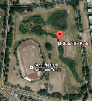
My first idea will involve photos that I took based on the work of John Baldesarri. I took photos of branches using a telephoto lens at Sutcliffe park. Then I changed the colours of the branches to colours you wouldn't expect a tree to be. That was the John Baldessari aspect of these images. Then the way I will display them came from one of my friends GCSE final pieces. My friend printed off a Google Maps photo of his street and he put photos that he took on the street all over the board. My idea is have the screenshot of the Park in the middle. Then put the best images all the way around the board. Then have a bit of strong showing where I was standing when the photo was taken.
Below is a quick mock of what my final piece will look like. This was a quick version that I made in Photoshop. As I said I would print off a map of the area where the photos were taken. Then the images I took would be around the side of the image. Also the lines on this image were added with Adobe Illustrator. In the actual final, I would use pins and string and to indicate where I was standing when I took a specific photo.
This could also give us an idea of a journey because it is showing me where I have been. 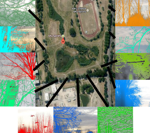
|
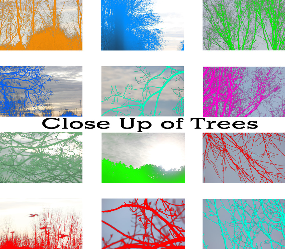
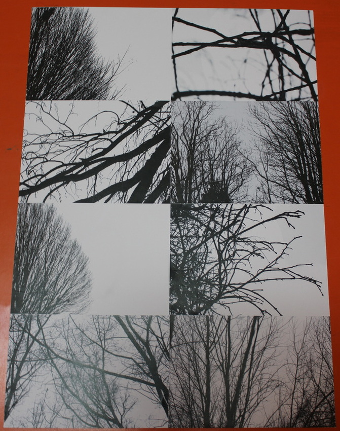
My second idea for my next final piece involves the display strategy of Multiples. This final piece would include low angle photos of me getting close to a subject. For example grass. This is showing inspiration from the work of Peter Fraser, where when he took photos. He went close into the subject. I would just lay them out on the board. The reason why I would use the strategy of Multiples is because I would like the photos to show a narrative of something like, "Small things happen that you don't see".
Below is what the 2nd idea for my final piece will look like. Also if I chose this final piece, the photos will be different. The photos I have used in this quick mock up is just to show the concept of the design.
If I have enough time left over. I will make this my 3rd final piece. The reason why I have decided to make this one last is because I believe the one with the map is the better idea. So I would rather take up time with one I prefer.
|
2nd Final Piece
|
On the left are the photos I'm going to use for my 2nd final piece. The photos in the slideshow are the photos that will go around the map, which is underneath the slideshow.
For starters people will look at the final piece and think how does this relate on Contrast. One reason why I believe this links to Contrast is because it is showing different things I saw whilst I was on a journey, walking through Sutcliffe park looking for things to photograph. There is a contrast in colour because some of the branches in the images are coloured red, some different shades of blue etc. Also I believe there will be a contrast in quality because the centre image [the map] will be fairly pixelated because that is just a screenshot, however the images that I took with a DSLR are massive. So there for the quality of the 2 sets of images will be different, however this is a contrast that I have no choice in. I believe this final piece shows us a sense of Journey, Time and Memory. Memory comes into this because because I'm relying on my memory of where I was standing when I took a specific photo. To show my memory I've decided to use 2 different kinds of string. For photos where I'm certain I was standing, I'm going to use string that is in a perfect straight line. Also for photos where I'm not sure I was standing I'm going to use string that isn't tight. This could show my 'brain waves' because the straight lines could represent I remember where I was, I'm going straight there. Also the not tight lines could so maybe I was here, or maybe I was there, this is because the line won't be straight. |
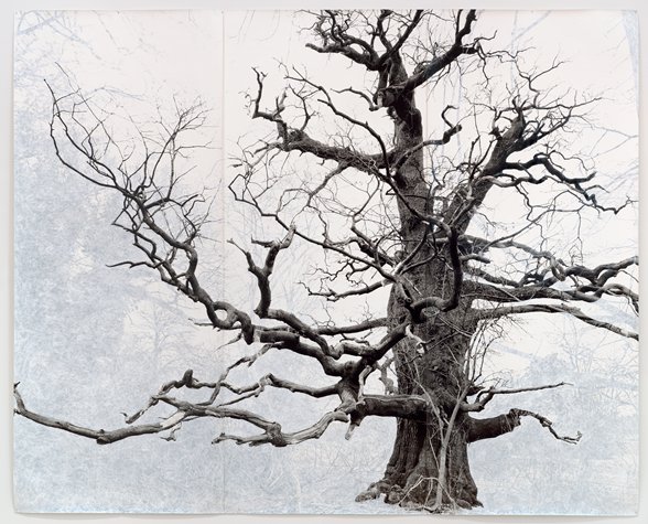
Redesigning the final pieceAfter talking to Mr Nicholls, we decided that the idea with the map didn't really work for 2 reasons. Firstly the idea of having images with bright colours and putting them with a map that has dark colours, didn't really work. The 2 problem was that the map was pixelated. However he said that if the images weren't edited and the map wasn't pixelated the final piece would make sense and work together. After doing some research, Mr Nicholls pointed me in the direction of the Tallis Arts Pinterest and he showed me the image on the right that was made by Tacita Dean. This is a blown up image, the size of a massive wall and she painted around the tree. I'm going to do a digital version of this on Photoshop. I've decided that I'm going to focus on close ups of branches rather than an entire tree. This is because it will be easier to paint around in Photoshop and I could possibly get a silhouette effect on the tree if I zoom in. I will display these images with the display strategy of Multiples because I believe the colour contrast of Black and White will work well with Multiples.
|
|
Below is my final piece. I prefer this final piece over the first one. You will see why in my evaluation at the bottom.
| Ben Peters A Level Photography 2nd Final Piece Evaluation |
