CON-trast
"Contrast is what makes Photography interesting" Conrad Hall
What is Contrast?
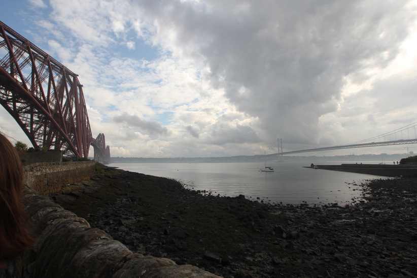
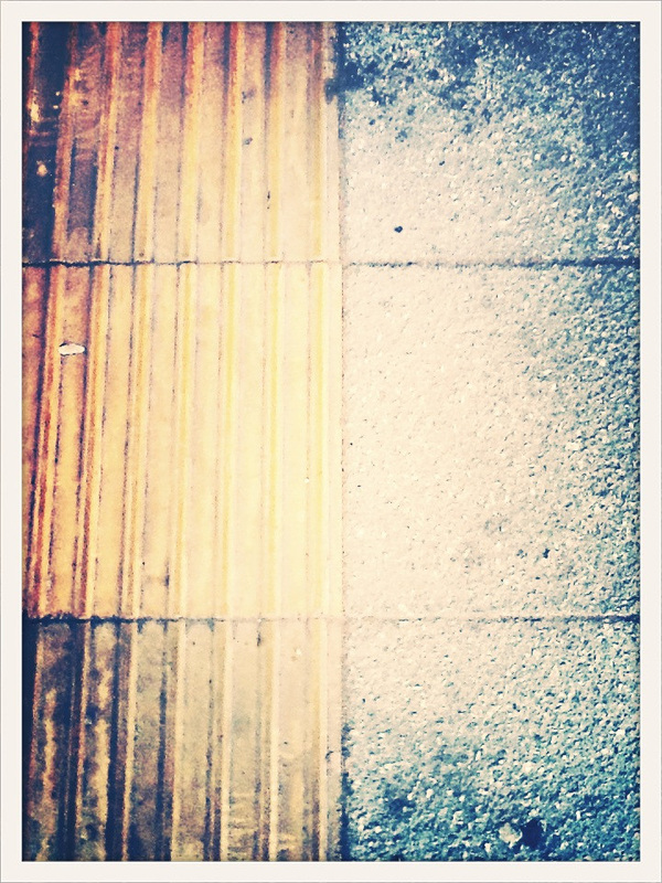
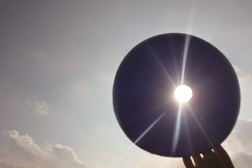
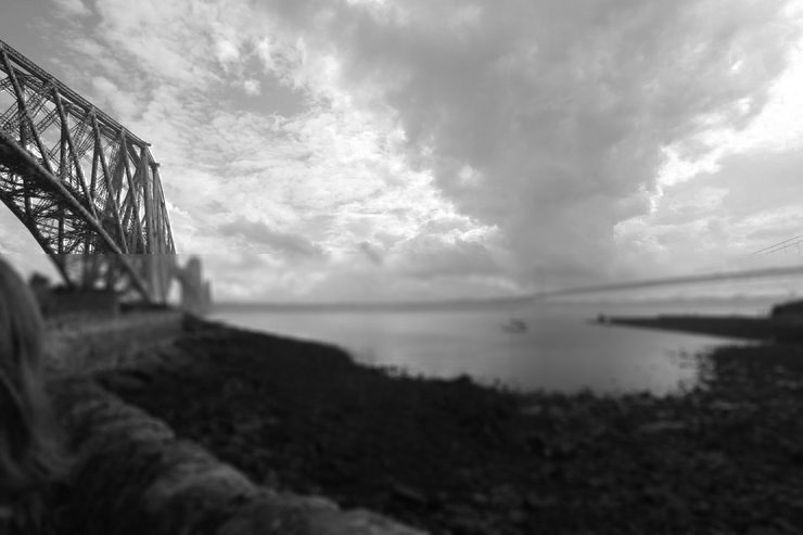
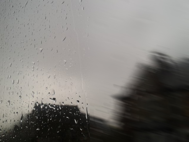
Contrast is the state of something being strikingly different. Something could be anything. One example of Contrast photography is this image I took in Scotland: The reason why I feel this is an example of Contrast Photography is because as you can see there is a split in the weather the right hand side has dark, hot colours [the grey clouds], whereas the left side has breaks in the clouds and has cool, bright colours [the blue sky].
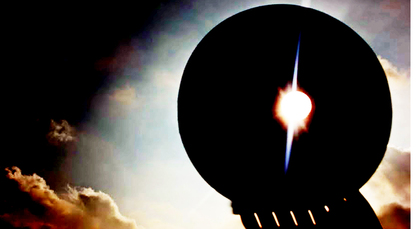
Below are example of Contrast Photography taken by expert photographers. [click on photos to properly view them]


Underneath is my Popplet called 'CON-trast' this line graph can be critical in giving me inspiration about what to for my final piece in the Unit Contrast.
Extension from mindmap
Unfortunately due to a faulty update Popplet is down, so I have to type underneath the mind map.
Contrasts
Light-Dark
Inside-Outside
Night-Day
Soft-Hard
Loud-Quiet
Still-Motion
Straight-Curvey, Zig Zag, Wavey, Bent
Close Up-Far Away, Impersonal
In Focus-Out Of Focus, Unclear, Fuzzy, Obscured, Abstract, Distracted, Diluted
Miniature-Enormous, Big, Massive, Ginormous
Wrinkled-Flat, Soft, Smooth, Young
Up-Down, Horizontal, Below
Complexity-Simplicity
Open-Shut, Closed, Barriered, Locked
Compact-Open Up
Luxurious-Plain
Transparent-Solid
Hidden-Exposed, Reviled, Found, Discovered
Central-Outer
Red-Green
Flat-Raised, Steep, Slope, Uneven
Multiple-Singular, Dividing
Bright-Dim, Dark, Glooming, Absence Of Light
Organic-Geometric, Artificial, Pollution, Synthetic, Angular
Black-White, Dull, Colour, Hopeful, Equality
Sigmar Polke, Claus Oldenberg, Ron Mueck, Peter Halley
Analysing photos about Contrast
This photo is takem by a Photographer called Christopher Nunn. His photos in Photography are litreally what a corpse leaves behind. When someone dies he would go in after or some times during the Phoresnsic analysis of the house and he would litreally go around and photograph what has been left behind.
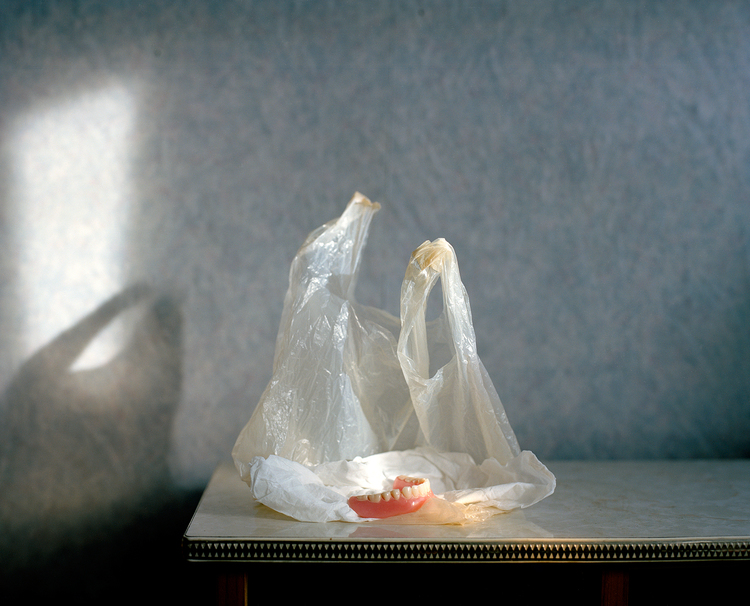
I believe that this photo relates to Contrast in multiple ways. One way is by the fact that there is a greyey/white, transparent bag in the foreground up against a bluey background. This photoalso makes me ask myself questions like is that shadow on the left intended or is it just coincedence. There is also a Contrast in the amount of space because the centre of the image looks fairly compact and small, whereas the majorty of the image is massive compared to the middle of the image.
I believe that this photo relates to Contrast in multiple ways. One way is by the fact that there is a greyey/white, transparent bag in the foreground up against a bluey background. This photoalso makes me ask myself questions like is that shadow on the left intended or is it just coincedence. There is also a Contrast in the amount of space because the centre of the image looks fairly compact and small, whereas the majorty of the image is massive compared to the middle of the image.
Comparing and Contrasting
Organic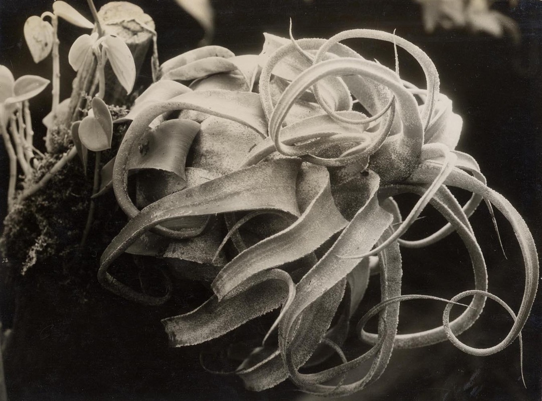
|
Geo-Metric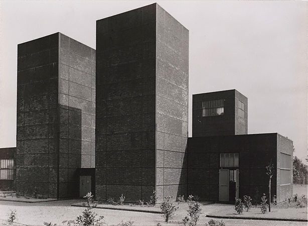
|
One thing I will say is that I couldn't find the Geometric one I was intending to use. So I've had to use a similar photo.
First I'm going to talk about the Organic photo contains a distinct lack-of-colour compared to the other photo. This photo is also showing the flower Decaying this is also a Contrast between the 2. This is because the buildings look fairly new, if they were old they would be decaying, some of the tiles would have wearer away. This could also show a Contrast in Age. There is also a Contrast in Lines in this image. This is because the Organic photo doesn't contain any straight lines, whereas the Geometric one mainly consists of straight lines, along with 1 or 2 curves.
Referring to lines, the Geometric image contains parallel lines. As you can see the 2 rectangular buildings are the same size, same shape, same height and lastly they keep the same distance, the gap between the 2 never increases or decreases.
Another difference between the 2 images is that the Geometric photo is organised, whereas the Organic photo is unorganised. This is because the Geometric one is a building it has to be planned if it is to be made, whereas the Organic one is a flower, it just does what ever it wants, it's a flower, it isn't planned.
|
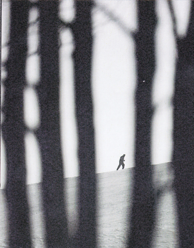
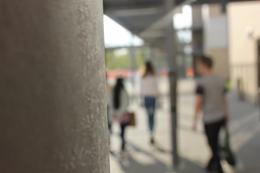
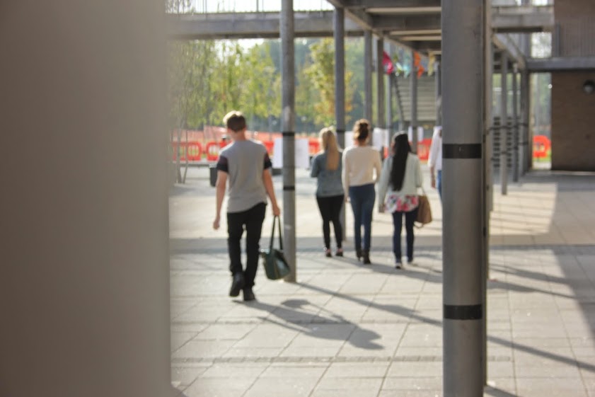
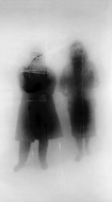
Favourite Photo about ContrastOn the left is one of my favourite pictures about Contrast.
One reason why I like this one is because, when I look at the picture it makes me ask questions like Where is this guy going?, is this a man or a woman?, another good question I think of is 'Is this a hill or is the image just slanted?. A second reason why I like this image is because of the secrecy of what the photographer he is standing behind. Because it doesn't look dark enough to be trees, however it is too big for the m to be something. A third thing I like about this image is the secrecy on who this is in the middle. All we know is that it is a person. Is it by any chance a soldier?. Because he appears to be wearing what looks like a beret. One final thing I like about this image is that the background is in focus and the foreground is out-of-focus. With most photos where focus is a formal element it usually the opposite way around. One last thing this image contains a few formal elements of Contrast photography. It contains focus, edges and tone. |
Poems about Contrast photos
|
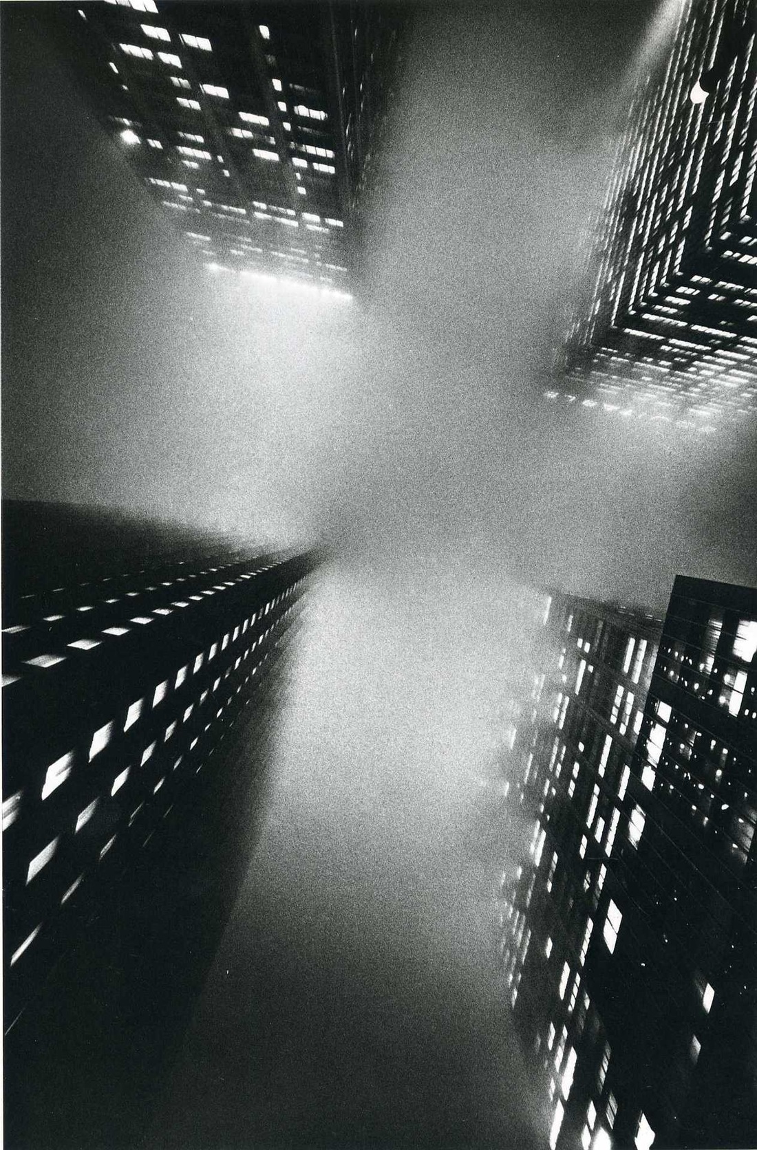
Below is an annotated copy of the image on the right. Called The Square, NY. It was taken by Ernest Haas.
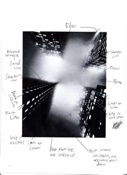
Below is a short poem which I've wrote referring to this
image. Questions of Manhatten Are we looking up, or looking down?. Are we looking up at clouds, or down at fog?. Why are there mroe lights on in the top right building? Whats important about this buidling? Is this corner important, Or is it just another corner? Is this photo meant to be portrait, Or Landscape? Doesn't it actully matter, Or is it important for the image? Are the edges completely straight, Or not? Are the buildings fully in focus, Or on slightly? |
Annotating Photos that involve Contrast.
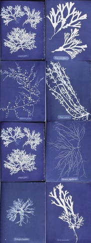
These are a bunch of Cyanotypes made by Anna Atkins. The reason why these link to Contrast is because each of the Cyanotypes have got varied degrees of exposure. This can be told by some of the Cyanotypes having a very bright white colour whereas one of them is very grey.
This indicates that some of these [very white ones] are exposed properly whereas the [grey ones] are possibly underexposed, or maybe the objects weren't touching the paper, maybe they were just hovering, being held over the chemical paper. Because if the object was being placed right on top of the paper it would be bright white, where it hasn't been exposed. However the thickness of the object could also be a factor in determining the colour. Because the thicker areas would have bigger objects blocking off the sun. |
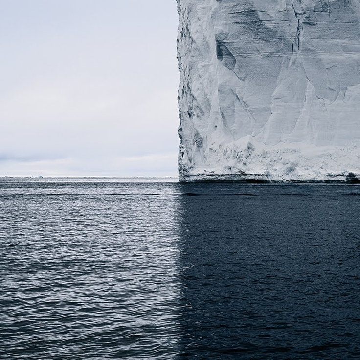
This in my opinion is possibly one of my favourite photos about Contrast. In this photo there are actually 4 areas of Contrast in this image. All 4 of the corners have got a different aspect. For example the top left is fairly cloudy, bottom left is a warm colour of water. Whereas on the bottom right there is a cool colour for the water. And finally on the top right there is very cold, very bright, very solid object. Each 4 of the corners Contrast the other corners. That is one reason why I like this Image. A second reason why I like this image is because it is quiet obscure where this location is, because it appears that there is a rather small, low level island in the distant and if it was the Arctic or Antarctica it would be very white. It is also very possible that this image was Photo-shopped. I believe this because it is very unlikely that there would be a sudden change in the tone of the water. However using Photoshop makes a great Contrast. It appears that the image on the right was possibly taken on in the Arctic because of the very colour of water and what appears to be Ice.
|
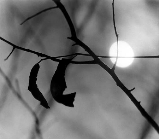
Firstly I picked this image because because I couldn't find the one I was intending to use.
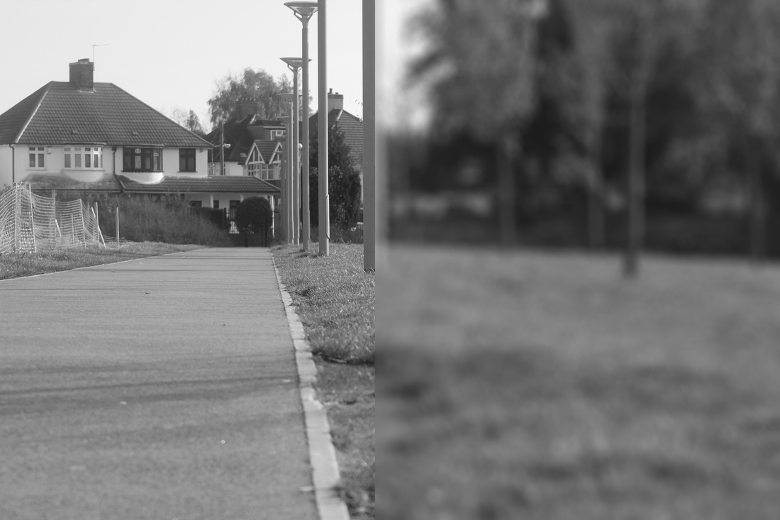
The formal element of this Contrast is focus. This is because the foreground [the twig] is in focus whereas the background, the sun, sky and other twigs are out-of-focus. There is a massive Contrast here between what is in and what it out of focus. This is known as a shallow depth of field because not much of this image is actually in focus, even the foreground is in focus, by a small majority. Most of the image is out of focus. The background makes up more of the image than the foreground. There is a sun in the background. The way I can tell this is the sun is that the foreground is literally a silhouette. yes this image is in B&W however if there wasn't a sun in the background, the twig would be dark but it wouldn't be completely black like it is because even B&W images still display colour, just not easy to see. |
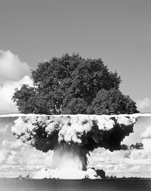
The bottom image appears to be an image of warship, possibly an ammunition ship [because of the massive explosion] exploding whilst in the middle of a vast armada of ships. Whereas the top image is of the top of a tree. Taken from the side of the tree. I really like this image because there is also a Contrast in the amount of space of the two images. This is because the bottom image has got war ships and loads of clouds. Whereas the top image has only has 1 or 2 clouds and a tree. Above them is loads of free space which is sky. Clearly you can tell that the point of these 2 images is to make the trees look like part of the explosion [Mushroom Cloud]. Also you could say that the mushroom cloud below is depicting a massive tree bark and the lower leaves of a tree.
|
1st Set: Textures, Lines and Colours.
Below is my first set of photos about Contrast. [Click on the image to have a better look]
Textures


Colours


Lines


Least Effective Image
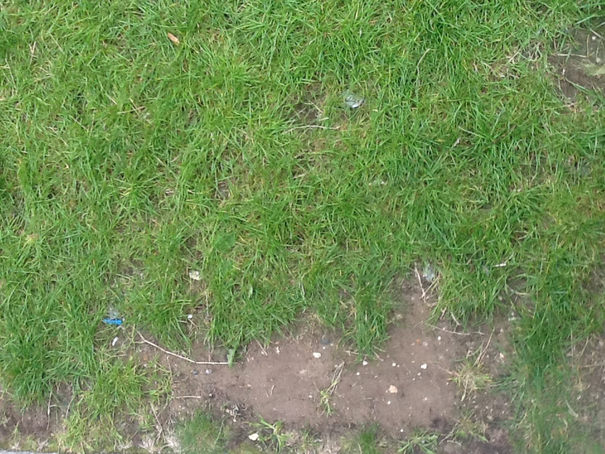
In my opinion this photo is the least effective as regards to Contrast. This was in the 'Textures' section and I originally had high hope for this image. However there are two problems with this image firstly it is not easy to tell what the grass texture is like compared to the soil. This is most likely because the iPad I was using is not zoomed in on the grass, which means we have to call a compromise on detail towards the Texture.
A second reason why this image is least effective is that there is not enough soil in this image for this to display a Contrast between the Grass and the Soil textures. If it was more like 50:50 then I would believe that this photo does relate to Contrast, however it doesn't exactly.
A second reason why this image is least effective is that there is not enough soil in this image for this to display a Contrast between the Grass and the Soil textures. If it was more like 50:50 then I would believe that this photo does relate to Contrast, however it doesn't exactly.
Favourite Image
In my opinion, this is the best image out of the set. One reason why I really like this image is because there is defiantly a Contrast in the Lines because as you can see on the right hand side there are only lines going sideways whereas on the left hand side there are lines going up and sideways. This image was taken on an app called Cross Process, which has given me this superb colour effect, this colour effect is the second thing I like about this image, it does make it easier to see all of the lines, and makes the Contrast easier to see.
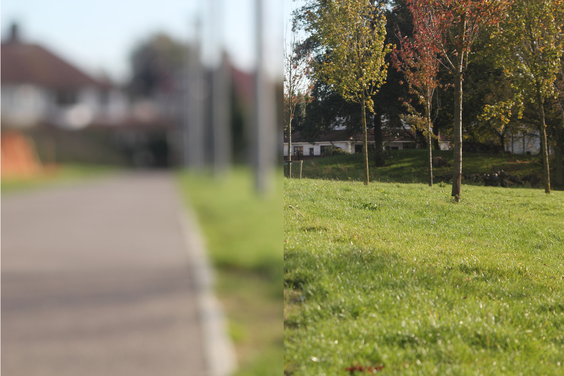
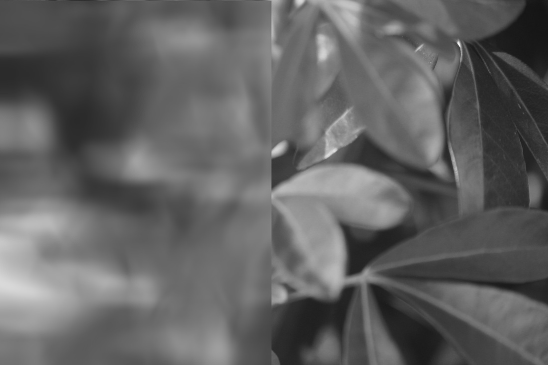
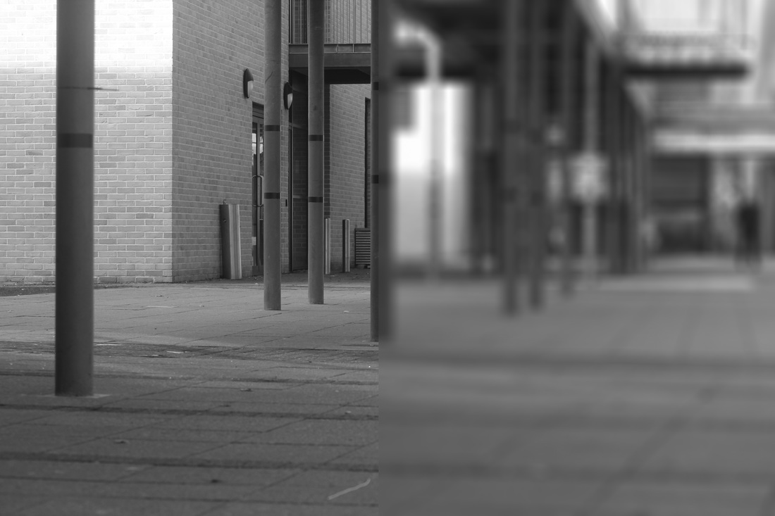
2nd Set: Viewpoint involving Depth of Field


Favourite Photo |
Worst photo |
This is my favourite image of the set. The reason why I like this image is because the Contrast line nearly goes down the middle of the image. The people in the background can also make the viewer ask questions like how far away are those people?. This is because with the people being out-of-focus it is hard to tell how tall someone or something is. Another reason why I believe this photo contains elements of Contrast is because of the focus there is a Contrast in colour because on the left the colours stand out clearly whereas on the right hand side it is hard to tell what some of the colours are because of the lack-of-focus.
|
The reason why this is my least favourite photo, is because there isn't a Contrast in the Focus in this image. It appears that the entire image is out of focus, this most likely happened because I was using mf [Manual Focus], so I must of set the DSLR lens to completely out of focus. In my opinion this has compromised the Contrast of the image because it just looks like a poorly taken image, rather than a planned out of focus image.
|
Photoshop experiments.
After taking these images I decided to, put certain ones through Photoshop via some different editing options. Here are the results:
Original ones
|
Photoshopped ones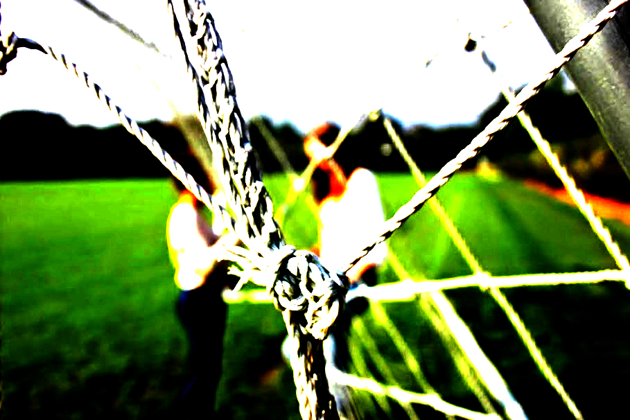
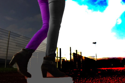
|
Best photo-shopped image
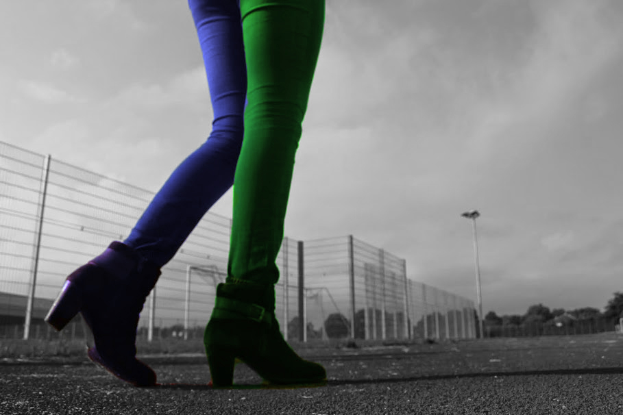
This was my fourth attempt at Photoshop in this lesson and in my opinion this is the best attempt. For this image the first thing I did was use the magic wand to select the background of the image. The background is the floor and the Hockey pitch behind the legs [Nadia]. After that I selected B&W on the 'Layer' bar and put the Black and White to maximum. Next I highlighted the right leg and changed the colour via selecting 'Solid Colour'. I did the same with the left leg, just with Blue rather than green.
The reason why this is my favourite image is because this photo is the most relevant to Contrast. This is because there is clearly a difference between the colours of the image.The foreground with the glow of the Green and the Purple/Blue on the legs, stands out against the greyer/B&W background. Which is displaying a Contrast between the foreground and background.
The reason why this is my favourite image is because this photo is the most relevant to Contrast. This is because there is clearly a difference between the colours of the image.The foreground with the glow of the Green and the Purple/Blue on the legs, stands out against the greyer/B&W background. Which is displaying a Contrast between the foreground and background.
How I made this image.
3rd set: 2nd attempt at Focus [Close Up]
My second attempt however this time these photos about Contrast in Focus are close ups. In-order to get a bigger Depth of Field
This is my favourite photo in the set because it is the most relevant. You can see a clear Contrast in the amount of Focus in this image because the left side is mainly in focus, however the far left is fairly out-of-focus. Whereas the right hand side is completely 100% out-of-focus.
|
This is the least effective image in my opinion. Mainly because the entire image is completely Out-of-focus. So there isn't actually a Contrast in this image. Only a tiny amount of this image
|
4th set: Textures
Below is one of my homework's about Contrast. The objective of this homework was to take 30 photos about Contrast, based on any of the formal elements. I chose Texture as the formal element to explore round my house. However I must admit it was harder than I expected.


Least Favourite Photo
The main reason why I'm disappointed with this image is because it is Out-of-focus, so it is very hard to tell the difference between the Textures. I did originally have high hopes for this image because I thought that Clay and Wall paper would create a very good Contrast image, however I simply could win with image. The flash would obscure most of it and if I didn't use the flash it would be out-of-focus because I sometimes rush images, especially with-out the flash.
|
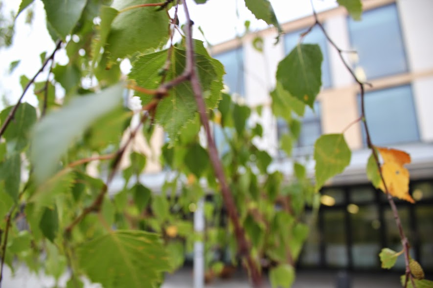
Best Photo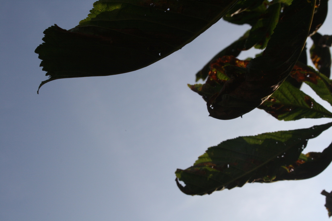
Some people will actually be confused at why this is my favourite image in this set about Texture, however I still believe this photo definatly has a link to Texture. The reason why I believe this because I believe that the sky can also count at a Texture. This photo was taken underneath a leaf in my garden looking up at the sky. In my opinion this image is displaying a difference in the texture between the sky and the leaf. One way I can tell what the Texture of the leaf is like is because light is shining through it, you can see that the leaf looks rather rough, whereas the sky looks completely flat and soft.
|
American Surfaces
William Eggleston
Eggleston is an American Photographer who is well known for his work involving Colour Photography. He was Born in 1939. It is believed that his work increased the recognition for Colour Photography where Black and White was no longer exclusive and was considered the only way to take photos. Eggleston was inspired by 2 photographer, Robert Franck and a book that Henri Cartier Bresson.
Eggleston is an American Photographer who is well known for his work involving Colour Photography. He was Born in 1939. It is believed that his work increased the recognition for Colour Photography where Black and White was no longer exclusive and was considered the only way to take photos. Eggleston was inspired by 2 photographer, Robert Franck and a book that Henri Cartier Bresson.
Stephen Shore
Shore is also an American photographer, born in 1947. Like Eggleston used colour rather than B&W when the latter was accepted as the only kind of Photography. Stephen has been an enthusiastic Photographer since a young age, at the age of 6 he received a Photography dark room kit from his dad. He got taught Photography by his father who also had an interest in Photography and was looking forward to the future of Photography. After 3 years of using a 35mm Film Camera he took his first colour image.
Shore is also an American photographer, born in 1947. Like Eggleston used colour rather than B&W when the latter was accepted as the only kind of Photography. Stephen has been an enthusiastic Photographer since a young age, at the age of 6 he received a Photography dark room kit from his dad. He got taught Photography by his father who also had an interest in Photography and was looking forward to the future of Photography. After 3 years of using a 35mm Film Camera he took his first colour image.
Differences |
Similarities |
|
|


After looking at these image even further I realised what was the intention of these photos. The intention is to photo stuff that appears to be out of place. So I took these photos in my house:


'Thomas Tallis Surfaces'
Below are a series of images that I've taken, which are inspired by the work of Steven Shore, for his 'American Surfaces'


Favourite Image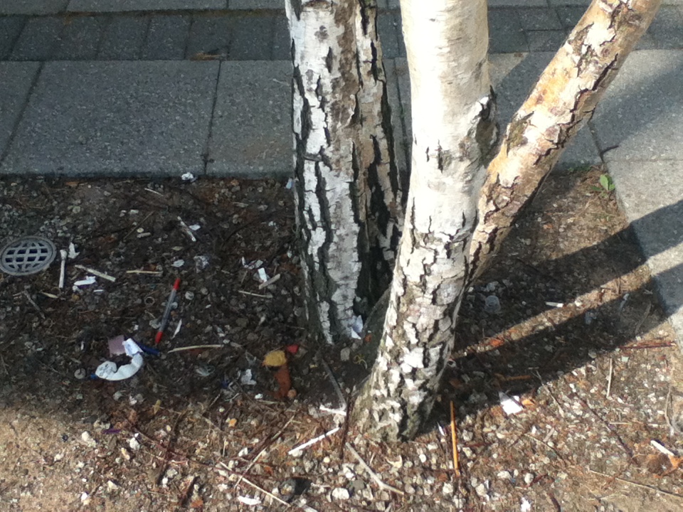
This is my favourite photo from set. I believe this photo is most relevant to the theme of Surfaces. If we base these image off of American Surfaces. This is the most relevant out of the set.
The reason why this is the most relevant is because it is showing rubbish on the floor which is out of place. The pen, the food wrapper is just litter which has been dumped by students and it looks out of place next to this tree. |
Least Favourite Image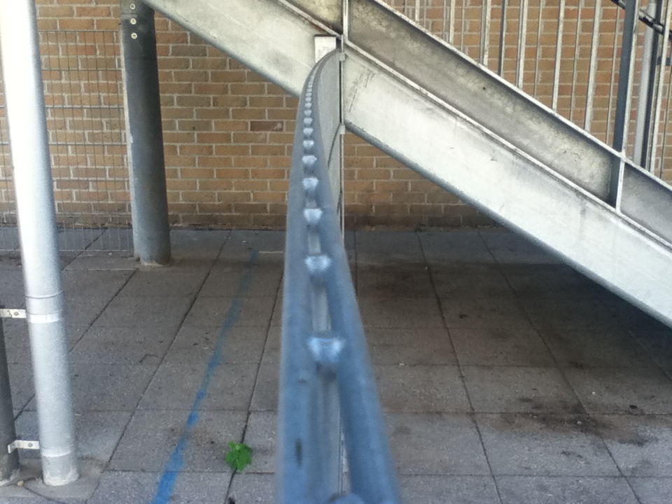
This is my least favourite image of the set because I believe that this photo is the least relevant to the theme of American Surfaces.
The reason why this is least relevant is because |
SE3 Surfaces.
In response to the album called 'American Surfaces' and my first attempt 'Tallis Surfaces'. I have decided to create a second attempt of Surfaces at my house. It is called 'SE3 Surfaces'. The reason why it is called that is because I live in the postcode of SE3.
Boyle Family
Scottish family
Project of a world series 'Barra'
Inspiration was luck [Throw darts at map blindfolded]
Photographs of Plankton in Barra
Macro-Photography [face of Plankton, the root of our hair]
Boyle Family:
The opposite working practise to the Boyle family
Guess - shot in the dark - trust - emptiness - excited about the work we are going to make
Collaborating
Dependent
Things to watch for inspiration:
Moma Shots [Museum of Modern Arts]
Tate Shots
ica [Institute of Contemporary Arts]
Scottish family
Project of a world series 'Barra'
Inspiration was luck [Throw darts at map blindfolded]
Photographs of Plankton in Barra
Macro-Photography [face of Plankton, the root of our hair]
Boyle Family:
- Free spirited artists - Using friends, open minded to possibilities
- They've all had different backgrounds - Mark was in the Army, Joan studies Art and ran their own business.
- Own bodies - but not in a 'personal'
- Working with family
- They do stuff at 'Their own accord'
- Started off the project with getting blindfolded to throw darts at a wall, the hits are where there photos will be taken
The opposite working practise to the Boyle family
- Choose the subject of the piece straight away, no consideration - Vague idea - The idea isn't clear at first, however you more you do it, the more ideas come into your head - Look at the work you have done before
Guess - shot in the dark - trust - emptiness - excited about the work we are going to make
Collaborating
Dependent
Things to watch for inspiration:
Moma Shots [Museum of Modern Arts]
Tate Shots
ica [Institute of Contemporary Arts]
Personal Project
My first proposal for 'Contrast'
My plan for this final piece it focus on a Contrast between 'Texture & Focus'. Out of the four Sub-Themes this is my most favourite one. The others were Abstract, Portrait/Figure and Places. I also decided to pick Focus is a Formal Element of Contrast which I have tried a lot especially during GCSE Photography
Potential Ideas
My main idea for this course is to get photos that are partly in and partly out of focus. This will involve the use of a tilt and shift Lens. Which I have previously used in GCSE Photography
Photographers to research
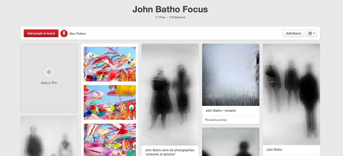
Uta BarthUta Barth is a German contemporary Photographer. Below are some of her photos that she has taken. As you can see, some of the photos do feature people, however only as extras. They are not the main subject of the image. This is in Contrast to John Batho because with his photos, people were the main subject.
Quotes from Uta Barth"If the subject of the work is perception and not what the camera is pointed at, then there is no point in "going out to photograph... But you still have to point the lens someplace. So let it follow your gaze..." "On the most obvious level, we all expect photographs to be pictures of something. We assume that the photographer observed a place, a person, an event in the world and wanted to record it, point at it. There is always something that motivated the taking of a photograph. The problem with my work is that these images are really not of anything in that sense, they register only that which is incidental and peripherally implied" "I have never been interested in making a photograph that describes what the world I live in looks like, but I am interested in what pictures (of the world) look like." for the quote above this could be taken as Barth is trying to say that the world isn't actually clear the future of the world is blurry [as that is what her photos are like]
|
John BathoJohn Batho is a French Photographer who has been dedicated to the hobby ever since 1961. Ho focused on colour when Black and White dominated Photography. He wanted to find out if colour increased the perception of a Photograph.
|
One Contrast between the two is that Barth took photos of objects, whereas Batho took out-of-focus pictures of People. Another Contrast between the 2 is how they take their pictures. Uta Barth simply took pictures where the Focal Length was already set to Out-of-focus. However Batho took out of focus images using his surroundings. For example Batho simply used a window Condesation has occured and taken a photo of someone looking through the window.
Favourite image from these Photographers
This is one of my favourite images that John Batho has taken. This image will actually inspire one of my sets later in the Unit. John Batho is known for taking out-of-focus images, however not like other photographers who take out-of-focus images. Most photographers take out of focus images by simply setting there lens to completely blurry. However Batho took these images by looking through heated up windows. Windows where Condensation has occurred because of either steam being let-off close to the window. However this window has got misty because of the cold weather. This is evidenced by the thick clothes that the people appear to be wearing.
This mist in this image appears to give off a Ghostly impression this is because the mist of the window breaks up some of the features of the image. For example the face. Quite a few features of the face have been lost. This makes us feel like we are looking at ghosts, only because the face is lost because of the mist.
This mist in this image appears to give off a Ghostly impression this is because the mist of the window breaks up some of the features of the image. For example the face. Quite a few features of the face have been lost. This makes us feel like we are looking at ghosts, only because the face is lost because of the mist.
My Initial Ideas
My first initial idea involves using Photoshop. During my research I have been interested in the work of Uta Barth where, he took images that were half in, half out of focus. So this gave me an idea. In these image there isn't any 50/50 focus. So this is my idea. It will involve a tripod and a DSLR. I will take an of something like a flower, or a staircase in focus, then next take the image again but completely out-of-focus. Then after that I will mix the 2 images together in Photoshop where it will be split 50/50. Some shot will be cut in half down the middle, some across the middle, some diagonally. Than finally after making a certain amount of 50/50 focus image I can put them in a Typology. This will involve using all 3 classes towards this final piece. Ideas for Contrast [Ms Gibson], Photoshop [Mr Kiff] and finally Typology [Mr Hodges]. I also believe that this will show off my skills of Photography.
First attempt
These are the images before I have edited them in Photoshop


As you can see there is only one image in this attempt. Me and another teacher spotted a mistake which could ruin the illusion of the picture. As you can see the image isn't lined up. This is because when you change the focus with the Lens there is a slight zoom, so as a result the image can't be lined up and then because of that there isn't really an illusion.
2nd attempt: Refined and Developed
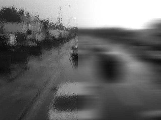
After discovering this mistake, I found another way to make a 50/50 focus on Photoshop. So this time I used just 1 photo and I selected half of it. Next I selected 'Lens Blur' and the 'Blur' section and put the radius at 100%. This brought these images as a result.
|
|
These are the photos that I'm considering to use for my final piece. As you can the photos are at the same zoom. This is because I haven't cut any images in half, I have simply selected half of an image on Photoshop then put the radius in 'Blur' up to the maximum. The after that I have added an effect to the image, to make them more abstract, and therefore the illusion will be better.
As I said I'm planning to make quite a lot of these, around 10 to 20. Where half of them will be close-ups and the other half will be Landscapes. The finaly I will put these into a Typology. This should display a Contrast in focus and in Landscape and Portraiture.
As I said I'm planning to make quite a lot of these, around 10 to 20. Where half of them will be close-ups and the other half will be Landscapes. The finaly I will put these into a Typology. This should display a Contrast in focus and in Landscape and Portraiture.
After taking these image. I was happy with the Landscape ones but I believed that the close up one could of been better. So I've decided to look at this Pinterest board done by Tallis Arts 'Close-up'. This board displays some photos of Macro-photography. Where a certain amount of the image is already out-of-focus. This could make the 'Blur' features on Photoshop very good.
How I made these images
|
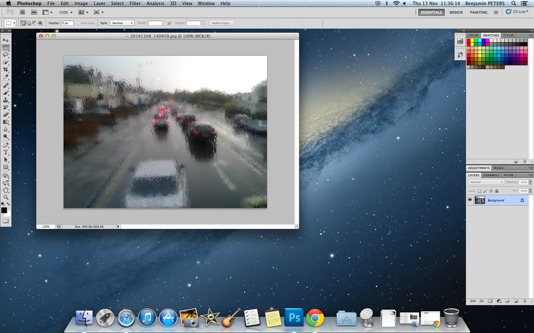
Step1: Add an image into Photoshop.
Firstly you simply have to open up Photoshop and then you have to drag an image onto it. |
|
Step 3: Apply a Blur filter
After you have selected a certain section of the photo. Click on 'Filter' then 'Blur' then pick a Blur option. For this image I'm going to use 'Motion Blur' 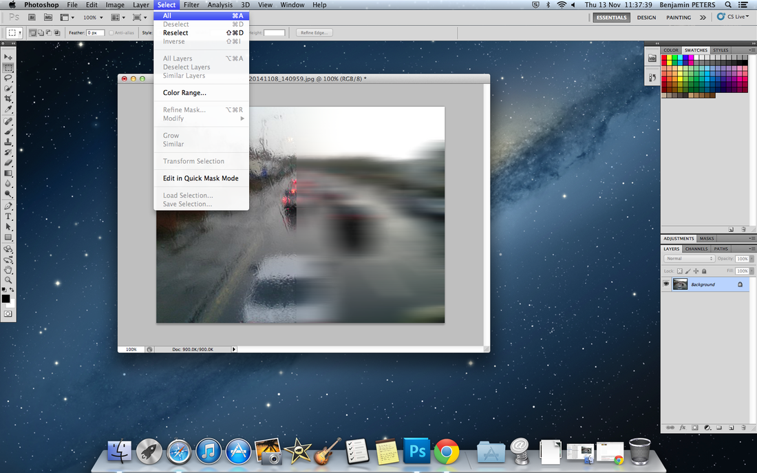
|
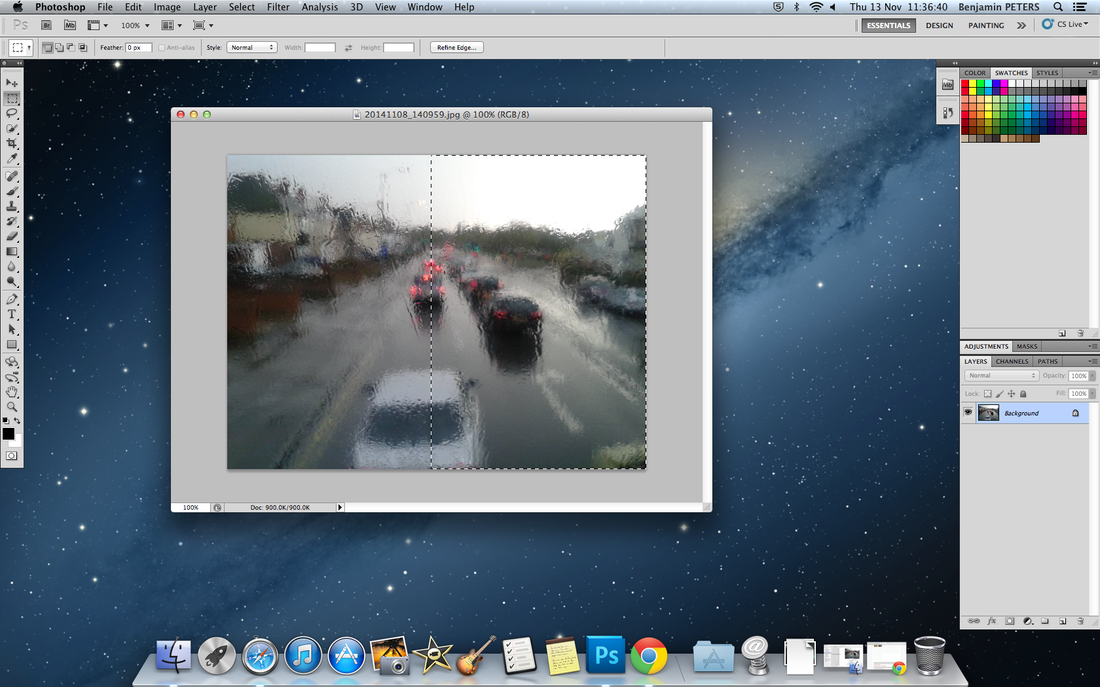
Step 2: Select half of an image.
Use the Rectangular Marquee tool on the tools Palette, then drag it over a certain part of the image you want to edit. 
Step 4: Adding a colour effect
After you have selected a Blur filter. I would select the entire image [Select, All]. This way I can apply a colour option to the entire image. |
|
Step 5: Applying the effect
After selecting the entire image you have a choice. You have to click on 'Image' then you can either select 'Mode' or 'Adjustments' Then after selecting one you receive loads of colour options. Below is the final result. |
|
2nd set. Focus involving Windows
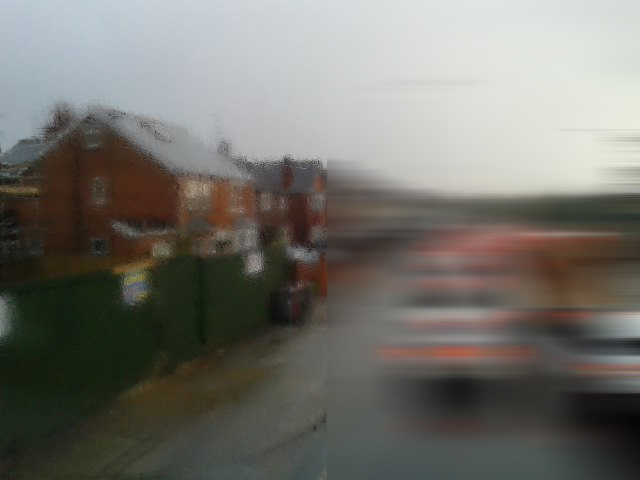
On the 8th of November I went to Reading to watch a football game. I decided to take a bus through Reading to get to the stadium. When I was looking through the window where Condensation had occurred because of the cold weather. It reminded me of photos that John Batho took. He took photos that were made out-of-focus because of the windows where condensation had happened. So I got my phone camera out and starting take photos through the window. The only problem with these images is that they were taken with a Phone camera rather than a DSLR. This means that the resolution of the image, won't be as good. Therefore you won't be able to see as much detail. Below are the photos that I took and under-neath it are how I've edited them in Photoshop.
|

|
Sites that can help
Final Piece idea
What you can see above is not my final piece. However this is how I would like to display my final piece. The idea of this is I take 1. Duplicate [copy it] and put one of them in Photoshop and add any Blur filter to one of them. Then finally the image will be cut up into equal sections. Then it will be layed out like this.
I'm currently deciding between the 2 images in the Slideshow on how to display them.
When I make this final piece, it will be made in a few different ways.
I'm currently deciding between the 2 images in the Slideshow on how to display them.
When I make this final piece, it will be made in a few different ways.
At Home
|
At School
|
Display Stratergies
Multiples
|
I believe that this display strategy would work really well for the kind of images I'm creating.
I could put this in a Multiple display, where each image has different effects. For example one image could be like this, another one could be entirely B&W. However the main formal element of these images would be Focus, Colour and possibly Texture.
|
Panorama
|
This is a second display strategy which I believe would work well for these images. One thing I could do is create a Panorama of these images with a DSLR and a Tripod, do the same effects in Photoshop, then I can put them all together in Ps, then send it off the be printed. Then once it has arrived it will be displayed on a wall.
|
|

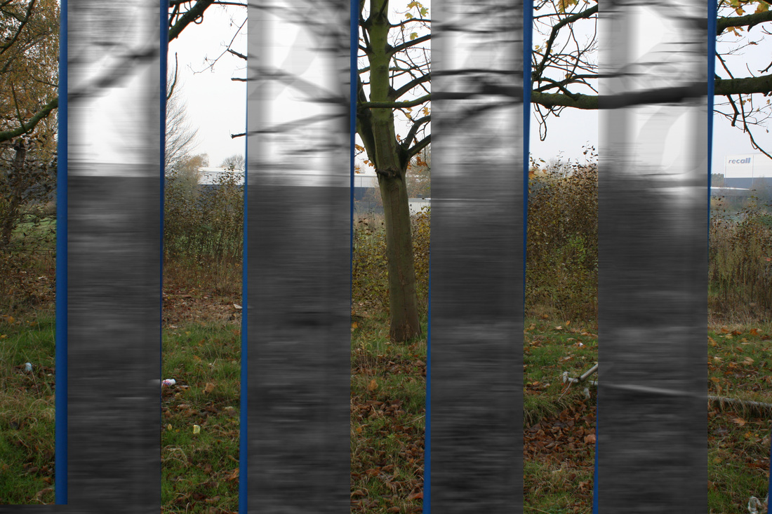
Above is a mock of what the final piece will look like if I used the Panorama display strategy. This was quickly put together in Photoshop. The main problem with this image was the Tripod. The tripod I used for this image was not completely flat so therefore the illusion of the Panorama is lost because then the images won't line up. Another thing that made this image difficult is the fact that this is a panorama of a curve. So when I actually make this Panorama it will be pictures of something in a straight line. Another reason why these images don't line up is because these fences are not in a straight line. It is tough to capture a corner in a Panorama and be able to keep the effect.
So when I take the photos for the actual final piece. They will be photos of a fence that is in a straight line. That way the photos will be straight and therefore there will be a good illusion in the panorama. Like I said above after stitching all the images together in Photoshop I will send it off to be printed then it will be displayed on a wall as a banner. The only problem with this way is that the Panorama will be very large when it is printed. So when it arrives I will have to be very careful when it comes to looking at it. Because of the size of the paper, it will be very fragile so it could tear rather easily.
So when I take the photos for the actual final piece. They will be photos of a fence that is in a straight line. That way the photos will be straight and therefore there will be a good illusion in the panorama. Like I said above after stitching all the images together in Photoshop I will send it off to be printed then it will be displayed on a wall as a banner. The only problem with this way is that the Panorama will be very large when it is printed. So when it arrives I will have to be very careful when it comes to looking at it. Because of the size of the paper, it will be very fragile so it could tear rather easily.
My First Final Piece
For my final piece I've made a few changes from the original idea. One difference is that with all of the photos. The first difference is how this one will be displayed. This one will be displayed downwards, this will be done because the bars will look better going sideways rather than up and down. In Photoshop I also added a Duotone to it [The blue tone]. Mr Nicholls thought of this idea. He believed that the colour and black tones didn't match with each other. So Sir said you can either put all of the in B&W or apply 'Grayscale' to all of the images and then add a Duotone. I decided to use a light blue colour. However with the gray/black tone it appears to be more of a dark blue. This makes the bars more easy to see. Therefore increasing the Contrast. Overall I believe this photo contains the formal elements Focus, Colour and Texture. Each one of the pictures are mounted separately. Originally I thought this was a negative, however this turned in a positive. This is because it expanded my ideas in the display strategy of Panorama. Now that these images are individual. When they are stuck together with Gaffer Tape, the final piece can now be displayed on a corner or a curve, rather than just simply being displayed in a straight line on a wall.
| Ben Peters A Level Photography 1st Final Piece Evaluation |
