Black Light
|
|
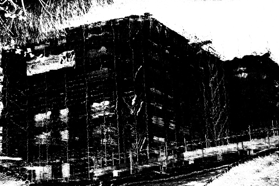
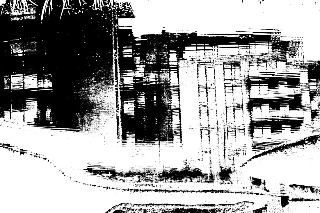
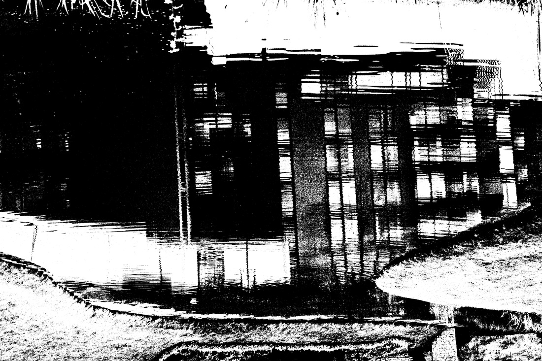
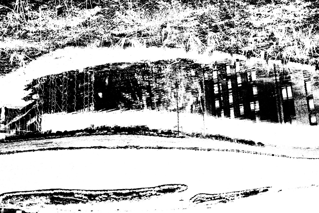
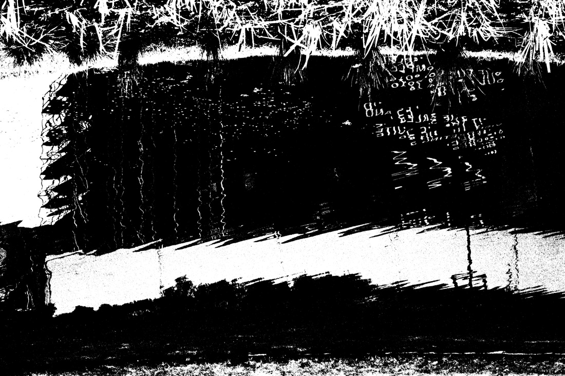
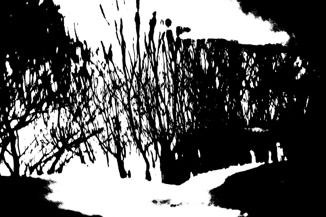
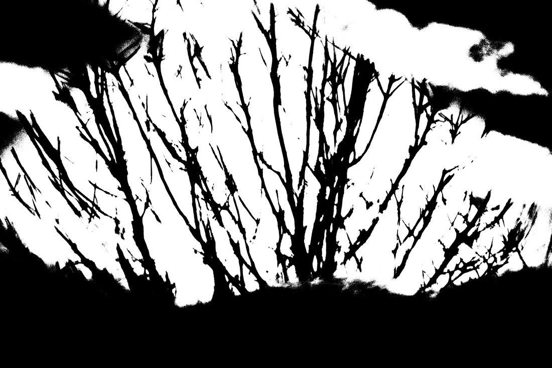
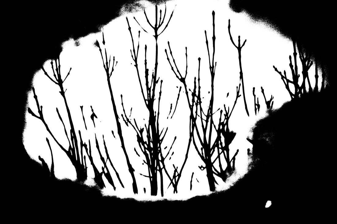
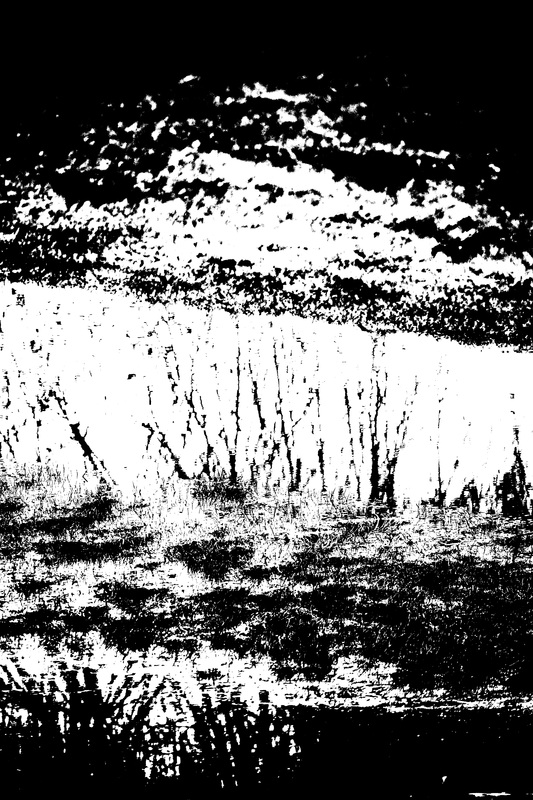
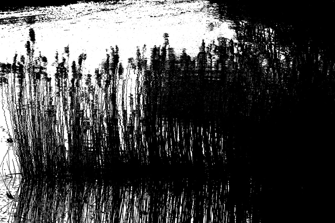
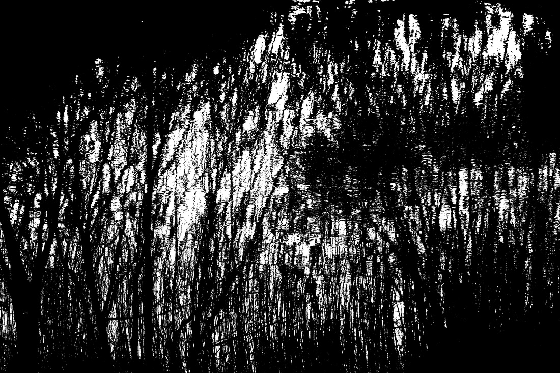
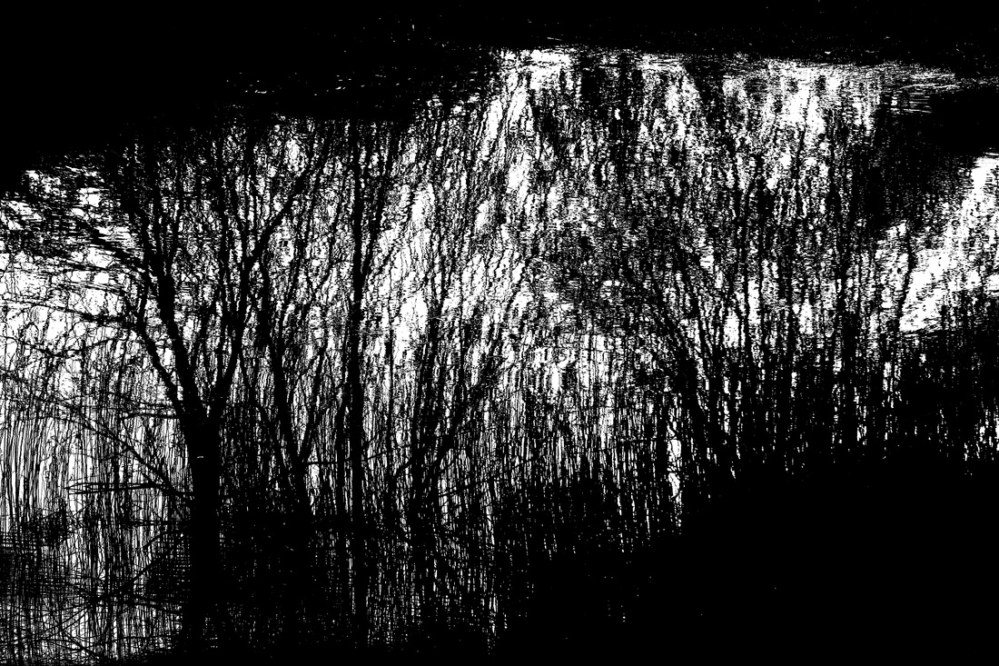
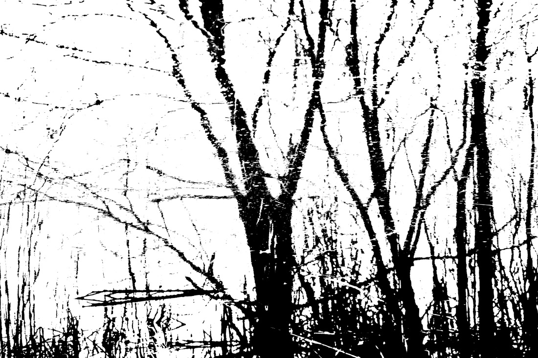
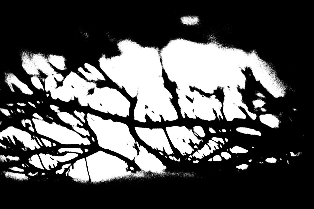
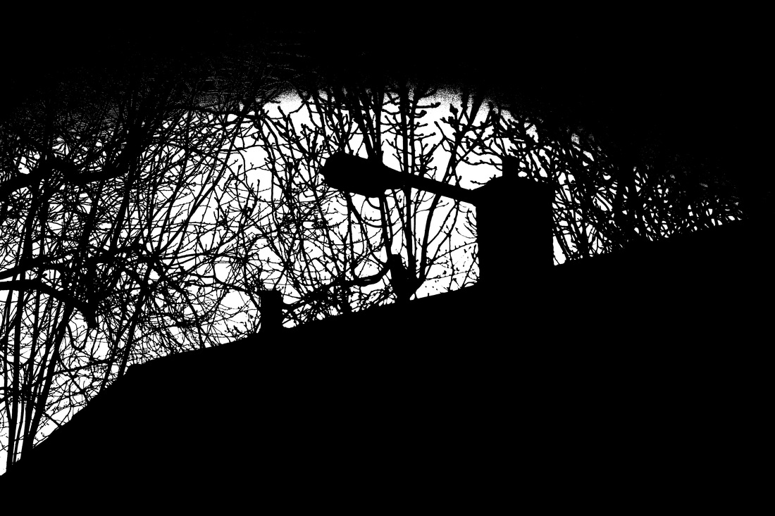
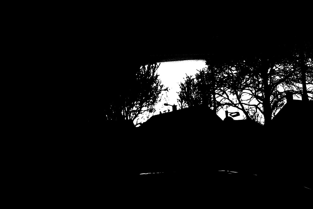
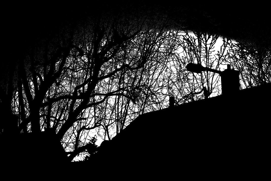
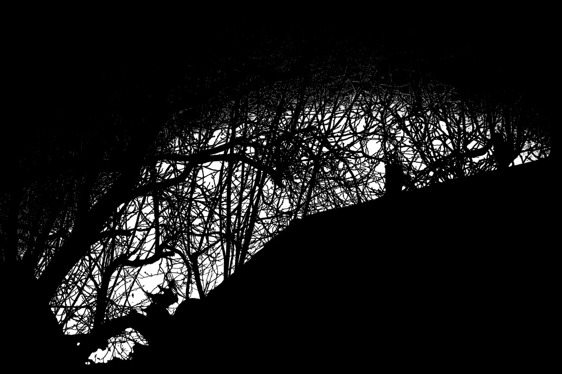
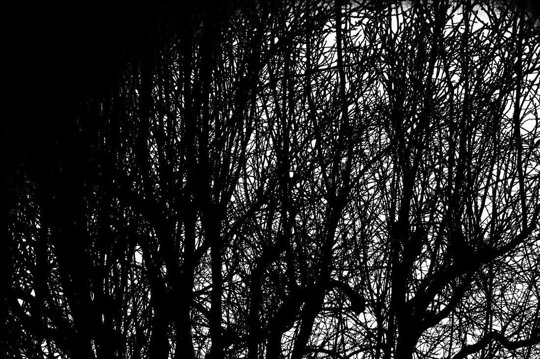
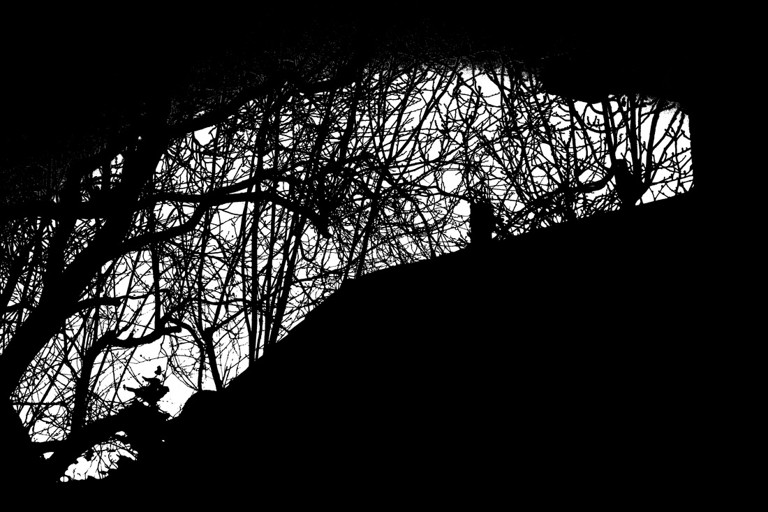
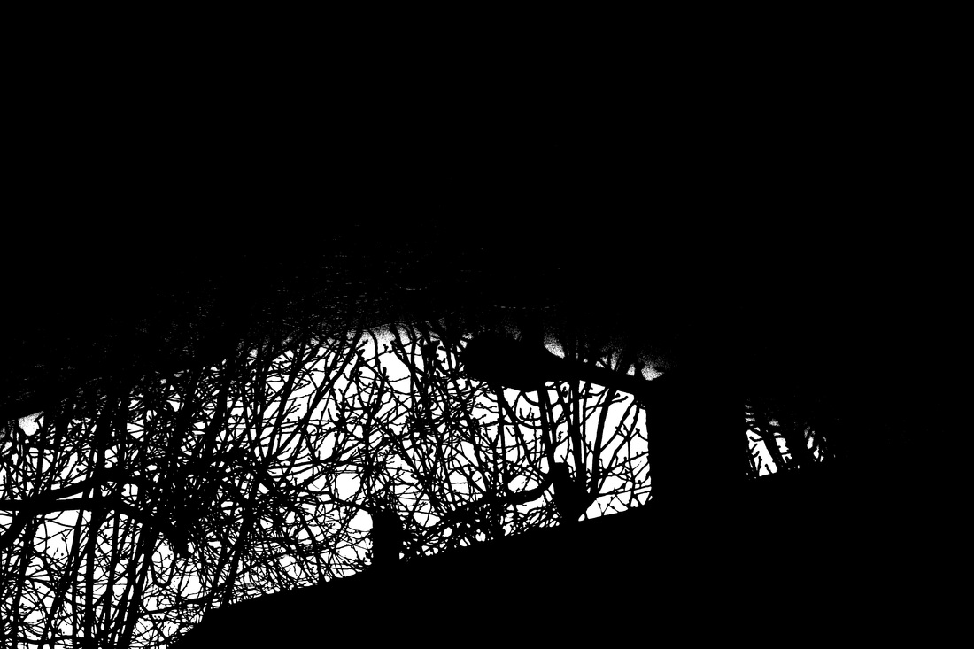
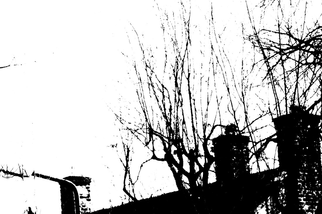
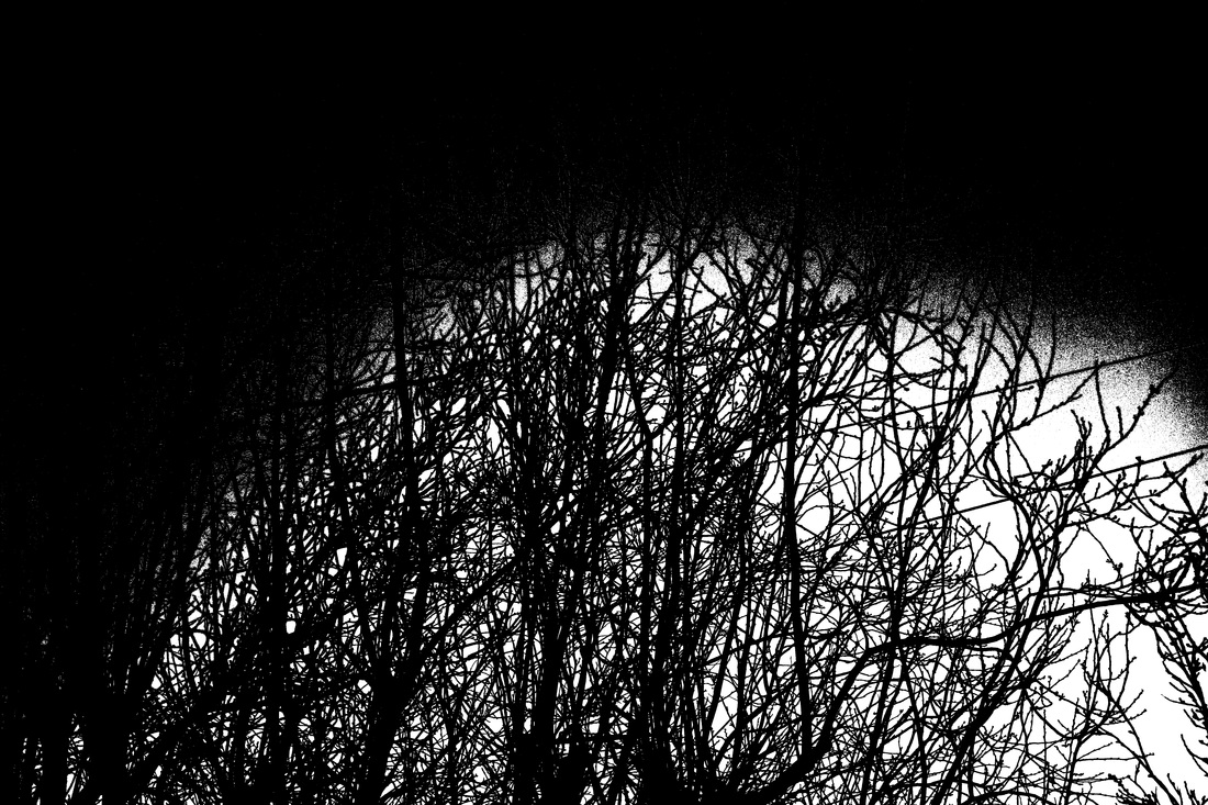
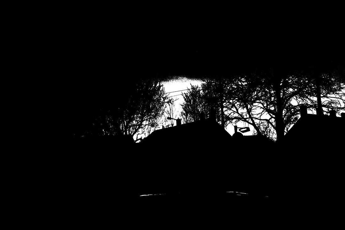
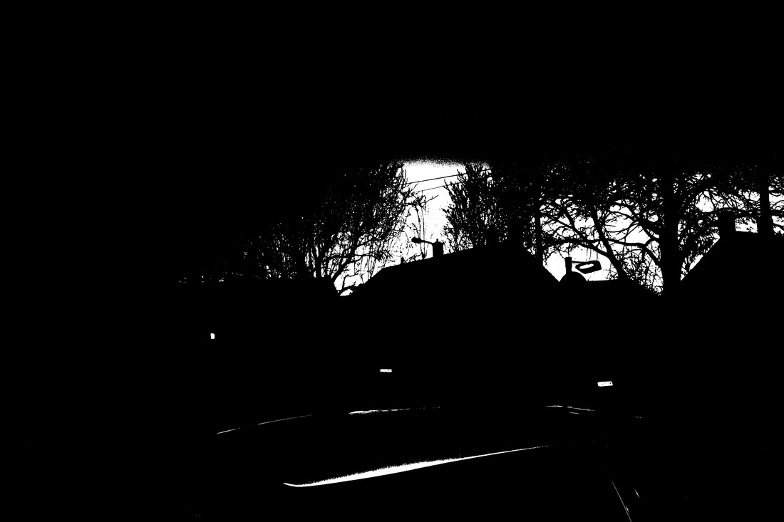
Keld Hemer-Petersen is a Danish photographer who is mainly famous for being a believer in colour photographer, where he published a book called "122 Colour Photographs". This was published in 1948, when the majority of photographers used B&W. However for this project I'm focusing on his work that he calls Back To Black. Kelmer-Petersen took photos or scanned in old photos. Then we would manipulate them in such a way where there are only 2 colours in the image Black and White. This isn't like normal black and white where you have various mid-tones, there is well and truly only black and white. This is known on Photoshop as Threshold. Even though when you like at my versions of the image, there appears to be a few shades that look like they are grey. However because of how close the black pixels and the white pixels are they just appear to be grey.
|
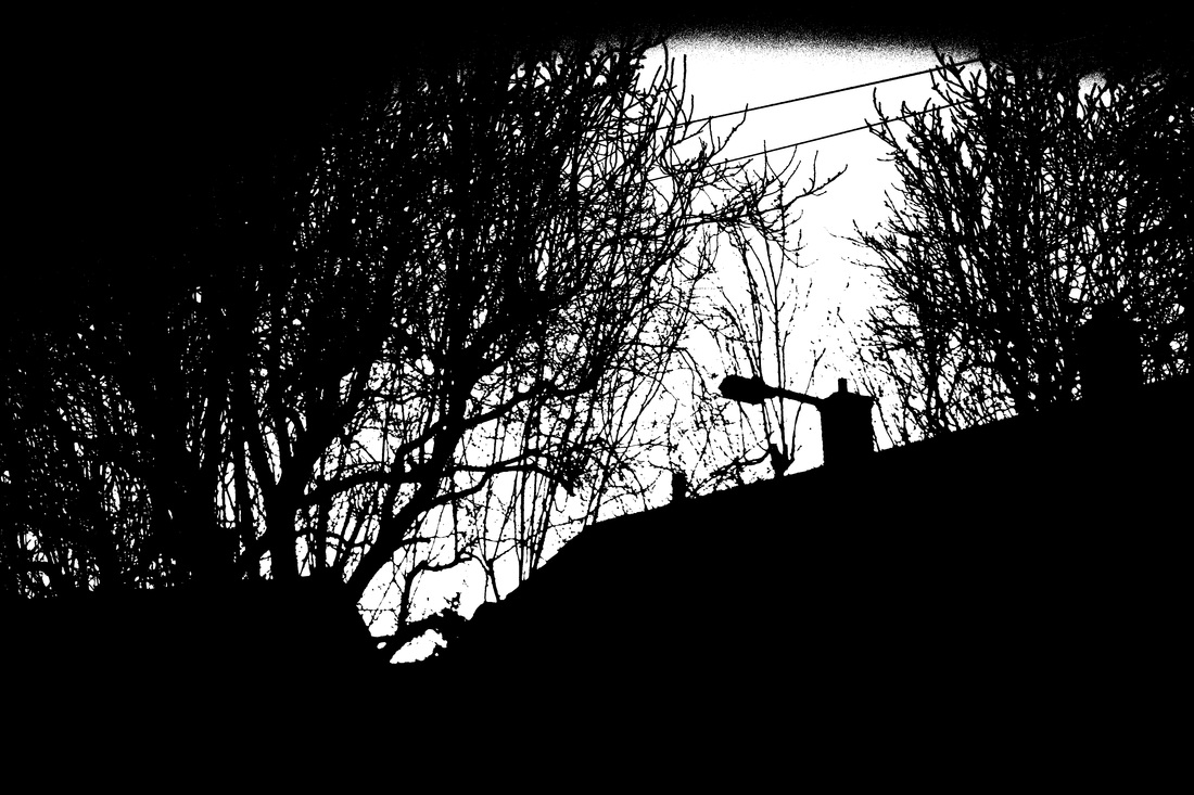
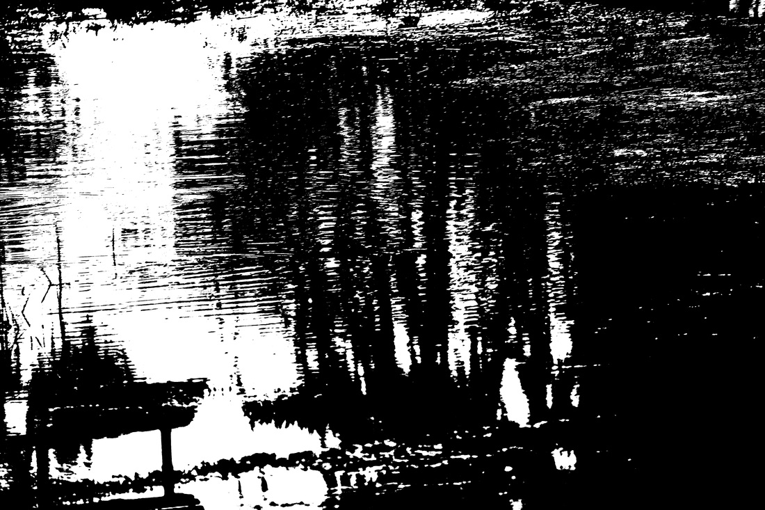
1st Attempt
How I Made Them
Refined & Developed
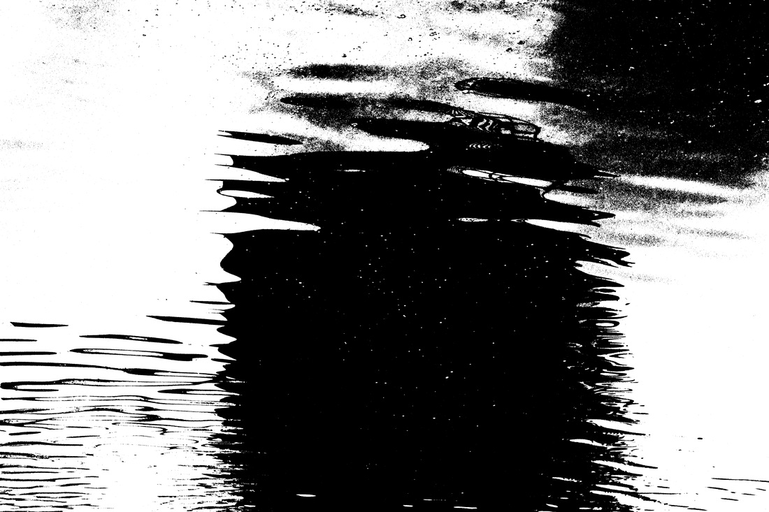
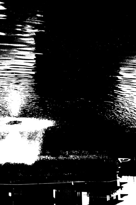
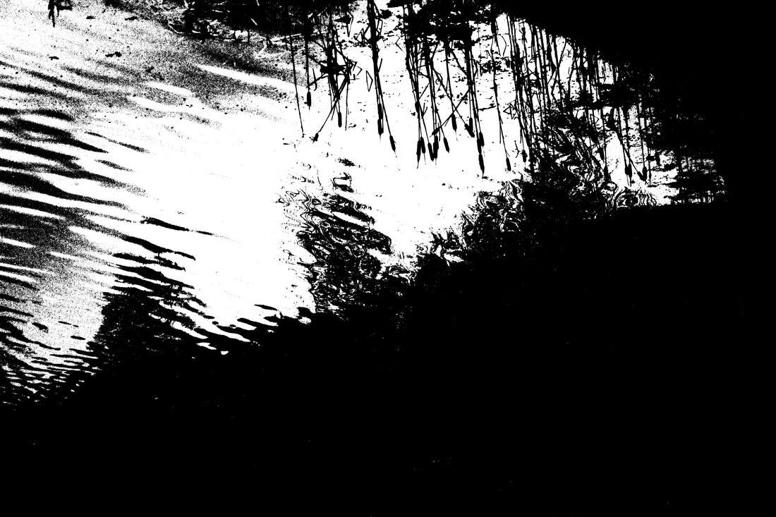
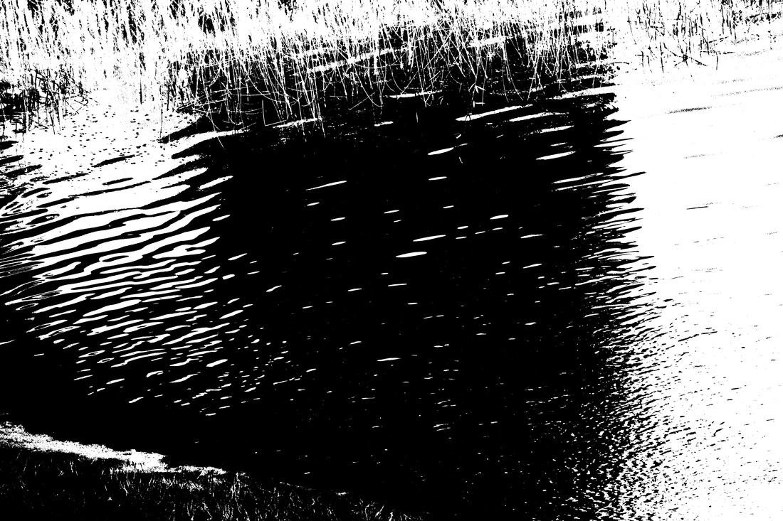
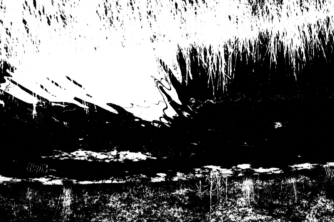
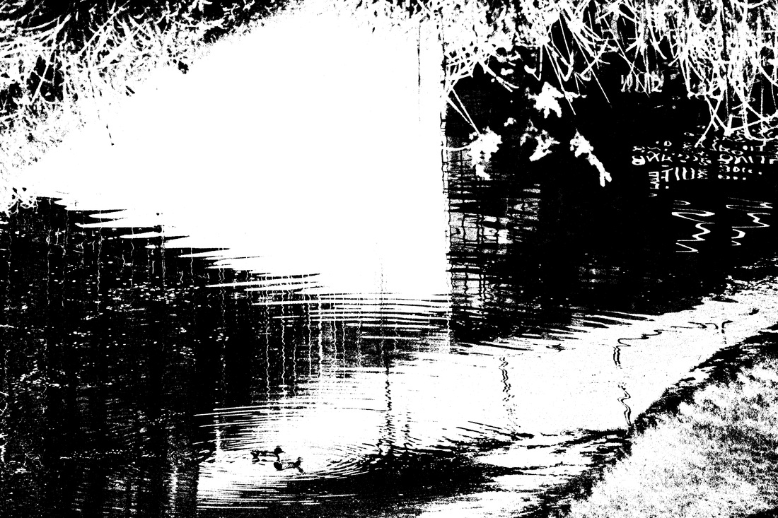
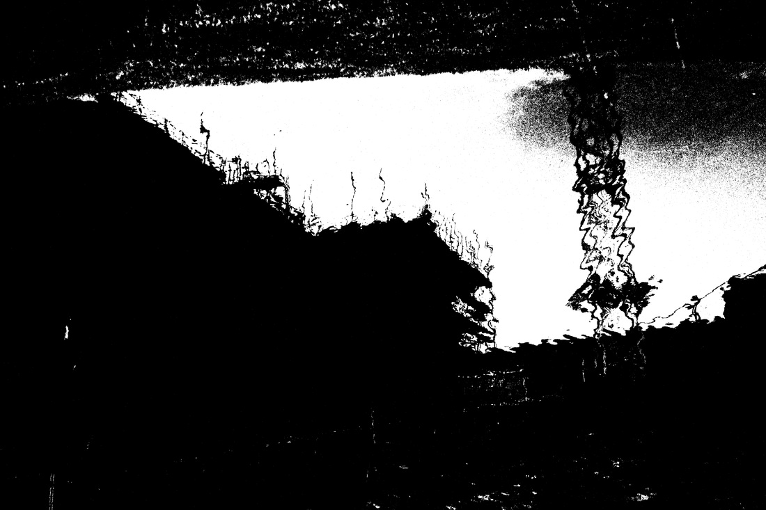
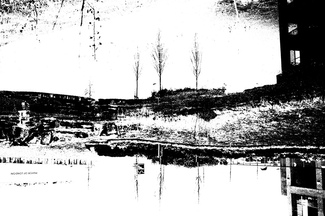
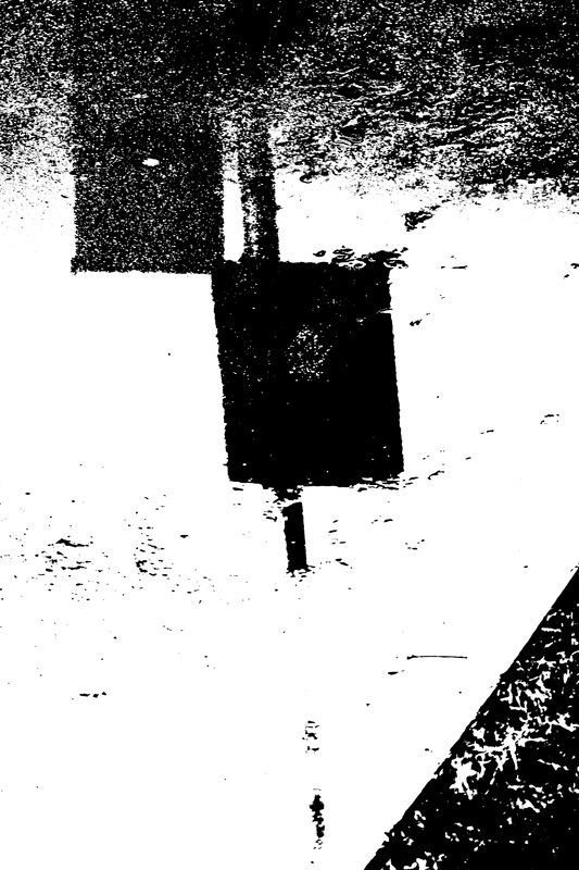
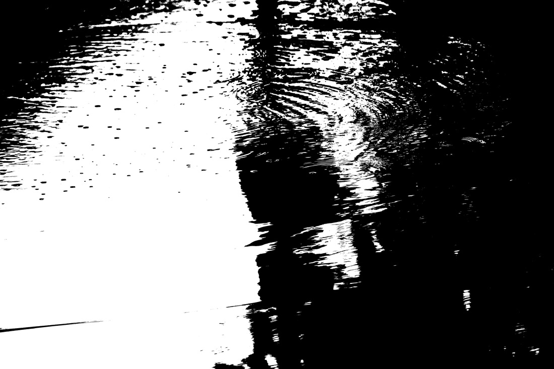
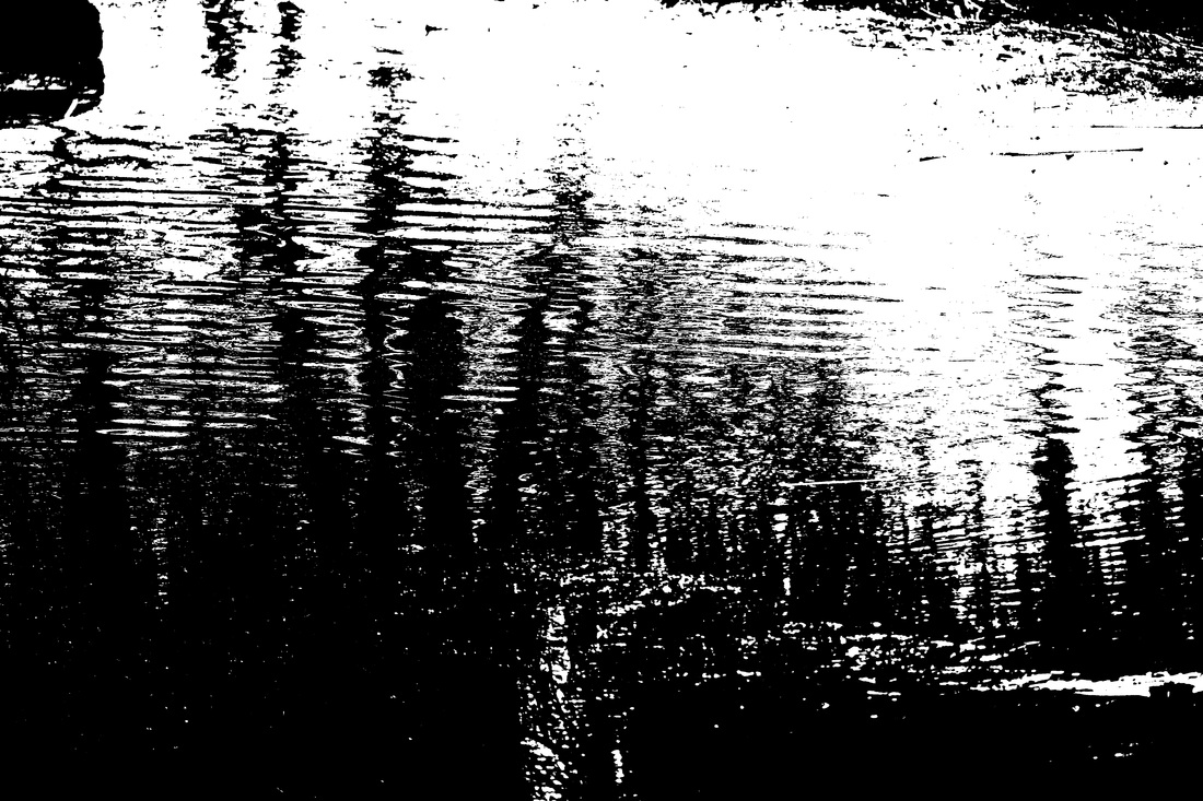
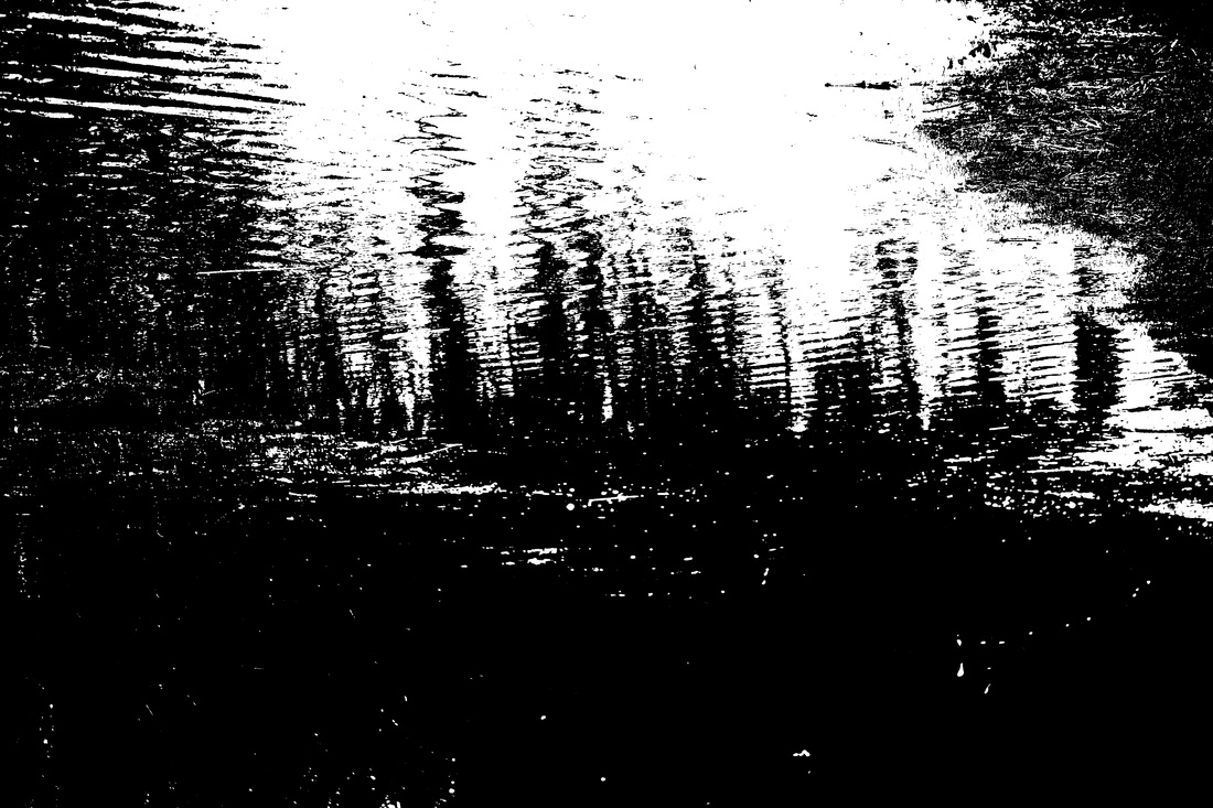
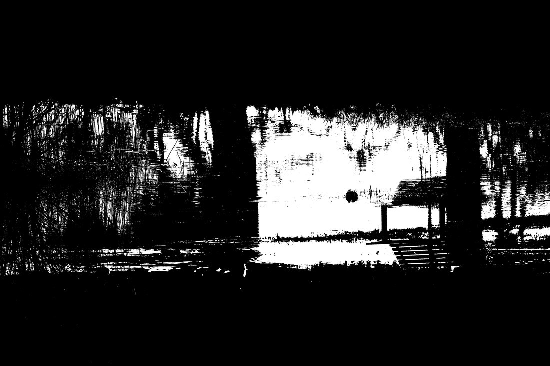
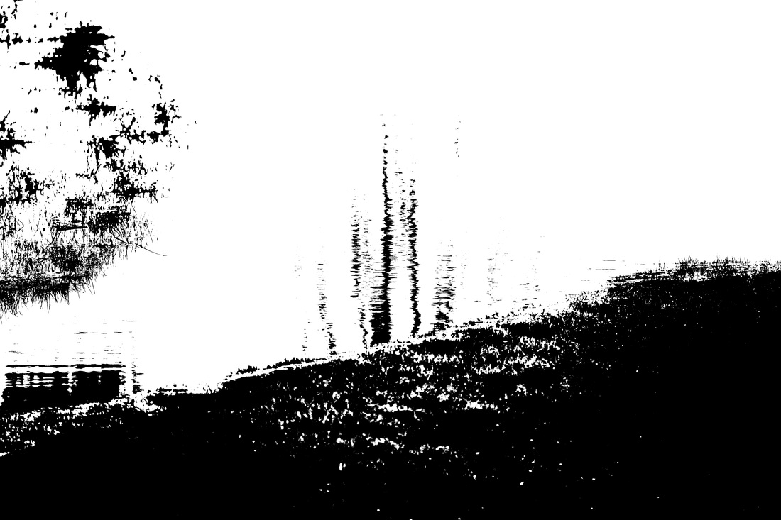
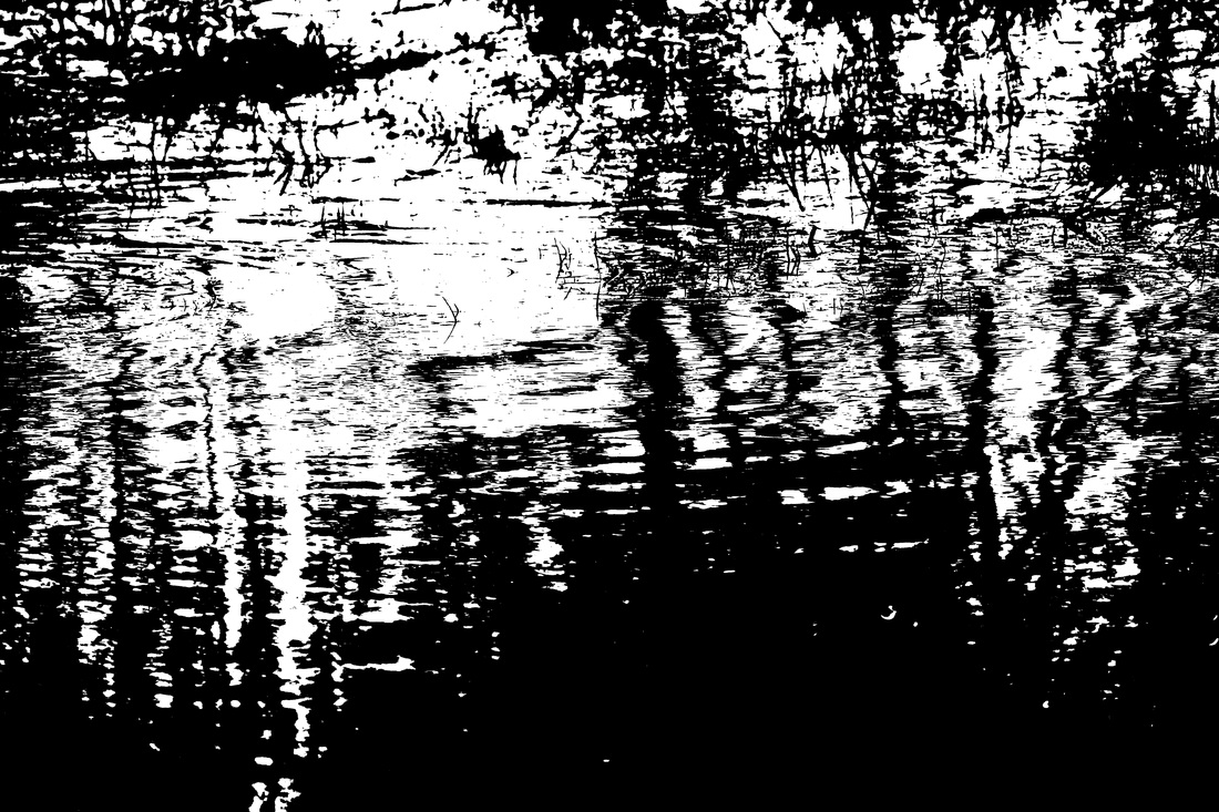
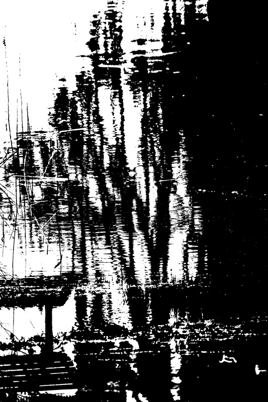
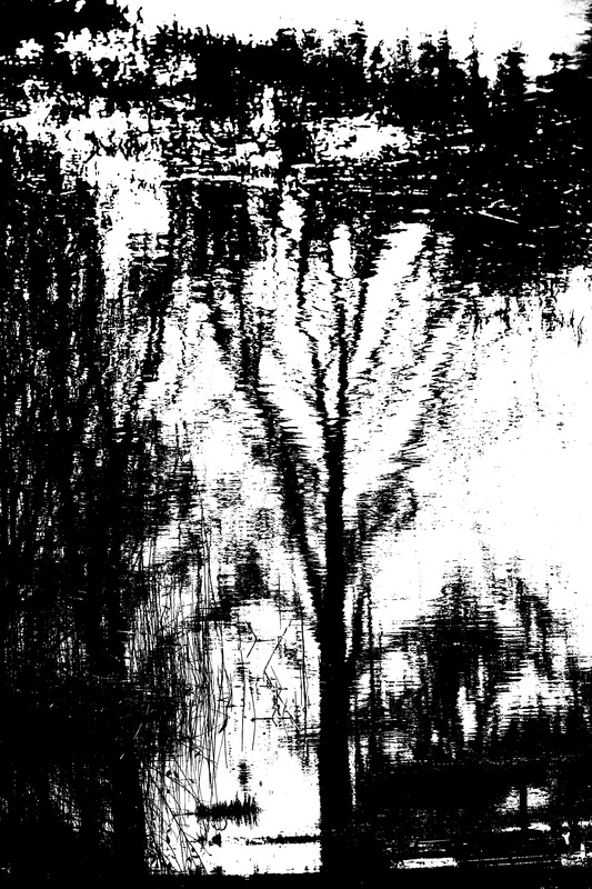
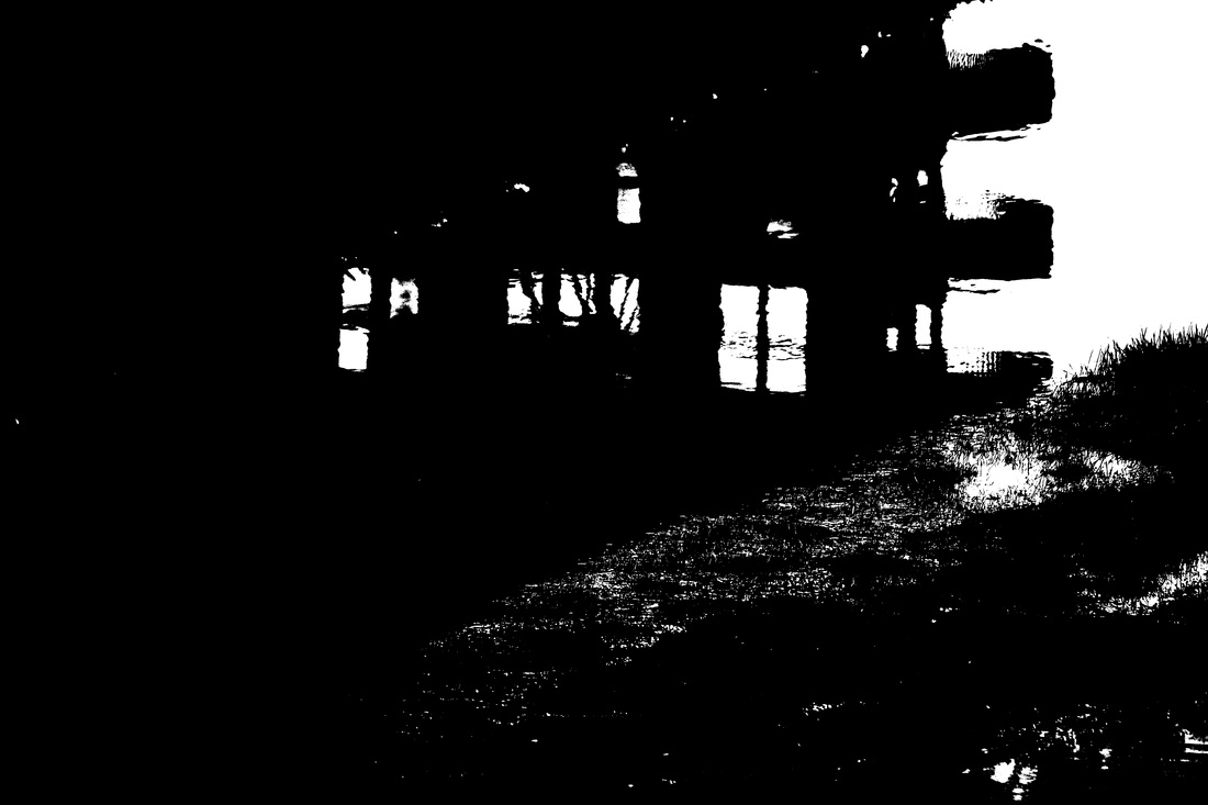
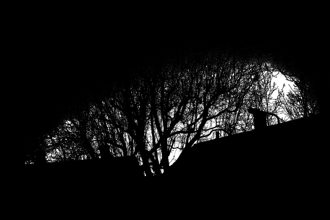
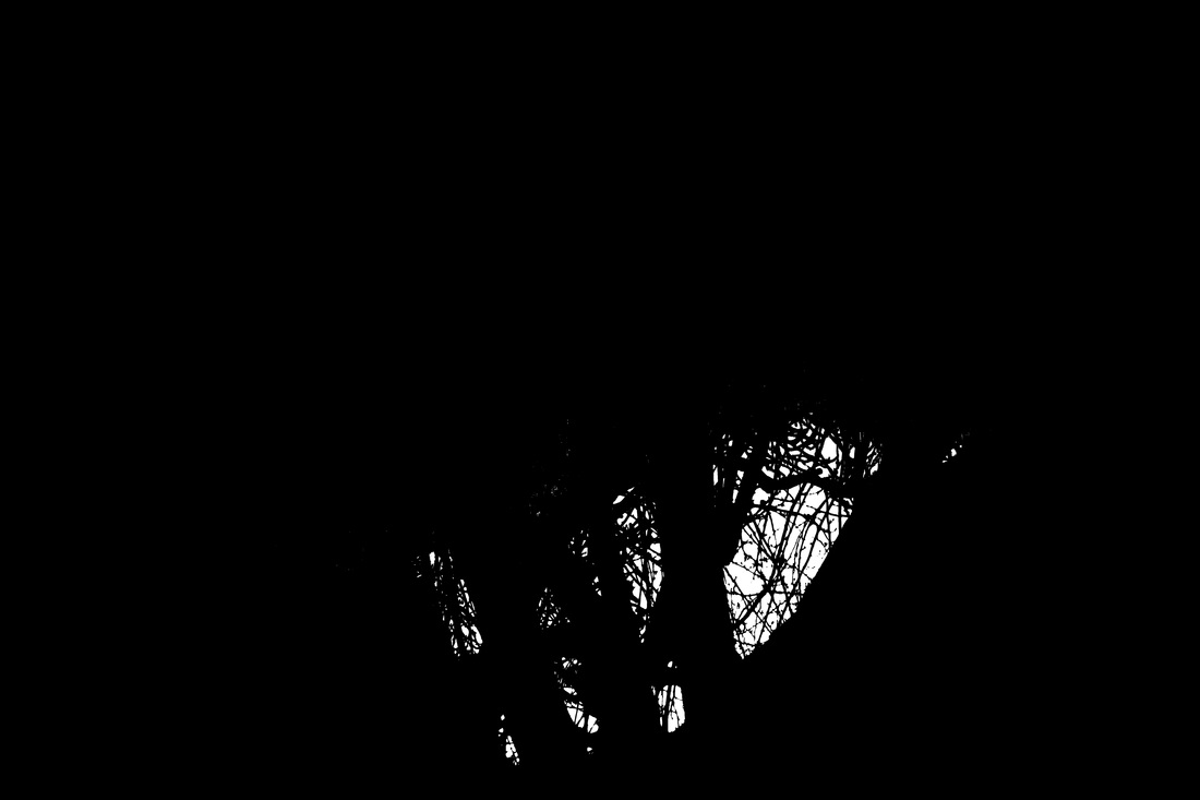
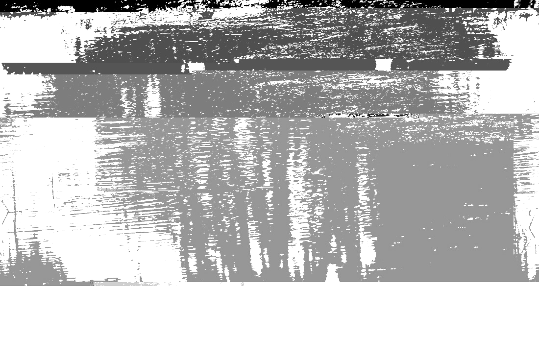
At my first attempt I really liked apply the effect to reflections on water. So the next week I took a walk down to Sutcliffe park and I got a few photos of puddles. Because it was windy the puddles had a rather distorted look to them. However the best was when I got to the park. The River Quaggy had overflowed and a lot of the centre of the park was flooded. This led to some great reflections on the water. Also duck and birds were flying over the water at low altitude, this led to some of the reflections to be distorted.

2nd Attempt
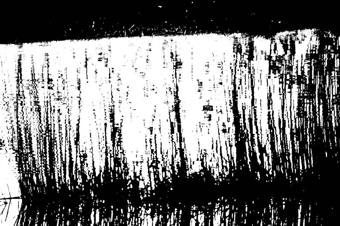
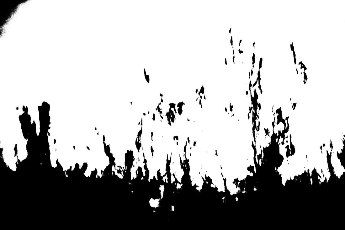
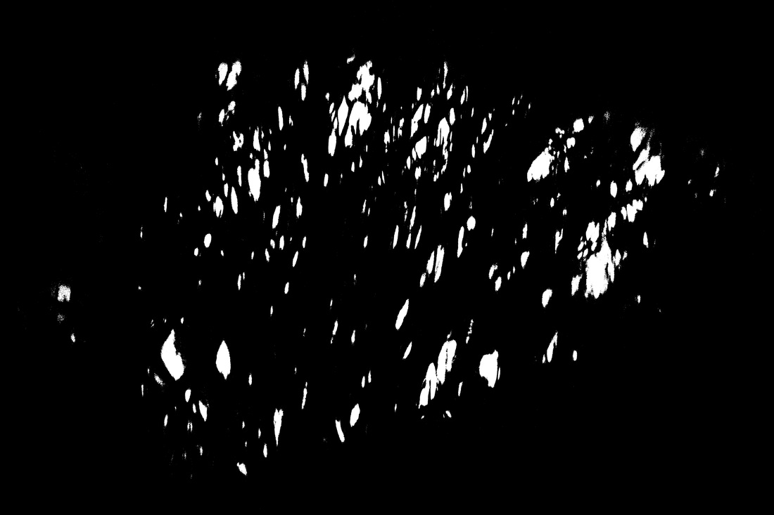
This time I decided to apply a threshold to photos where there was a high-level of contrast. Luckily there was a great sunset outside, so I got photos of the sunset and applied a Threshold to it.
How can this be a response?
PhotobookThere are 2 ways I can make a response. I can either do it in the style of Keld Helmer-Petersen which is a photography book. For this option I would have no choice but to send it off to somewhere like Photobox to be printed, which will cost money but the product will be of fantastic quality.
|
|
|
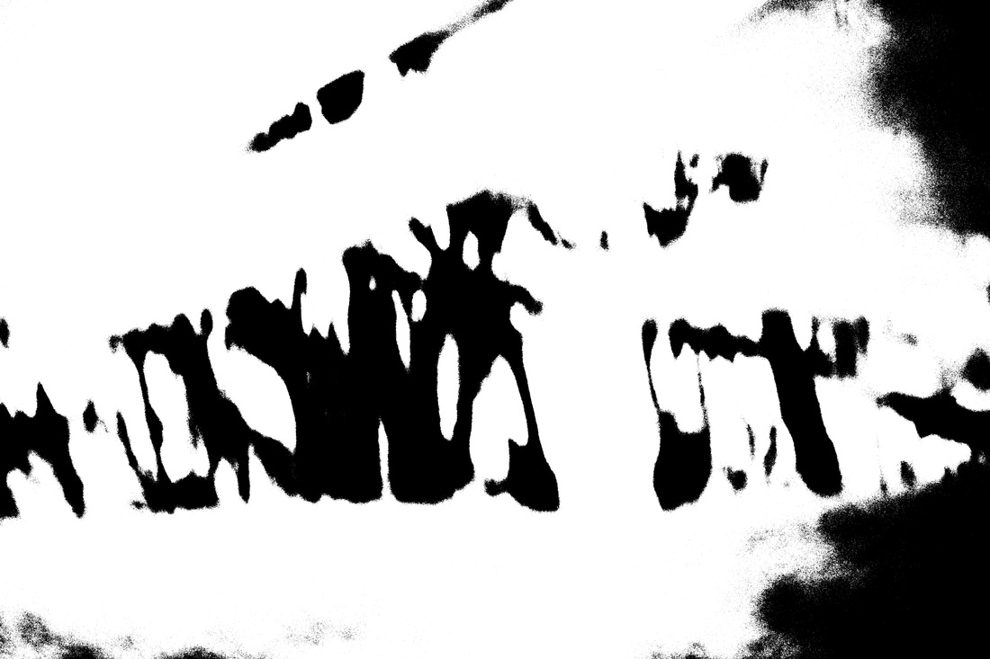
Abstract ShapesThe other response I can make would involve sticking them together to try to create an abstract pattern, or turn a bunch of abstract images into one big abstract image. I can either do this at school by printing off the images in A4 and placing them next to each other, or I can make it in Photobox. I'm not really a fan of this idea because the photos being put together doesn't work that well, it is too obvious that the images aren't intended to be together.
|
MergedThis was also created on Photoshop. Out of the 2 ways to merge the image. I prefer the option of lightening the images. I prefer this way is because Helmer-Petersen created these photos to make people really think about the tone of the image. This can only be done if I 'lighten' the image. If I merge them by changing the opacity. The image turn into a more greyer tone. So therefore people won't focus on the tones of the image anymore.
I really like the Lightening effect because of how the black lines are disrupted and just stopping. Also with the massive amount of lines, you instantly think that there is massive depth to this image, however there is very little colour or focus for us to judge it. |
|
Glitching
After I thought of these 2 response ideas. My friend was glitching some coloured images. So I wondered what would these black light images look like when they have been glitched.
|
I must admit I wasn't that impressed with the glitching. It's not the fact they are bad, they're just not that effective
|
|
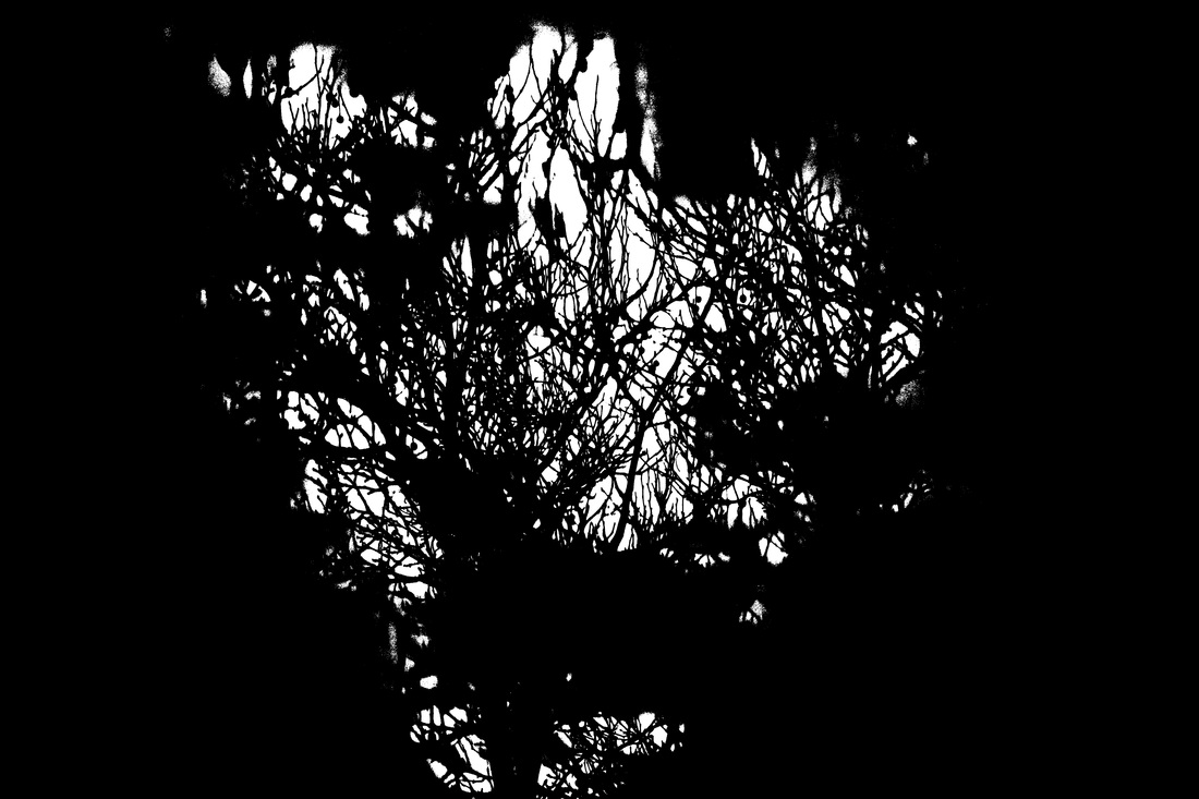
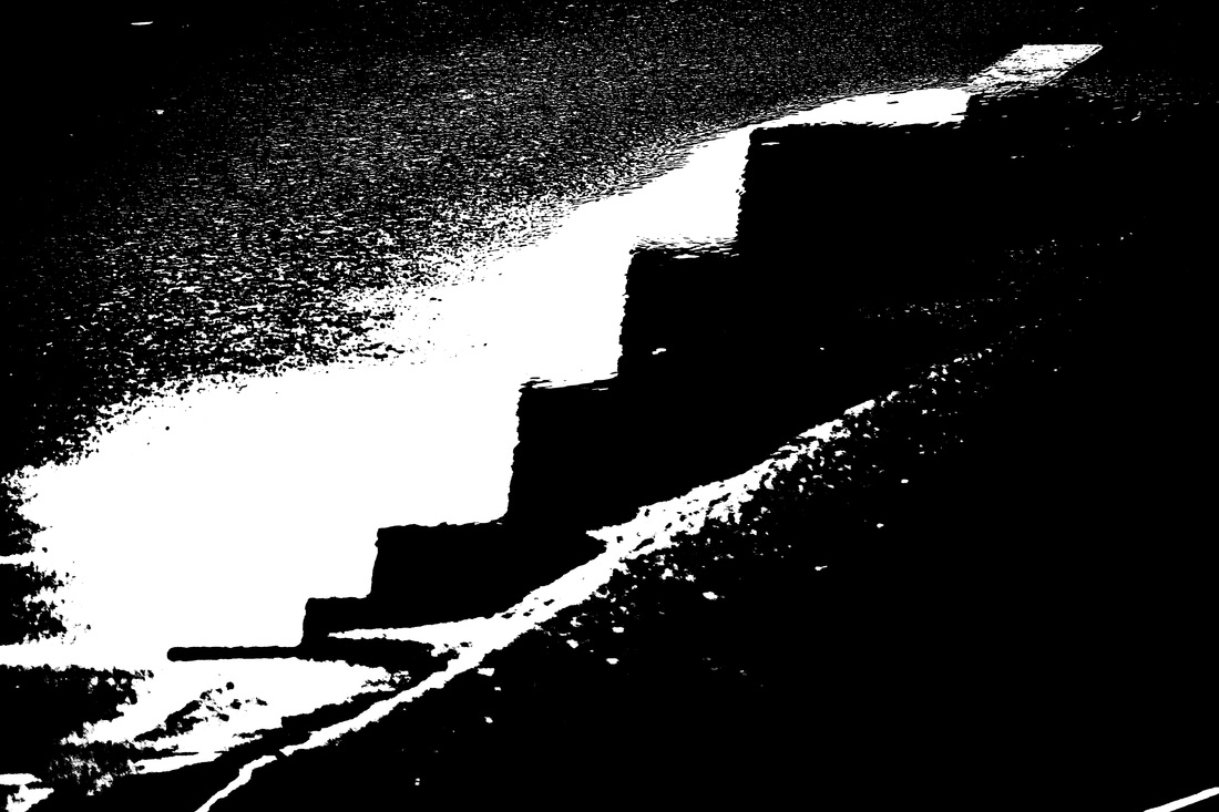
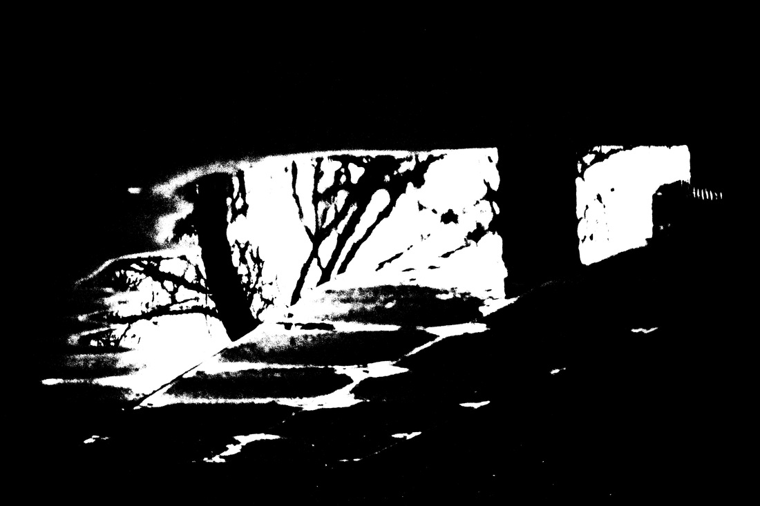
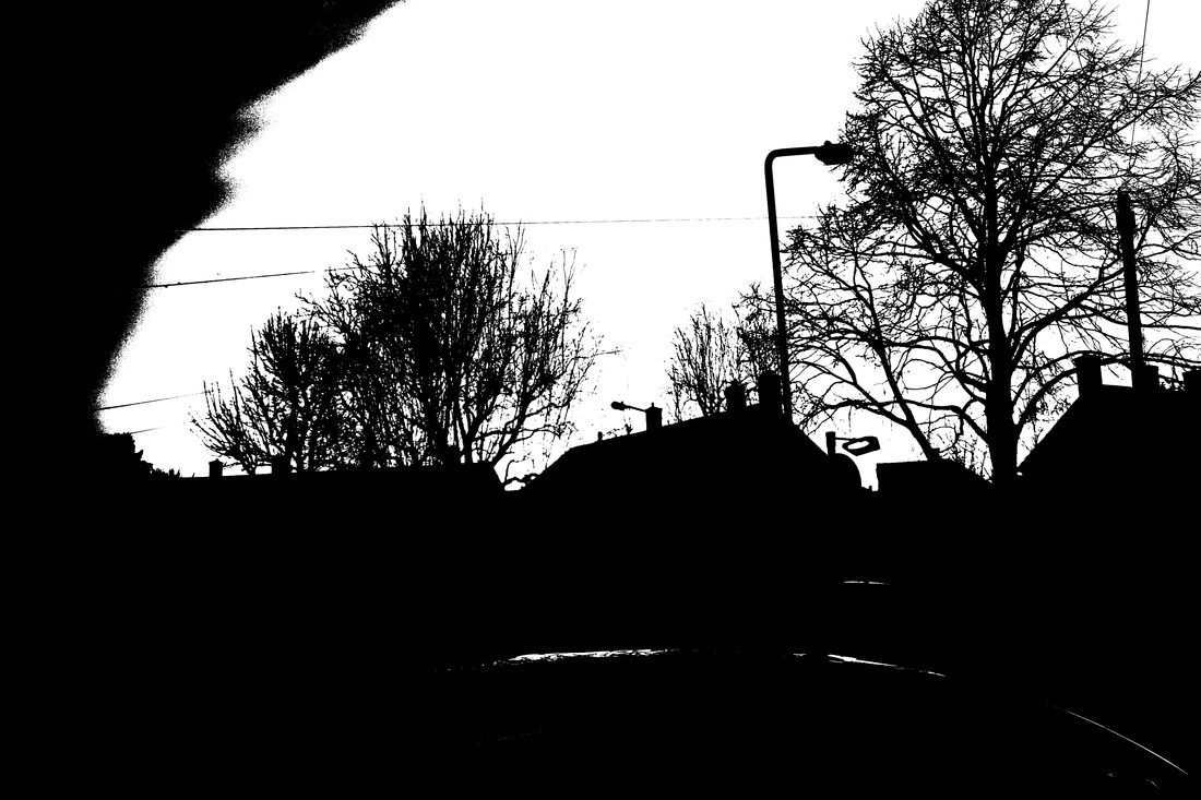
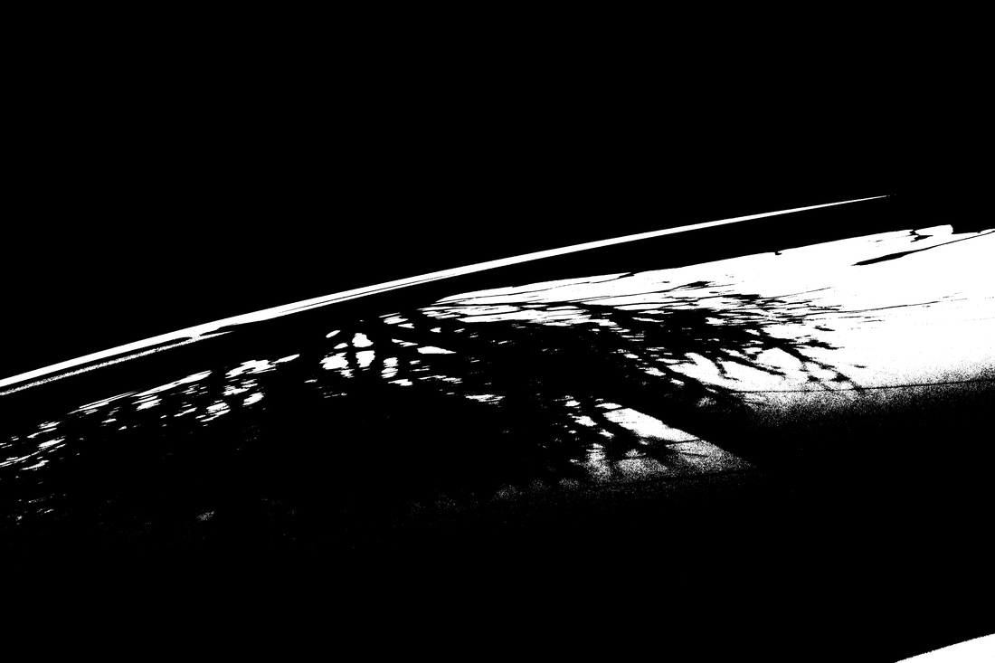
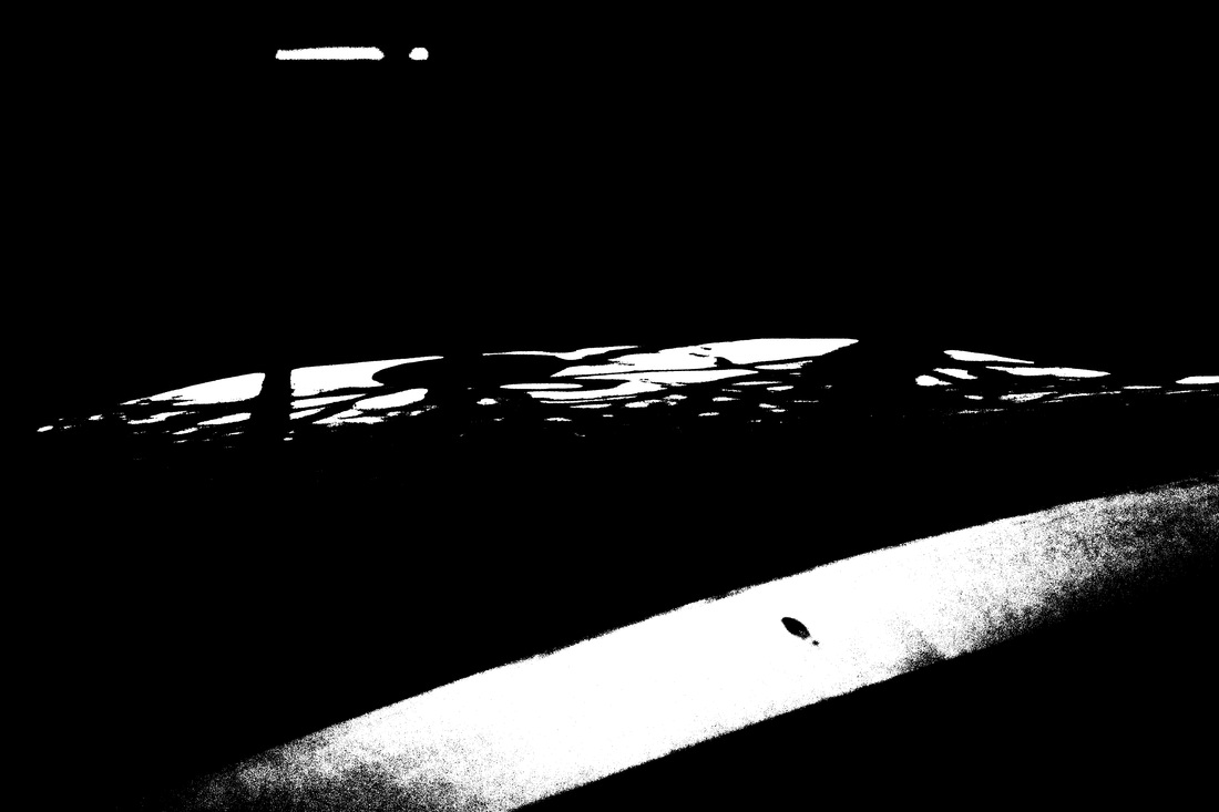
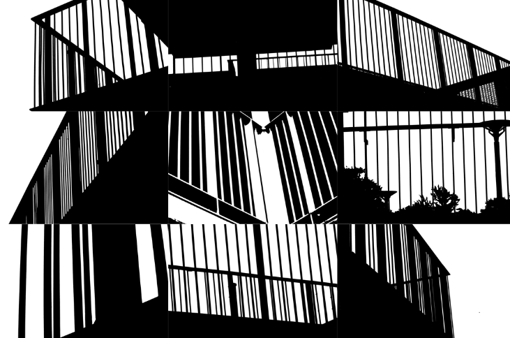
3rd Attempt
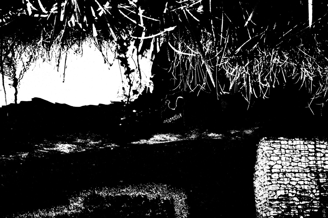
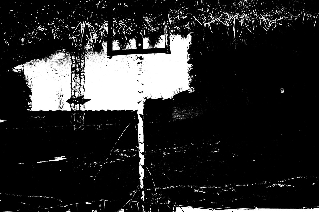
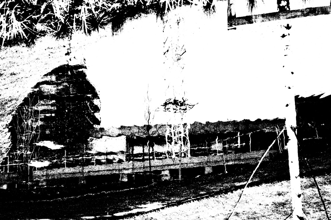
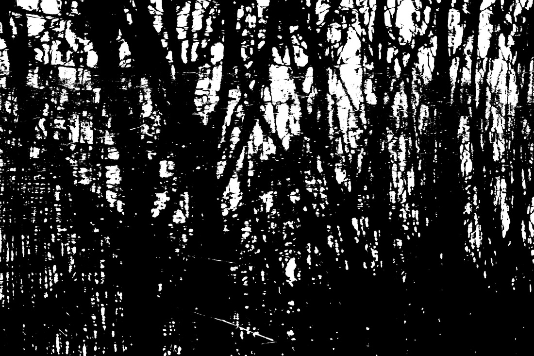
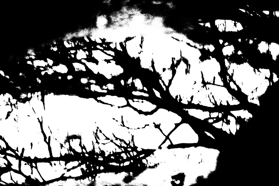
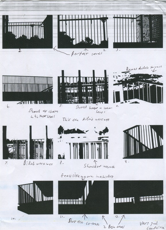
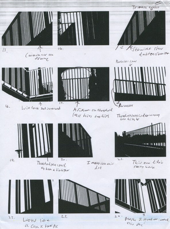
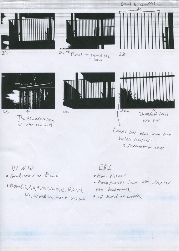
After taking another look at Helmer-Petersens work. I decided to take photos of railings. So I walked around he school concourse and photographed the railing on the link and the stairs. I feel that some photos works very well, when at the same time a few didn't work that well.
Evaluation of the images
|
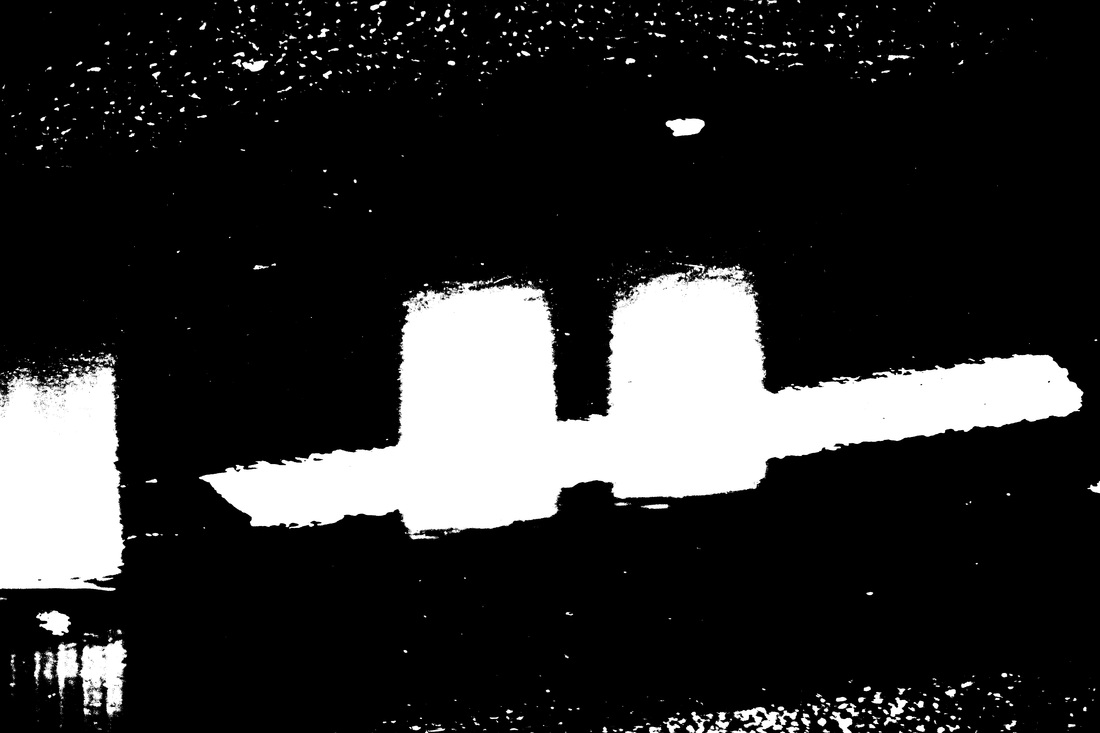
I've only evaluated 30 images because the first 30 in this slideshow were taken during lesson. The next 35 photos in the slideshow were taken after I evaluated the photos. I was mainly commented about the threshold level used, like if it was too high or too low. I was also considering the contrast with in the image. In some of the contrast is very good especially photo 10-12. Whereas in some photos the contrast didn't work that well, like photo 6 and 8. This could possibly be because there was too many colours for Photoshop to change to black or white.
|
|
|
Words
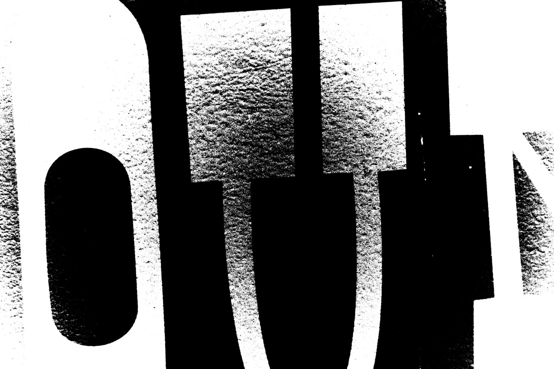
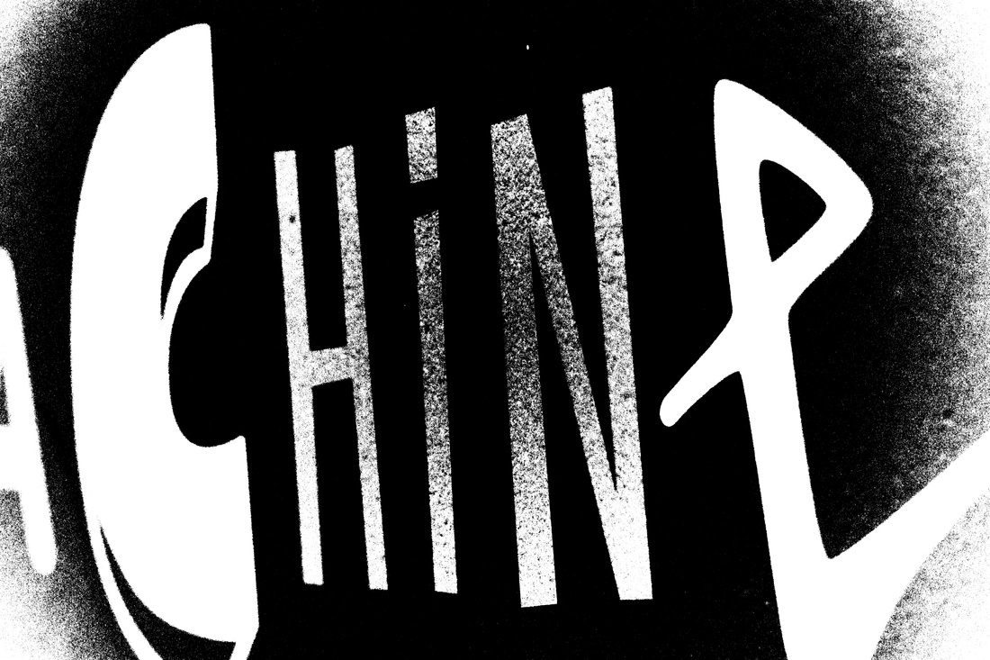
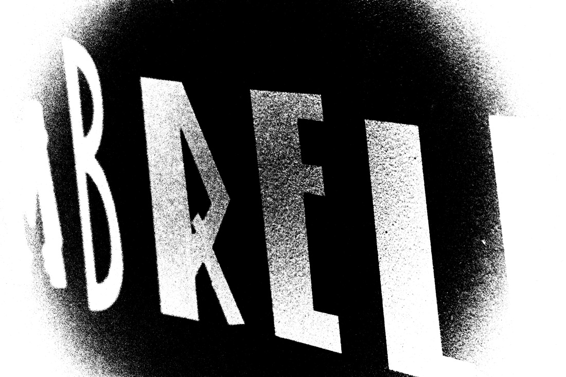
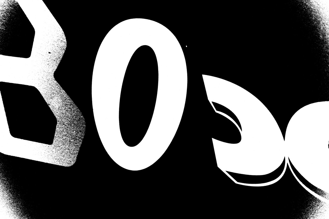
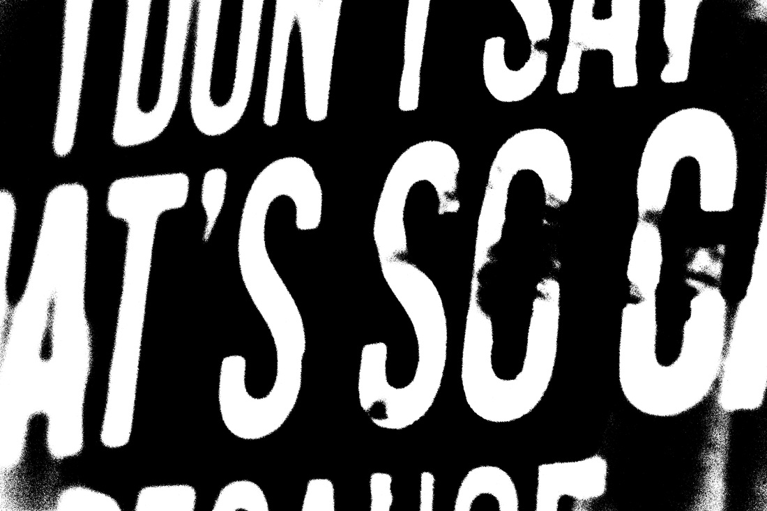
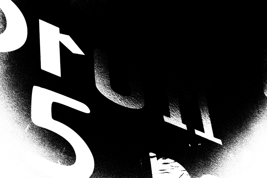
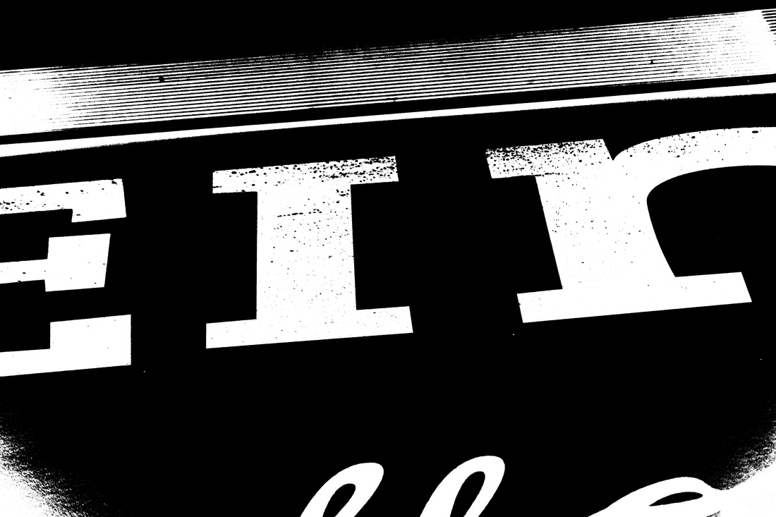
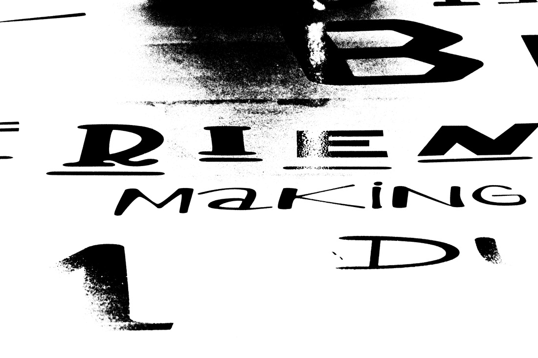
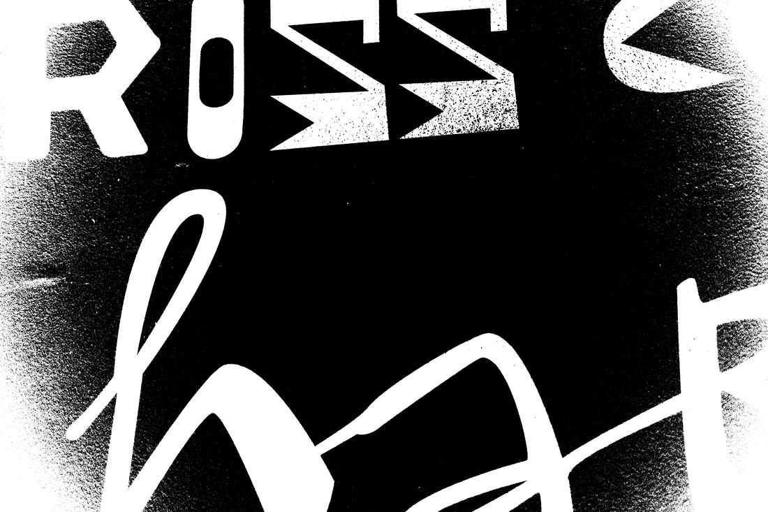
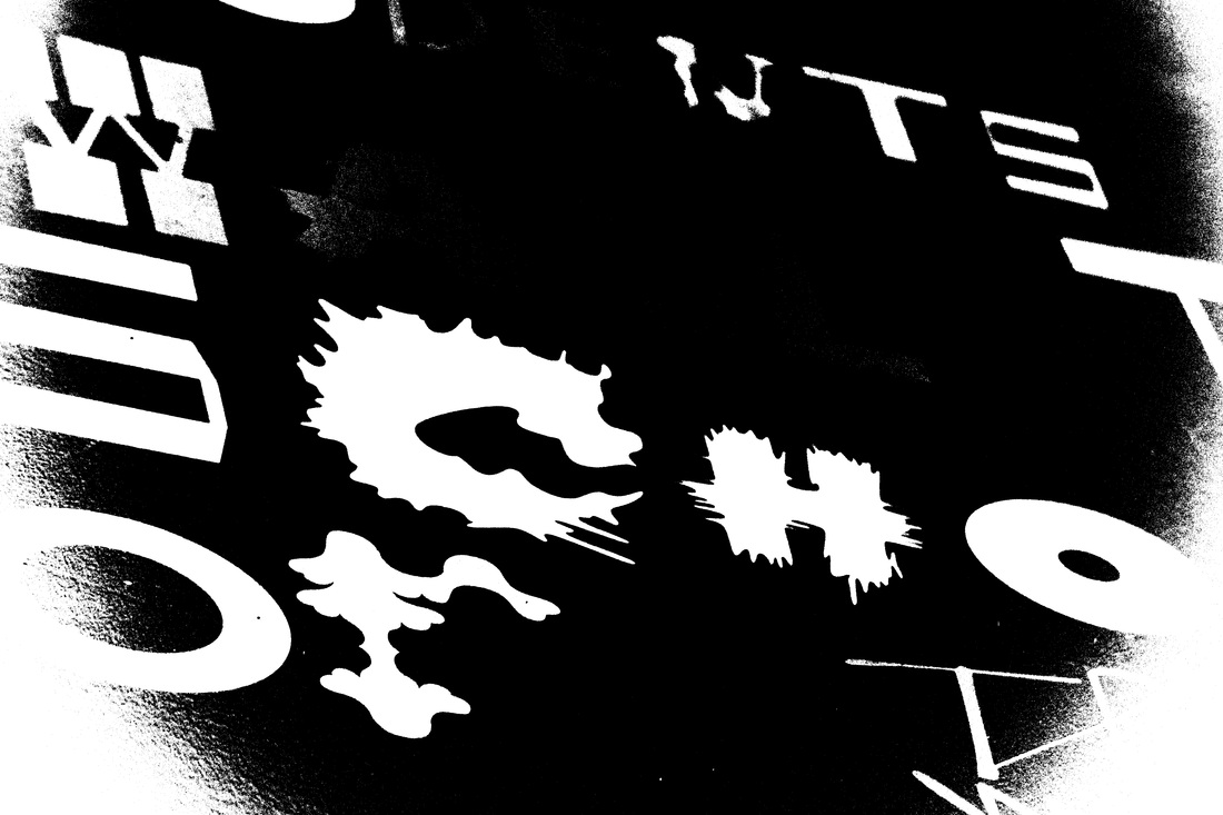
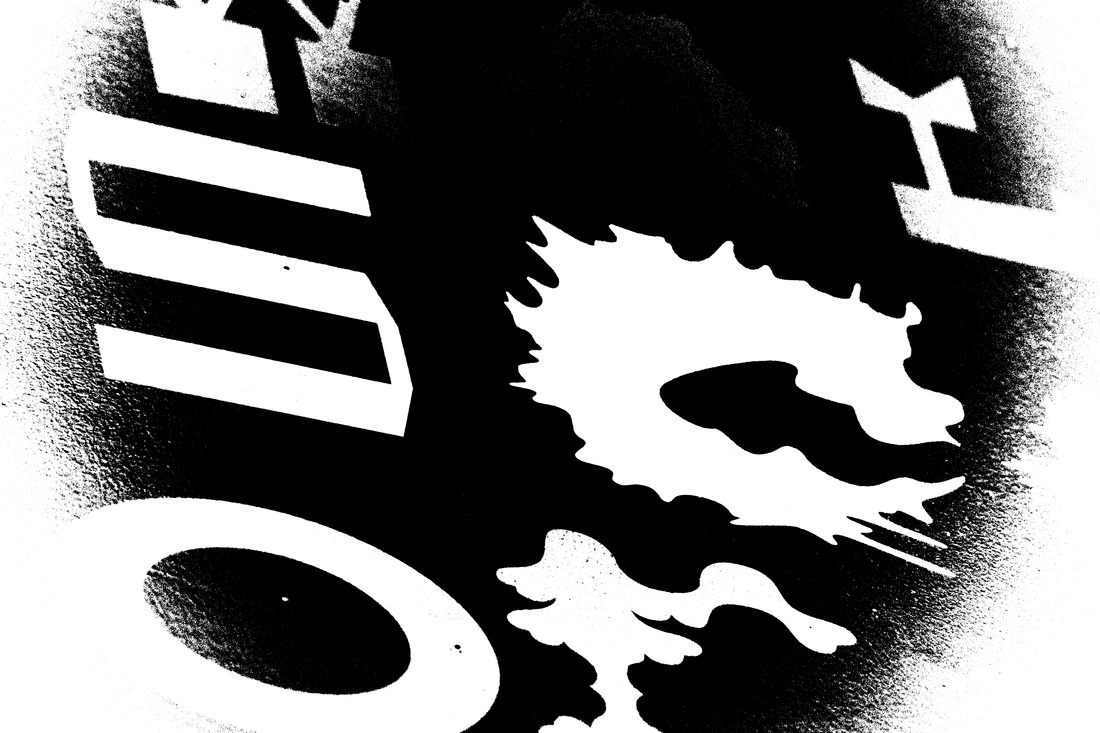
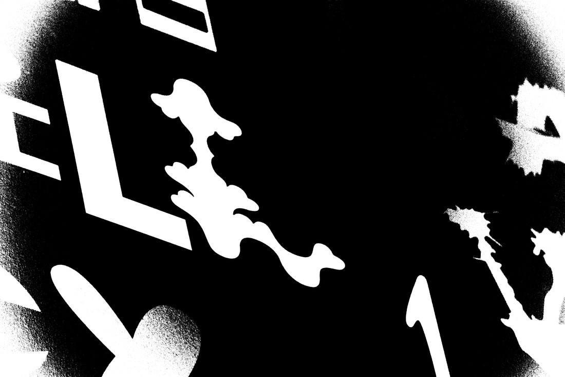
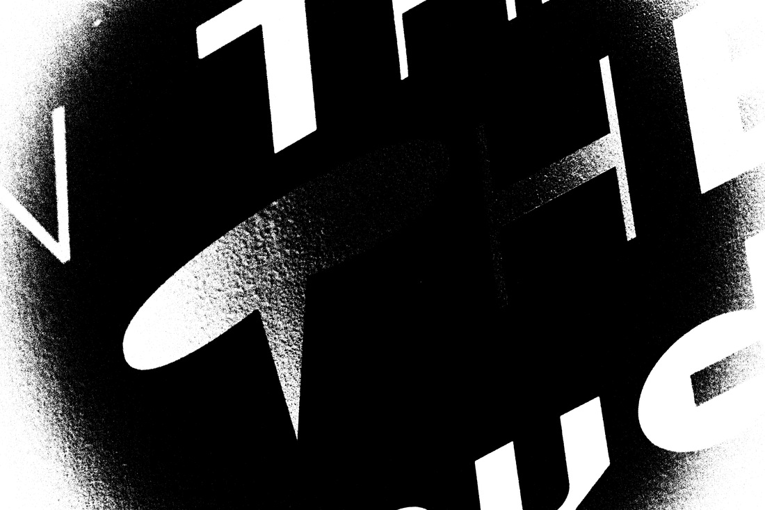
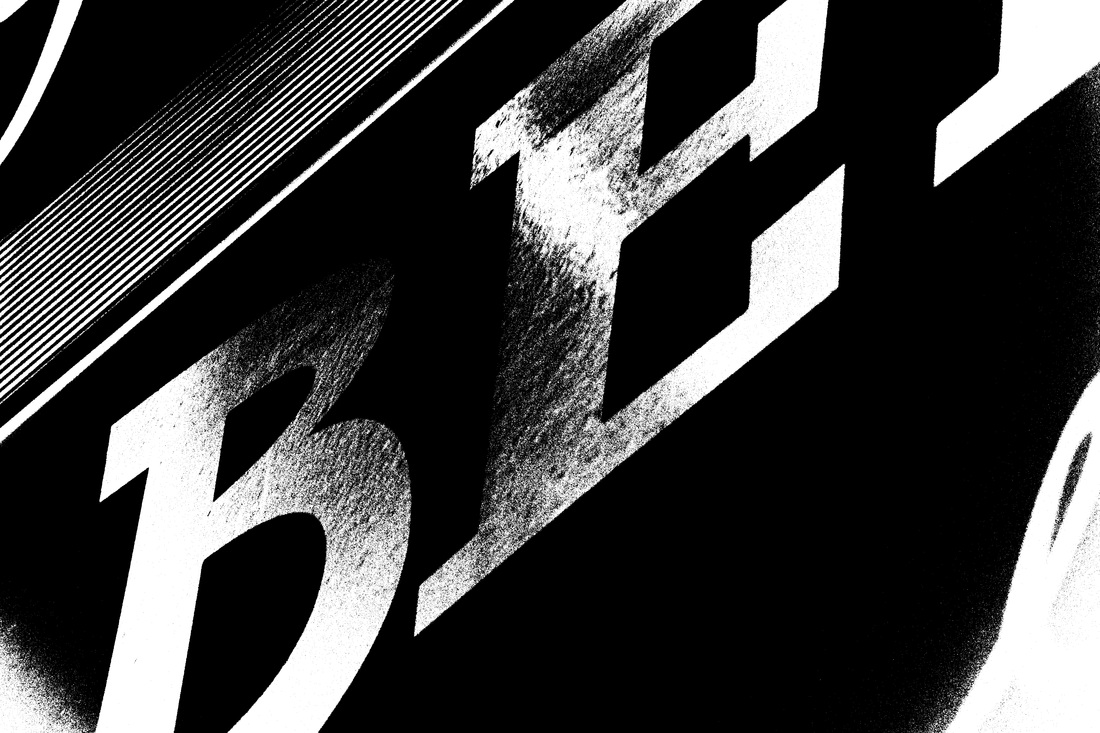
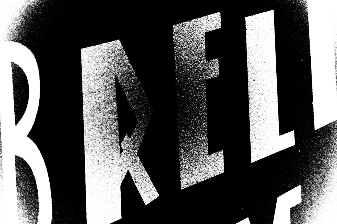
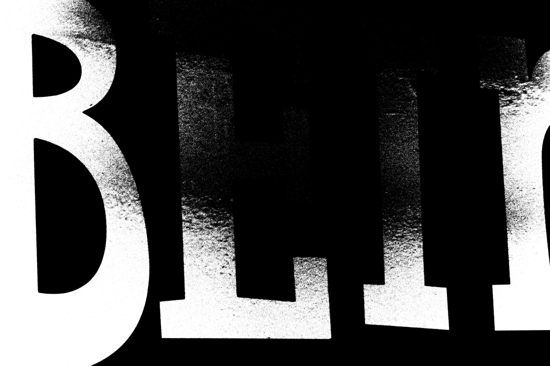
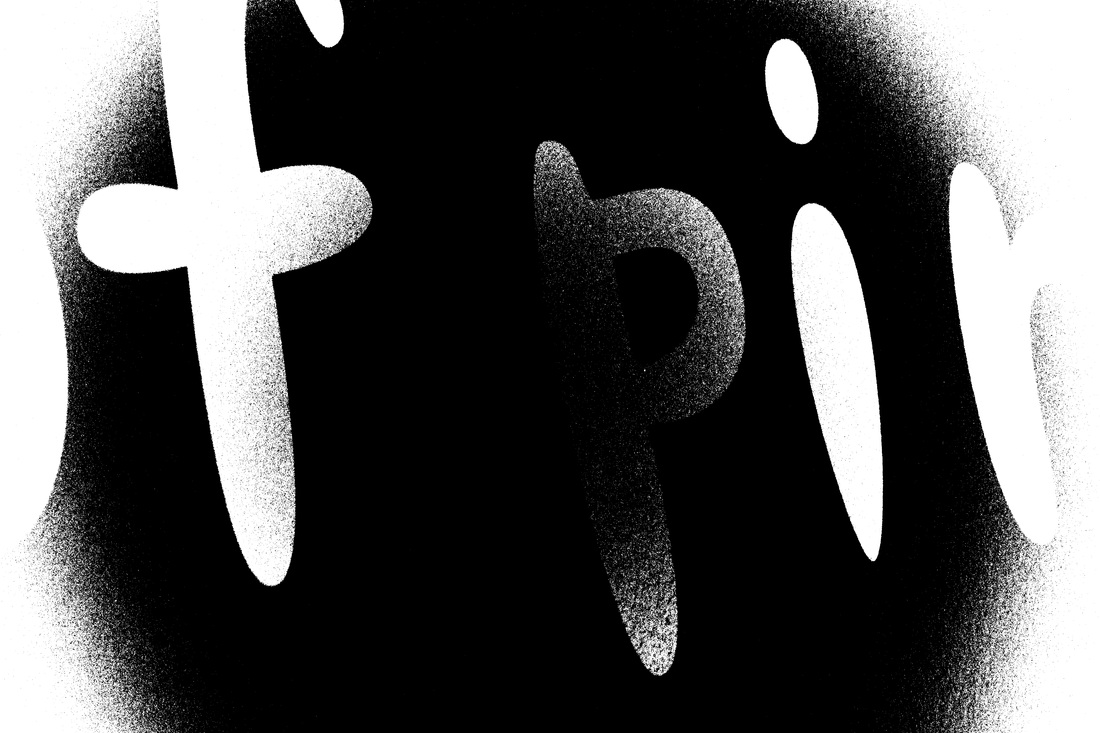
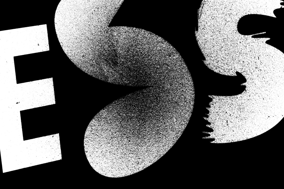
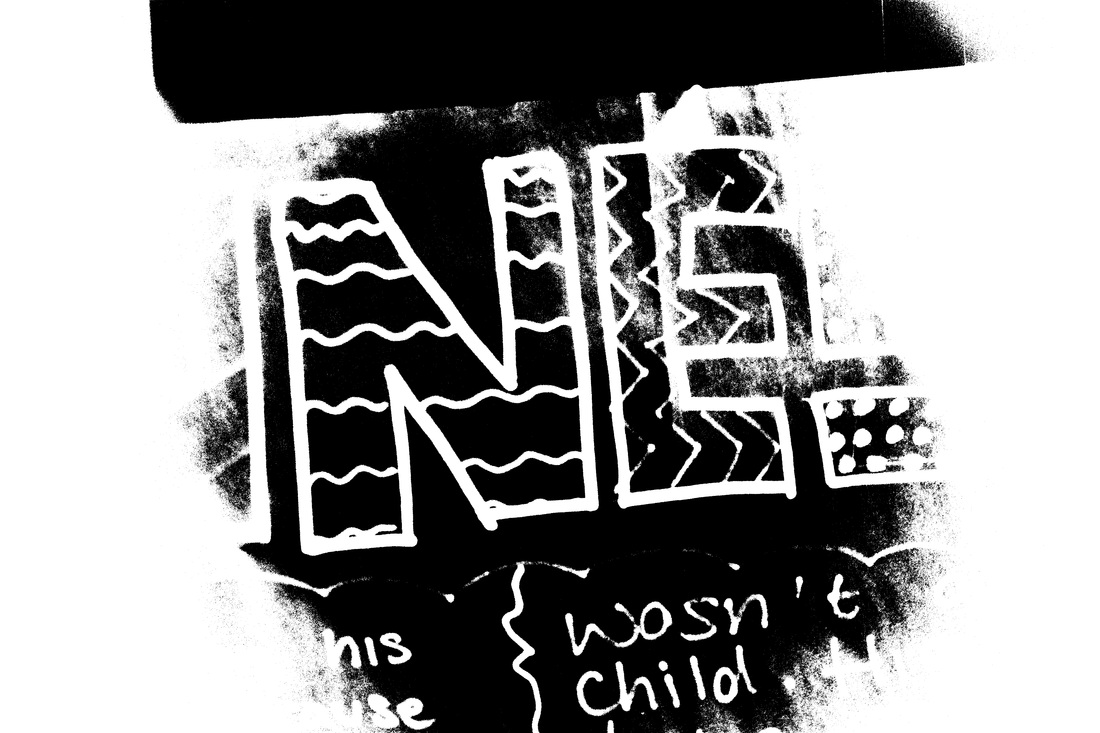
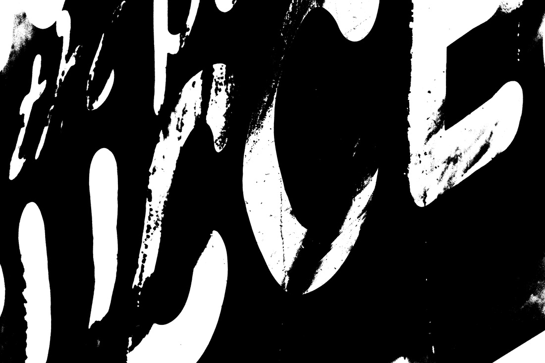
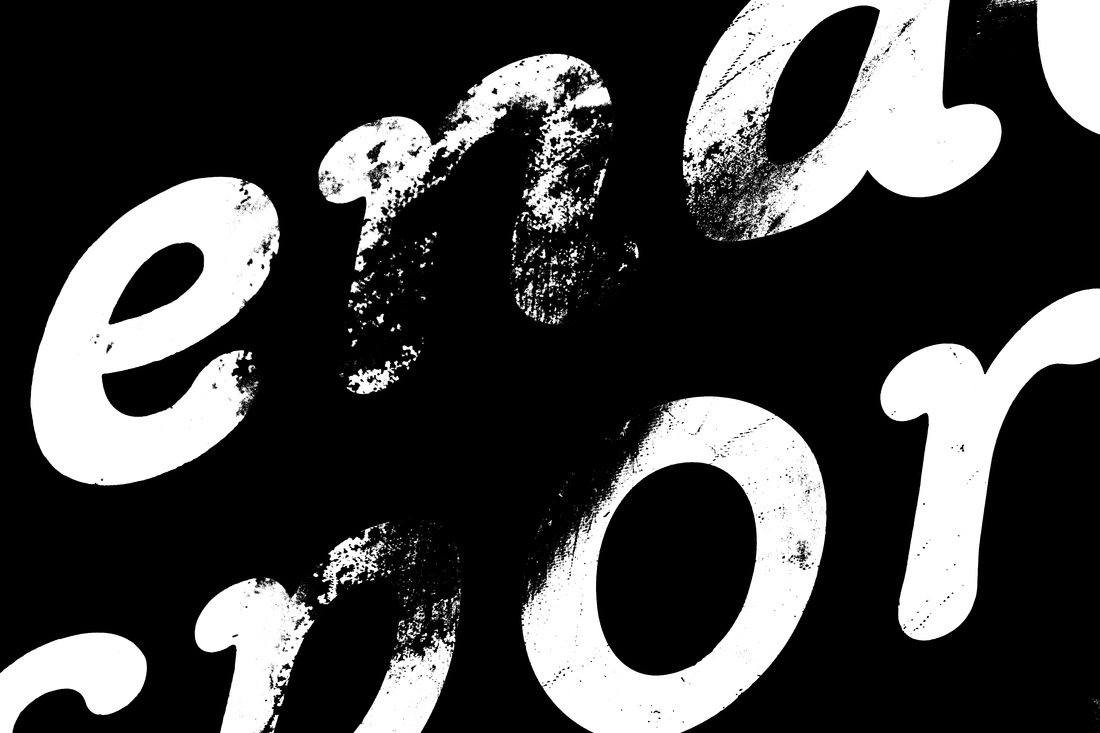
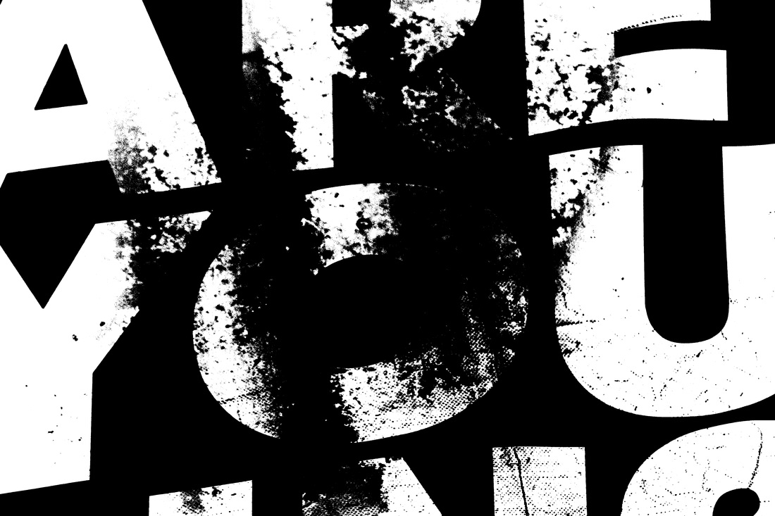
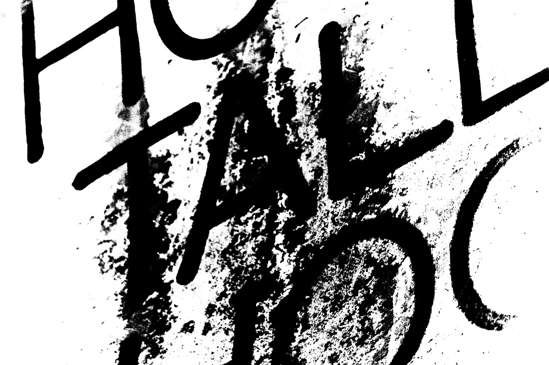
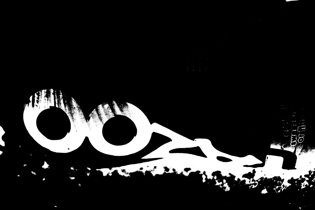
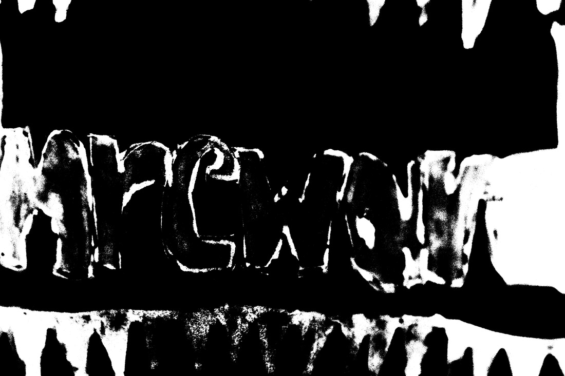
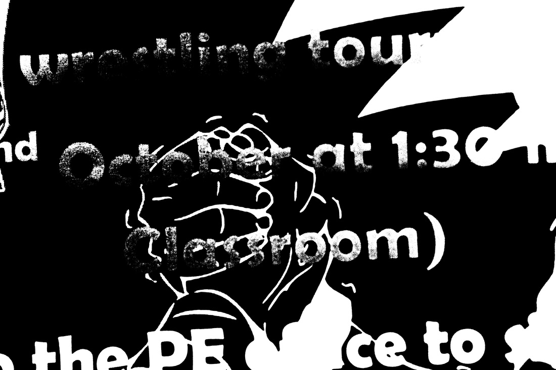
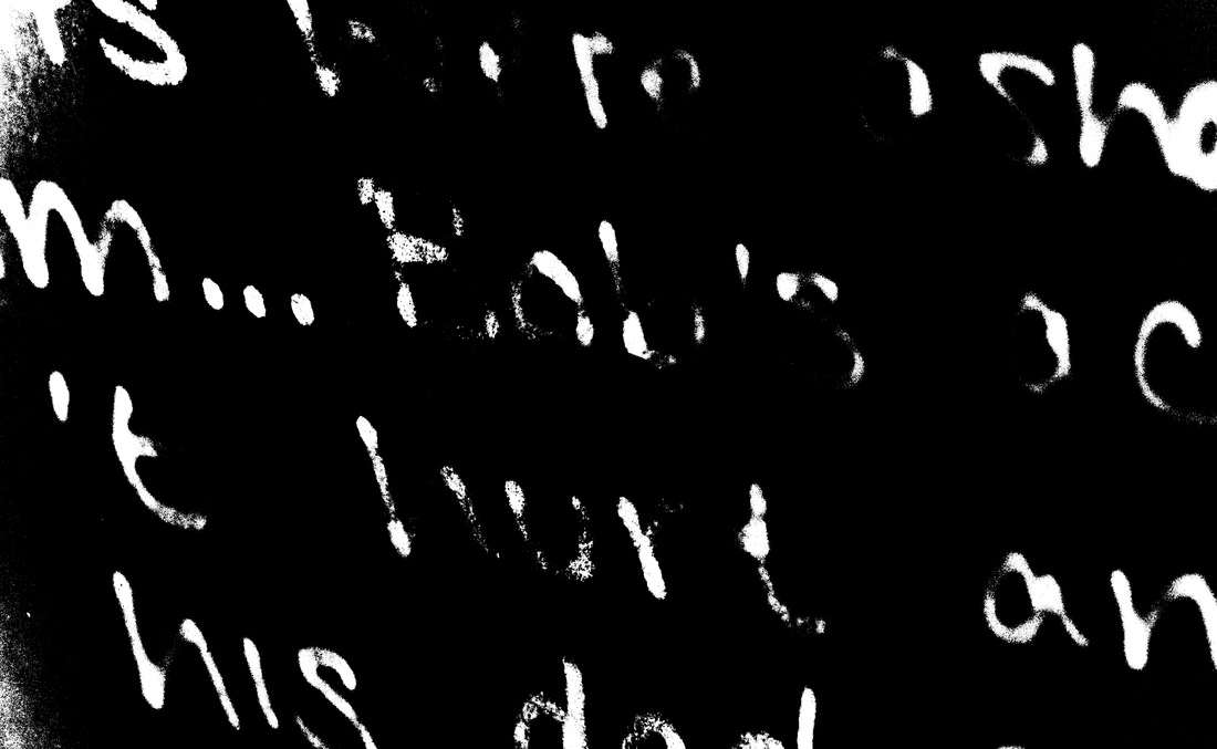
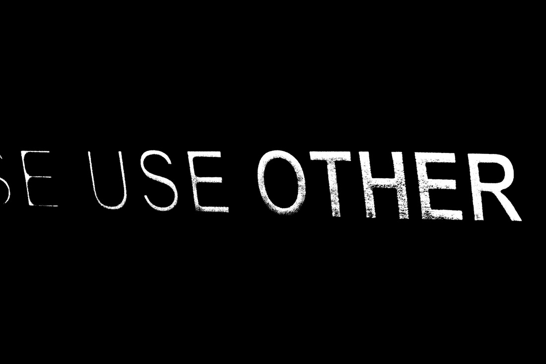
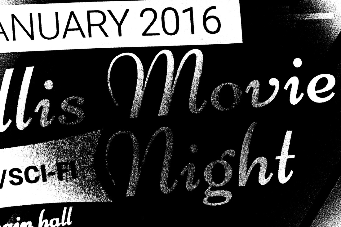
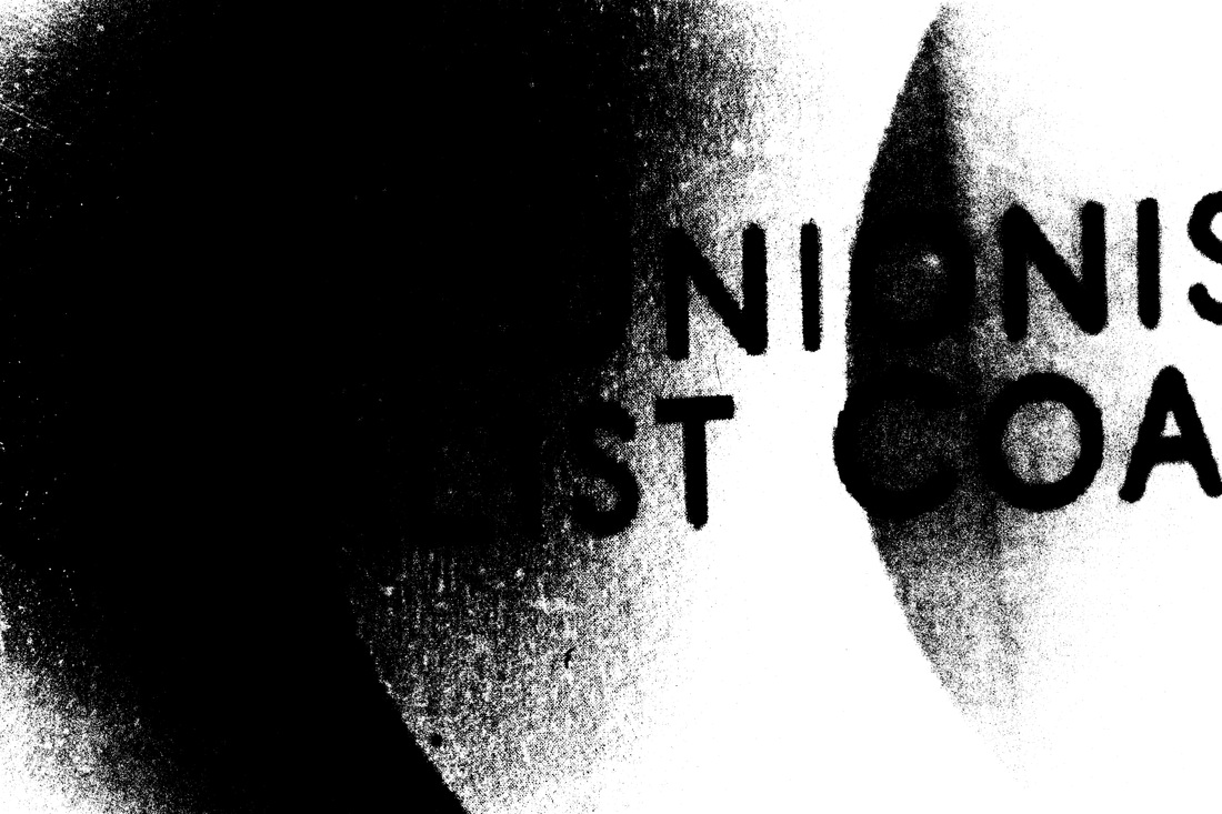
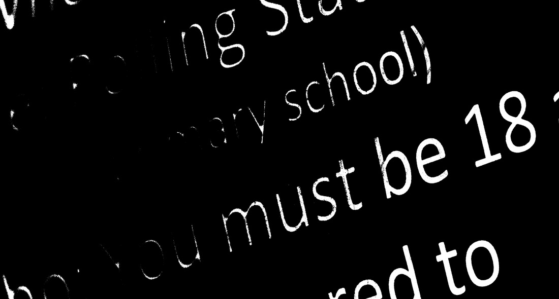
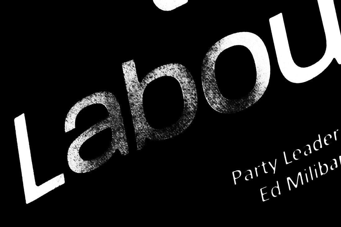
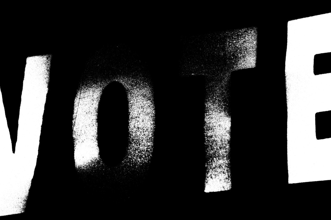
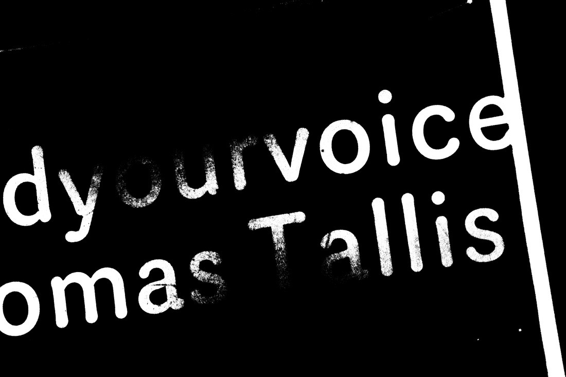
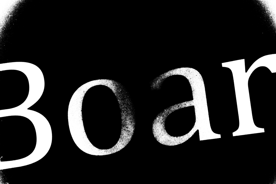
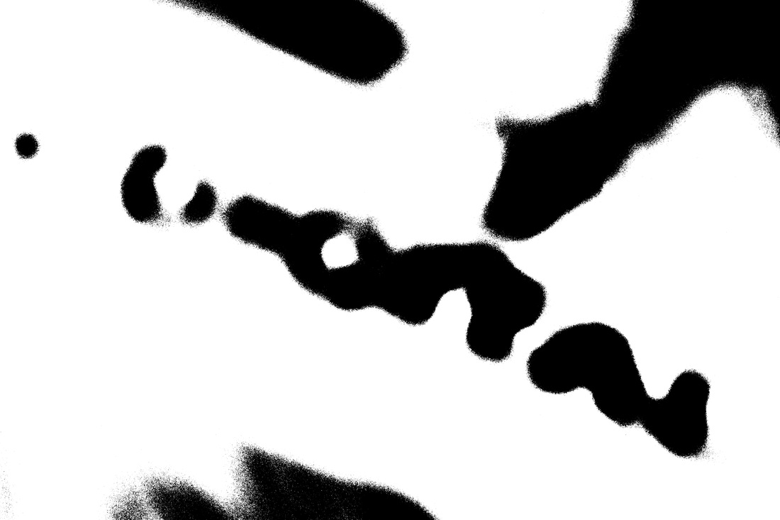
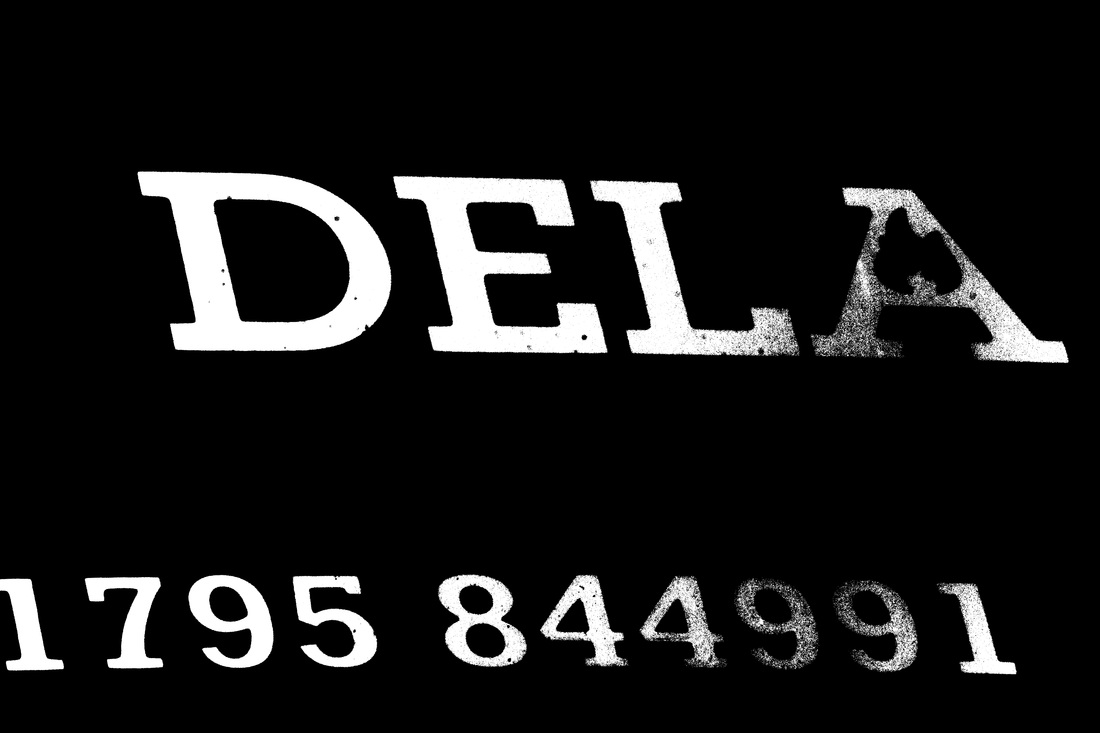
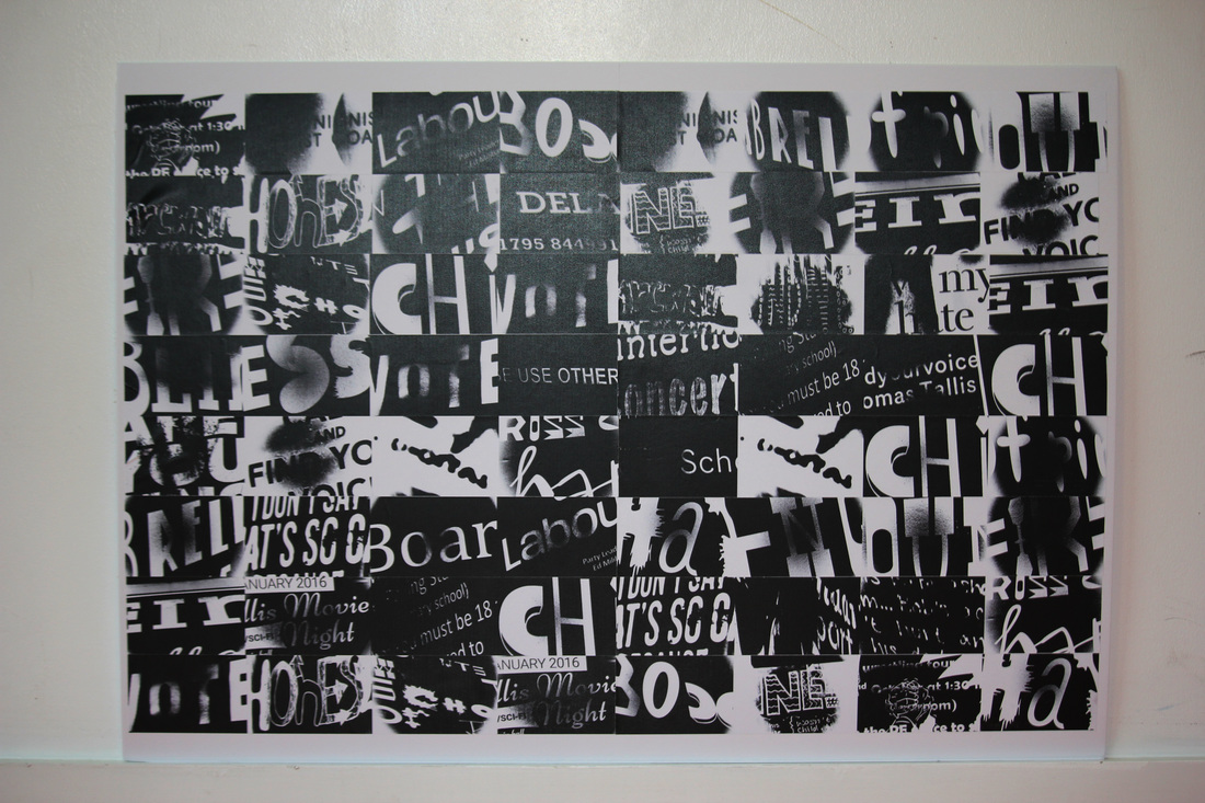
In the final week of my investigation. I wanted to make one more set of photos to apply a threshold to. So I walked around the school and got photos of words that I found whilst walking around the school. I thought that words won't be that abstract, even when a threshold is applied. So I've decided to zoom in on the letters or the words, so that way. The viewer won't be able to tell what the word is saying.
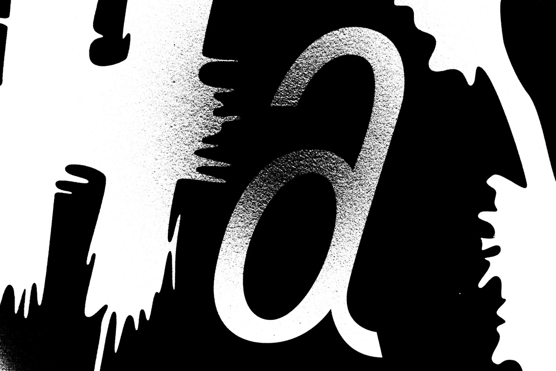
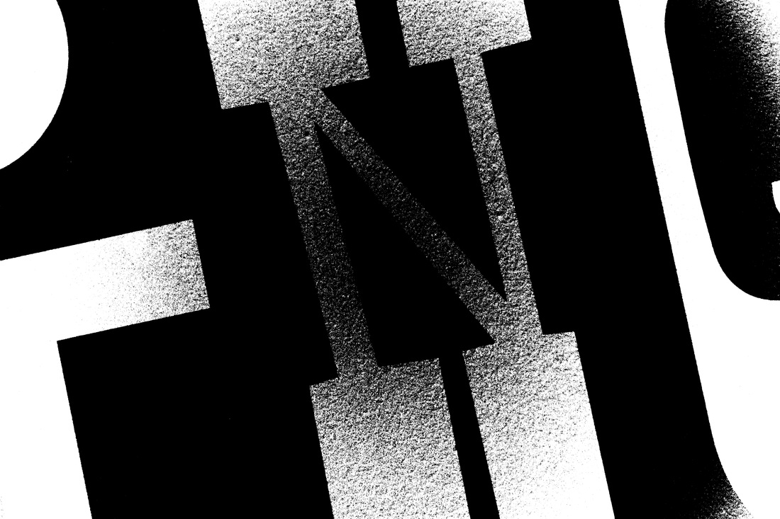
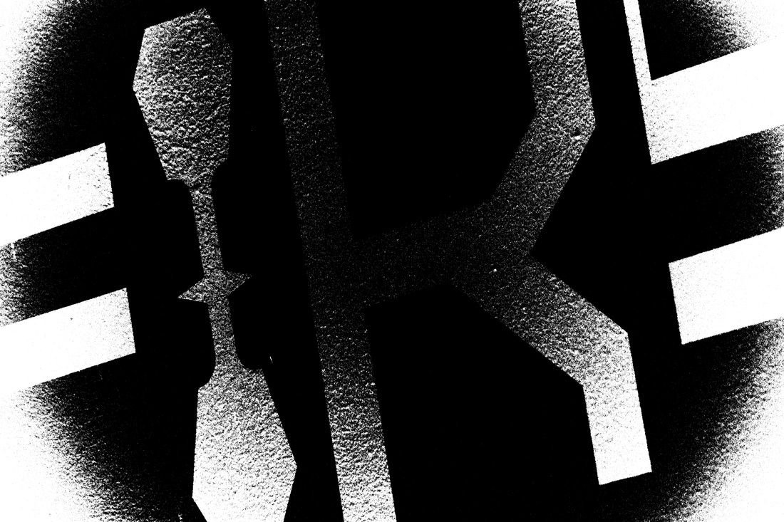

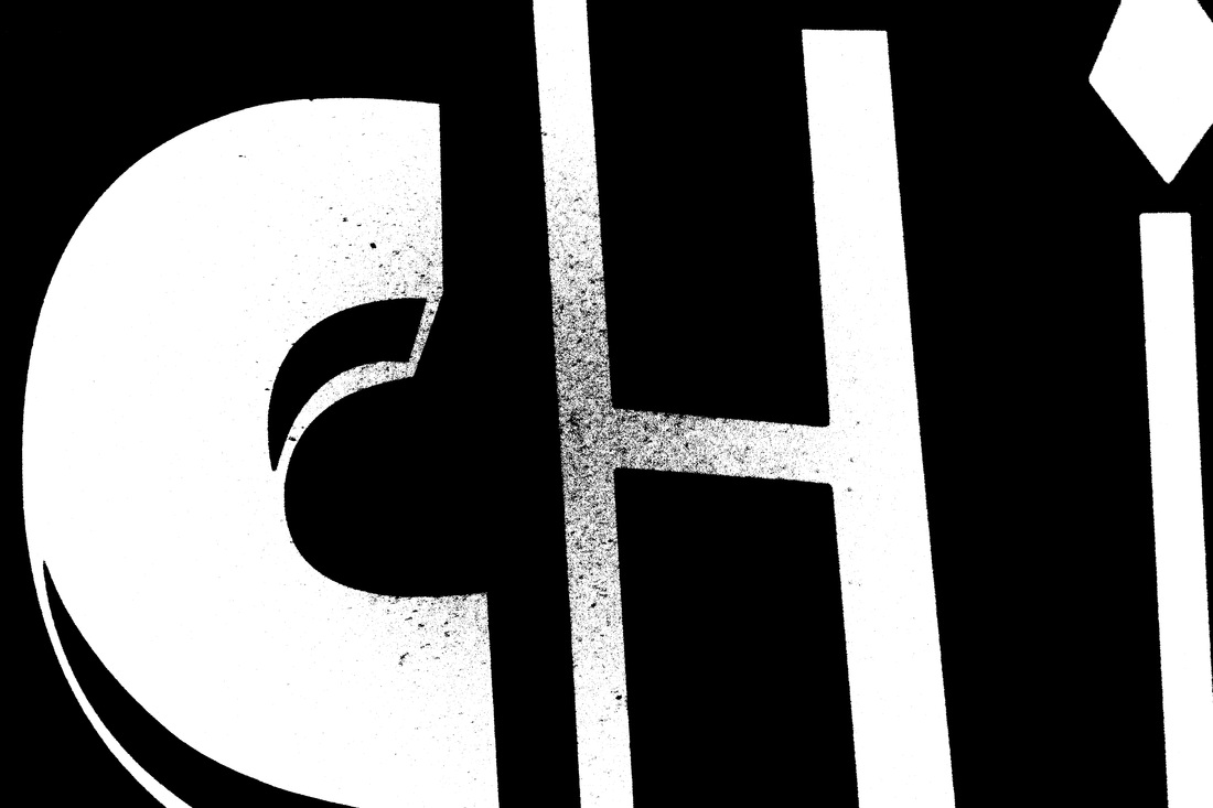

Photoshop Edits
|
|
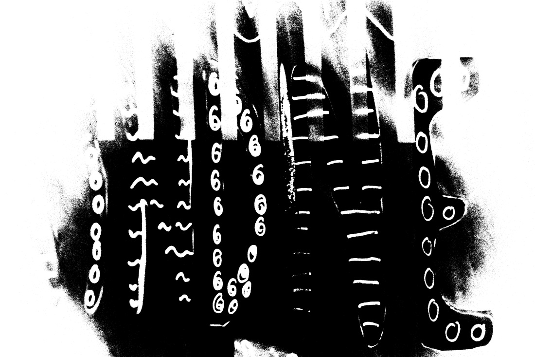
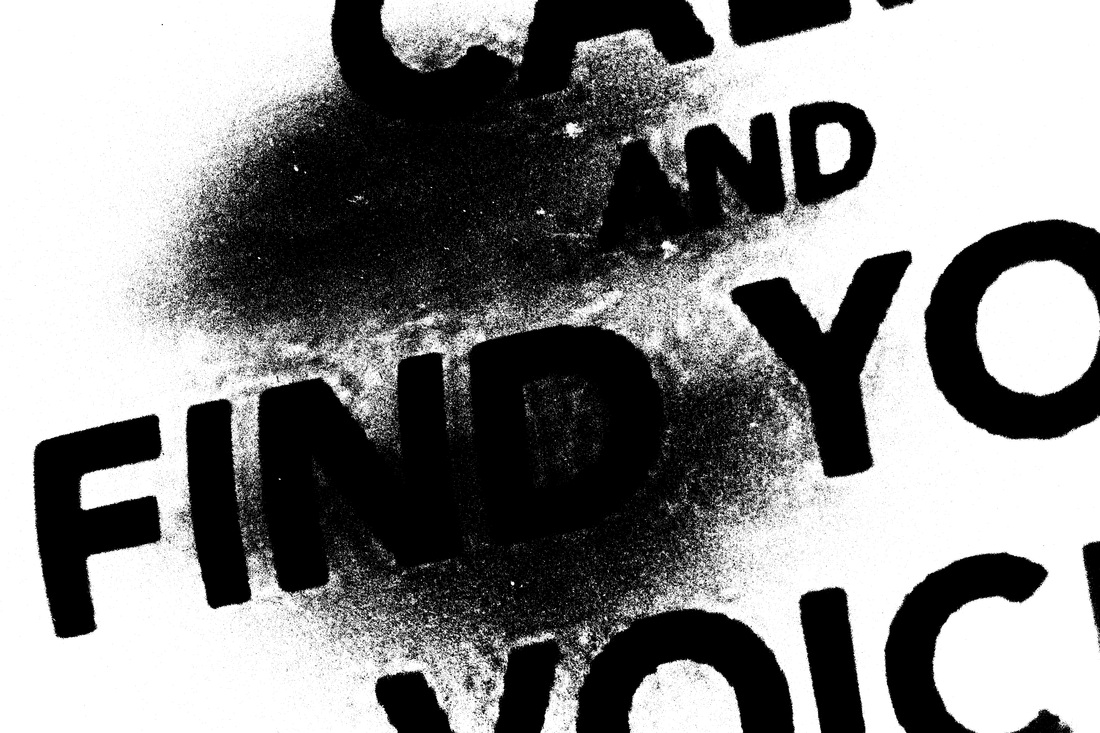
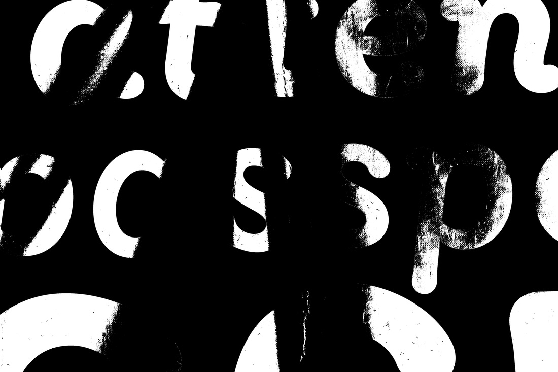
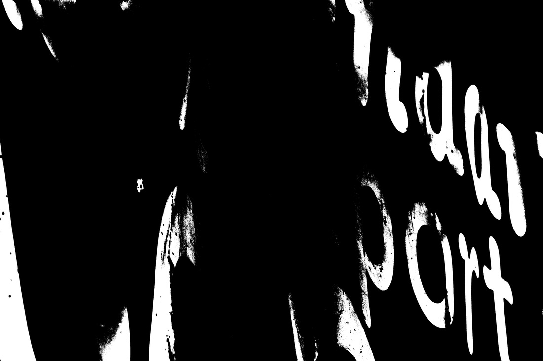
After creating these Helmer-Petersen inspired images. I decided to put them together. Hopefully to create some kind of abstract pattern, maybe even create a new word or a Surreal messages. I made 20 'words' with 4 images each. The photos in the word were selected by element of chance. This was simply done with a random number generator. I did it this way because there was 55 images. I needed a way that was 100% random. I was going to select the first number that came into my head. But this isn't completely random
|
Response
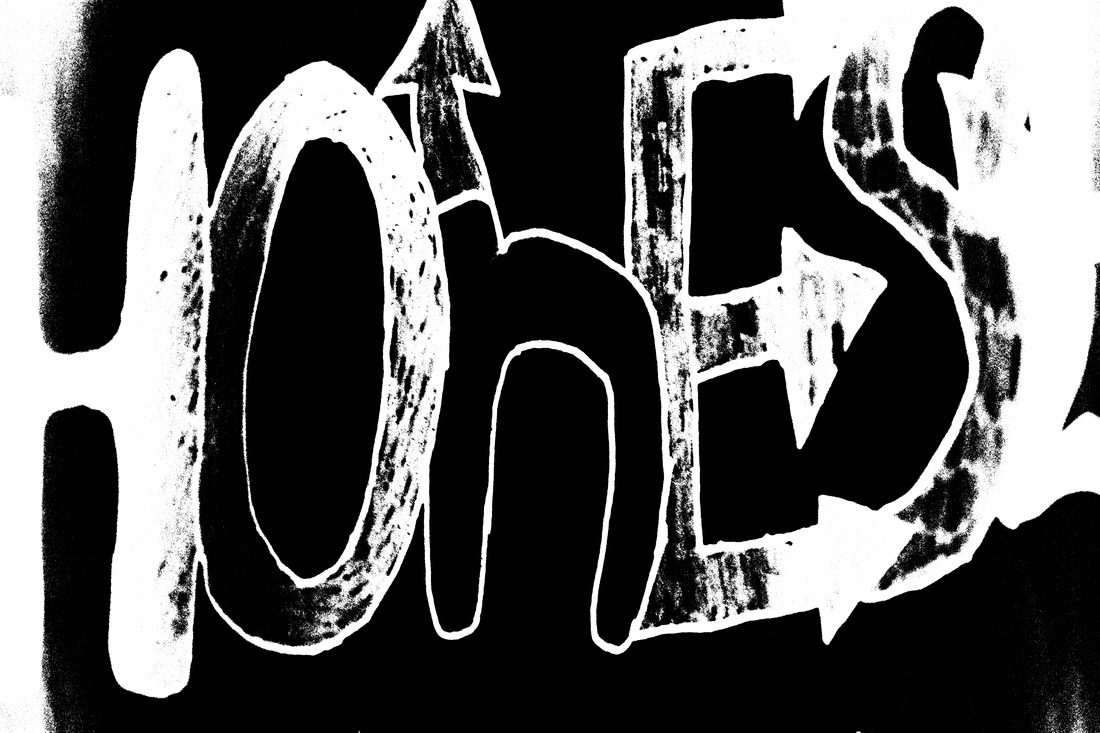
WWW
|
EBI
|
Motion Blur
|
|
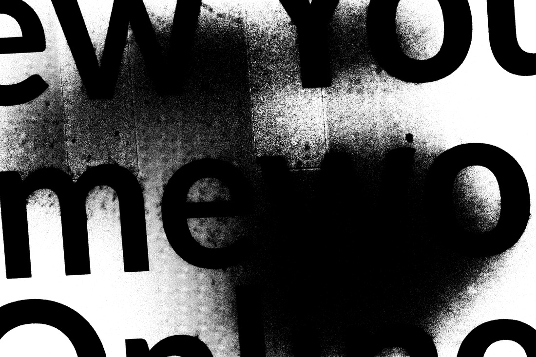
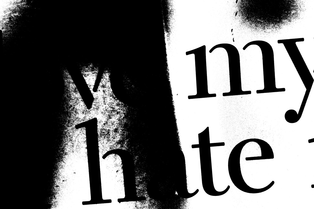
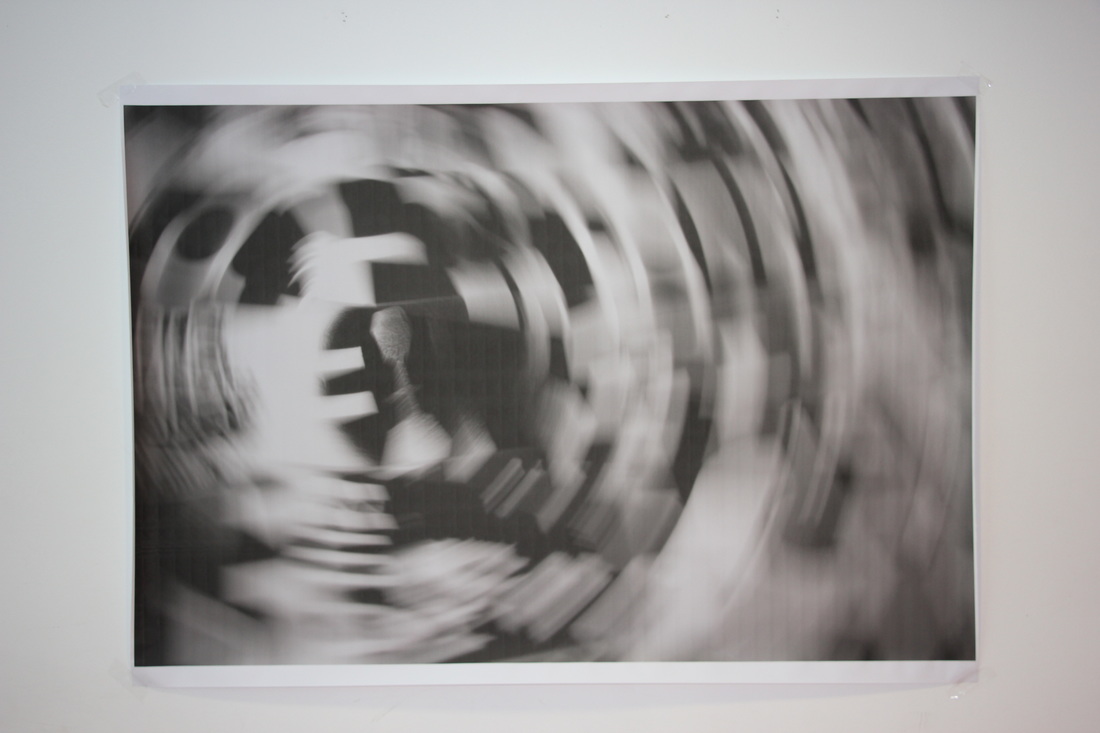
After I laid out these photos on the mount board. I decided to zoom in the words. I was thinking this would lead to more images. Then I realised that the photos were being taken with shutter speeds of 1/60. So I decided to add some intentional camera shake to the images. The result are very good in my opinion. I took these images in 2 different ways. Firstly I took images and rotated the camera at a quick pace. The 2nd way I took these images was by zooming in or out a millisecond after I pushed the shutter. This way wasn't as effective as rotating the camera.
|
WWW |
EBI |
