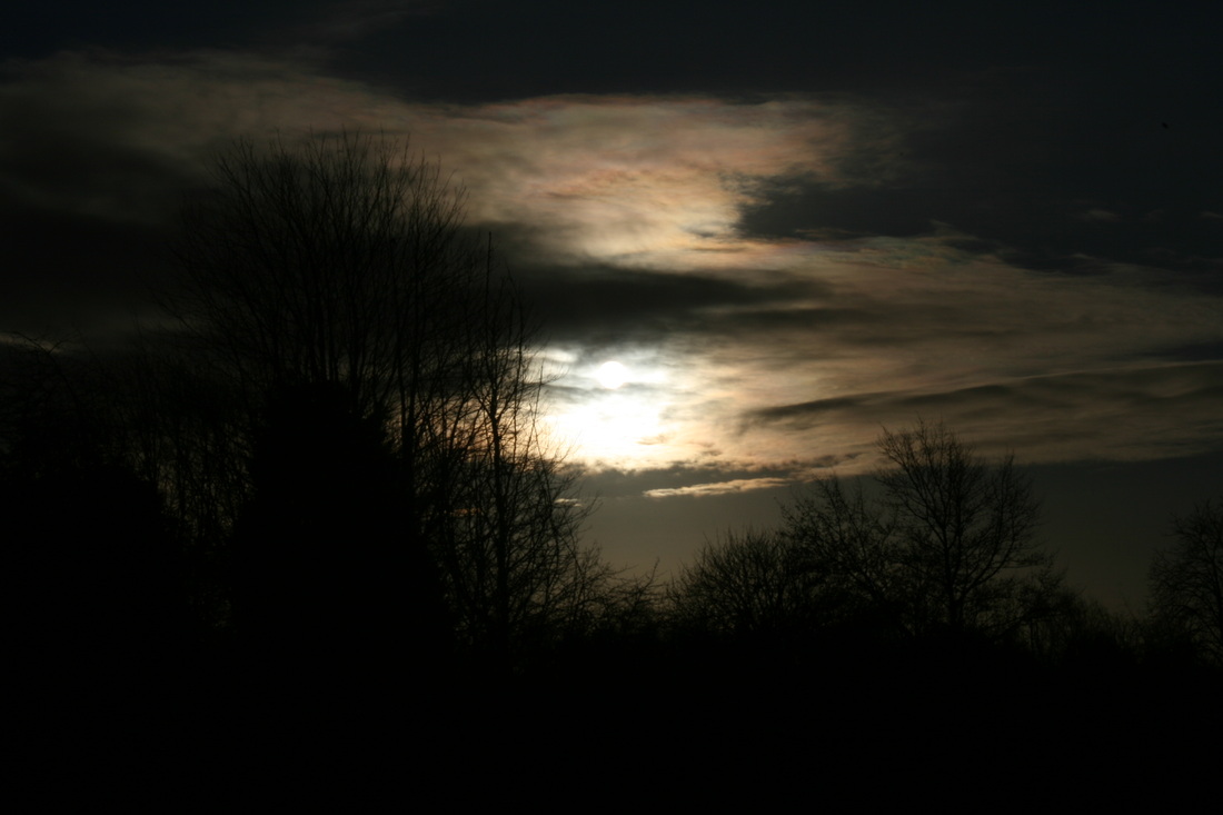
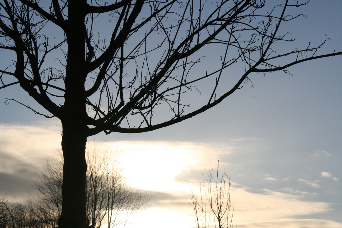
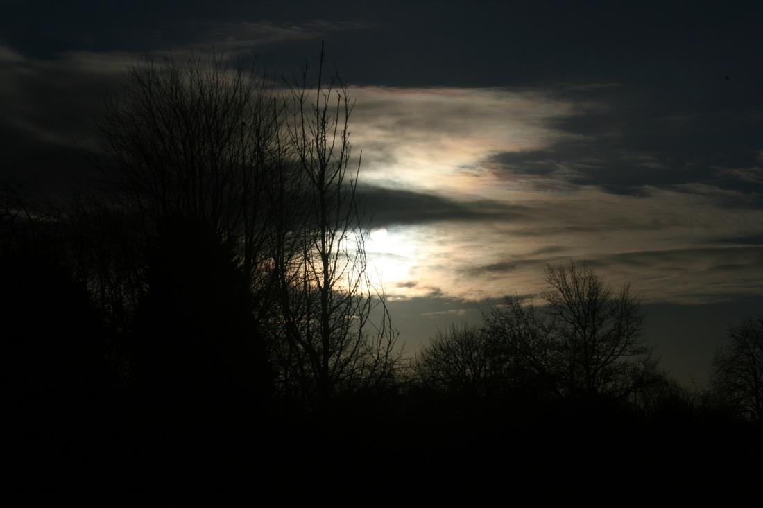
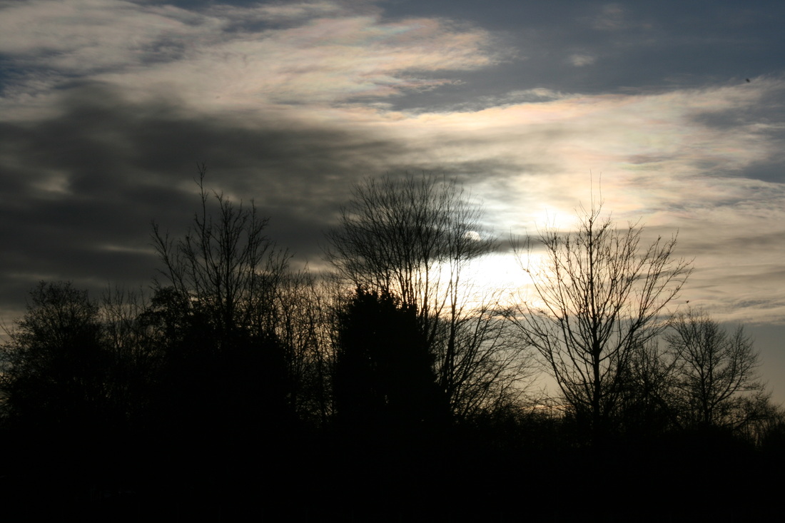
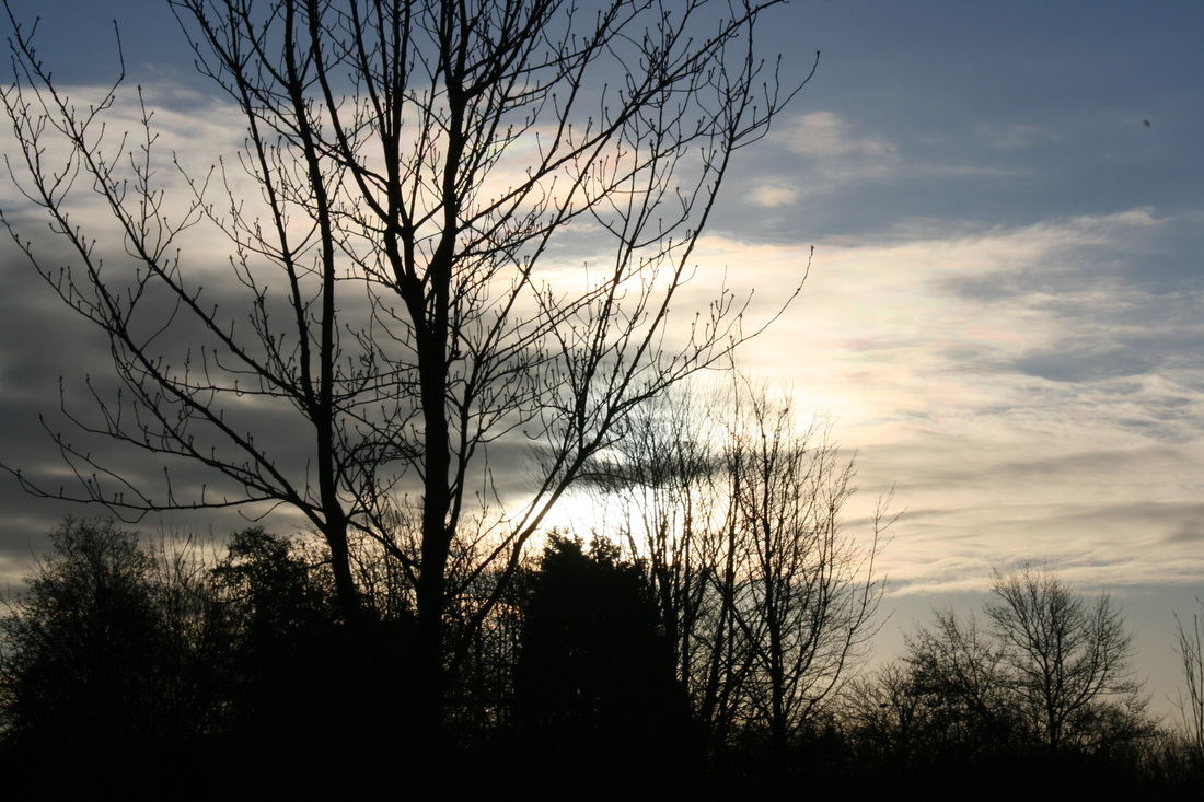
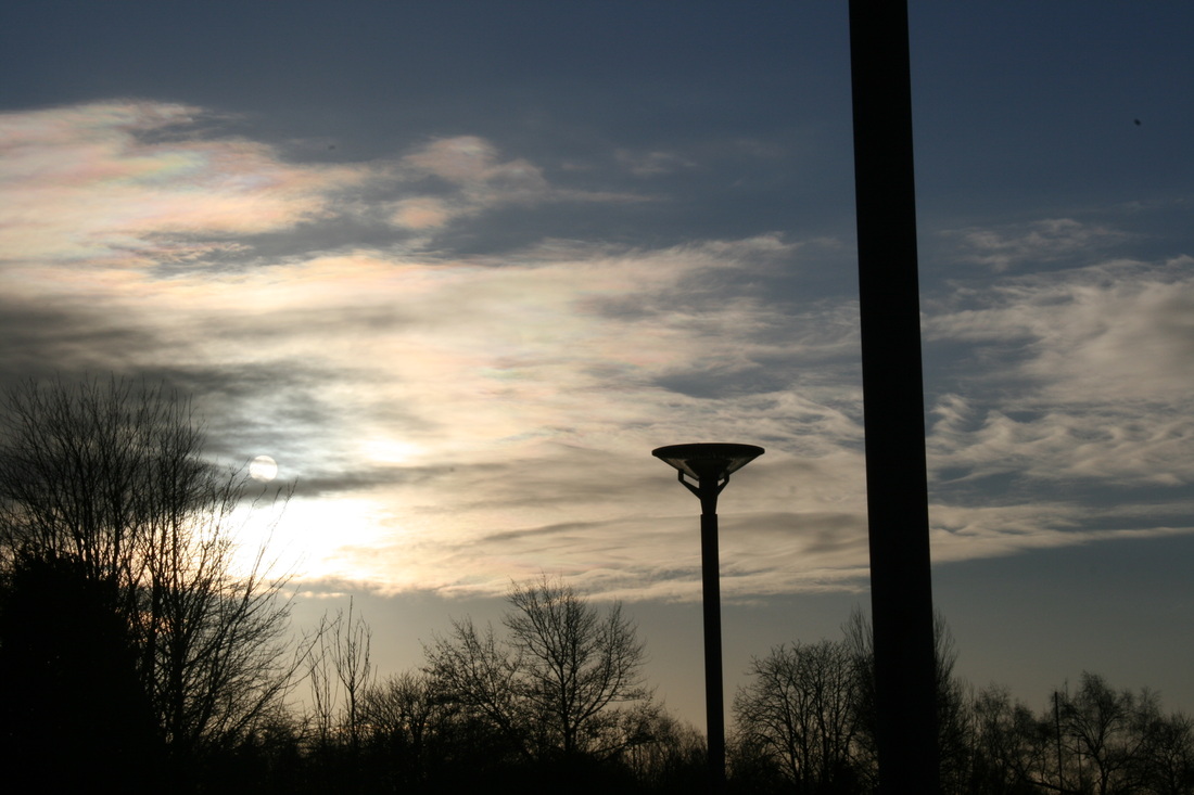
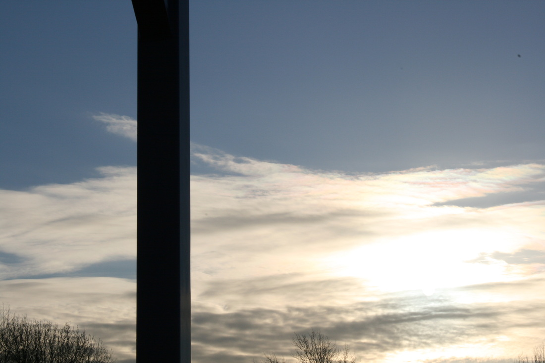
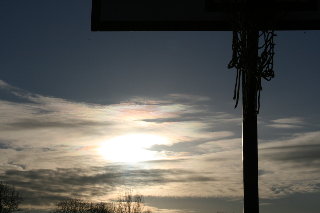
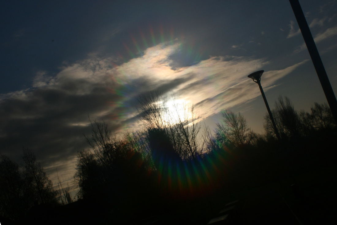
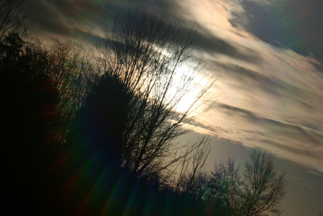
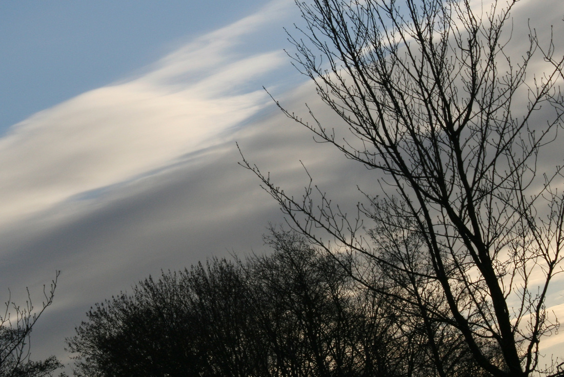
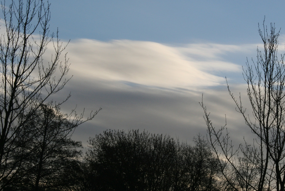
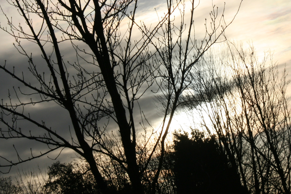
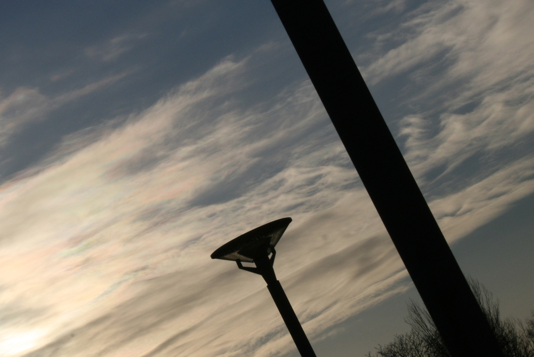
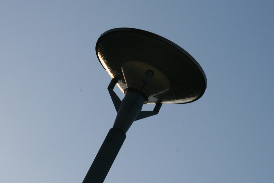
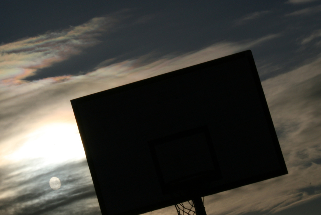
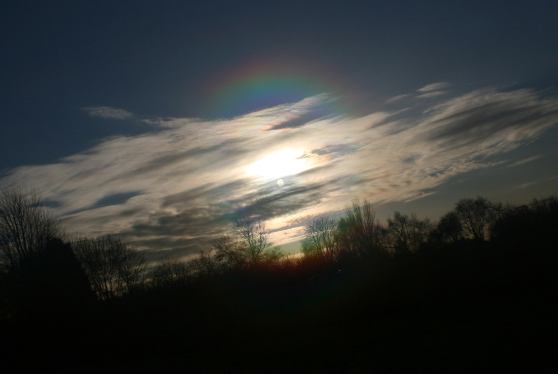
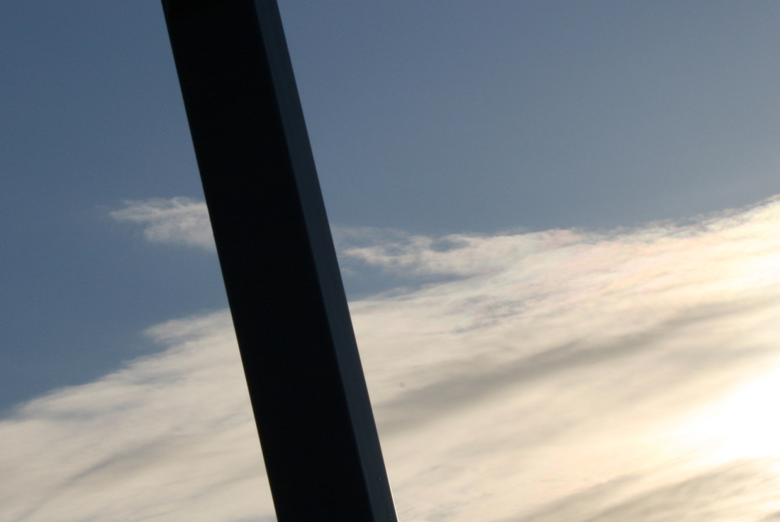
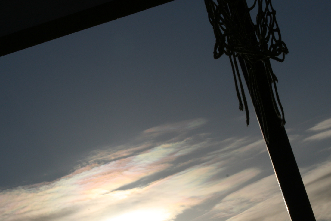
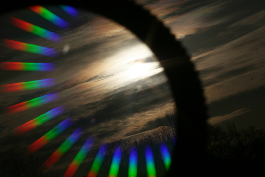
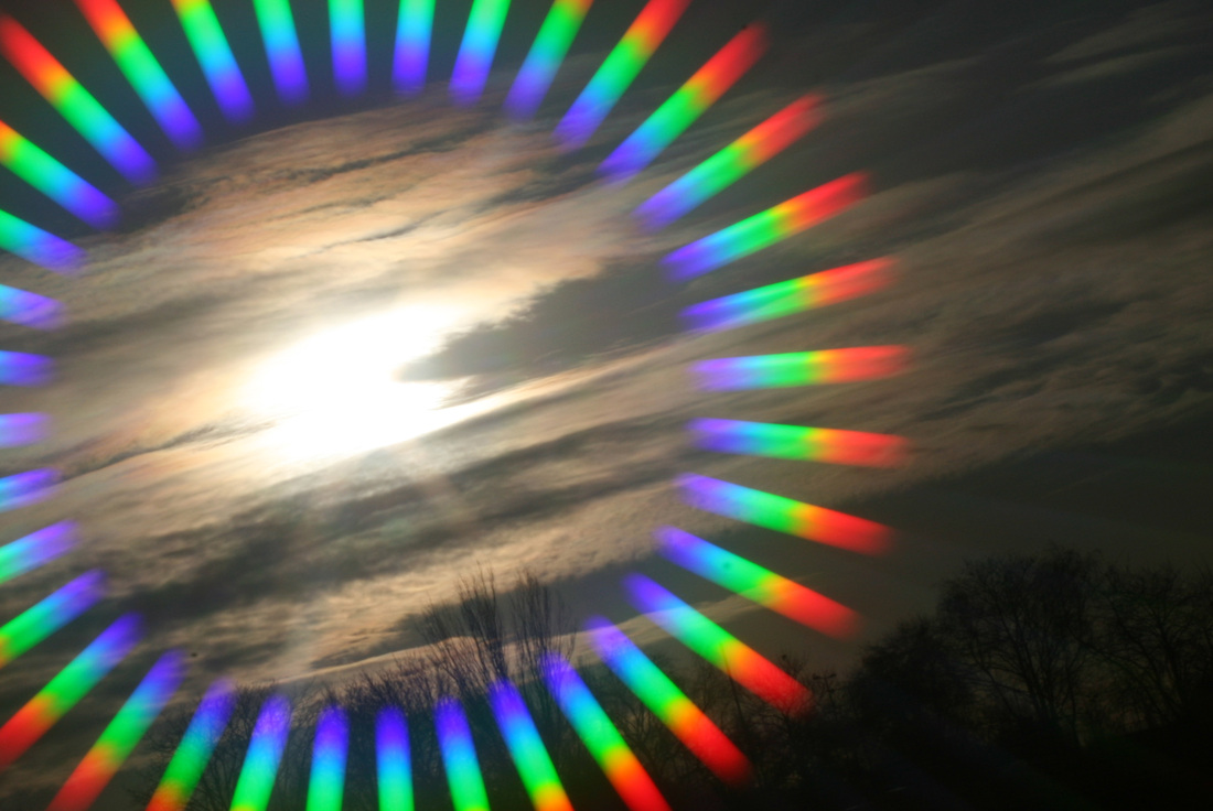
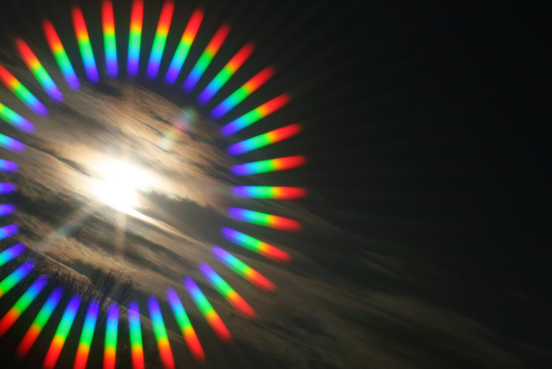
For this unit, I'm going to be looking at the work of John Baldessari. When I was looking through his images, I realised some photos that were taken of the sky. Photos of the sky strongly link to Contrast in my opinion. The reason why I believe this link to contrast is because firstly the colour of the clouds [white] contrast with the colour of the sky [blue]. Another way of making a Contrast using the sky, is by making a silhouette. Back when I was doing the Abstraction unit in GCSE Photography, I can remember taking photos of the sky. The sky in those images, made the foreground into a silhouette. I believe that this will be a very good contrast.
How is this going to continue on from my First Final Piece
Hopefully Balessari's will help me genrate the idea for a final piece based around clouds. The contrast in this image will mainly be colour. I'm hoping to achieve this Contrast by getting photos of branches, or leaves on trees. These photos will also contain the sky in the background. With the sky in the background, a silhouette will be formed. This will form a Contrast of Blue and Black.
John Baldessari
|
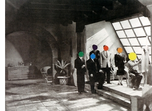
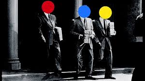
Baldessari is an Amertican contemporay artist, who is also well known for his Photography work. Despite the fact there are only a few photos, my main inspiration from him is his photos where the sky is the background. Baldessari is an inspiration to 1000s of people for his random but very good ideas like photos with intentially bad composition, hitting things with gold clubs, waving at sailing boats and possibly his most famous Dots on peoples faces. Baldeassri has had over 200 individual shows and over 1000 group shows.
|
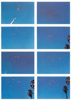
I found this photo on Pinterest. This photo is my main inspiration for what I'm going to do next in Photography. As I said Baldessari is using the sky and has thrown a couple of red balls up and photographed them. This has gained a Contrast in colour between the blue sky and the red balls. For this unit I'm possibly going to move more towards the silhouette photos though. Back to talking about this specific image, this image as probably captured by luck. This is because Baldessari most likely, just chucked the balls in the air, then pressed the shutter multiple times. Then these images are the results. As I said, this is probably down to 'Chance' however that is how Photography works. My previous final piece was found by chance.
|
1st Set of images
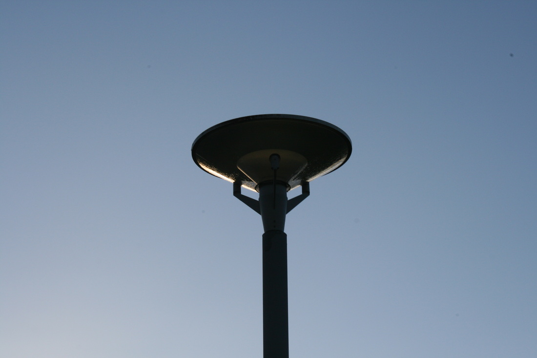
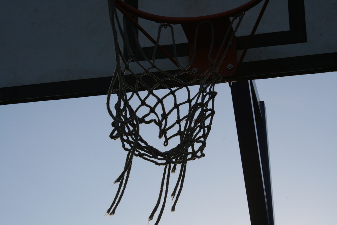
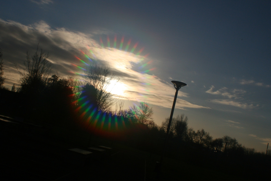
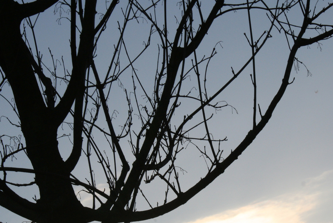
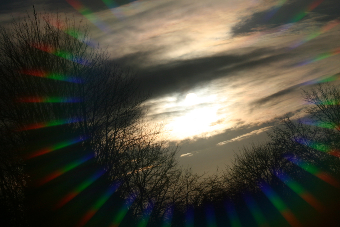
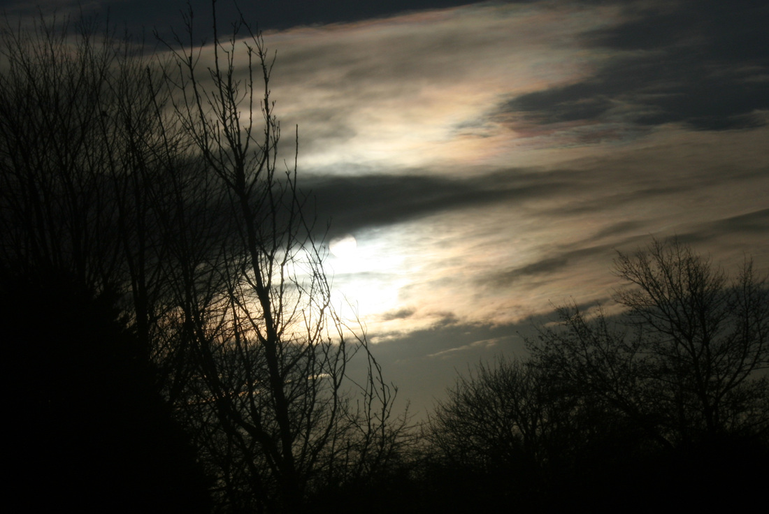
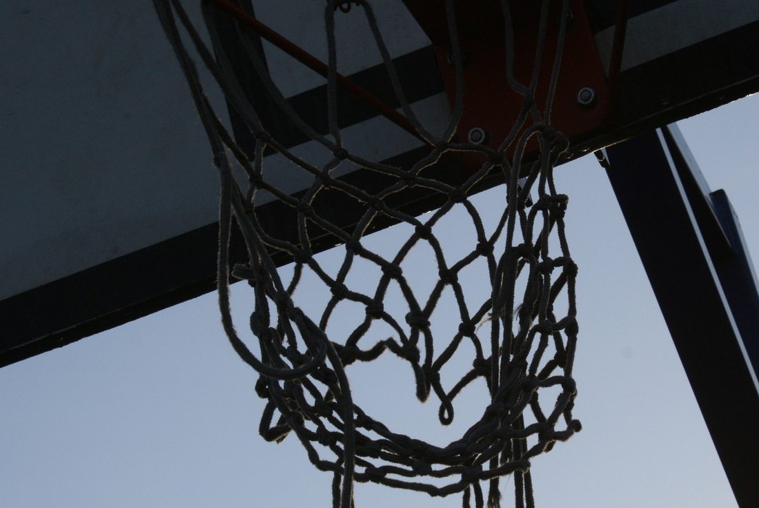
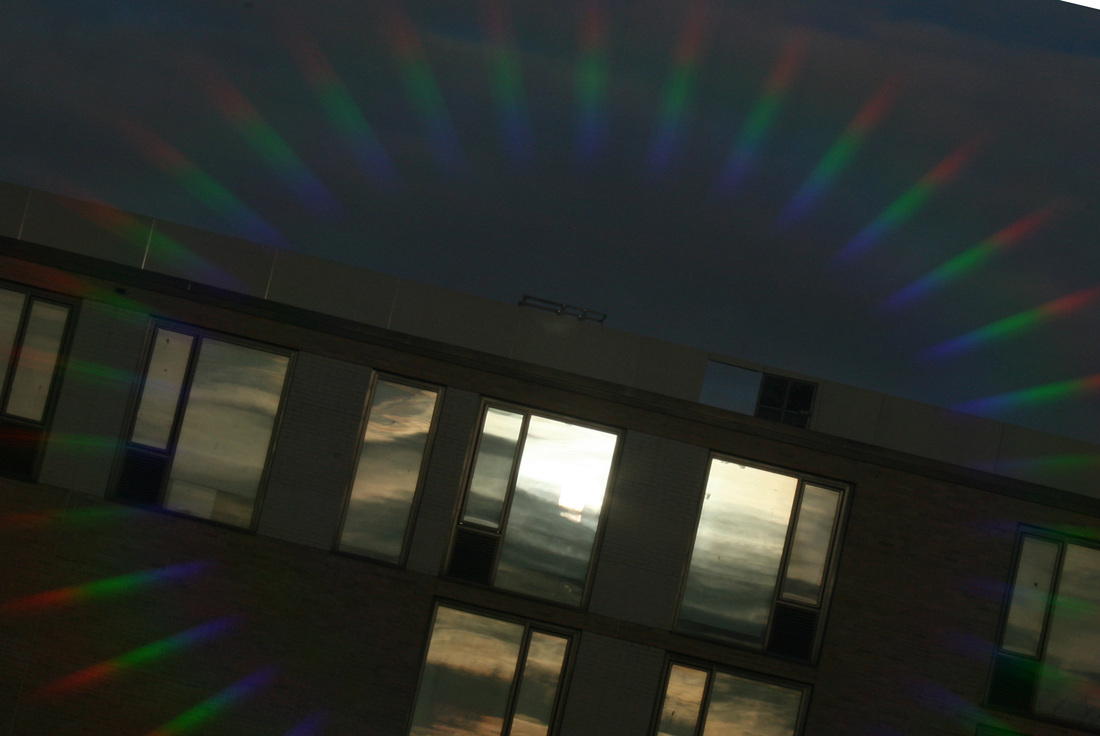
This first set of images are just very basically silhouettes. This will be done by photographing the something in the foreground e.g. a branch or a tree. The background of the image will be the sky. The very bright colour of the sky, should turn the foreground a dark black colour. [A silhouette]
I've decided on how I can refine and develop these images. When I was watching the John Baldesaari video [at top] the took photos in a series called 'Wrong'. This series were photos where the composition is 0. Basically he took photos with a composition that wouldn't be accepted as a good photo. However he called it Art, then people started to like looking at these images that didn't have a composition.
So basically I'm going to retake these photos os silhouettes, however I'm going to take these photos without a specific composition.
So basically I'm going to retake these photos os silhouettes, however I'm going to take these photos without a specific composition.
2nd Set of images.
After taking the first set of photos. I decided to put the images into Photoshop and rotate them. So that way the image won't have a composition. Just like the photos that John Baldaserri did with his series called 'Wrong'. When I was recomposing these images. A question came into my head. That question was 'will people actually see these lack of composition'. The reason why I asked my self this is because I believe that there are loads of people who don't think about composition. However there are some people who really take the composition seriously.
Overall this change of composition worked for some of the photos and it didn't work for some of them.
Overall this change of composition worked for some of the photos and it didn't work for some of them.
2nd Idea
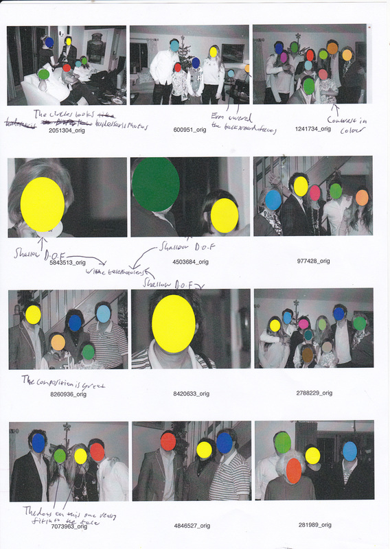
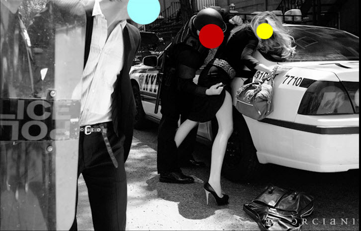
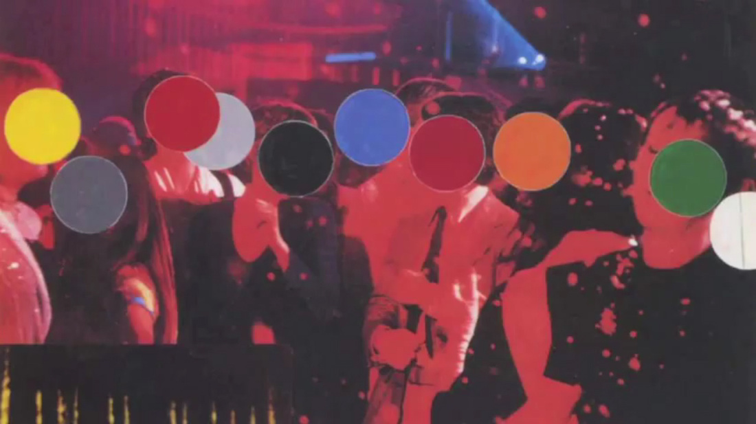
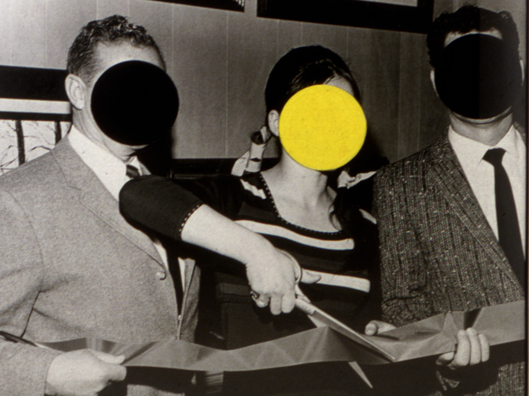
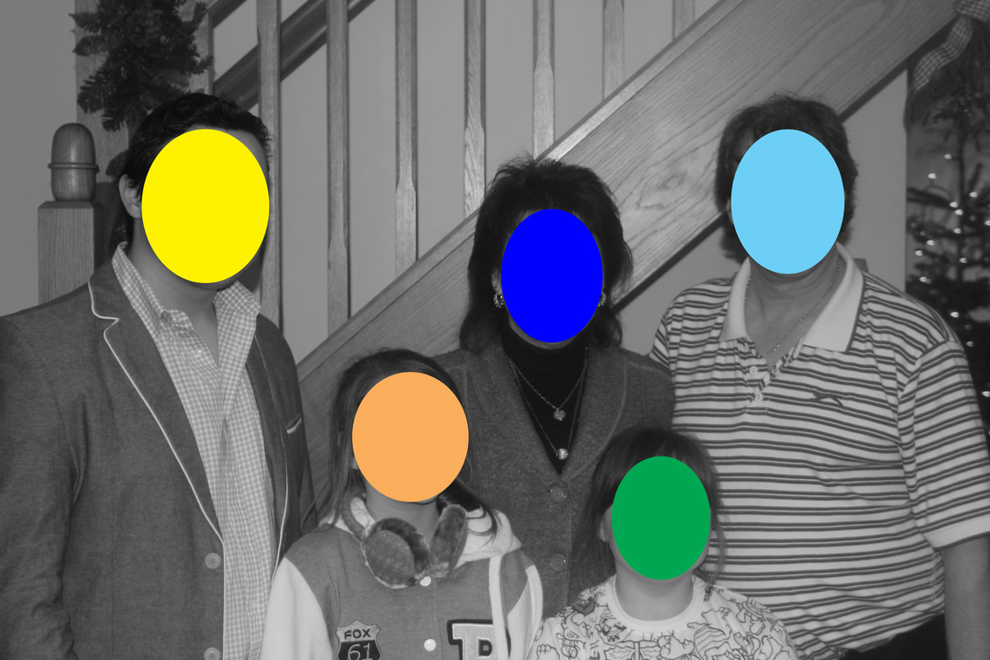
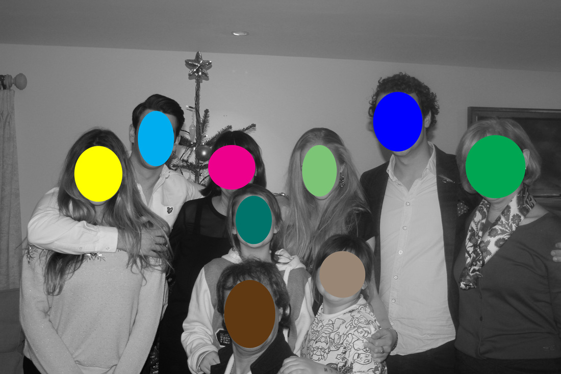
After watching the video, one section of it that really impressed me was "the man who put dots over peoples faces". The reason why I like it is the simplicity of it, yet the result produces a very good contrast. My first set of these are photos from my uncles Christmas party. I was 1 of the 3 people at the party taking photos. I was mainly taking photos of groups of people. Another reason why I thought of this idea was because of censorship. My uncle doesn't really like his photos being put on the web. so I was thinking about blurring his face out of the photos before I put them onto Facebook. Then I remembered back to Baldesarri on how he put dots on peoples faces.
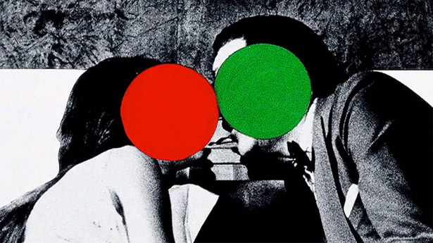
Below is some good examples of "Dots on peoples faces"
Below is some good examples of "Dots on peoples faces"
Testing it
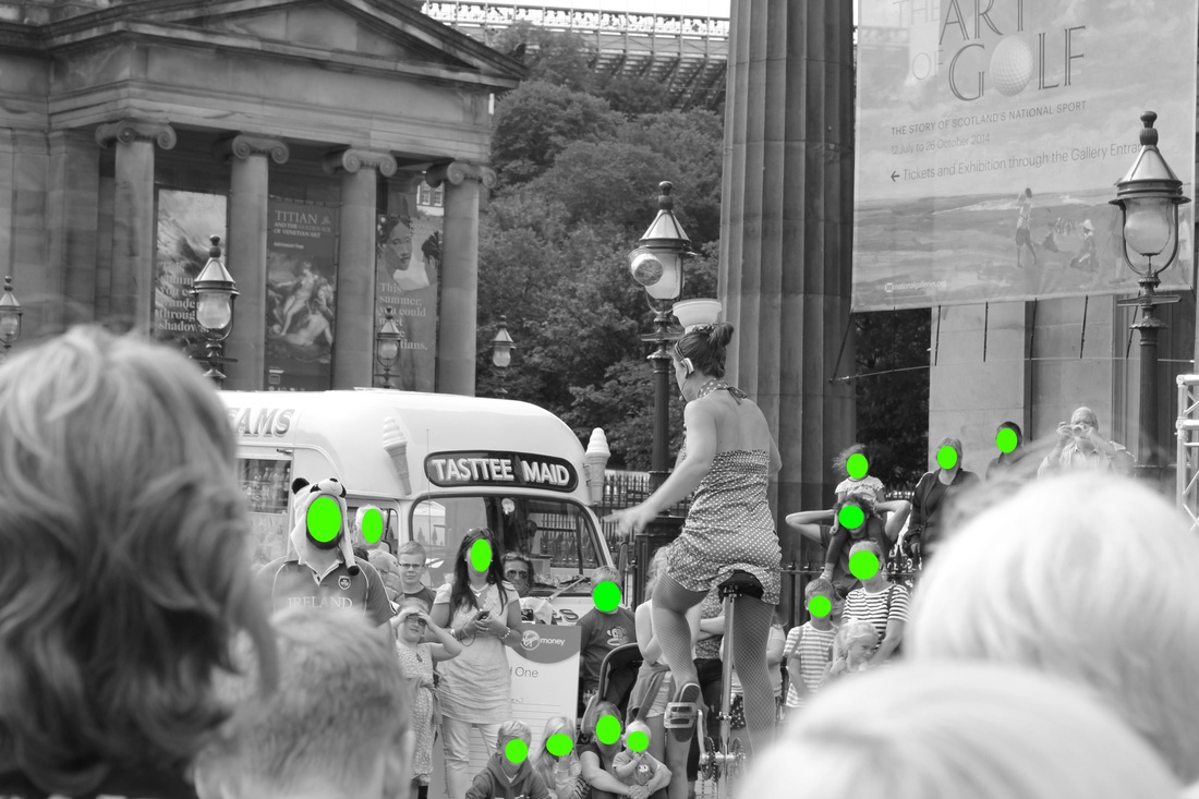
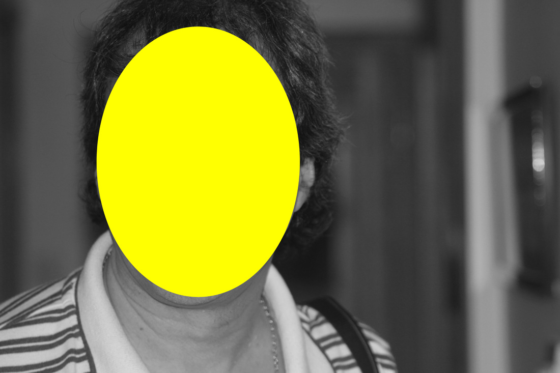
The first thing I decided to do was try out this idea of "dots on faces". So I remembered back to when I went to Scotland, I took photos on the streets of Edinburgh, which were filled with people. I chose this photos and I decided that every face where you could easily see, I decided to censor it. By censoring it, I meant put a green circle over their face.
For these photos to succeed, I need to get close up photos of loads of people, for example photos of people on crowded streets, like Oxford street. Or I can get pictures of people at parties. Another thing I can try is getting photos of the football crowd at Charlton Athletic. I have a season ticket so all I need to do is spend around 10/15 minutes outside the stadium before the match getting photographs of people coming down Floyd Road. Or I could get photos of the fans in the refreshment area
For these photos to succeed, I need to get close up photos of loads of people, for example photos of people on crowded streets, like Oxford street. Or I can get pictures of people at parties. Another thing I can try is getting photos of the football crowd at Charlton Athletic. I have a season ticket so all I need to do is spend around 10/15 minutes outside the stadium before the match getting photographs of people coming down Floyd Road. Or I could get photos of the fans in the refreshment area
1st Set
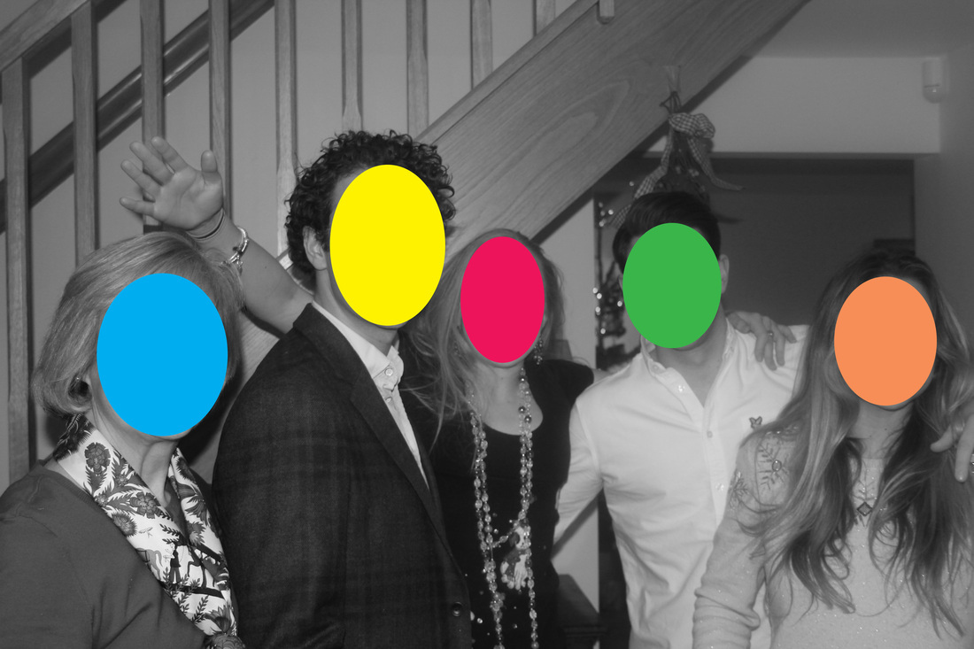
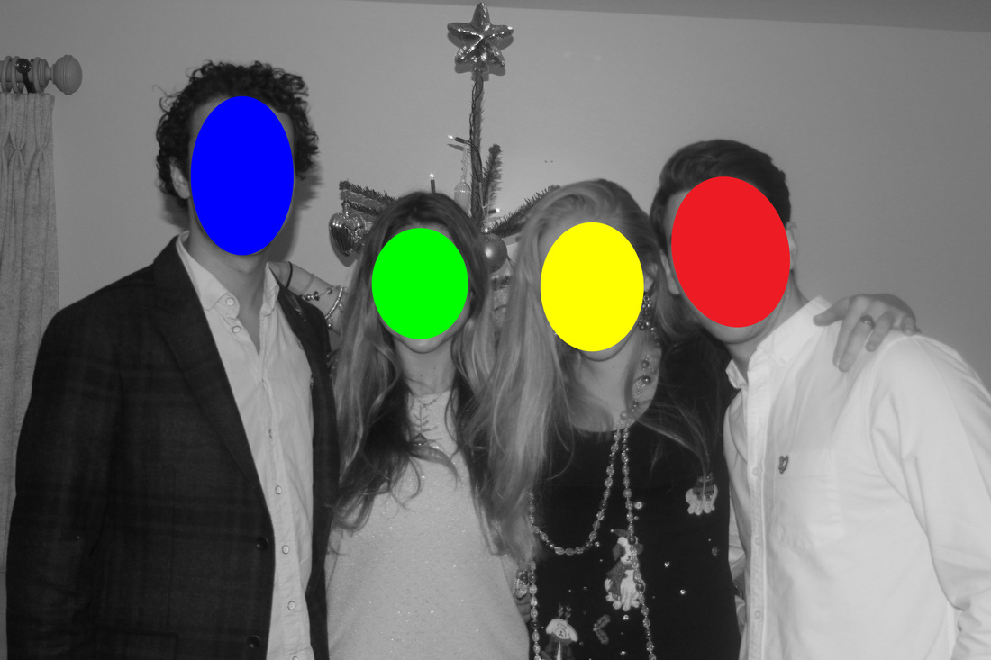
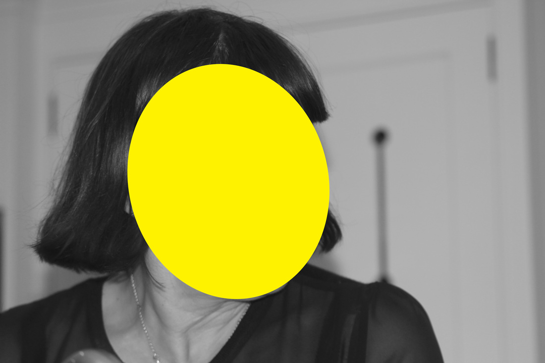

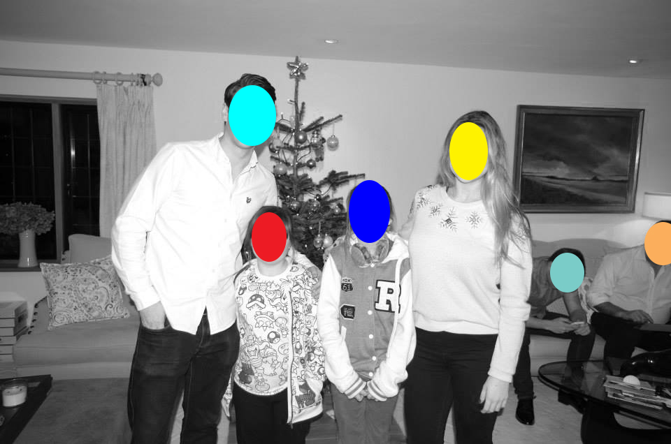
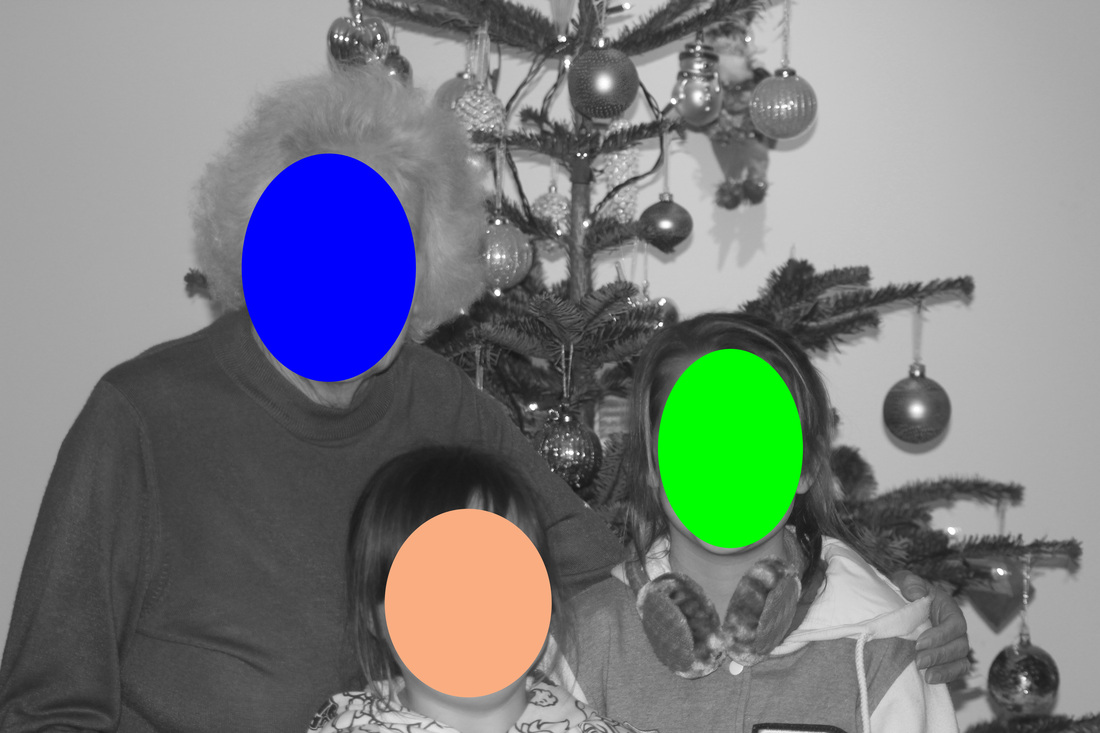
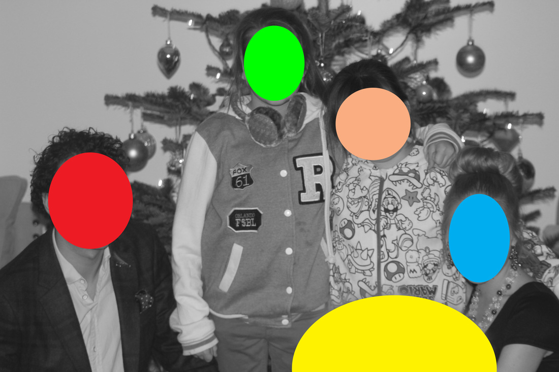
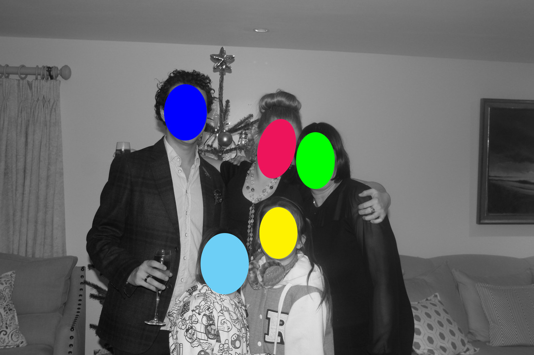

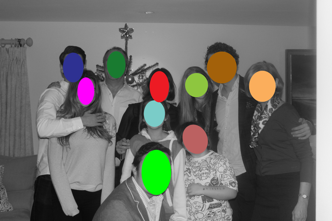
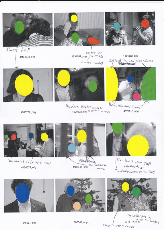
The main thing I like about these photos are the great contrast in colour. This great contrast of colour is made by me applying a Black & White adjustment to the picture. The contrast is made better by the use of bright colours, especially the very bright Green.
|
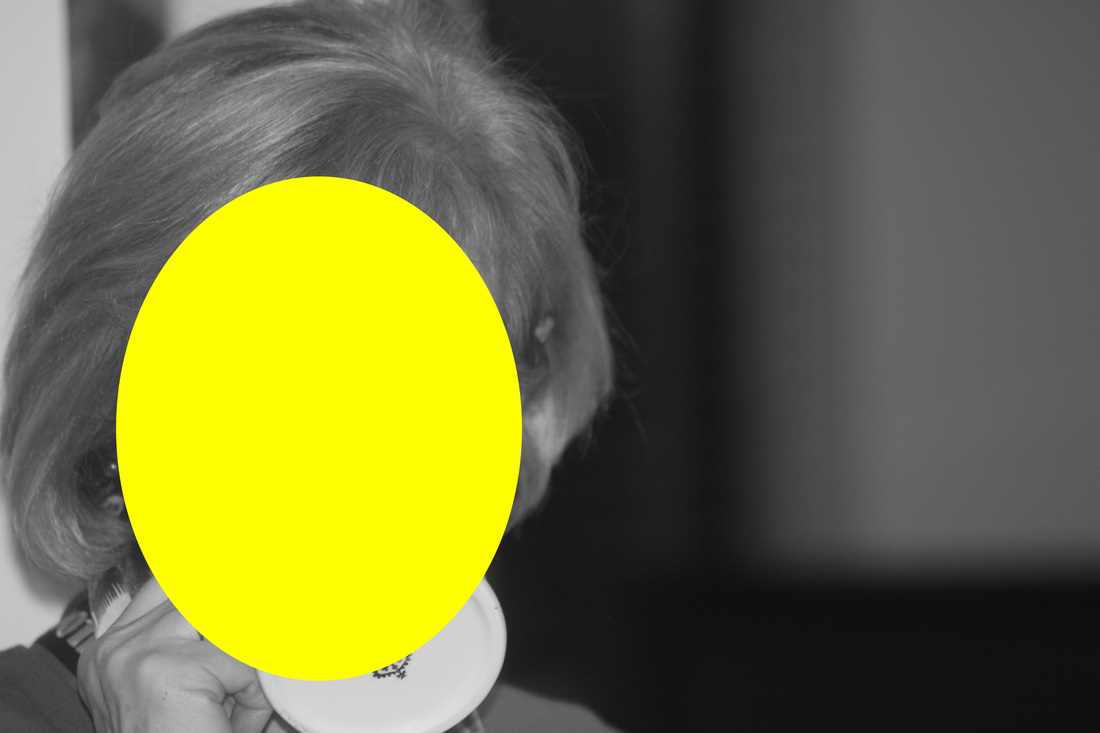
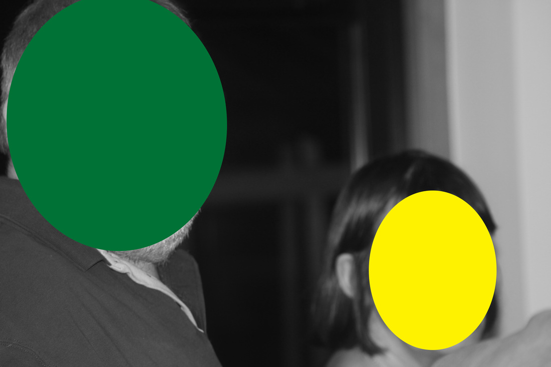
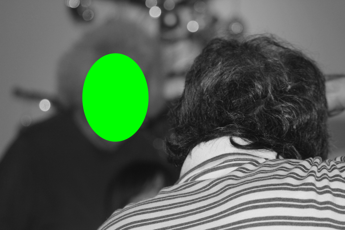
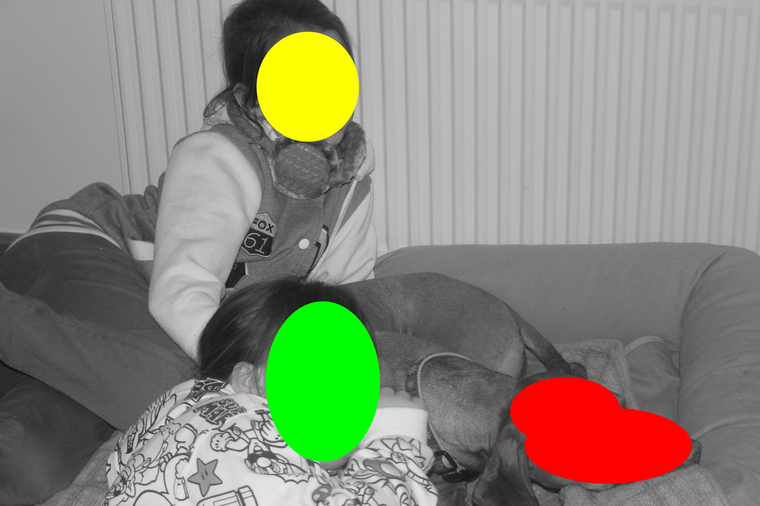
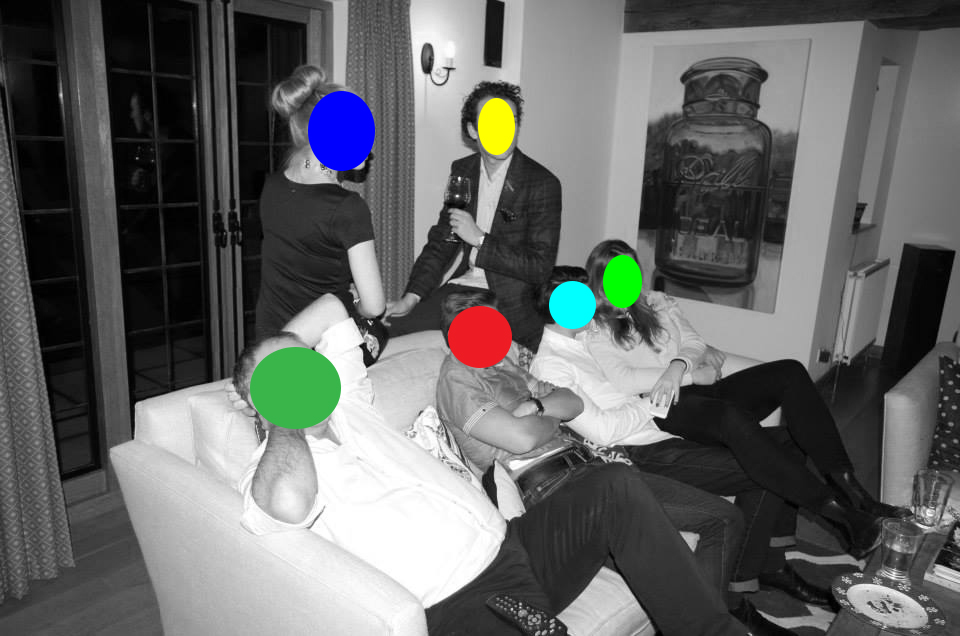
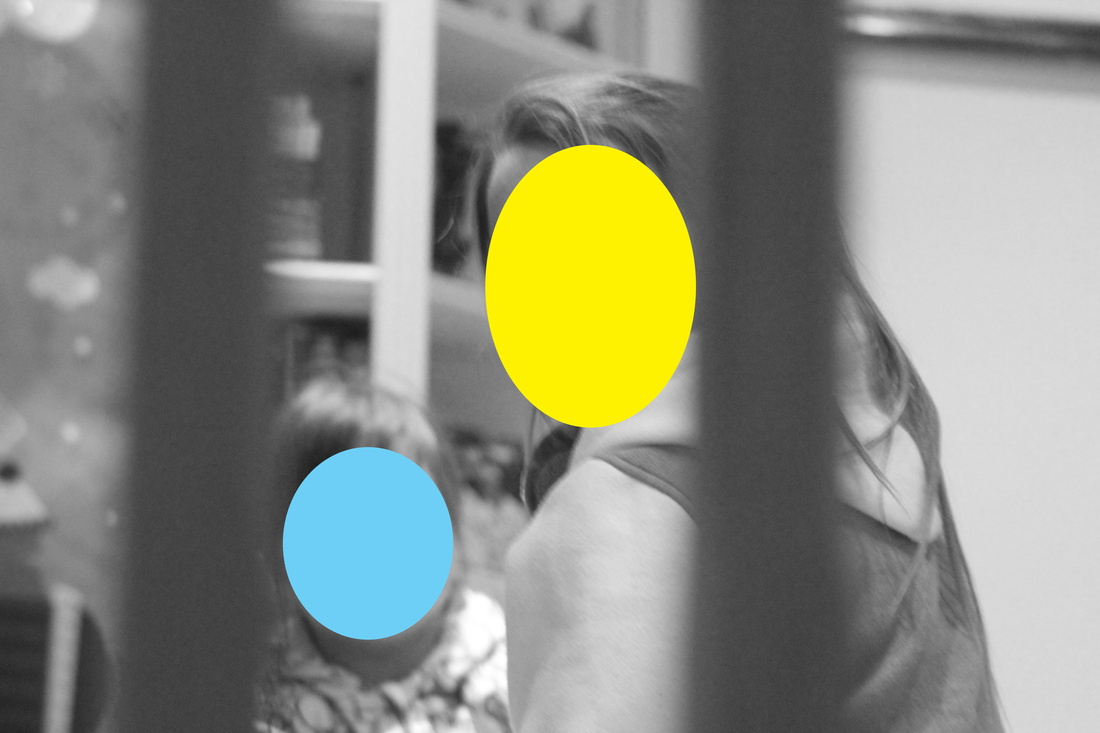
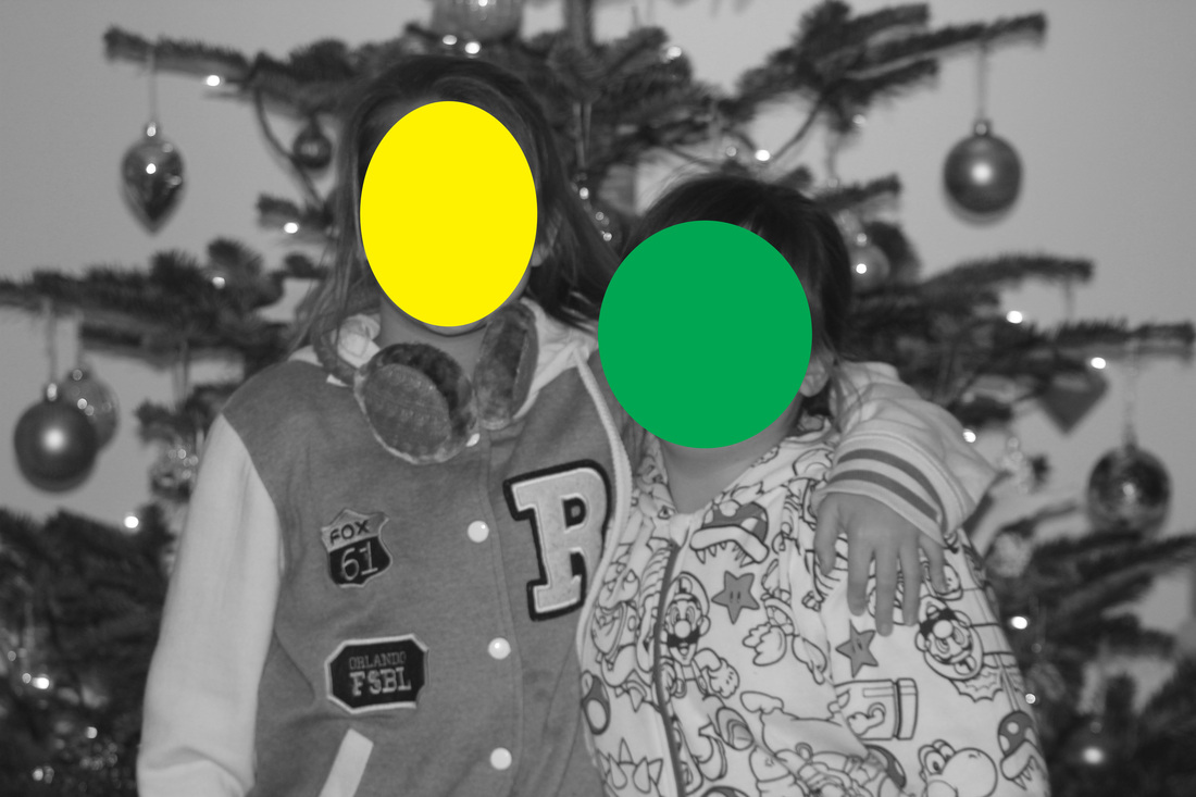
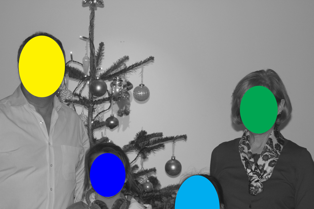
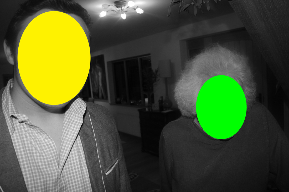
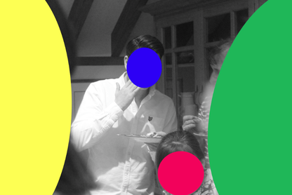
This is my favourite image out of the set. The first reason why this is my favourite one is because of the depth of field of the image. The dots in this image are covering my cousin Nicholas [green] and my Nan [yellow]. You will realise that there is a depth of field in this image. I think that the green circle over the out of focus section of the image, is itself a contrast. You have a contrast in colour and focus. The second aspect I like about this image is the contrast in colour. I decided to use bright cool colours, that would stand out even if the image was in colour. However when the image is B&W. The contrast in colour is even better. I also like it how the focus breaks up the image. Look at the wine glass in the hand in the background, I like it how it is completely broken up because of the focus and you have this small dab of colour in the bottom of the glass that is the wine.
|

|
|
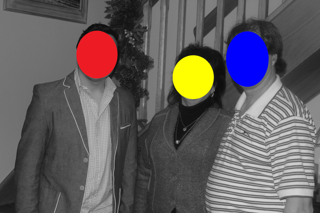
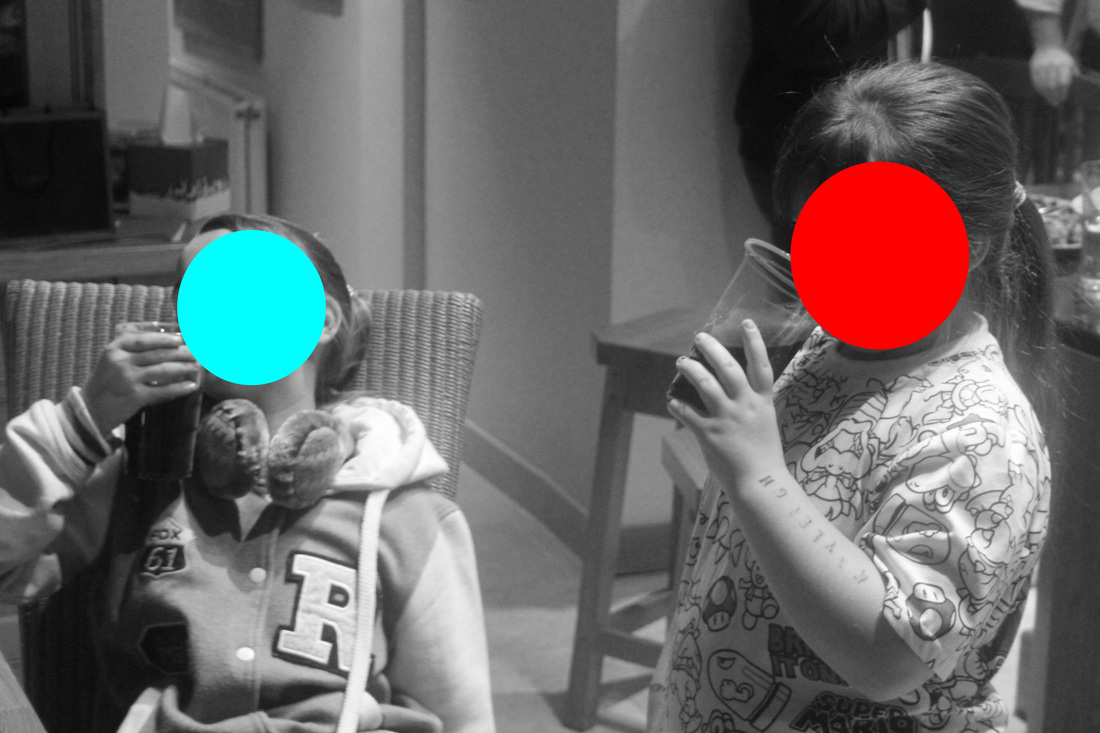
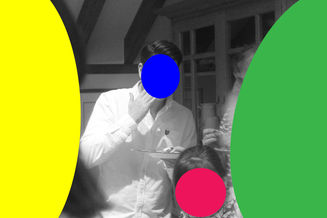
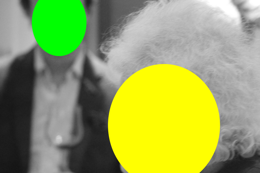
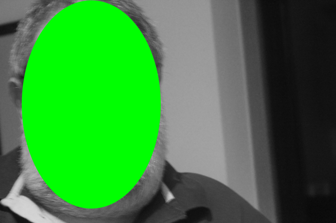
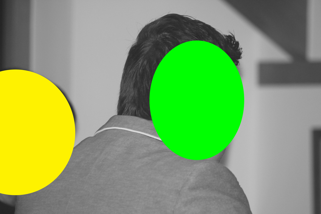
This is my least favourite of image of the set. The main reason why I don't like this is because of the green and yellow dot on the sides of the image. The reason why I don't like these is because the colours ruin the concept of the image. The reason why it ruins the image is that the point of these photos are to put dots over peoples faces, however because of the size of the dot, it doesn't look like it is covering a face.
|
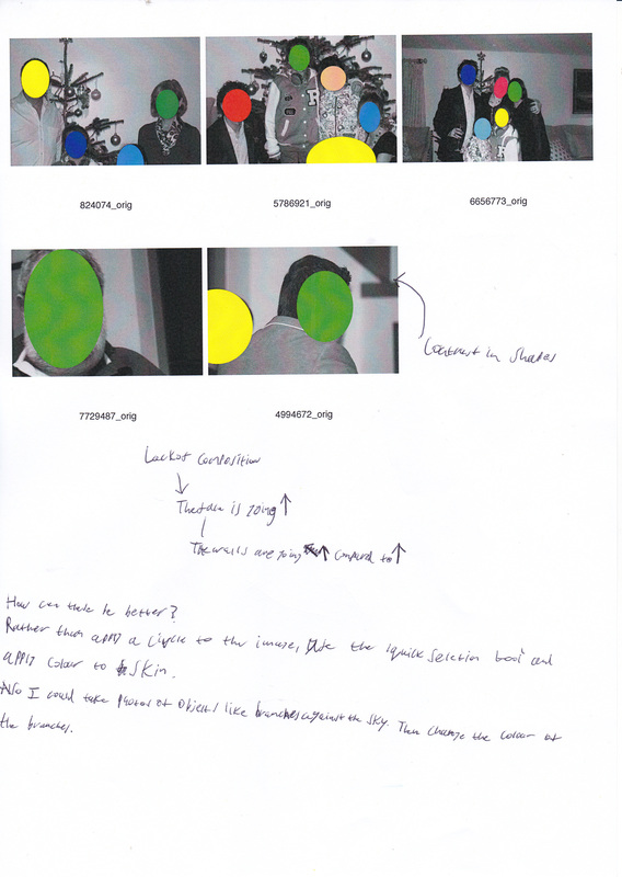
After making 2 sets of photographs based around different ideas from the same photographer. I've had a thought about combining both the sets together.
HW: Retake 30 images about conceptual photography based on annotations of previous images
For this homework, I've decided to combine these 2 units together. I'm going to head down to sutcliffe park and take photos of branches contrasting with the sky. Then after this I'm going edit the photos in photoshop. I believe that this set could be better than the original idea of putting dots on peoples faces. The reason why is because putting dots of a face gives us a feel of layers however changing the colour of an aspect of the image, it still feels like it is 1 image.
|
|
On the left hand side is my annotations of the previous Baldesarri photos that I made. [click on them to enlarge them]. They contain notes like
|