
Unit 2: The externally set task
|
|
Creative use of light
|
I have decided to follow the theme of 'Creative use of light'. I was going to choose sportspeople, however I believed that the unit was closed because the only kind of sports photos are action photos. Only one thing to follow. Also there would be only one way to present sports photos for the final piece. That would be in a book. In contrast to this, creative use of light is a very open theme. Lighting is involved in every single photographic image. There is loads of ideas I can follow for this theme, shadows caused by torches, silhouettes, studio lighting, Photoshop editing etc.
|
Checklist
Green: Completed
Orange: In progress Black: Not started yet 1. Pick a theme 2. Give a brief summary of theme 3. Create a title page 4. Research famous photographers 5. Find and annotate some photos from photographers 6. Read some photography books 7.Take some photos |
What is Creative use of light?
"Photographers and filmmakers have recognised that the way in which an object or setting is lit can affect the mood and atmosphere of the image. This can be achieved by ambient, artificial or studio lighting. Investigate the creative use of light, refer to appropriate work of others and explore a range of approaches."
I believe light is the most important aspect of every photographic image because light it is in the meaning of the word photograph. This is because Photo = Light and Graph = Drawing.
I believe light is the most important aspect of every photographic image because light it is in the meaning of the word photograph. This is because Photo = Light and Graph = Drawing.
|
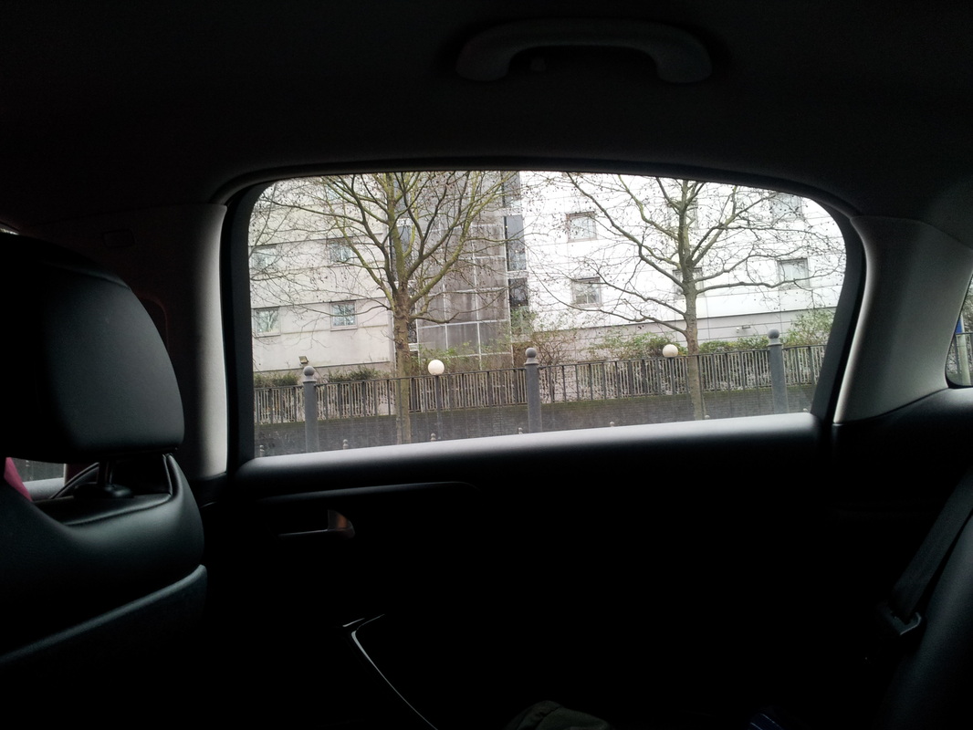
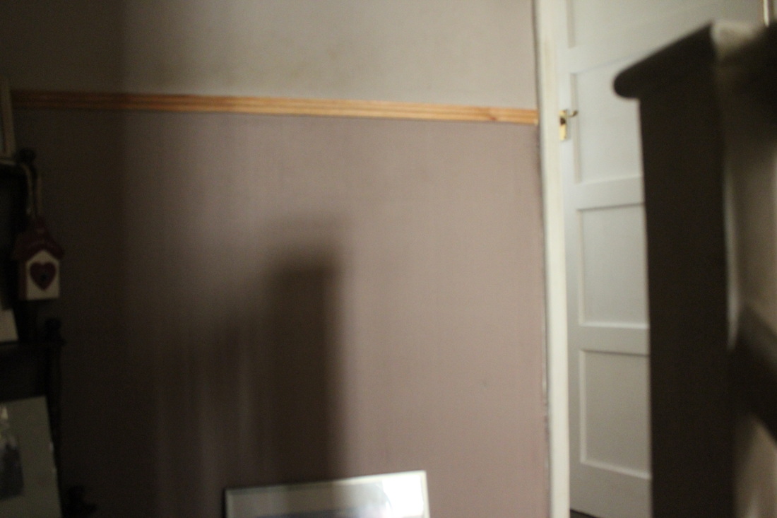
I believe that I have explored the idea of creative use of light before. On the right are a couple of images that I believe link to the idea.
|
|
What can I make in this unit?I believe I can make loads of different pictures in this unit. I believe in the theme of creative use of light I think I can make:
|
|
Famous photographers
Saul Leiter
|
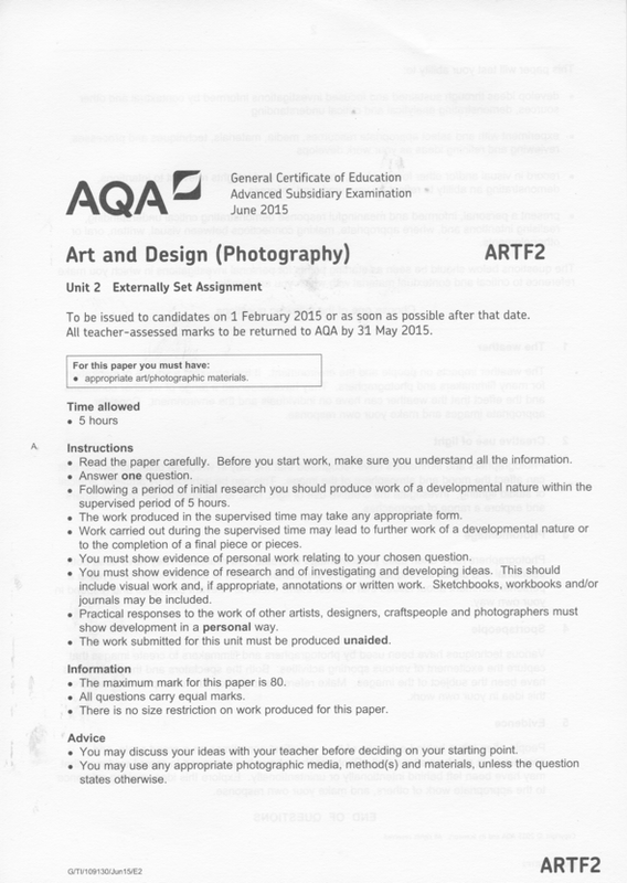
Saul Leiter is a well known American photographer who was famous in the 1950's and 60's. The photo below is the inspiration for my 2nd photo-shoot.
|
Tim Noble and Sue WebsterTim Noble and Sue Webster are a British artist duo who are well known for their images I have on the right, in the slideshow. I must admit I had never heard of these artists until my teacher Ms Gibson mentioned the names to me. After seeing their images I instantly became interested in this idea. The concept of this is great because the 2 took rubbish, stuff that nobody wanted and they turned it into fake shadows of people and fake skylines. These 2 called this pieces of art 'Shadow Sculptures'.
|
Annotated images
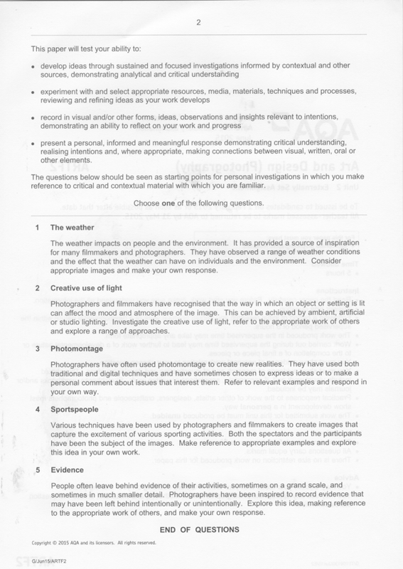
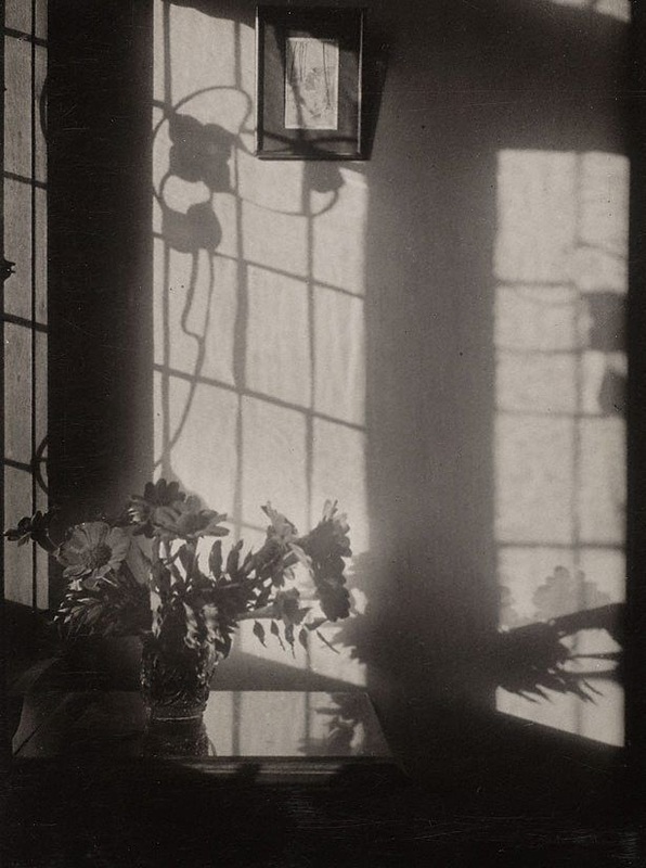
This is my favourite image that Saul Leiter took. The first thing I like about this image is the composition. If we refer to the rule of third [red lines]. We can see the window at the top is intended to be part of the composition of the image. We can also see that the sun glare on the chair is supposed to be part of the composition. The second thing I like about this image is the shadow on the window. If you look just above the bottom 1/3, in between the 2 middles line. You will realise on a window a reflection. This has been created by the light rebounding on the subjects face. This shows a good creative use of the lighting.
|
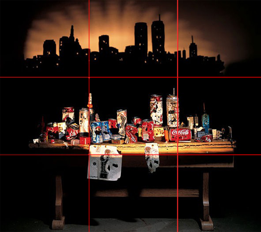
This is my favourite photo by Tim Noble and Sue Webster. The first thing I like this image is fun idea of the picture. The reason why I like that is because this image looks like it was really fun to make. The 2nd thing I like about this image is the fact that it includes the sculpture in it as well. I like this because it is showing us that this isn't a real picture.
|
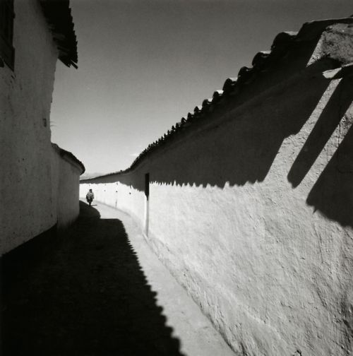
Other photographers I looked at in this course is Paul Strand, Otto Umbehr, William Kentridge, Gregory Crewdson, James Casebere and Minor White.
Below is a Popplet board that I made to help me generate idea for what I can do during this Unit.
#1st Photo-shoot: Man made shadows
|
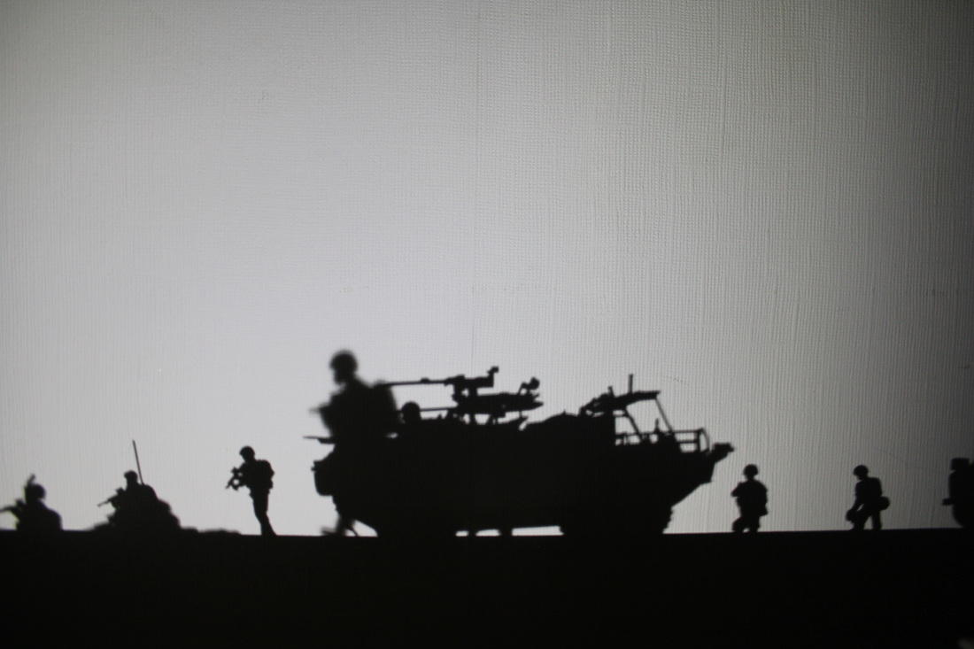
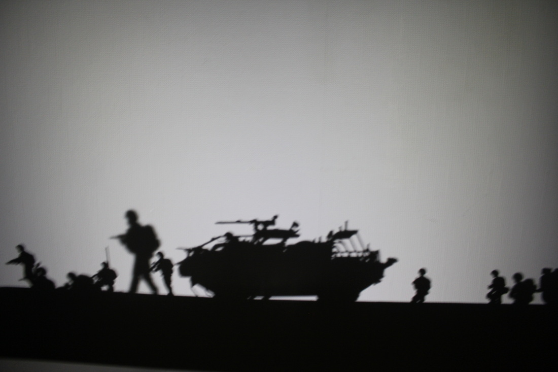
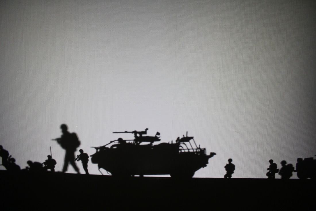
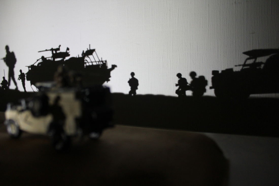
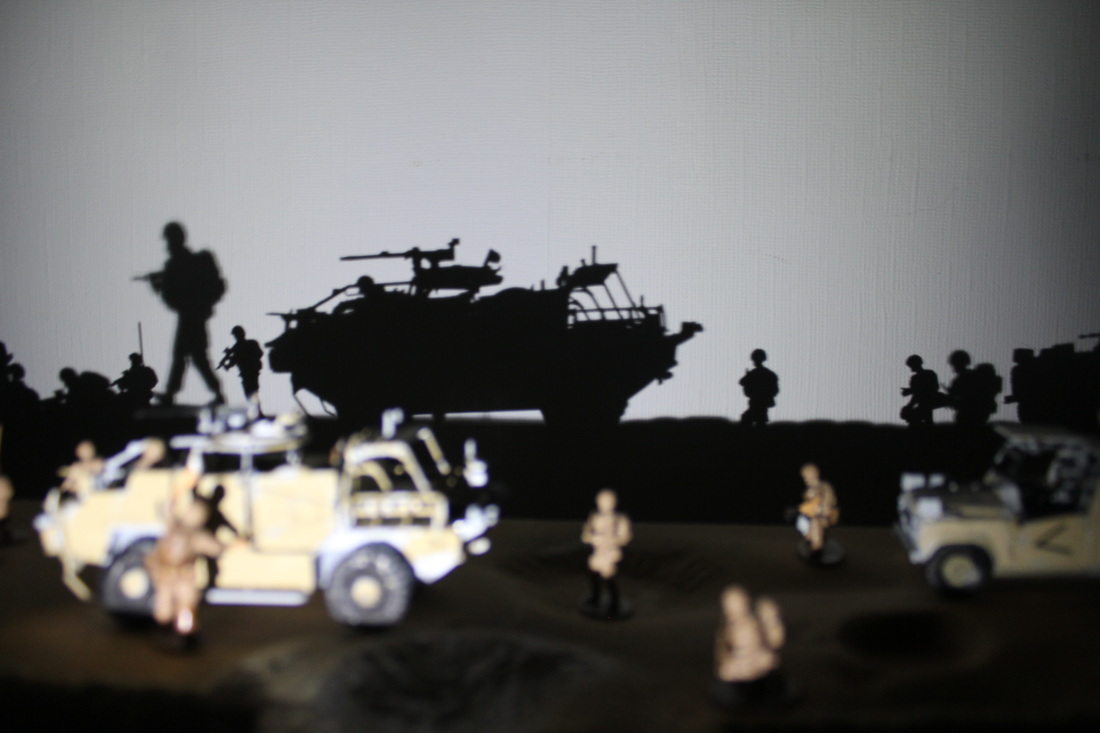
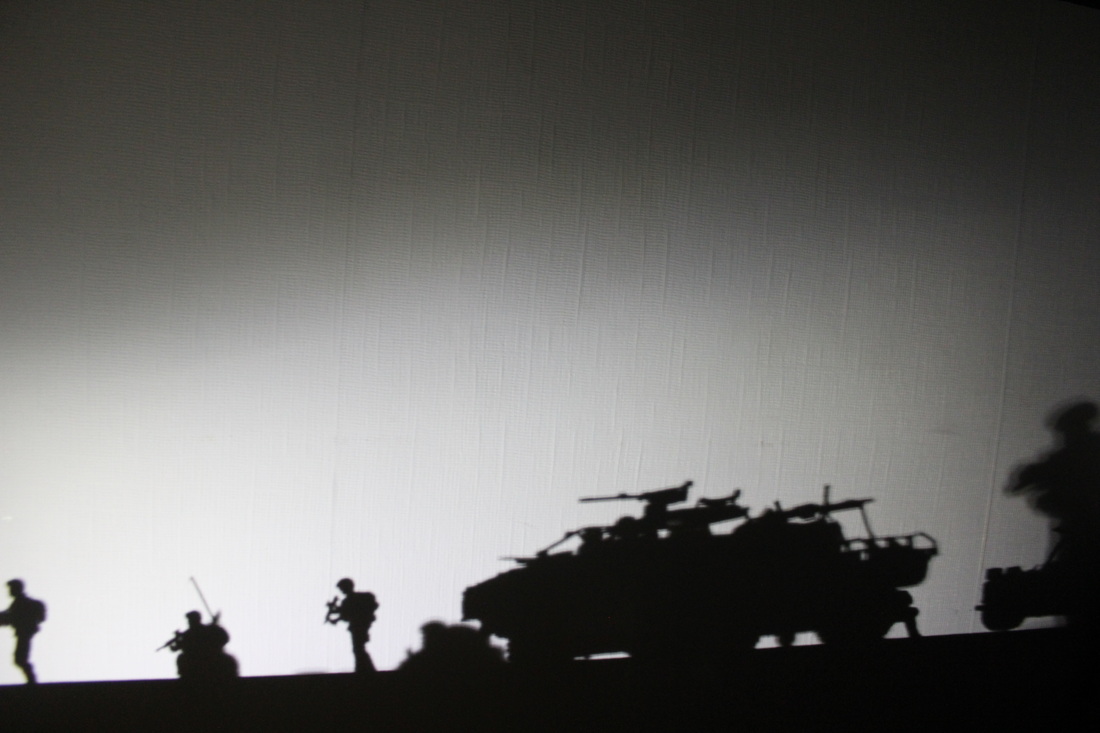
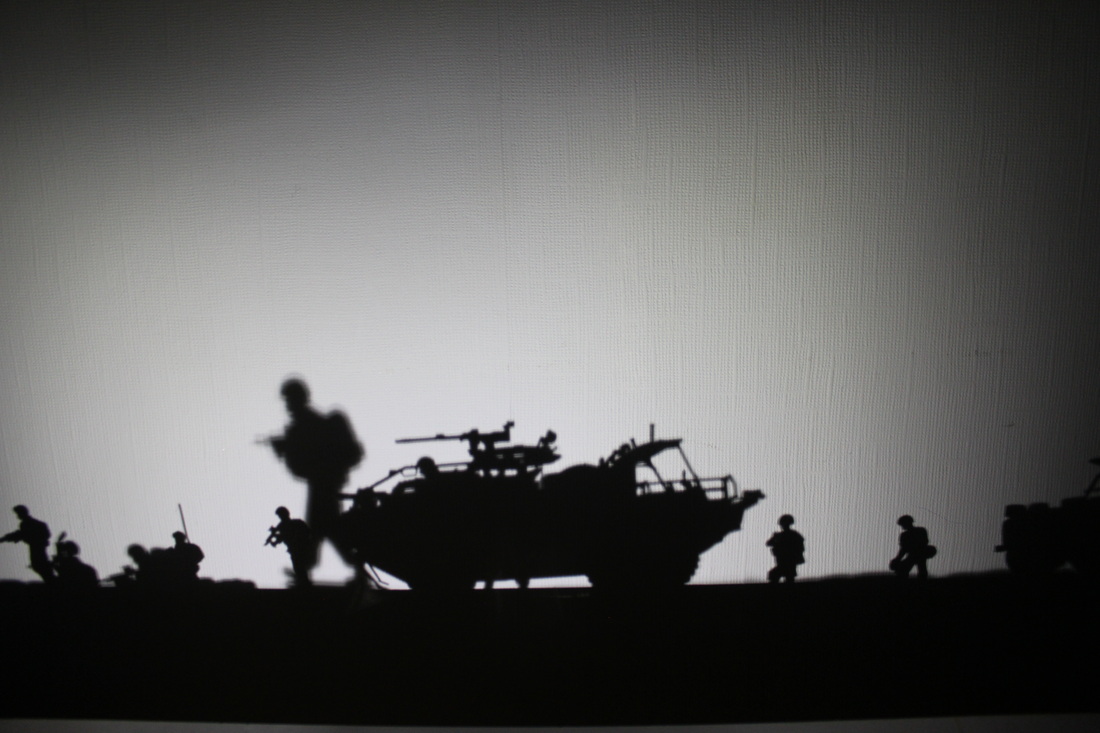
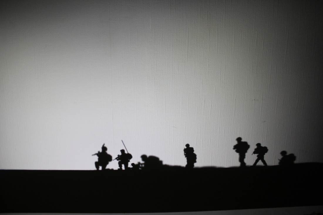
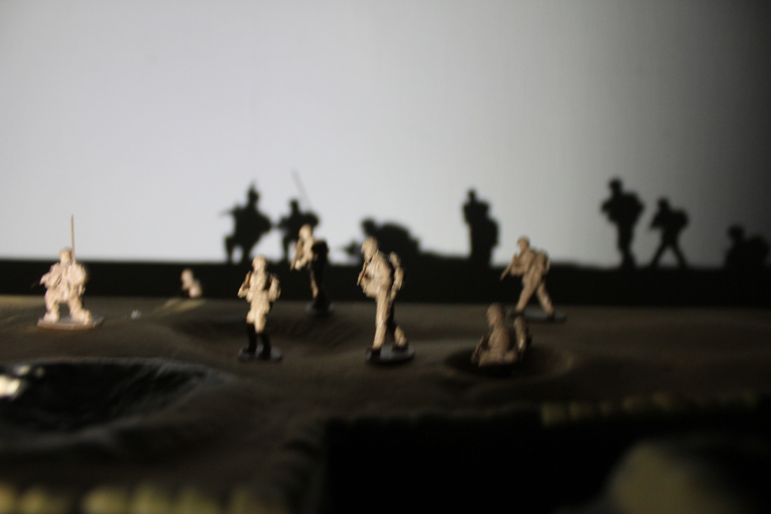
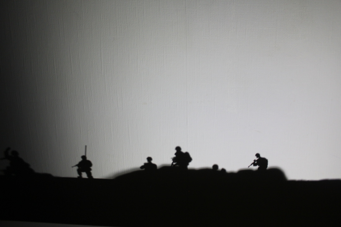
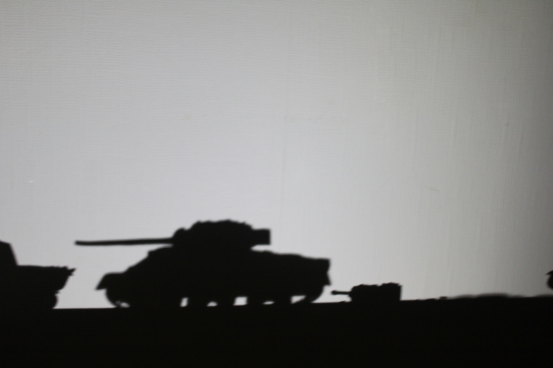
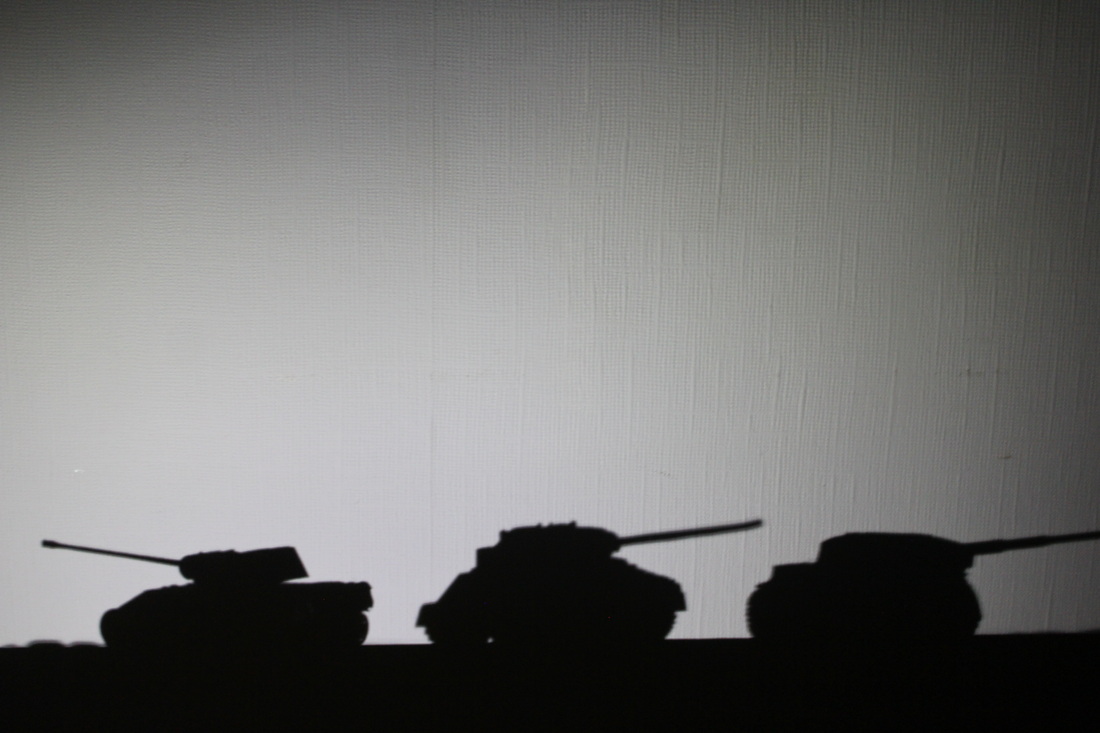
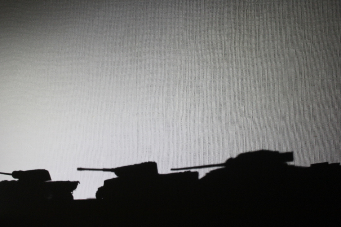
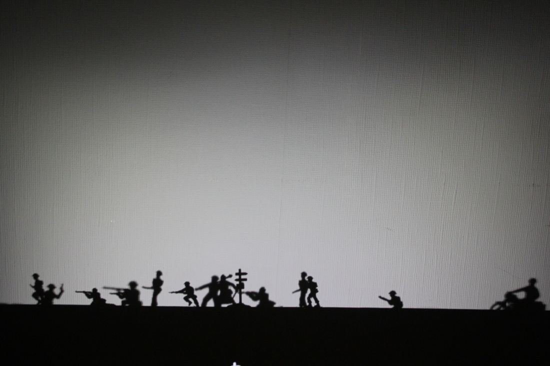
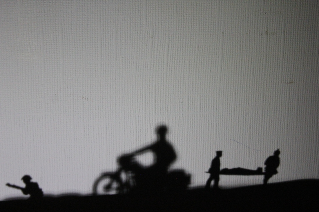
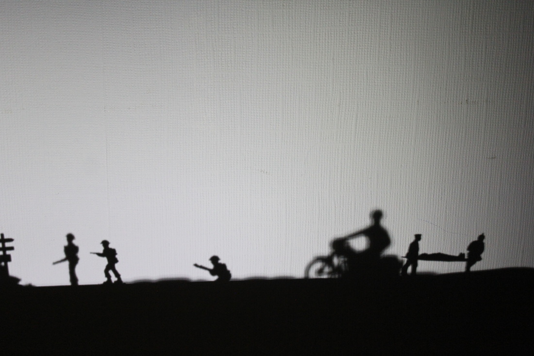
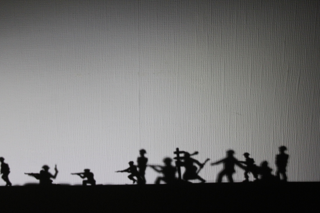
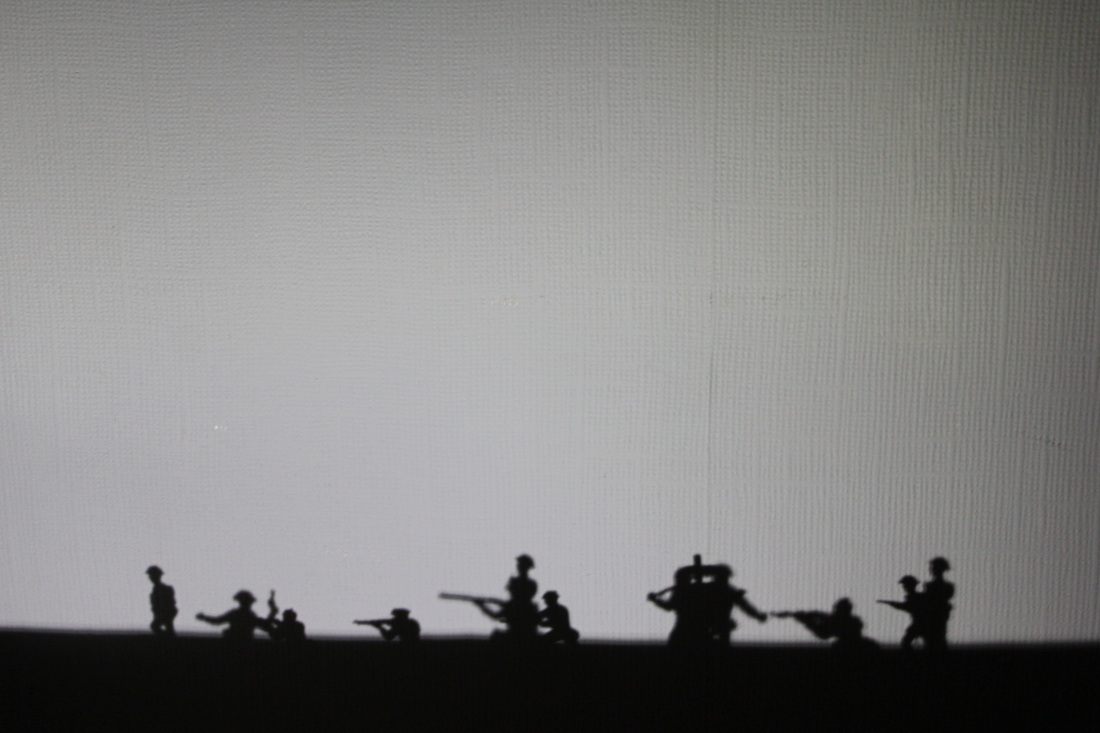
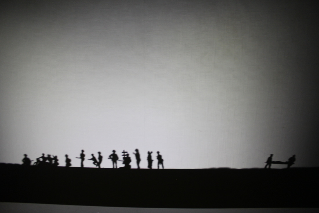
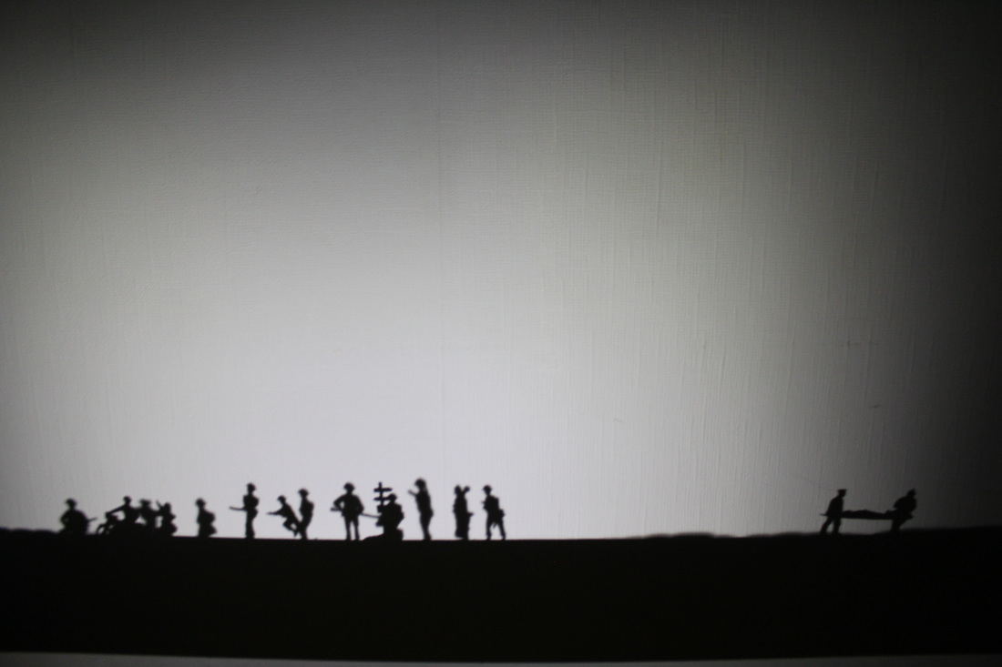
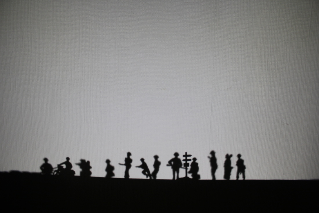
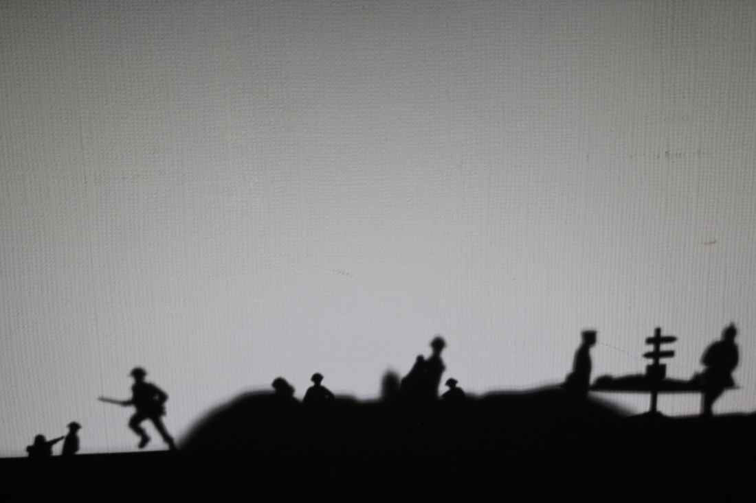
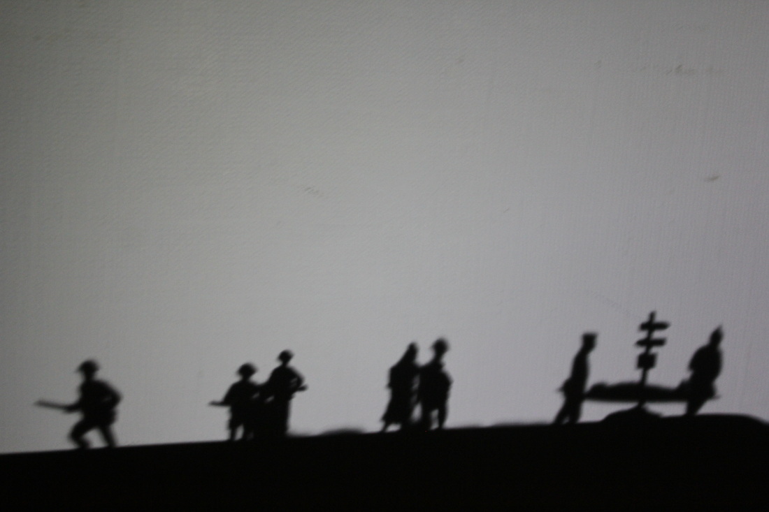
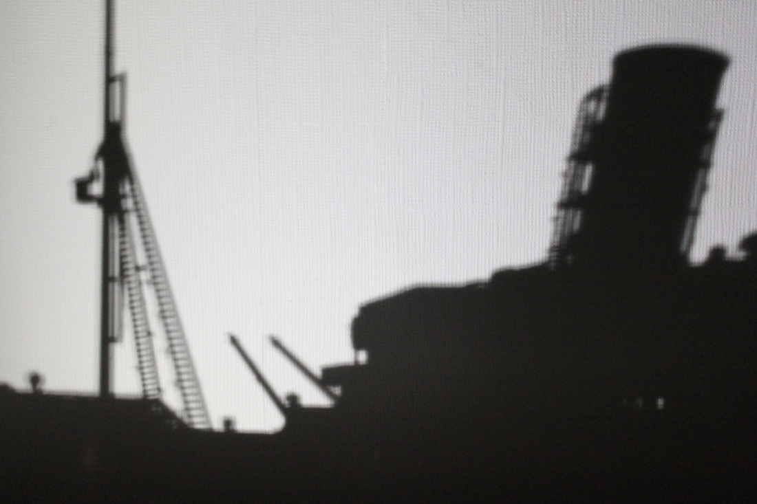
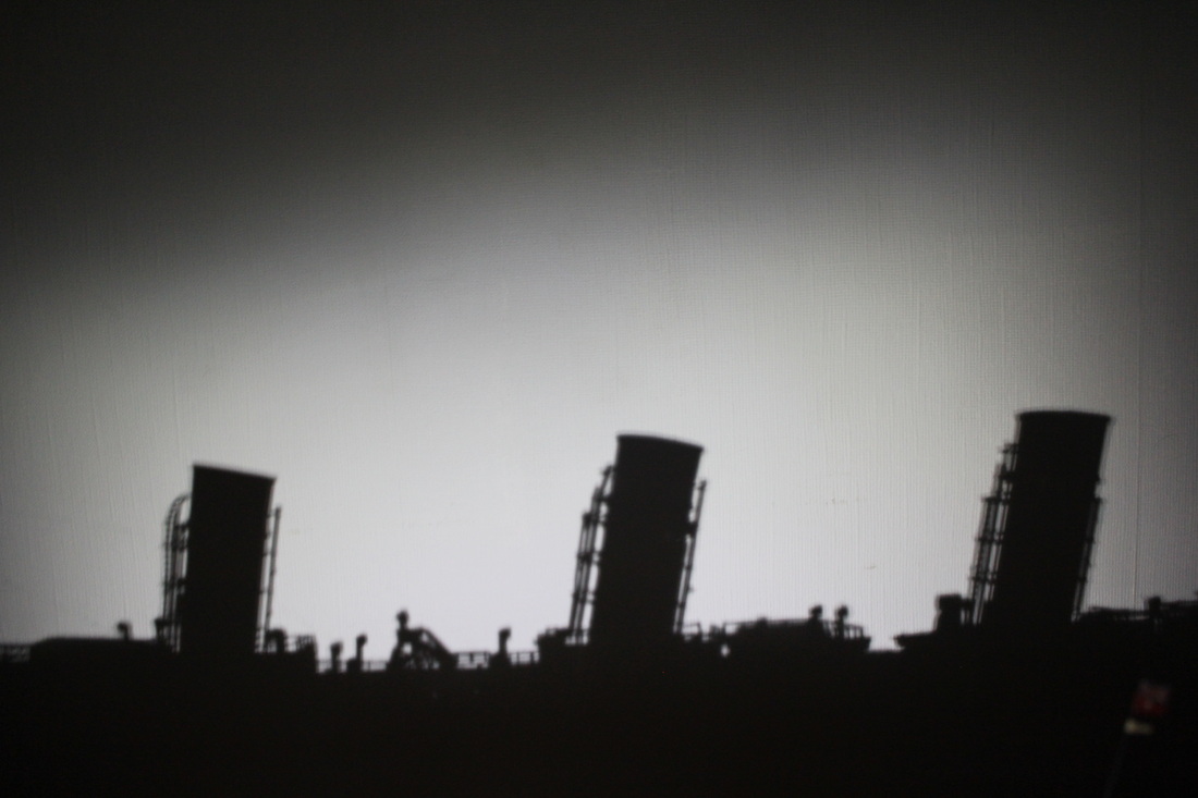
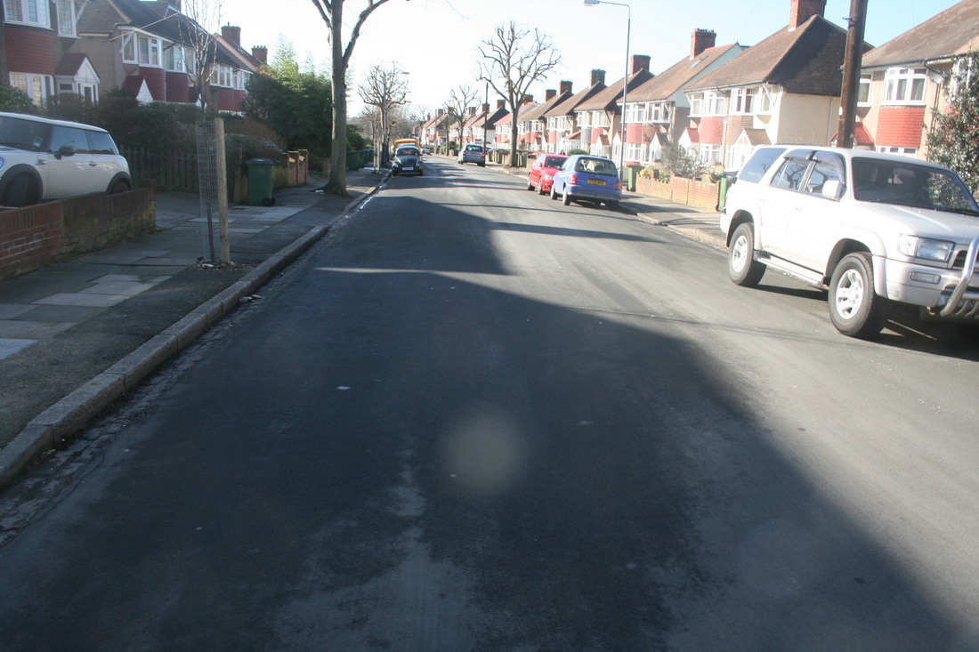
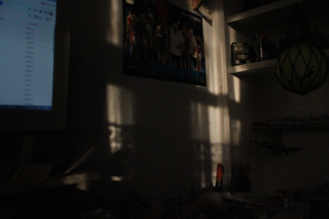
My first photoshoot is going to be similar to photos I got in GCSE Photography. On the right are photos that I got for my Abstraction unit. The idea of these photos was using a torch on my phone to produce shadows from my Airfix dioramas. Whilst I had the phone presenting the shadows I was taking the photos with my Canon 550D. The idea for the photos came around because of the anniversary of WW1 coming up when I took them [around March 2014]. So I thought of getting photos similar to what was taken during the war. Also the black shadows up against white walls, makes them look like real images from the war. The 2 images that have the brown/khaki colour are of my modern airfix. Once again the brown colours are representing where these were sent to fight [Afghanistan].
|
|
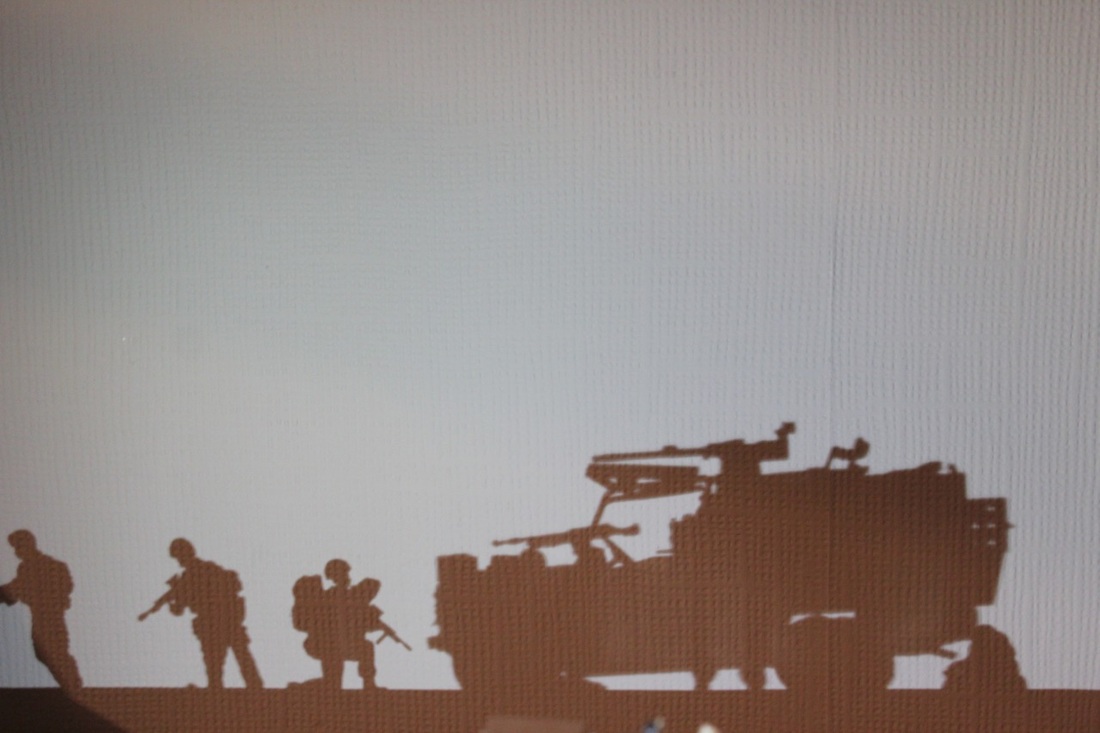
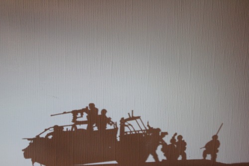
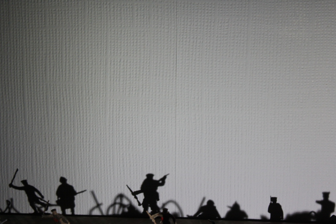
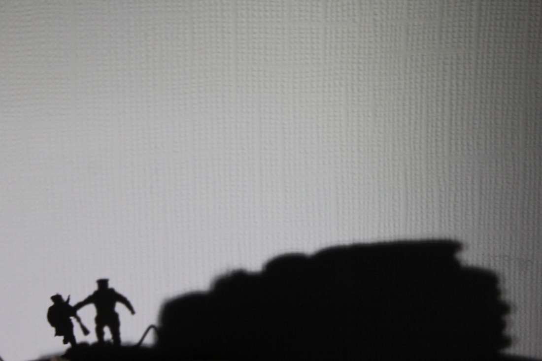
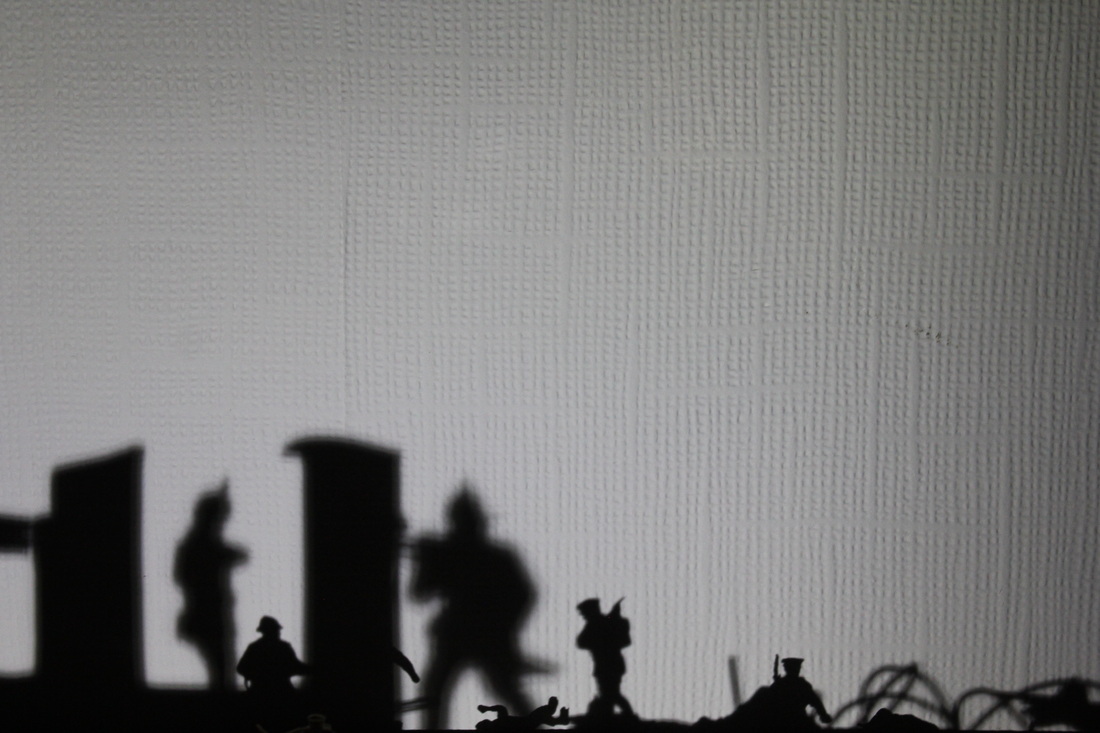
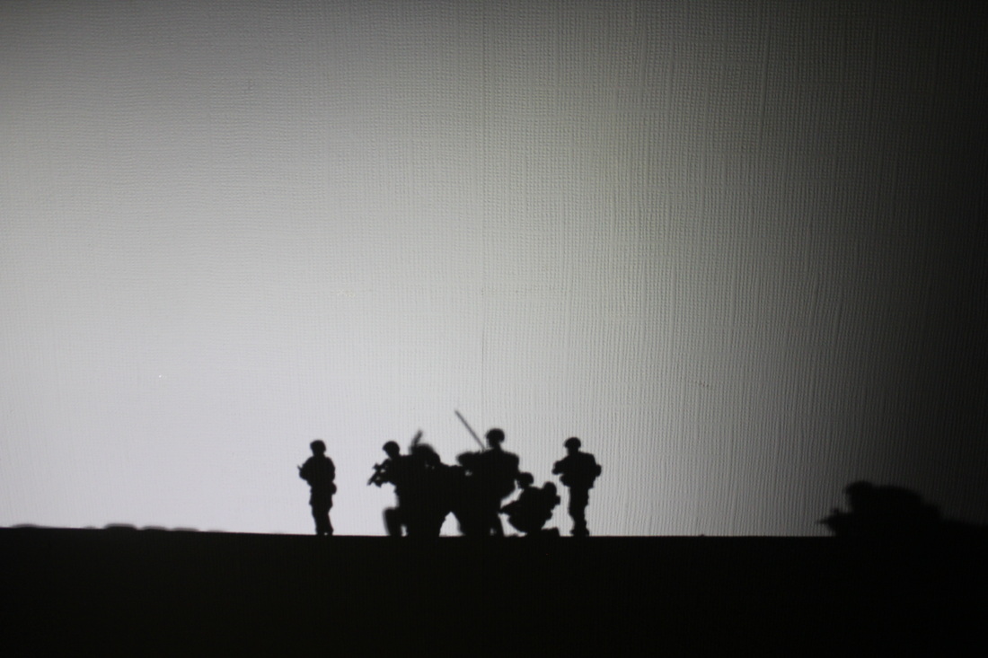
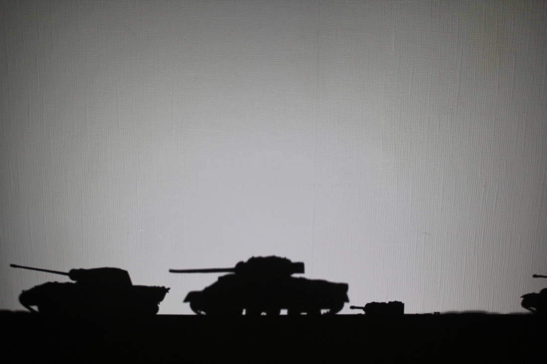
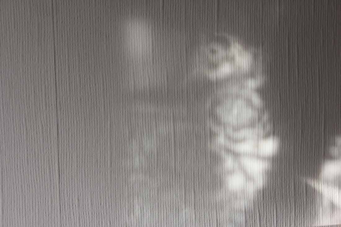
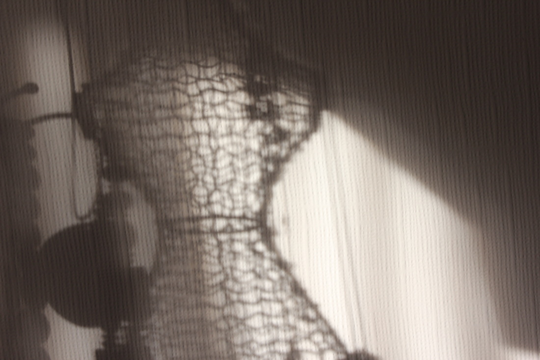
Here are the photos from my first photo-shoot. I decided to have some of the photos showing the objects of the shadow. I took this from the work of Tim Noble and Sue Webster, where they took photos of the shadows and they showed the subject, the things that made the shadow. It was very fun taking these photos because I really like the British military and I love looking at silhouette photos of British soldiers in Afghanistan. Here I'm technically doing the same, however I'm just not 'on-location'. The way this link to creative use of light is because I'm creating shadows using studio lighting [my phone].

Favourite photo
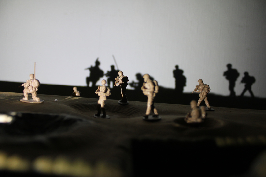
This is my favourite photo of the set. Firstly I added a rule of third to this image so you can get a sense of composition to this image. The first I like about this image is the way I have positioned the lighting. I have positioned the light in front of the army Land Rover, soldiers and Jackal. However I took the image from the side, at a 45 degrees angle off of the Rover. The lights are also slightly below the vehicle and this increases the size of the shadow. The size of the shadow increases the illusion that we are looking at a real silhouette image. The second thing I like about this image is the sense of scale to the image. You get a sense of scale because we have a soldier on the far left of the image who is larger than the Jackal, despite the fact the vehicle is bigger in real life. This shows you how I have laid out the figures in a specific line to look like a platoon moving. If we refer to the rule of third, we can see that soldier on the far left is clearly one of the intended subjects. This is because it is on the line that separates the middle and the top third. There is one final thing I like about this image. You will realise that I have included the subject in this image. The actual airfix car that has created the shadow. I really like in on how this is out of focus, when because of its bright khaki colour, you would possibly expect the car to be in focus and the shadow out of focus.
|
Least favourite photo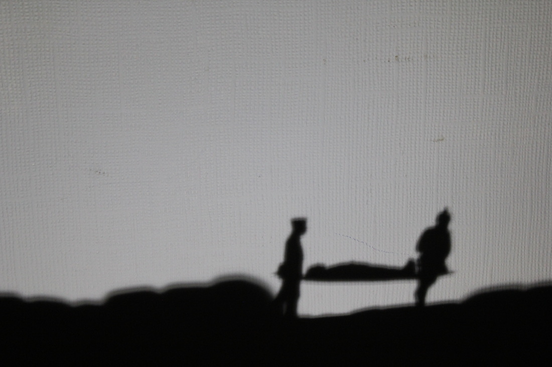
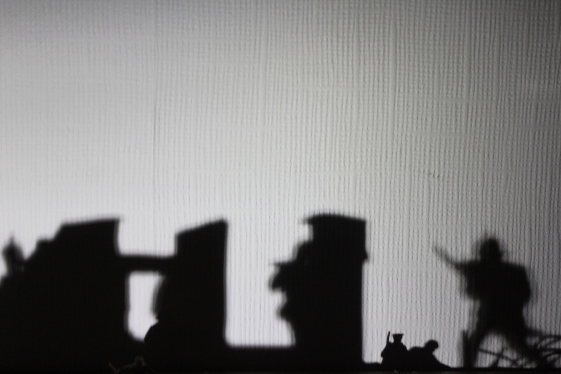
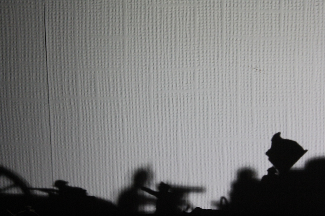
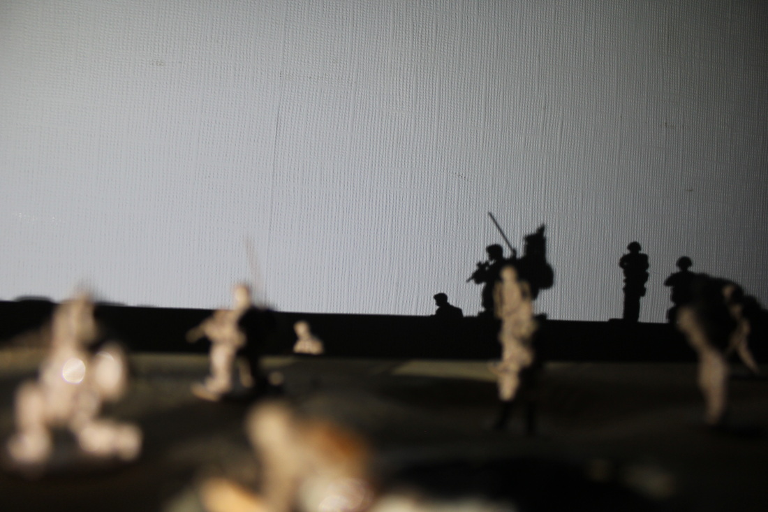
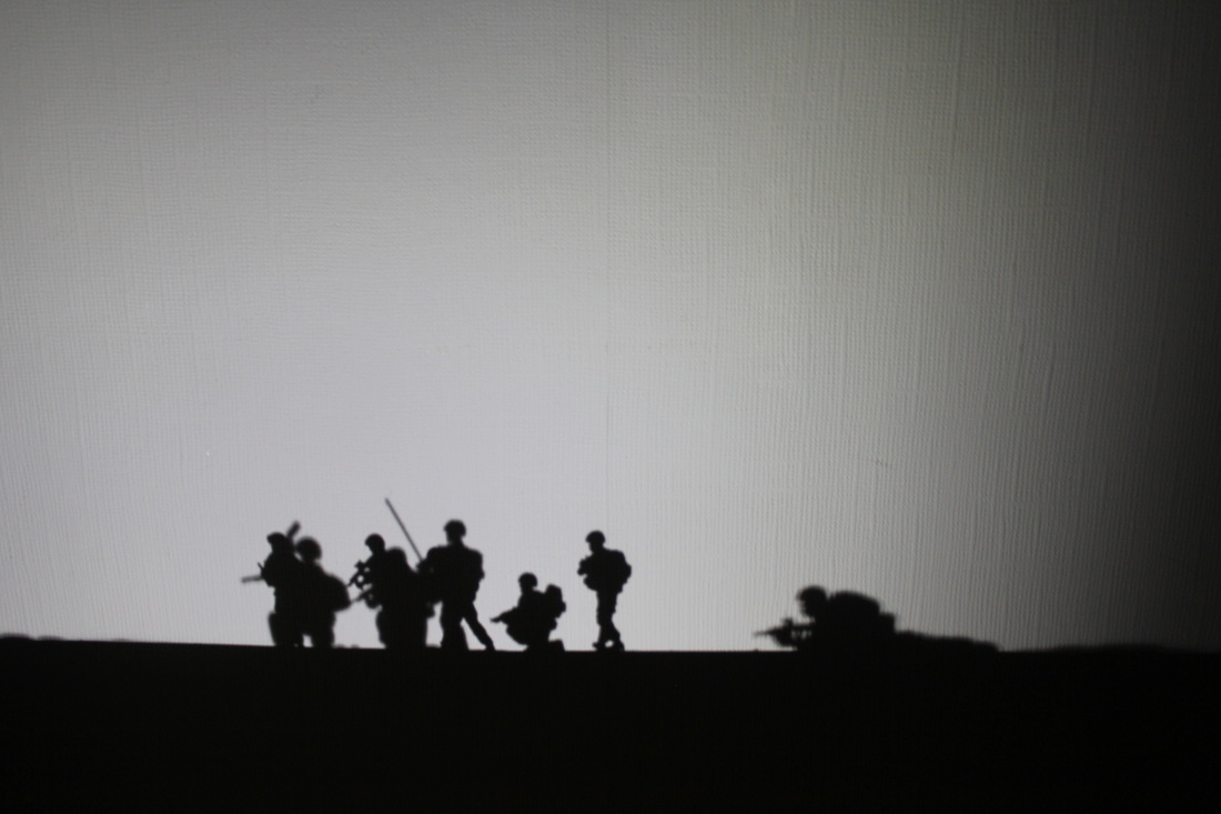
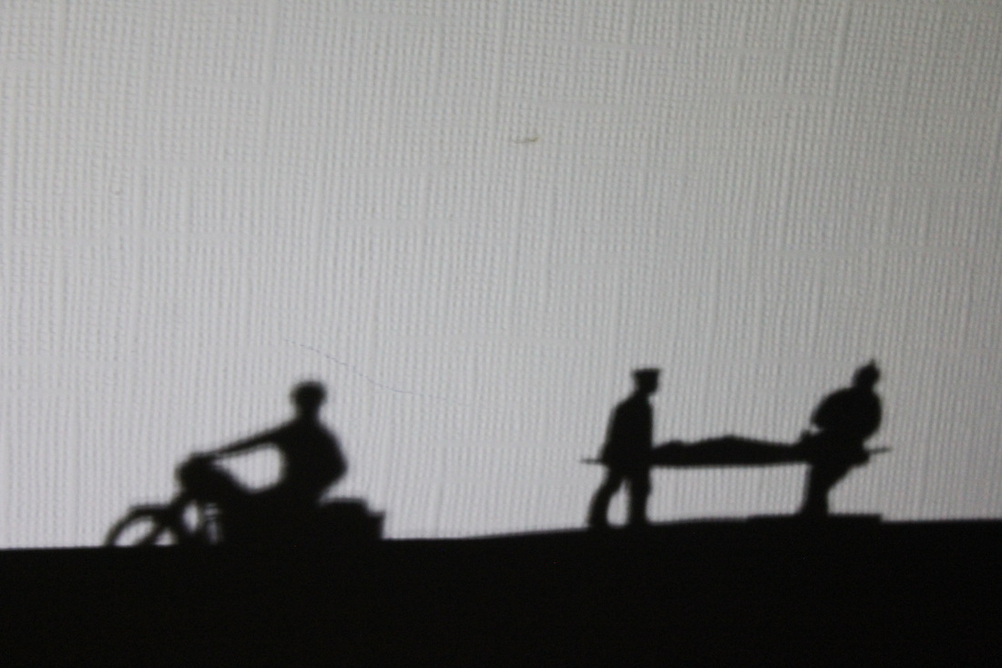
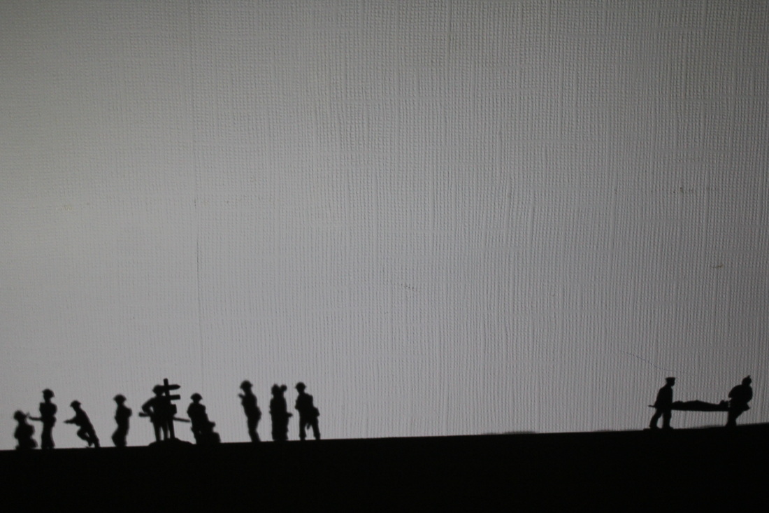
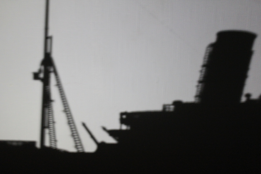
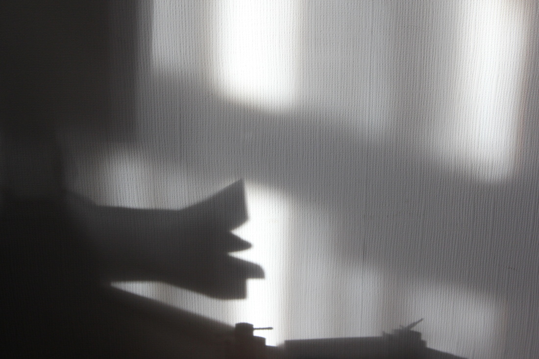
This is my least favourite photo of the set. The first obvious reason why I don't like this image is because of the blurred landscape. There are 2 possible reason to why this is blurred. The first reason is camera shake. I didn't use a flash because then I wouldn't capture the shadow. Also my camera wasn't on a tripod, so therefore there was a chance that my camera would shake. A second possible reason for this is the lighting moving. The lighting was created by a torch on my phone. So I was holding the torch in my left hand and the camera in my right hand. So there was always the chance that my camera could shake. This is really frustrating because this could of been a great image because of the mountainous landscape created by the airfix trenches I had. Also the presence of 2 stretcher bearers. Really make this look like an image that would of been captured on the Western Front during WW1. However despite the good potential of this photo, I feel this one was a little bit empty. I think this image could of been better, if I had a bunch of soldiers around the stretcher bearer, heading in the different direction.
|
#2nd Photo-shoot: Silhouettes
This is my second photo-shoot. The idea of this came from a photo that Saul Leiter photo at the top. The idea of this was to make silhouettes around the light source, the outside. As you can see the centre of the image is coloured and the outside is black. The silhouette. I believe these photos link to creative use of light because I'm using the light to create a silhouette effect. The only problem I had with these images was that I took these images with my phone. So therefore the image will only be 8 megapixels. This means they won't be very big. So the next time I attempt this idea I'm going to take these images with a DSLR rather than a phone.

Favourite Image
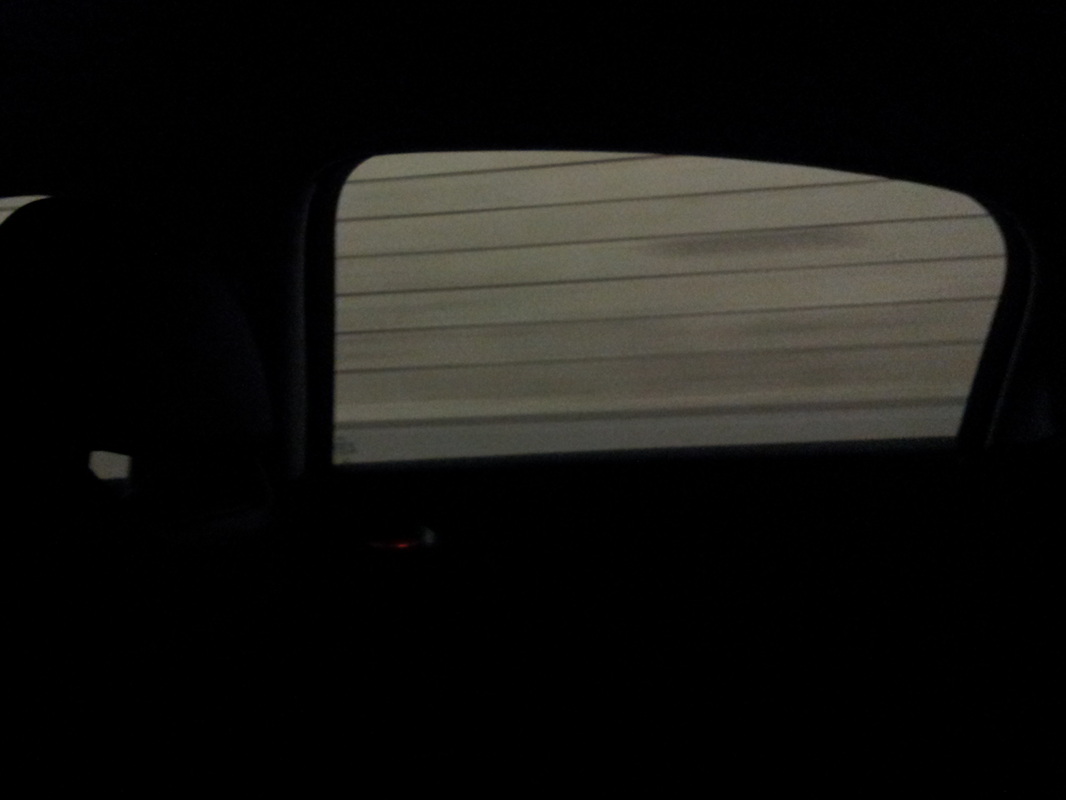
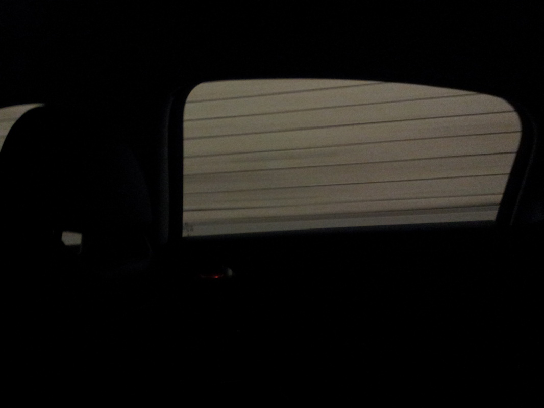
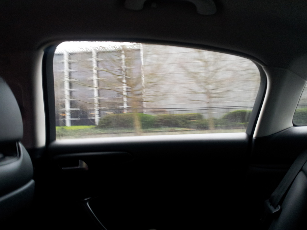
This is my favourite image from the most recent photo-shoot. The first thing I like about this image is the silhouette effect. This effect has been added by the light being picked up from the outside of the car. Because they have picked the light from outside, the light inside the car is just turned into black. This aspect shows me that I'm playing with the light available. The 2nd thing I like about this image is the out of focus lines. It is good that the lines are out-of-focus because it gives the viewer a sense of motion, makes them feel like they are on the move. I managed to achieve this very bold silhouette because the photo was taken in a tunnel, so therefore there wasn't really much light to trap. However if this image was taken out side, the silhouette illusion wouldn't be a bold because there would be light coming in from other windows in the car, to the right, to the left and from behind me.
|
Least favourite image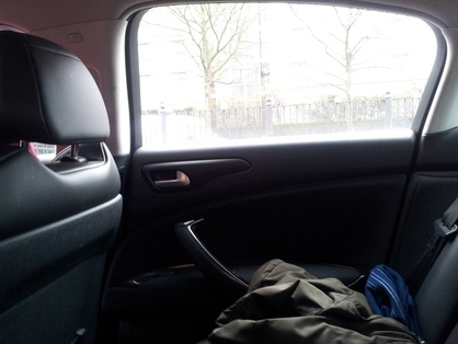
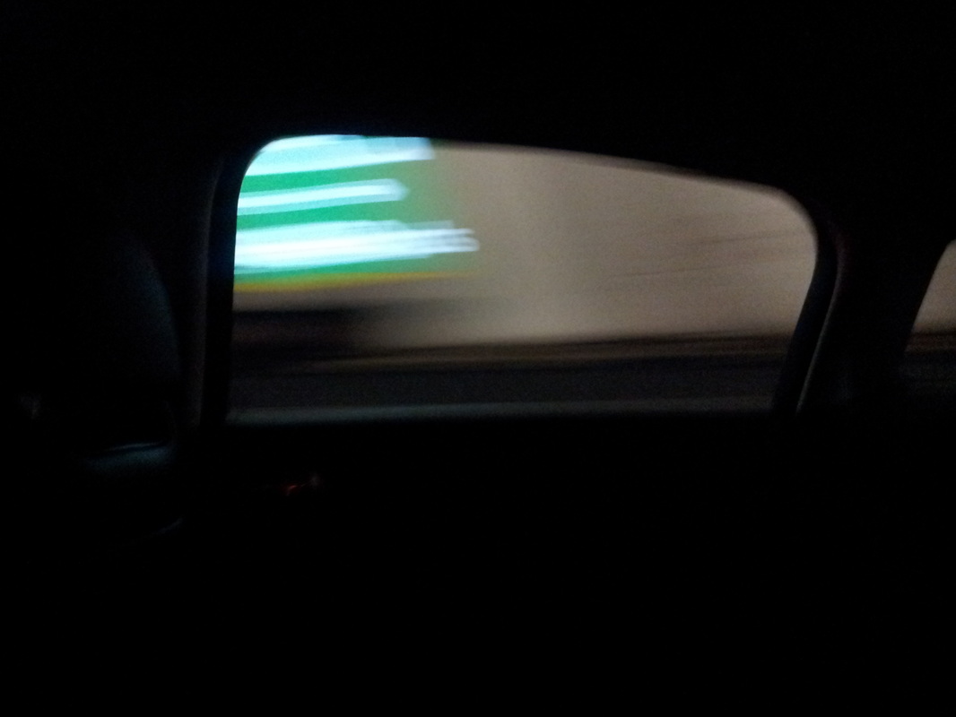
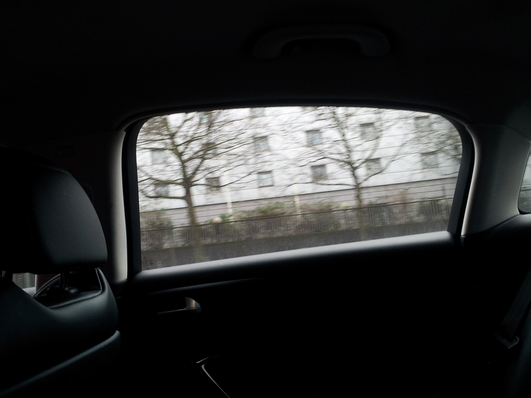
This is my least favourite image. The first thing I don't like about it is that the image is relevant to the idea. The reason why this isn't relevant is because there isn't a silhouette in the image. This has occurred because the framing of the picture is wrong. However this mistake could of turned into a positive. This is because the camera is focusing on the on the bottom of the door rather than the top half. This had led to the window turning positive [brighter]. The opposite of a silhouette. This mistake has made the lighting go around the tree branches and the fence. This shows a good effect with the bright light, however the framing of the image is the main reason why I don't like it.
|
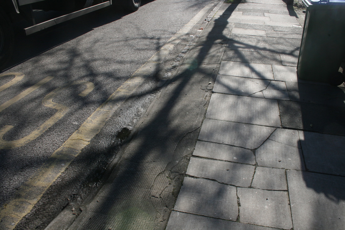
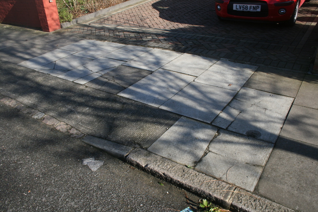
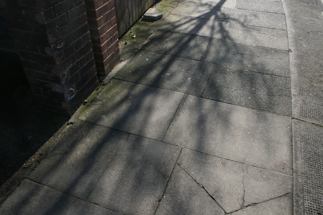
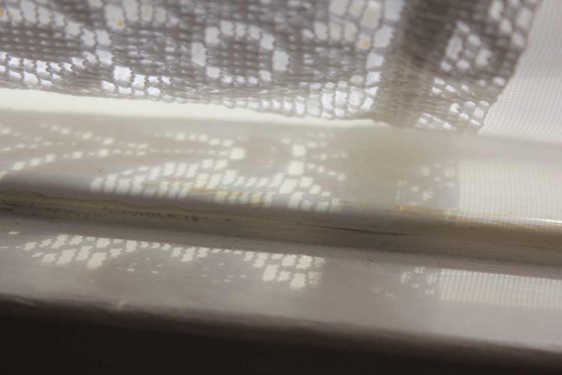
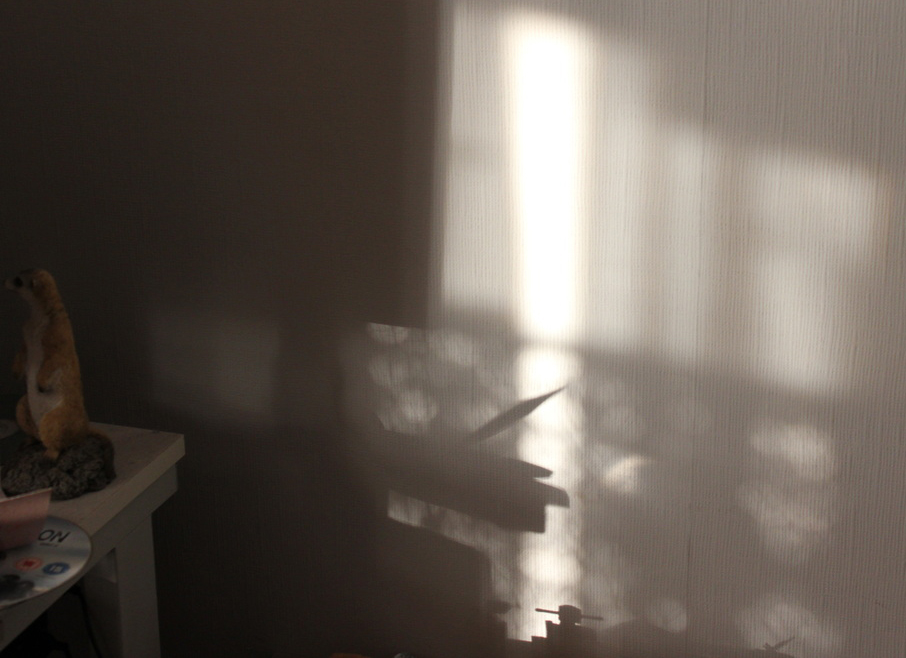
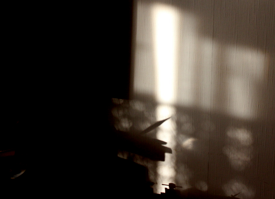
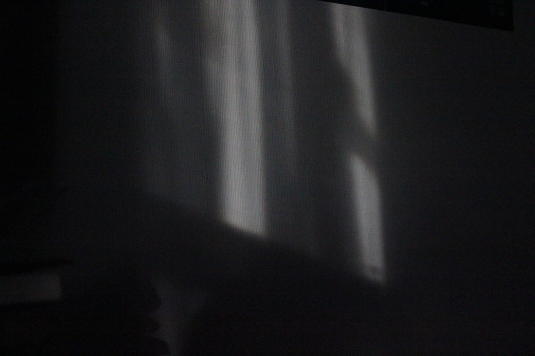
#3rd photo-shoot: Natural made shadows
For my 3rd photo-shoot I've decided to switch to take photos of natural made shadows. I want to do this because the first 1st set of photos were of shadows that I made with a torch. The second set of photos were of silhouettes. So I thought that I've already done man-made shadows, I should now try natural shadows.
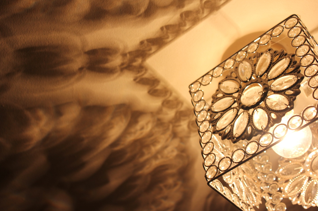
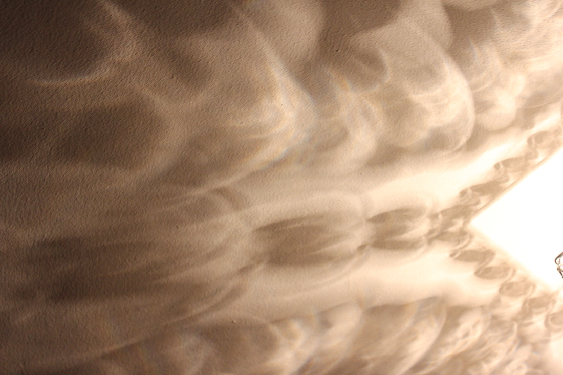
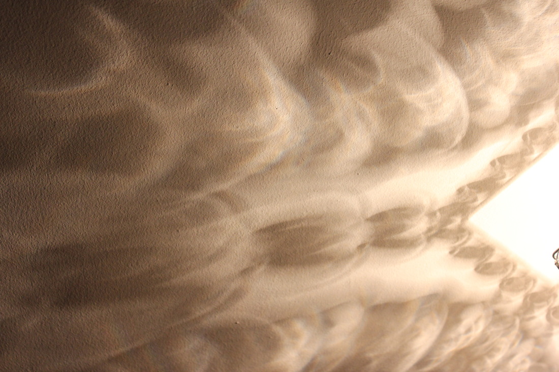
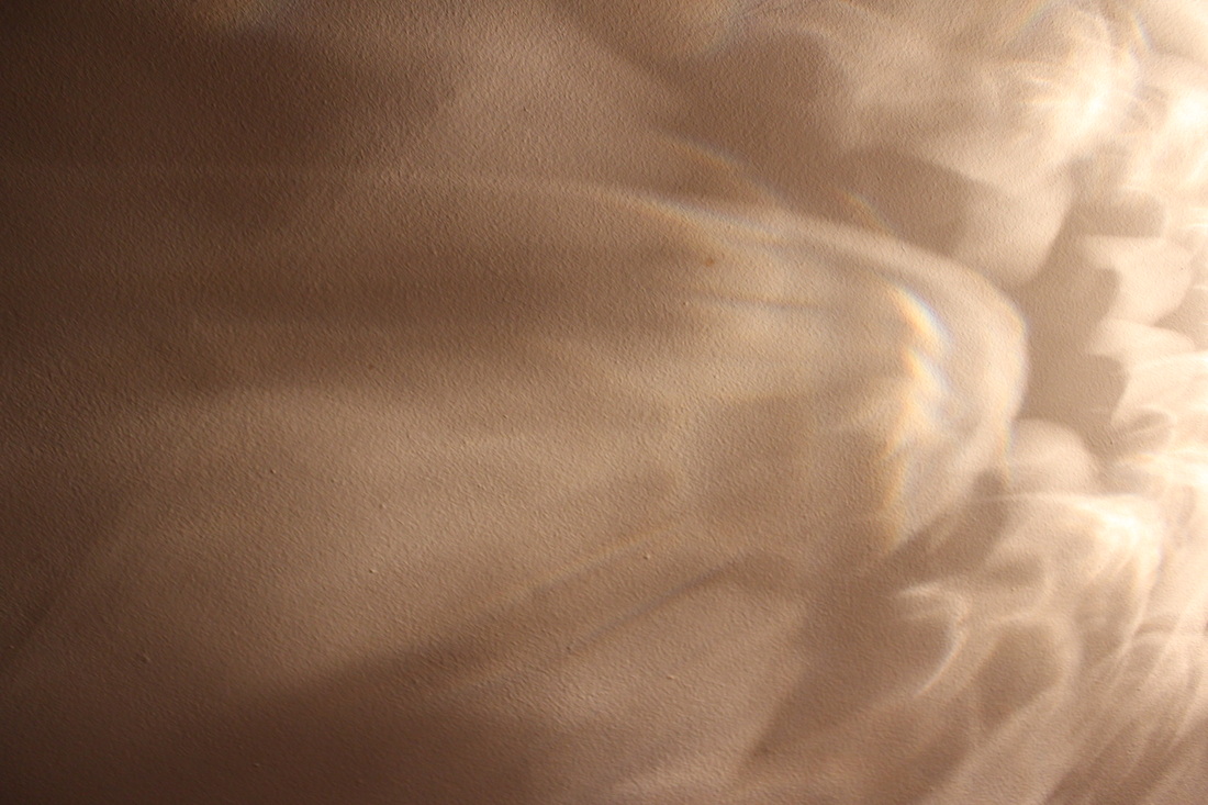
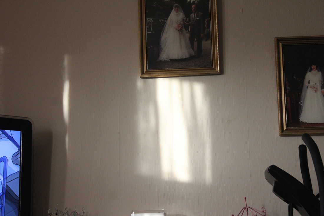
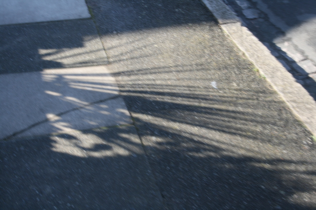
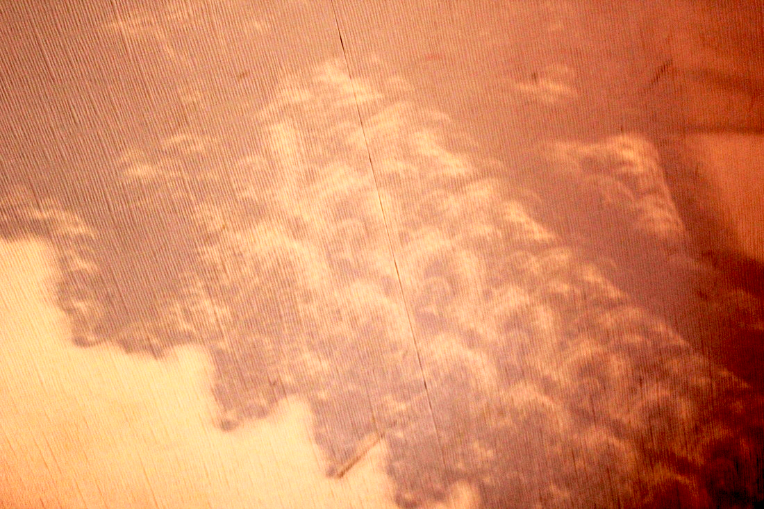
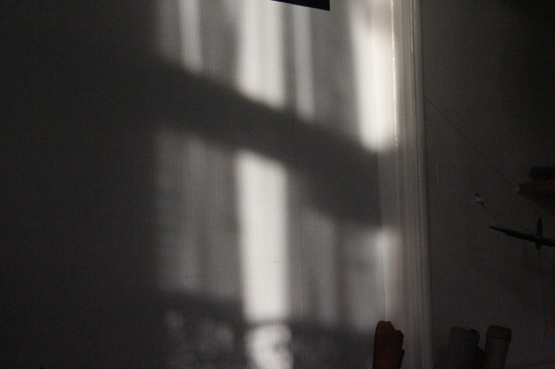
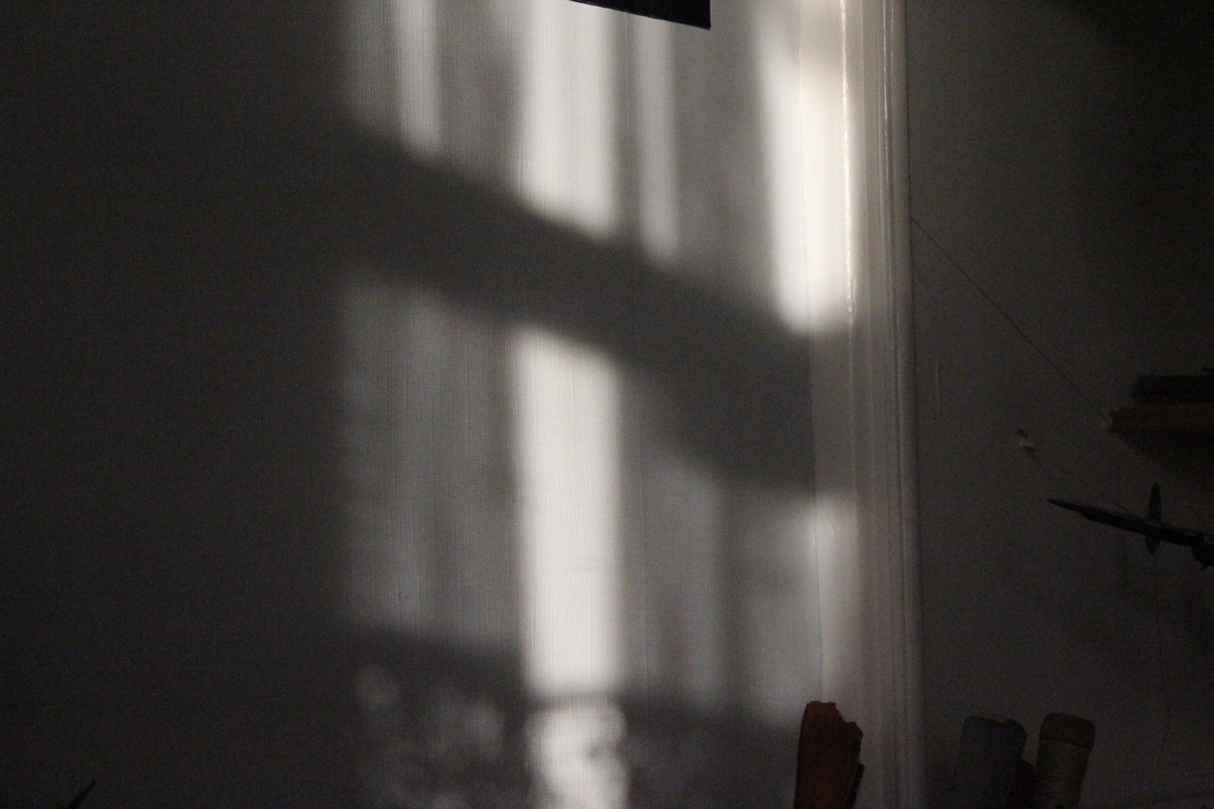
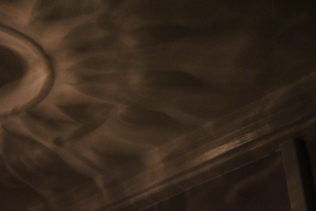
Uta BarthFor this idea I've looked at the work of Uta Barth. I've already done research on Uta Barth in my Contrast work. So I've decided to only show you Uta Barth's photos rather than research her again. Barth let light into her house and then took photos of the shadows from objects, curtains, windows etc. I intend to do this at my house. However the only problem is we live in England, and the climate in England is cold and cloudy rather than sunny. However I will keep my eyes out for sun. I believe this photo-shoot can possibly be the best one because on one side of the house I have windows with a pattern in them. So therefore I can get a very good pattern with them.
|
|
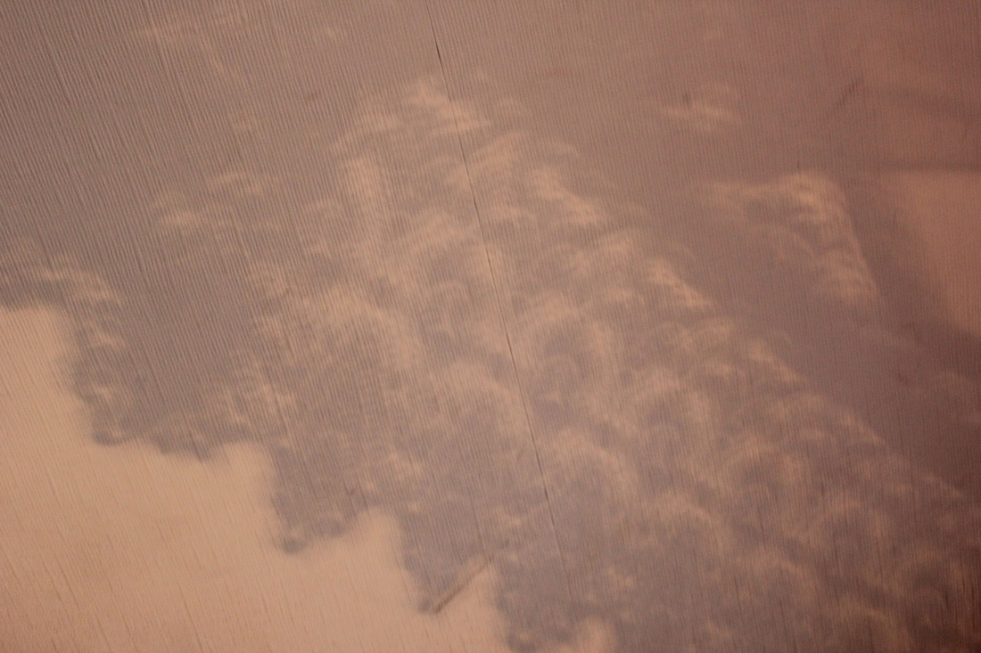

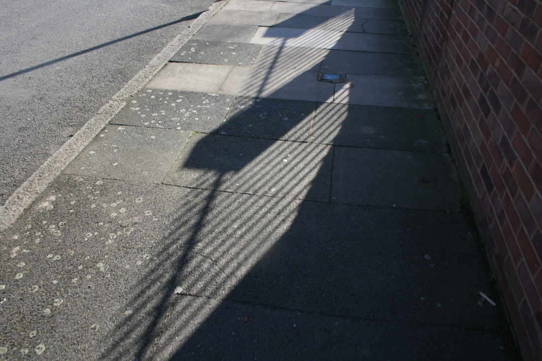
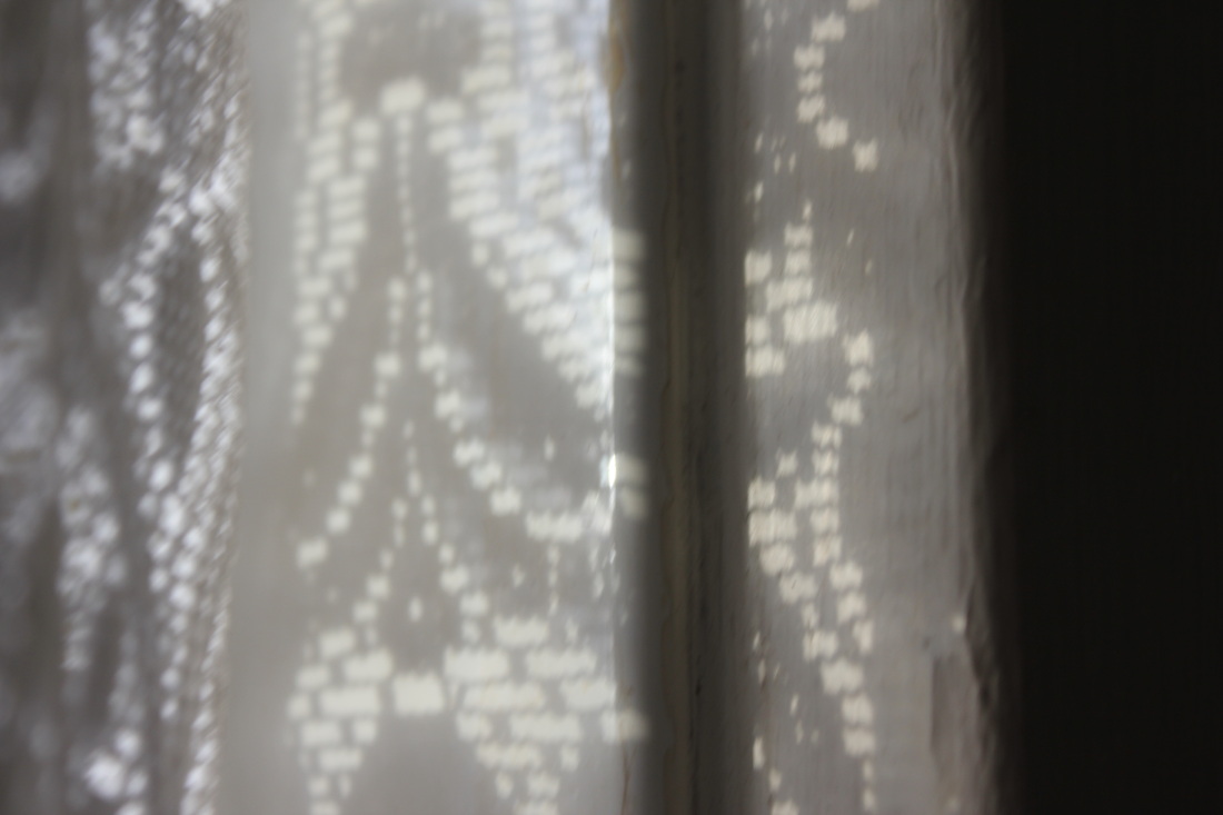
Favourite image of the set
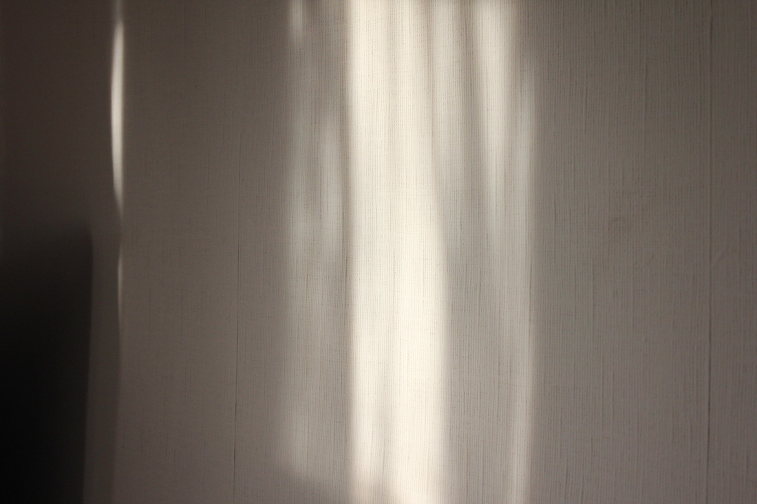
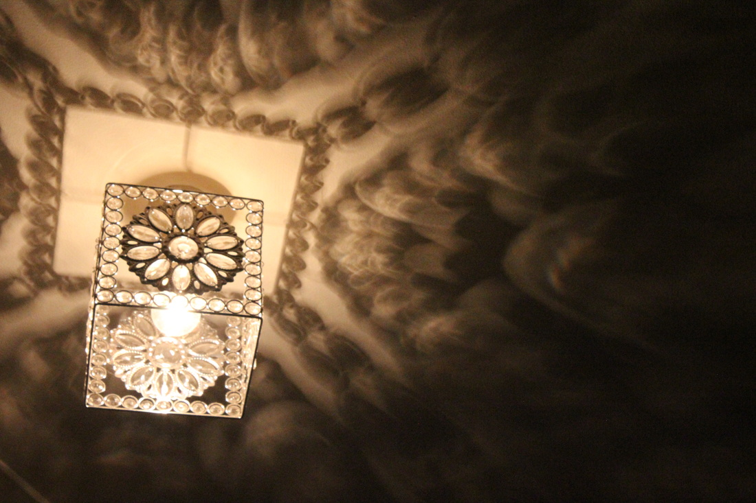
This is my favourite image of the set. The first aspect of this image that I like is the amount of light in the image. As you can see the level of light varies in this image. This is because of the glass that the light has to travel through. This is made by the glass surrounding the light source.
|
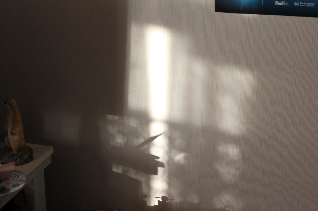
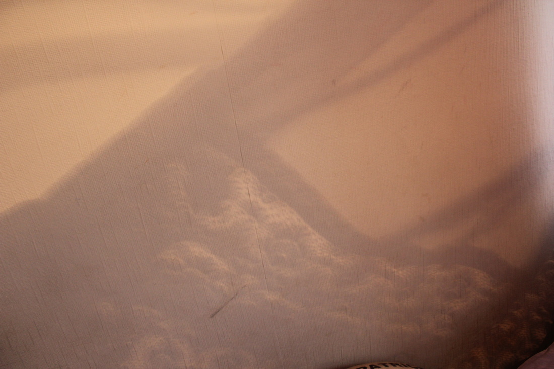
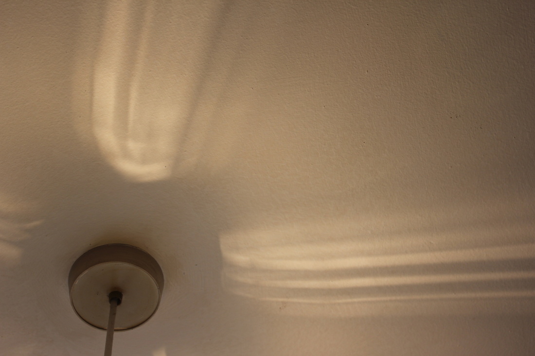
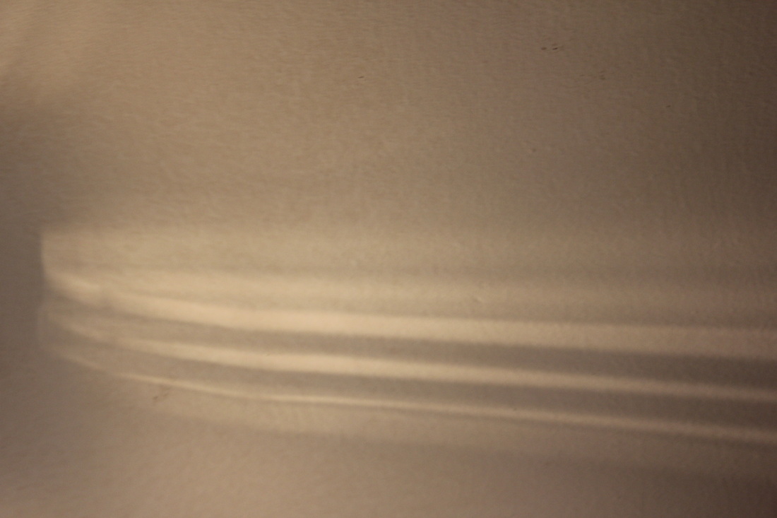
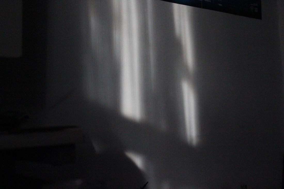
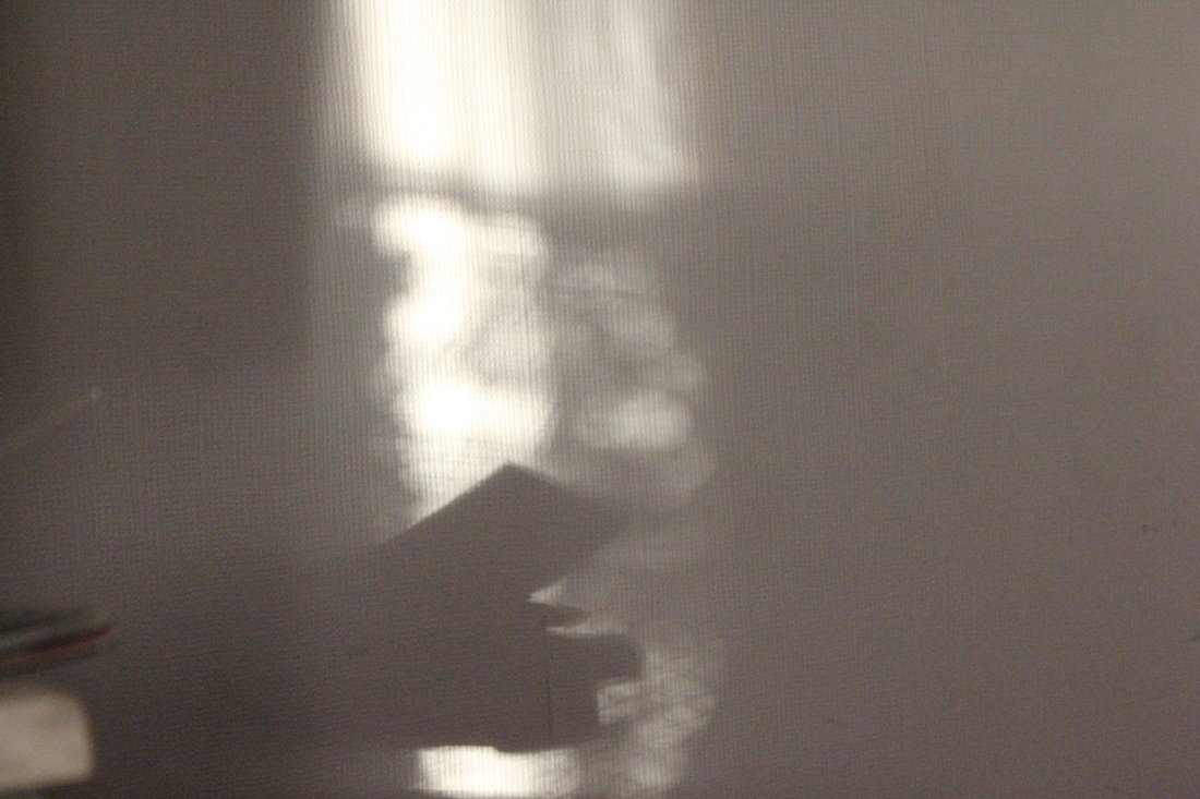
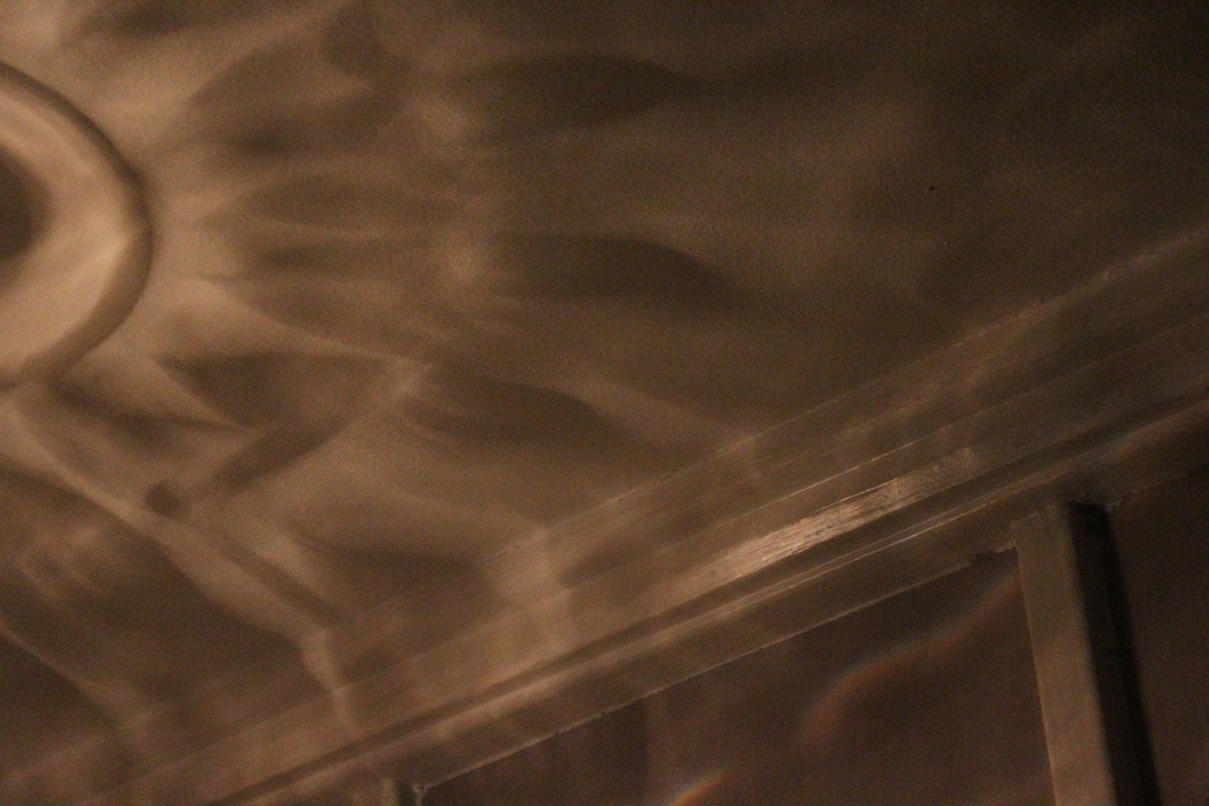
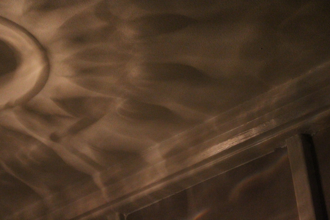
Least favourite image
This is my least favourite image of the set. The first thing I don't like about this image is the brightness of the image. It is hard to see the shadow of this image, that is probably because of the settings of the camera. I probably shot this on a ISO which would of meant that the light would of been brought in much quicker, that way the image won't be dark. As a result I was unable to capture the shadow.
The next time I attempt this idea, I will make sure this doesn't occur again. |
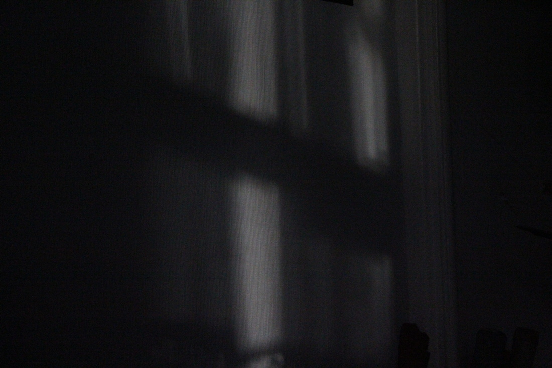
Edited photos
In the edited images above. I have focused on cropping the images down to a certain section of the image. I have done this because the shadows in most of the photos are good. However if they are in a small section of the image, it could be missed by the viewer. Therefore I have to crop the image to that certain point.
In this set of edited images. I have focused on darkening the image. I'm doing this to make the shadows stand out more. This is because the point of these photos are to make the shadows prominent. Make them more recognisable and make them stand out.
Refined and developed
I've decided to retake these images. This time though I'm going to these images with really fast shutter speeds. The reason why I'm going to do this is because in some of these images. The shadow isn't bright enough. This is because I'm using slow shutter speeds. As a result more light is let into the image. So therefore the shadow won't be dark.
So for this set I'm going to be taking these images with fast shutter speeds. Speeds of 1/3200, 1/4000 maybe. This way, less light will be let in. With less light, the darker the image will be. And the darker the image, the more distinctive the shadow will be. That is one thing that didn't happen in the previous set of images. In the previous set I could see the shadows. However they weren't that dark. I had to edit some of the best ones in Photoshop.
So for this set I'm going to be taking these images with fast shutter speeds. Speeds of 1/3200, 1/4000 maybe. This way, less light will be let in. With less light, the darker the image will be. And the darker the image, the more distinctive the shadow will be. That is one thing that didn't happen in the previous set of images. In the previous set I could see the shadows. However they weren't that dark. I had to edit some of the best ones in Photoshop.
Minor White, Helen Birch and Harry Callahan are the photographers that I will research. For when I refine and develop this idea. The Callahan research will hopefully help me with getting photos
This is my favourite Minor White photo that I have seen. The first thing I realised with this image is the composition. You realise that the main subject of this image, the flowers. Is in the bottom left of the image. Because this is the subject of the image. I would expect it to be in the middle of the image. However it isn't. This shows you that White isn't intending to use the composition. A bit like what John Baldesarri did. He took photos where composition wasn't important. Another important thing about this composition is the shadow in the background. It fills the entire frame.
|
This is a photo that Harry Callahan took. The main point of this photo was the shadows that came from the metal roofs. I must admit this photo is actually confusing to look at. This is because we have got shadows coming from buildings on the right and the left. I really like this aspect of the image. This feels like an optical illusion. The 2nd thing I like about this image is the composition. You will realise the shadow on the left appears to go down the middle of the image. This shows that Callahan clearly considered the composition of this image. However this could just be coincidence.
|
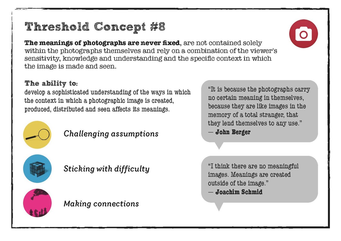
Threshold Concept Analysis
|
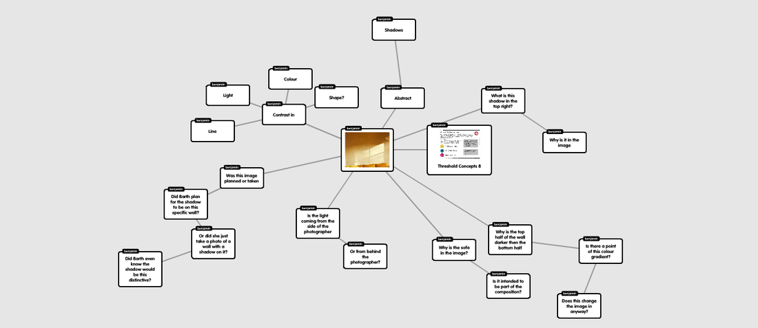
For this image. I decided to analyse it using the Threshold concept #8. This concept is "The meanings of photographs are never fixed". I took this concept in the way of what is the photo of this photo. Questions are asked like, why was this photo taken. What is the point of this image?, is there even a point of it?. To answer these questions I'm mainly looking at the composition of the image. What is included in the image.
The reason why I decided to use this concept is because I really like this idea of challenging the meaning of a photographic image. This concept is literally saying do we look at an image for a specific reason, or do we look at it because it is on a wall. |
The next thing I did for Creative use of light was take photos of Light trails. On that page, you will also see how the idea of Light trials could link to my first final piece.
The next idea I tried was photograms. In this idea I wanted to experiment with where the light came from. The specific angle of the light source.
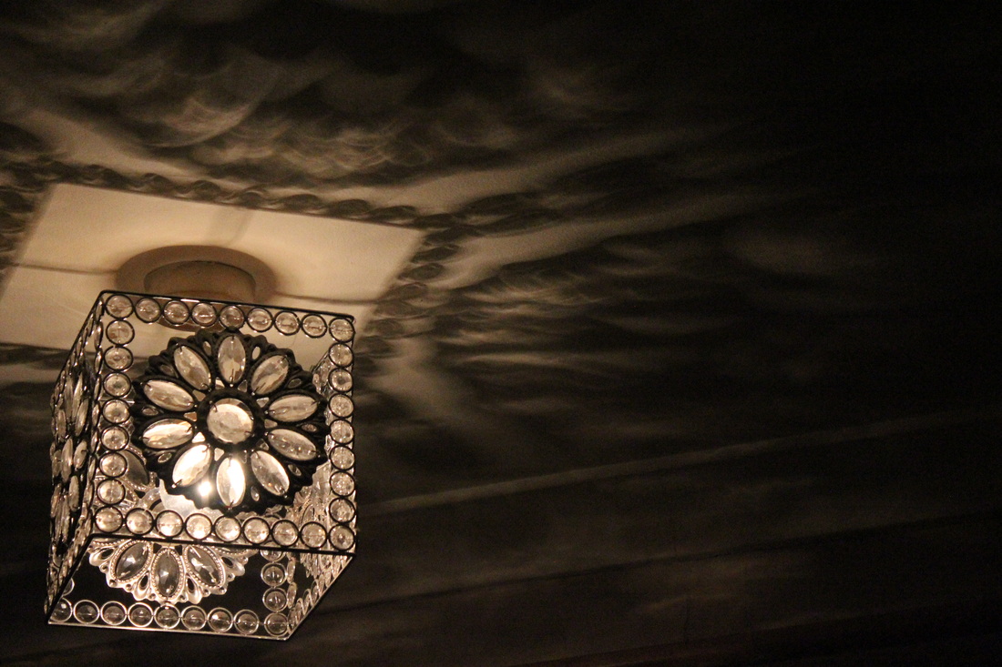
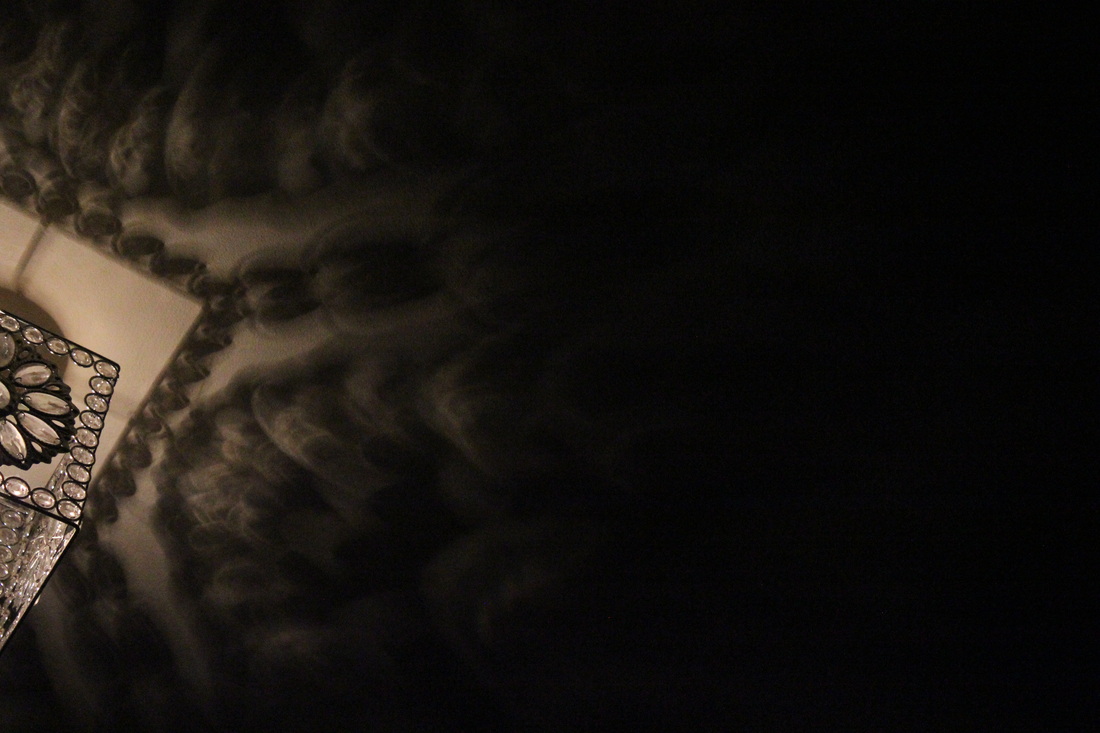
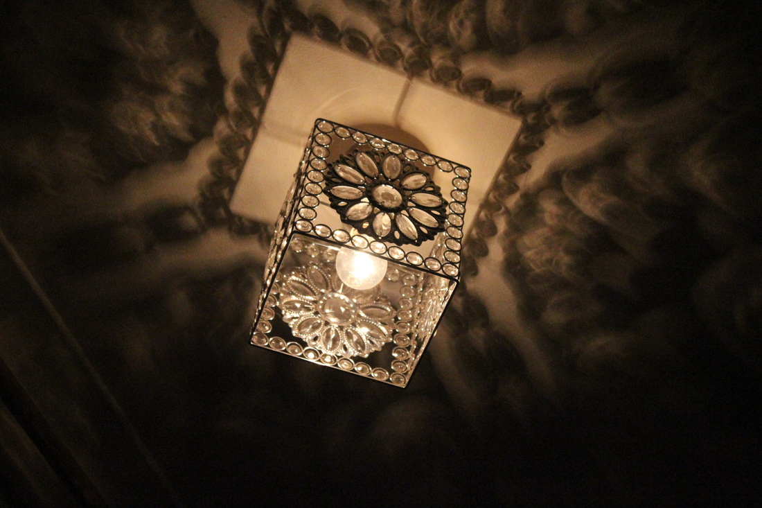
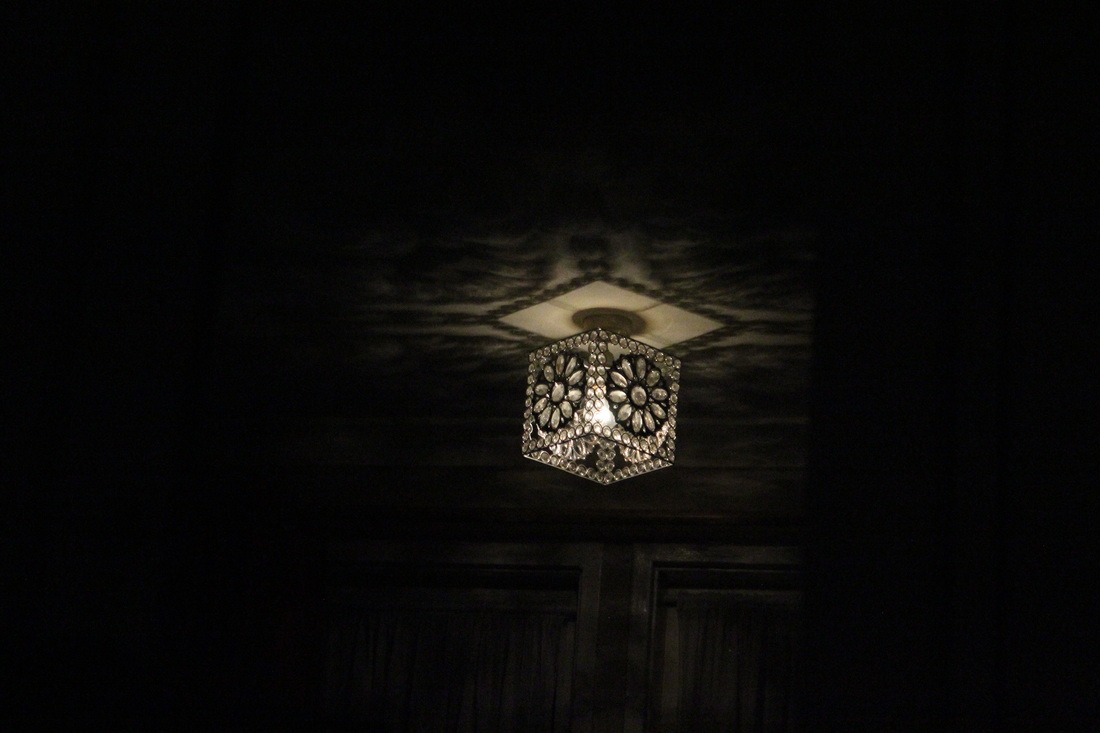
4th Photo-shoot: Night-time photograhy
Brassai
|
Brassai is a Hungarian photographer. Brassai is mainly known as a photographer who took photos of light sources in the dark. Mainly on the streets of Paris. However he also took photos in New York and other famous cities.
As you can see in the slideshow on the right, you can see he mainly uses the fog, to make the light source stand out more. Especially in image 4 and 5. Another subject Brassai took photos of was shadows of people during the night time. The way Brassai did this was take photos of people. With the photos about shadows my favourite one in the slideshow is image 10. |
Lights |
