|
|
"Patterns can be observed in nature and in the built environment. Patterns can also be present in human dress and behaviour. Diverse approaches to this theme can be seen in the work of Bernd and Hilla Becher, Paul Strand, Andreas Gursky and Hans Eijkelboom."
I decided to go with the theme of Patterns because I felt I could get the most out of it. I must admit in this exam there weren't many themes that attracted me. Peoples & Possessions seemed too tough for me. I felt Issues & Observations was one that I could very easily get wrong. We were told not to choose Water, Mixed Media and Performing Arts. So in the end there was only 3 themes left. 3 themes which I must say really did attract them to me. Dramatic Images, The Journey and Patterns. I was on the verge of picking The Journey but I believed that Patterns would be a more open topic. I also felt the Journey would be fairly repetitive.
LO1: Researching & Generating ideas
When I received the exam paper I decided to go with the theme of Patterns. The first photographer I looked at is Bernd and Hilla Becher, I really liked there typologies of the decaying German industrial industry. They would go around and photograph buildings that weren't being used anymore. Next I looked at Paul Strand with his abstract shadows. Strand tended to get photos where the subject was created by gaps in buildings and fences and other man made structures. For example this image that Strand took, he has got the abstract shadows which are being shone onto the table because the sun has gone through a fence. The next photographer that I looked at was Benoit Courti who took super close up images of live natural forms like leaves. I must say that not much work came from the Courti research because to be able to get the shots like he did I would need a proper macro lens or even a telescope to be able to get up close and personal with a leaf. After I looked at Courti I was struggling to think of other photographers to look at. However when I mentioned natural forms I was pointed in the direction of Imogen Cunningham and Karl Blossfeldt. At first I looked at Blossfeldt because I was very aware of Cunningham already from both AS and GCSE photography. Karl Blossfeldt took extreme close up macro shots of natural forms which often made me question the existence of the subject. For around half of the images I said to myself is that real, that has got to be a sculpture. Blossfeldts work inspired me to get close up photos of natural forms which was later on lead to the majority of my responses.
There was some photographers that I researched which never lead to any photo-shoots. Firstly I looked at the work of Hans Eijkelboom who is another typologist photographer. I really liked his work where he wanted to show a pattern between the clothes that people wear, whether their Rolling Stones fans, carrying a shopping bag or if their wearing a yellow jacket. I did plan to do a photo-shoot like this around Canary Wharf and focus on subjects like people wearing a certain colour tie or wearing a certain colour suit. However I've never been that confident with getting photos of people, even though the images aren't staged. Another photographer that I looked at is Andreas Gurksy. I really liked his manipulated Rhein II image. I was fascinated how he managed to turn this image which was packed with subjects into an image of a quiet and empty river. I never got around to getting photos like this because I really didn't know how I could effectively make images similar to this. The final photographer I looked at is Alvin Langdon Coburn. When I was make the abstract photograms, sir said to me they look like ariel photographs. So he asked me to look at Coburn's pictures which were taken in the air and to make comparisons between the 2. Sir even said that maybe I should make contact with a former Tallis student who had a pilots license. However as you would expect that never materialised.
There was some photographers that I researched which never lead to any photo-shoots. Firstly I looked at the work of Hans Eijkelboom who is another typologist photographer. I really liked his work where he wanted to show a pattern between the clothes that people wear, whether their Rolling Stones fans, carrying a shopping bag or if their wearing a yellow jacket. I did plan to do a photo-shoot like this around Canary Wharf and focus on subjects like people wearing a certain colour tie or wearing a certain colour suit. However I've never been that confident with getting photos of people, even though the images aren't staged. Another photographer that I looked at is Andreas Gurksy. I really liked his manipulated Rhein II image. I was fascinated how he managed to turn this image which was packed with subjects into an image of a quiet and empty river. I never got around to getting photos like this because I really didn't know how I could effectively make images similar to this. The final photographer I looked at is Alvin Langdon Coburn. When I was make the abstract photograms, sir said to me they look like ariel photographs. So he asked me to look at Coburn's pictures which were taken in the air and to make comparisons between the 2. Sir even said that maybe I should make contact with a former Tallis student who had a pilots license. However as you would expect that never materialised.
LO2: Experimenting & Refining
For my 1st photo-shoot I decided to make a typology of batteries. I wanted to show if there was any patterns of colours, shape or even condition of the battery. At first I just got a normal shot of the side of the battery. However I felt that these photos didn't really show a pattern between the batteries. So I decided to rephotograph them but this time I got photos of the top of the battery. I felt that this way worked better because this way you could see a better detail of the batteries condition also the batteries were more abstract at this angle because some of them don't look like batteries. Some look like tyres, this one looks like a button. After I made these I decided to merge some of them over each-other in Photoshop. I decided to use the 'Lighten' tool rather than change the opacity. This is because they made irregular patterns. Some of them looked like planets.
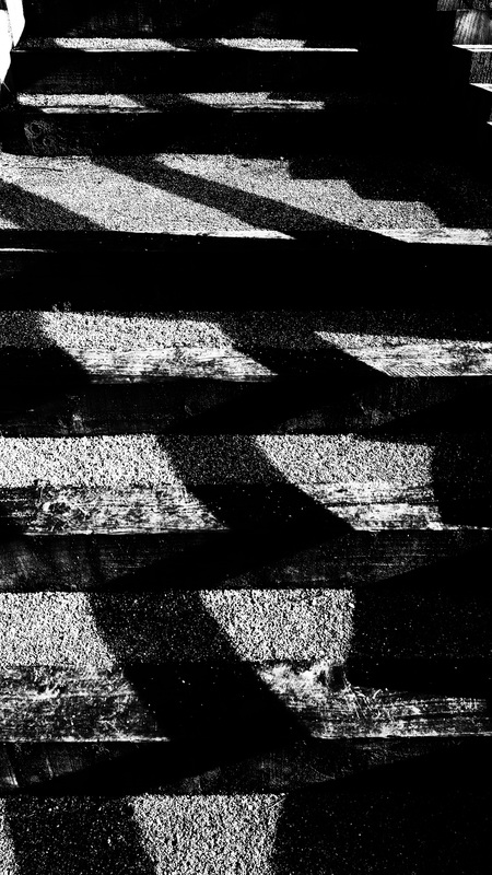
For my next experiment I needed some sun because I wanted to make normal shadows look abstract. I did this by having the shadow be disrupted by the landscape. I feel this worked very well in this image because there was a shadow which would normally appear straight like the object that created the shadow. However because the shadow is hitting the stairs, the shadow went diagonally. This photo-shoot was a refined version of my original shadow photos where the shadows weren't being disrupted the landscape. Originally I was only getting photos of shadows on flat surfaces so they were abstract but as the same time they seemed normal. Whereas the refined photos seem to be more abstract because they are disrupted.
The next time I experimented was with getting photos of the natural forms. I really wanted to get photos in a similar style to Karl Blossfeldt however I thought at first I would need a very expensive lens to be able to do this. However during the half term I came across this video which was how you could make a very powerful macro lens with a toilet roll. I have it a try however unfortunately it wasn't working. So in the end I decided to settle with a Bridge camera because they tend to have very good macro capabilities and even though they won't be as close as Blossfeldts images. They will still be fairly close and I could crop them later if I wanted to. After I took these photos I decided to apply a threshold effect to the image that way I could create photograms with them. So after I applied a threshold I put the image into the film holder within the enlarger. So that way the photograms would themselves be macro shots. However the images were too dark. This is what they came out as. This is because there was enough punch from the light hitting the paper. I tried different light sources from a torch on my phone to a normal torch. But sadly there just wasn't enough light going through the picture.
So I decided that I should simply crop the images and the put them over the photogram paper and expose it for around 10 seconds. They looked a lot better when I did them this way because there was a lot more light hitting the photographic paper. One problem I did have with the photograms was the contrast. I left the photograms in the developer for around a minute with each one the contrast looked very rich and bold. However when I looked them under normal light I realised the contrast really wasn't that strong. However this could easily be improved in Photoshop.
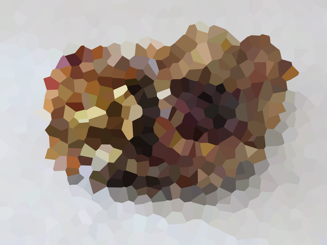
The last experiment I did for this unit was pixelation. For some reason I suddenly thought, could pixelation be a pattern. So I decided to go back to the natural form photos that I got with the bridge camera and I decided to pixelate them. I decided to use Crystallize the image under the Pixelate filter because I liked the shapes that were created by them. I also liked it that it brought out all the colours which I didn't expect to see in the natural forms. I was also pointed in the direction of an app called Dmesh Pro. Which was an app where you could make an image look pixelated. However unlike Ps in Dmesh you can create the shapes, you can create shapes in relevance to the image and shapes that have no relevance to the image.
For my next experiment I needed some sun because I wanted to make normal shadows look abstract. I did this by having the shadow be disrupted by the landscape. I feel this worked very well in this image because there was a shadow which would normally appear straight like the object that created the shadow. However because the shadow is hitting the stairs, the shadow went diagonally. This photo-shoot was a refined version of my original shadow photos where the shadows weren't being disrupted the landscape. Originally I was only getting photos of shadows on flat surfaces so they were abstract but as the same time they seemed normal. Whereas the refined photos seem to be more abstract because they are disrupted.
The next time I experimented was with getting photos of the natural forms. I really wanted to get photos in a similar style to Karl Blossfeldt however I thought at first I would need a very expensive lens to be able to do this. However during the half term I came across this video which was how you could make a very powerful macro lens with a toilet roll. I have it a try however unfortunately it wasn't working. So in the end I decided to settle with a Bridge camera because they tend to have very good macro capabilities and even though they won't be as close as Blossfeldts images. They will still be fairly close and I could crop them later if I wanted to. After I took these photos I decided to apply a threshold effect to the image that way I could create photograms with them. So after I applied a threshold I put the image into the film holder within the enlarger. So that way the photograms would themselves be macro shots. However the images were too dark. This is what they came out as. This is because there was enough punch from the light hitting the paper. I tried different light sources from a torch on my phone to a normal torch. But sadly there just wasn't enough light going through the picture.
So I decided that I should simply crop the images and the put them over the photogram paper and expose it for around 10 seconds. They looked a lot better when I did them this way because there was a lot more light hitting the photographic paper. One problem I did have with the photograms was the contrast. I left the photograms in the developer for around a minute with each one the contrast looked very rich and bold. However when I looked them under normal light I realised the contrast really wasn't that strong. However this could easily be improved in Photoshop.
The last experiment I did for this unit was pixelation. For some reason I suddenly thought, could pixelation be a pattern. So I decided to go back to the natural form photos that I got with the bridge camera and I decided to pixelate them. I decided to use Crystallize the image under the Pixelate filter because I liked the shapes that were created by them. I also liked it that it brought out all the colours which I didn't expect to see in the natural forms. I was also pointed in the direction of an app called Dmesh Pro. Which was an app where you could make an image look pixelated. However unlike Ps in Dmesh you can create the shapes, you can create shapes in relevance to the image and shapes that have no relevance to the image.
LO3: Recording & Desiging
For this unit I've used a wide range of photographic equipment. I used the following photographic equipment.
This unit also involved a wide range of Photoshop manipulation. These ranged from simple changes like Brightness & Contrast to more sophisticated edits like pixilation. When I was doing the batteries typology, it involved merging a lot of images in Photoshop. This was done by going to layers and choosing 'Lighten'. Another technique I was using on Photoshop which was simply Brightness & Contrast. When I was taking the shadow images. I upped the contrast of all the images because that way the shadows are very prominent and they sometimes form a new layer to the image. For example this image. I dramatically upped the Contrast and as a result it seems like a completely new layer to the image because I've made the shadows darker so you can't see the objects which were in the shadow.
The final editing that I did on Photoshop was with pixilation. I decided to pixelate my natural form pictures so I can bring out the colours and hopefully see a pattern in the colours. So I decided to use the Crystalize filter because I liked the shapes that it produced and the wide range of colours. Mentioning pixels, I did originally look back at the shadow photos and I was going to apply a Pointillize filter which I liked at first because it tended to bring colour out of a B&W image, believe it or not. However I never really pursued this idea because I wasn't really sure what I could do with these images.
- Canon 550D
- Tripod
- Studio Lighting
- Canon Bridge Camera
- Macro Lens
- Attempted to make a homemade macro lens
This unit also involved a wide range of Photoshop manipulation. These ranged from simple changes like Brightness & Contrast to more sophisticated edits like pixilation. When I was doing the batteries typology, it involved merging a lot of images in Photoshop. This was done by going to layers and choosing 'Lighten'. Another technique I was using on Photoshop which was simply Brightness & Contrast. When I was taking the shadow images. I upped the contrast of all the images because that way the shadows are very prominent and they sometimes form a new layer to the image. For example this image. I dramatically upped the Contrast and as a result it seems like a completely new layer to the image because I've made the shadows darker so you can't see the objects which were in the shadow.
The final editing that I did on Photoshop was with pixilation. I decided to pixelate my natural form pictures so I can bring out the colours and hopefully see a pattern in the colours. So I decided to use the Crystalize filter because I liked the shapes that it produced and the wide range of colours. Mentioning pixels, I did originally look back at the shadow photos and I was going to apply a Pointillize filter which I liked at first because it tended to bring colour out of a B&W image, believe it or not. However I never really pursued this idea because I wasn't really sure what I could do with these images.
LO4: Responding & Evaluating
For my 1st response to Patterns, I decided to send off my favourite photo from the pixelated natural forms to Photobox to be printed professionally. I changed my mind about which photo to send to be printed. Initially I was going to send this image to be printed this was because I felt it was the most abstract. However Ms Gibson recommended that I choose a different image where the subject is right in the middle of the frame and doesn't go out of the frame. That was the only problem with the one I was going to send, the subject left the frame at the top, bottom and left. So I decided to send this image off instead. I went for this one instead because the composition is a lot better and also I feel that there is a wider range of colours. The wide range of colours is the reason why I decided to order it in Glossy paper that way the colours will shine out of the poster.
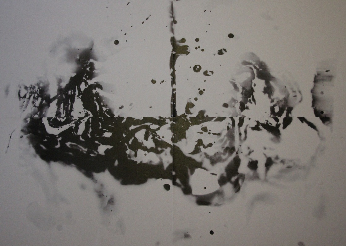
My 2nd response is from my photogram experiments. When I was making the photograms, I remembered back to when I did the Surrealism unit, I made some photograms in the style of a rorschach. So I would expose the picture onto the paper. Then I would drop the the developer onto the photogram and fold it in half so the chemicals should develop in a symmetrical fashion. I decided to do this so the normal pattern would be turned into an irregular pattern. After I put the photogram on the computer. I decided to split it into 4 sections so it could be printed in a big size. However as a result I lost around a MM of the image. However I feel this makes the pattern even more irregular.
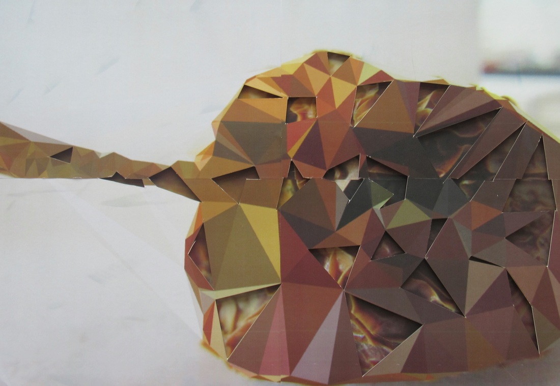
My 3rd response was without a doubt the toughest one to make. Mr Nicholls recommended that I pixelate one of the natural forms with the app Dmesh. Then I should place the Dmesh image over the original image and to cut out some of the shapes from the Dmesh image. Mounting the image was easy because all we had to do was put foam board on the original and stick the pixelated one of top of the foam. The tough part was cutting out the shapes. I attempted to do it with a Stanley knife and a ruler. I managed to cut the shapes out, however the edges weren't that straight, this was mainly because I was struggling to get at the correct angle. However Mr Nicholls assisted in sorting the edges out. Even this response was the toughest, it is my favourite response.
On the last day of the exam I created a 4th response. This 4th response consisted of my favourite photo from my abstract shadows idea. Once again I cut the image into 4 sections however because there was only 2 colours in the image the viewer shouldn't realise the section of the image that has been lost. The printed out image seems a lot more abstract than the digital image. The printed image doesn't for one second look like a shadow. It looks like a Helmer-Petersen image.
Overall I'm very impressed with my work for the theme Patterns and at the same time I'm surprised that I've made so many response considering that I had only made the 1st one 3 days before the deadline.
My 2nd response is from my photogram experiments. When I was making the photograms, I remembered back to when I did the Surrealism unit, I made some photograms in the style of a rorschach. So I would expose the picture onto the paper. Then I would drop the the developer onto the photogram and fold it in half so the chemicals should develop in a symmetrical fashion. I decided to do this so the normal pattern would be turned into an irregular pattern. After I put the photogram on the computer. I decided to split it into 4 sections so it could be printed in a big size. However as a result I lost around a MM of the image. However I feel this makes the pattern even more irregular.
My 3rd response was without a doubt the toughest one to make. Mr Nicholls recommended that I pixelate one of the natural forms with the app Dmesh. Then I should place the Dmesh image over the original image and to cut out some of the shapes from the Dmesh image. Mounting the image was easy because all we had to do was put foam board on the original and stick the pixelated one of top of the foam. The tough part was cutting out the shapes. I attempted to do it with a Stanley knife and a ruler. I managed to cut the shapes out, however the edges weren't that straight, this was mainly because I was struggling to get at the correct angle. However Mr Nicholls assisted in sorting the edges out. Even this response was the toughest, it is my favourite response.
On the last day of the exam I created a 4th response. This 4th response consisted of my favourite photo from my abstract shadows idea. Once again I cut the image into 4 sections however because there was only 2 colours in the image the viewer shouldn't realise the section of the image that has been lost. The printed out image seems a lot more abstract than the digital image. The printed image doesn't for one second look like a shadow. It looks like a Helmer-Petersen image.
Overall I'm very impressed with my work for the theme Patterns and at the same time I'm surprised that I've made so many response considering that I had only made the 1st one 3 days before the deadline.
My responses to the theme of Patterns
|
WWW
EBI |
|
WWW
EBI
|
|
|
WWW
EBI
|
|
WWW
EBI
|
|
Order of work:
- Battery Typology
- Airfix Paint Typology
- Abstract Shadows
- Flora Photograms
- Flora Close Up
- Natural Form Close Up
- Natural Form Photograms
- Natural Form Pixelation
