Typology
What is Typology
Typology is where you mix up images which relate to each other, it could be, they look like each-other, or they have the same colours. Basically Typology is making a collage. Technically I have done Typologies before. The cover photo of this page was my final piece for multiple images in GCSE photo and it follows the same principle of typology. Collecting photos of something by subject.
Photographers
August Sander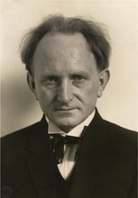
August Sander is a German portraiture photographer who is well known for his typology of jobs in Germany before, during and after the First World War, even photos that were taken pre-WW2. He photographed everything from the Working Class labourers, the cooks to the Upper Class officers fighting in a war.
Like I said this was to capture the amount of Jobs that there was in Germany in that period between 1900-1940's. This was a time when there was a class divide in Germany, and the class divide decided what your job was. In the army the Rich upper classes were the officers, where as the Working classes were the privates, the corporals etc. It even happened in society. The upper class were the Bank Managers, the land-owners etc. whereas the working class who were the 'Workingman'. 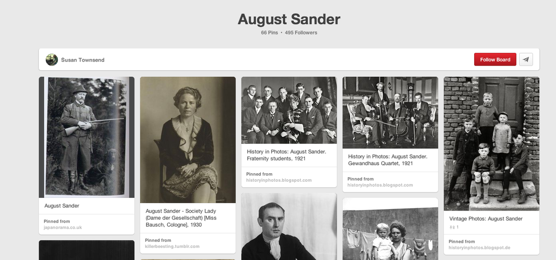
|
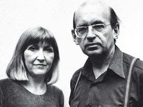
The Becher are a famous Photography partnership between the 2 people who were Husband and Wife. As you can tell by there names they are German photographers and they took photographs of buildings around Germany, like for example silos, houses etc.
Bernhard was born in August 1931, Hilla was born in September 1934. The 2 of them met each other at school as Painters in 1957, 4 years later the 2 married. The photo that you see on the right were first taken in '59 when German industrial buildings were starting to disappear and the 2 really wanted to capture this particular feature of German history. This project took nearly 20 years. Bernhard died in 2007, however Hilla is still alive today. 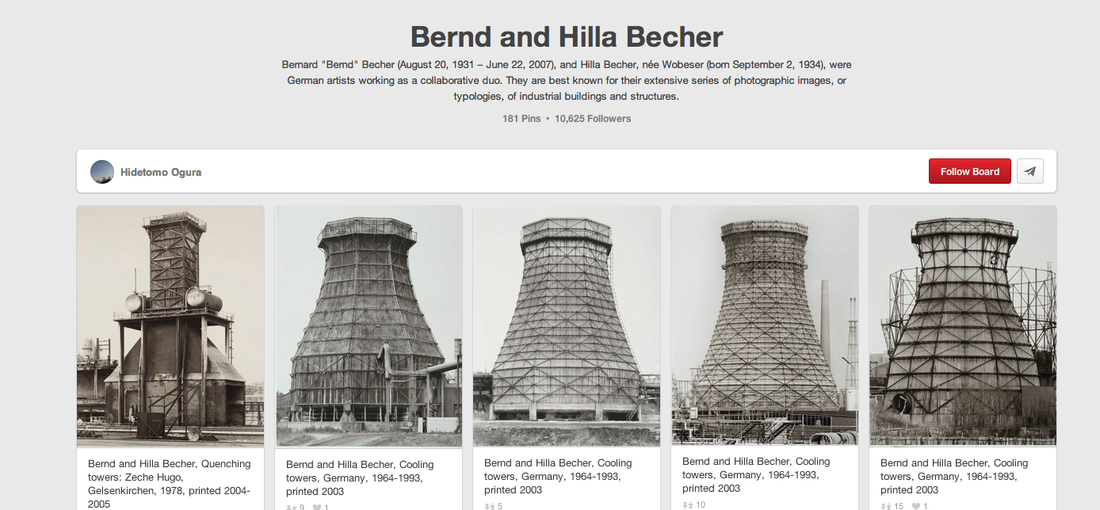
|
A third photographer who did this kind of photography is John Baldesarri. He had photos of himself taken by subject. For example he had photos of himself covering his face with hats, photos of him waving at boats, hitting objects with a golf club etc.
My considerations for Typology
One idea that I would seriously want to try is to get a Typology of the Moon. For this I would need a Tripod, a good DSLR and finally and very long Telephoto Lens. I only have one Telephoto Lens, a 55-330mm, however to get a really good, detailed photo of the Moon every night I would need a lens of more 450mm, possibly even over 600mm.
It would take a long time to set up the ISO, shutter speed etc. to be able to get a good amount of detail on the moon. If I went out and just took a photo of the moon it would look like a white circle.
Yes this would be very hard and take a lot of commitment however this could lead to a very good Typology.
#1st Typology: Coins
Below are photos of my first attempt at Typology. These are coins that I have found round my house. The coins range from commemorative coins to european money to Australian dollars etc.
I decided that this should be my first attempt at Typology because I believe that this would be very interesting seeing what kind of coins I have scattered around my house.
I decided that this should be my first attempt at Typology because I believe that this would be very interesting seeing what kind of coins I have scattered around my house.
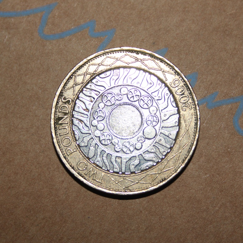
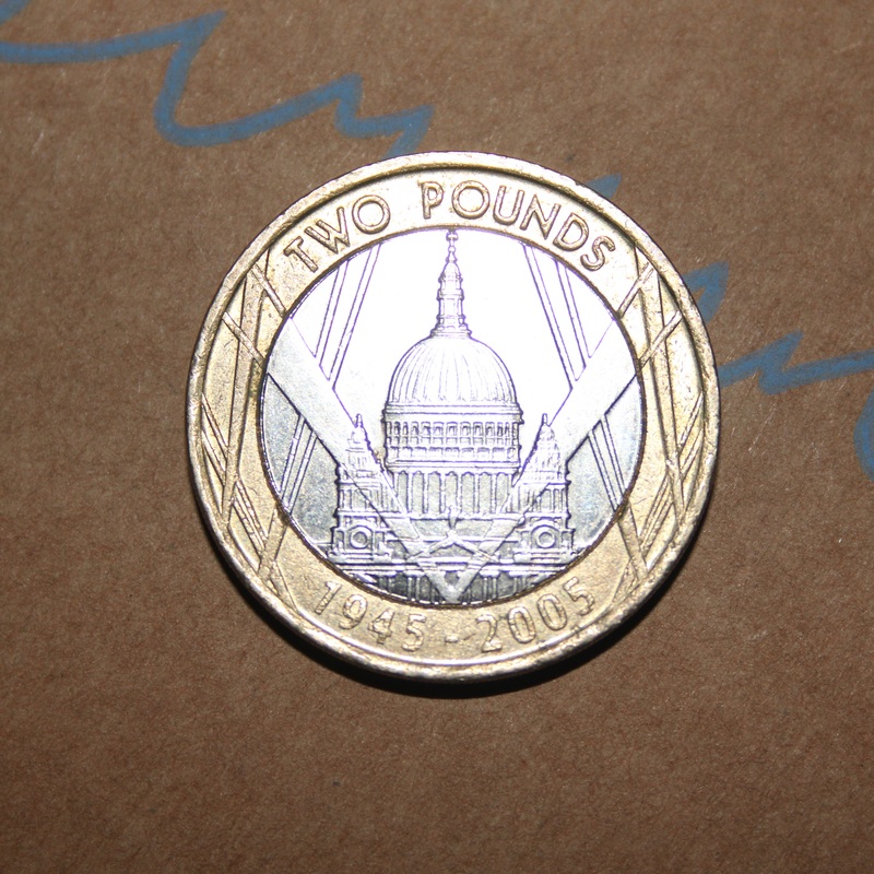
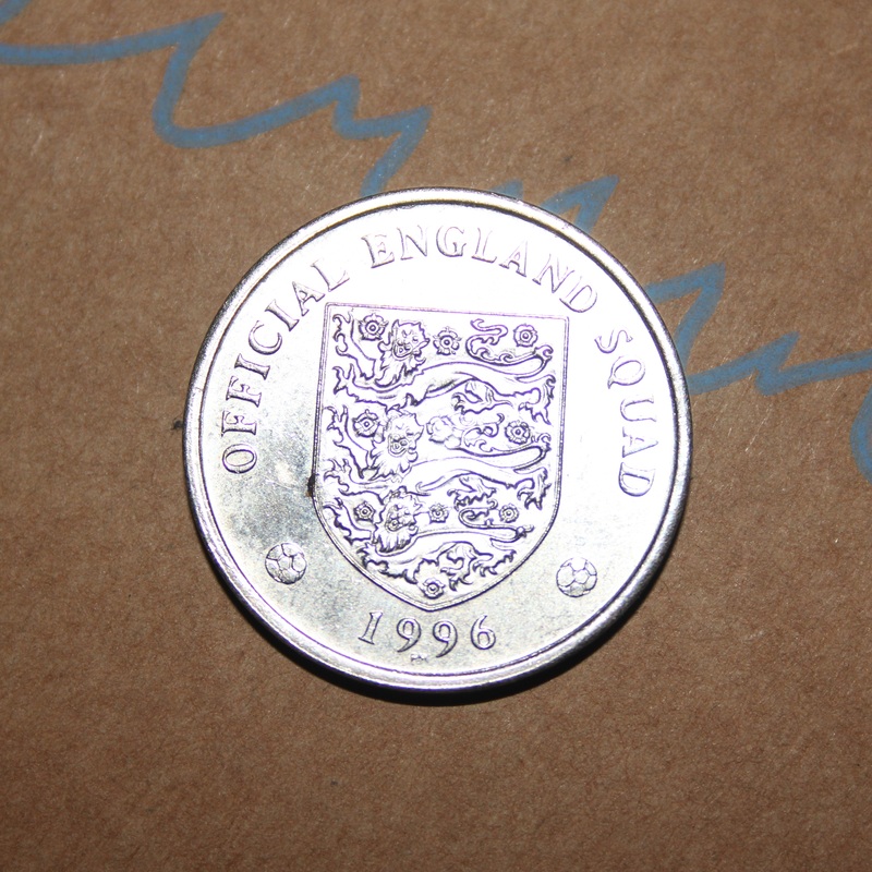
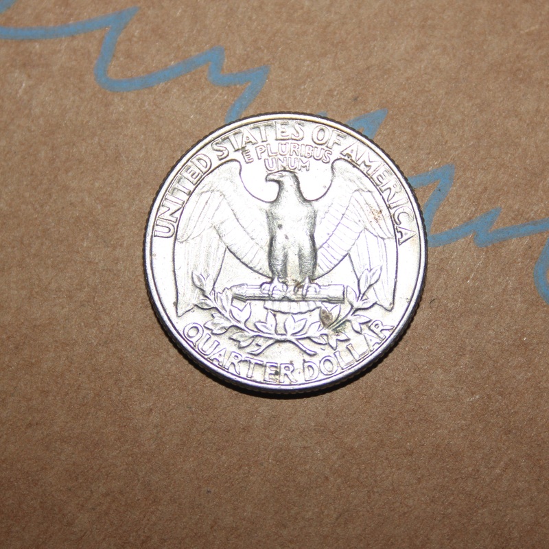
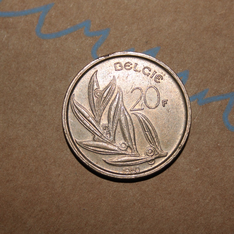
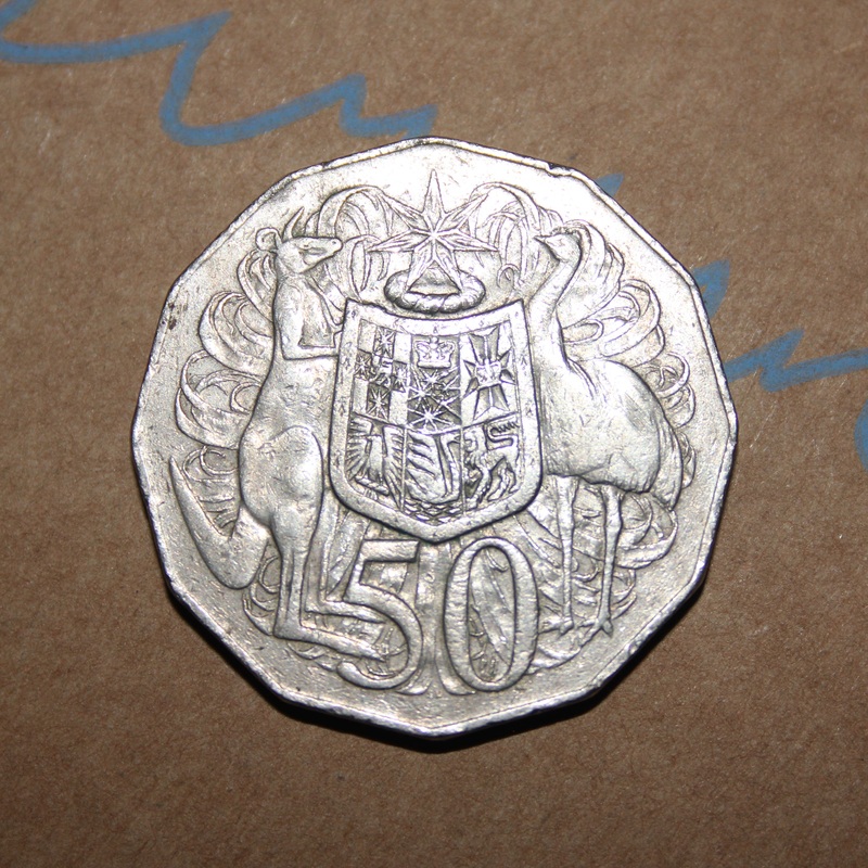
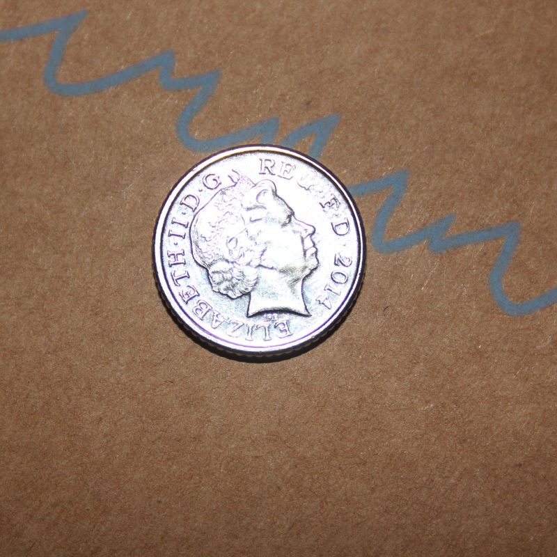
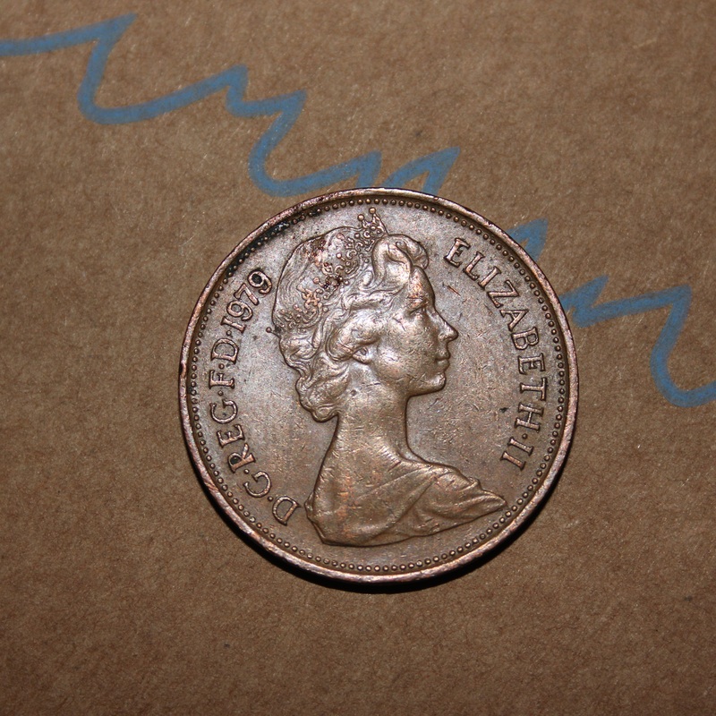
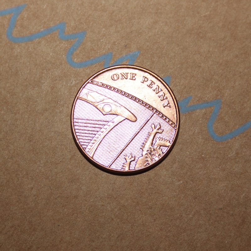
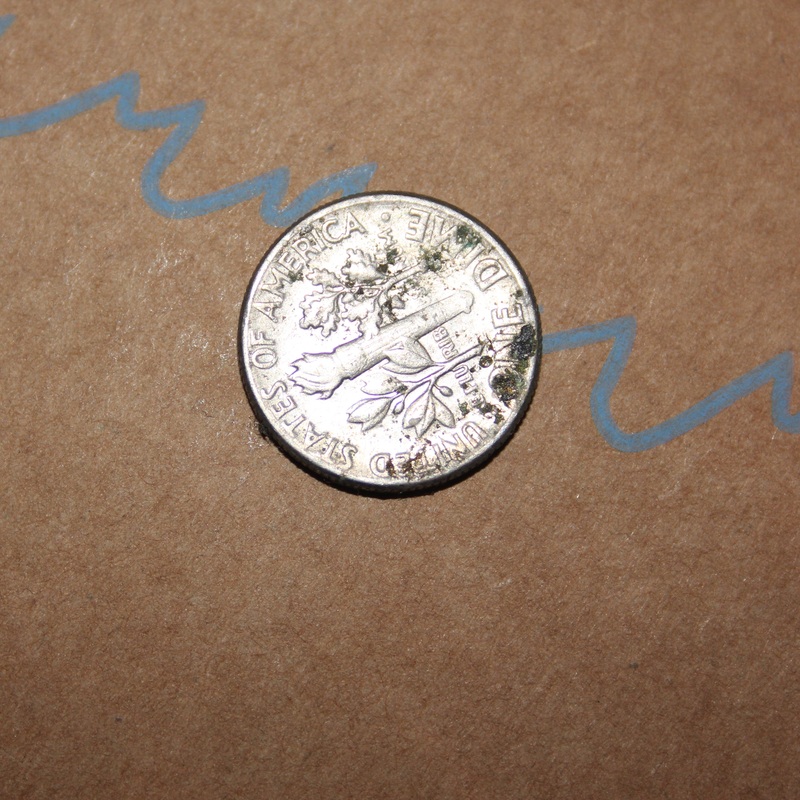
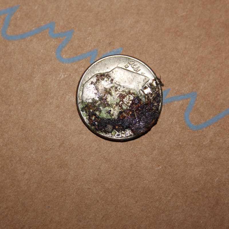
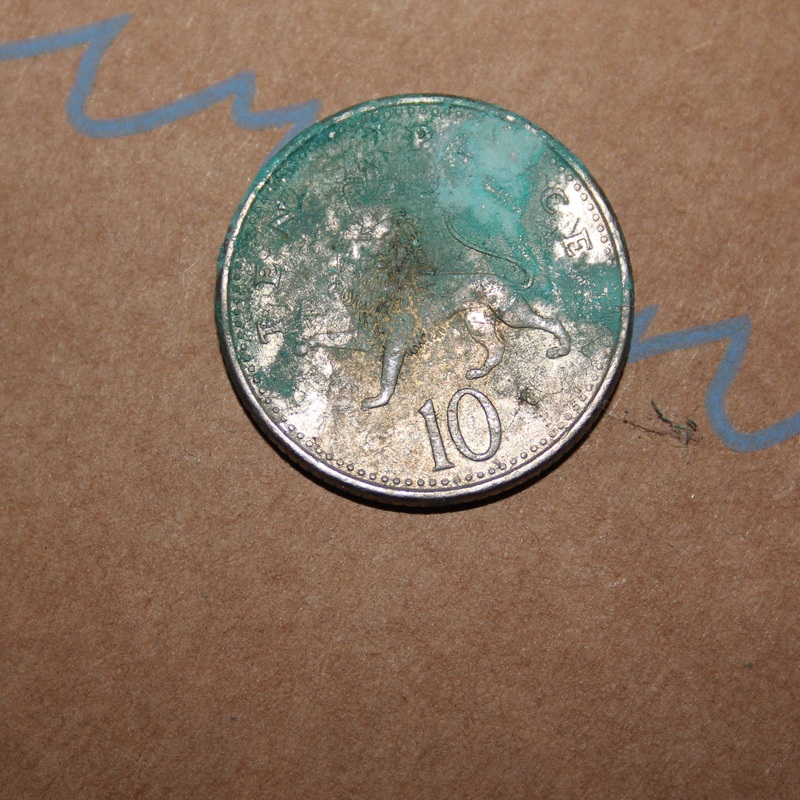
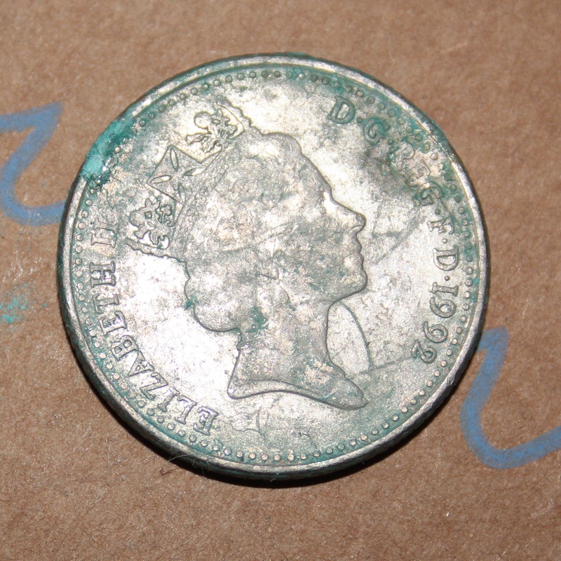
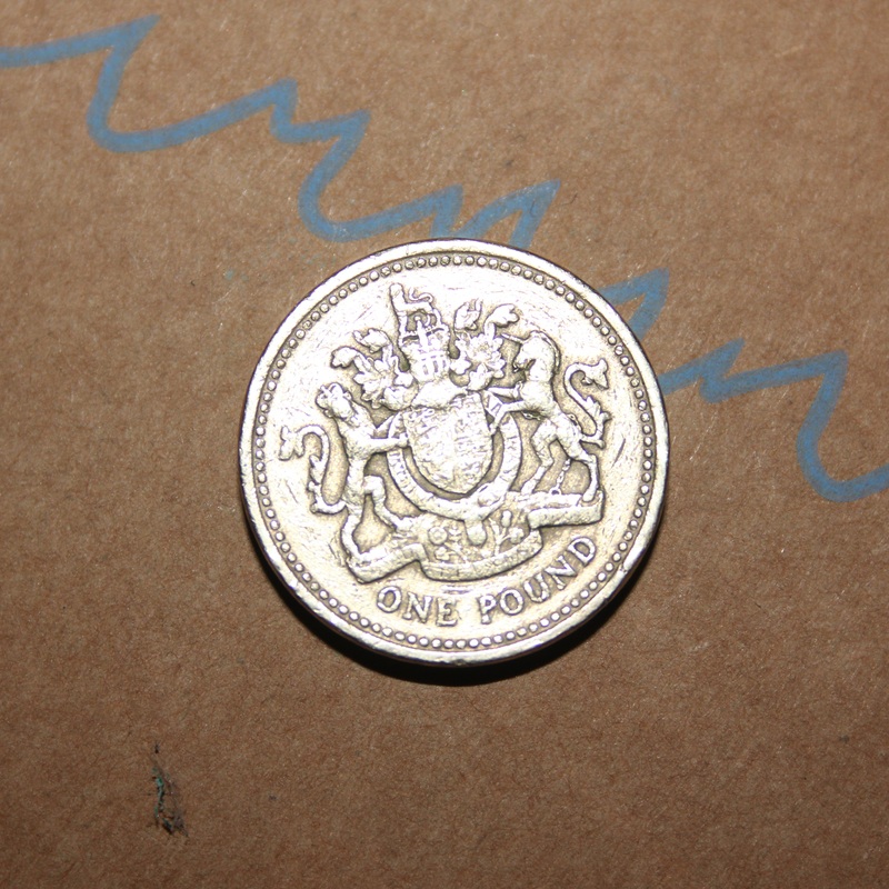
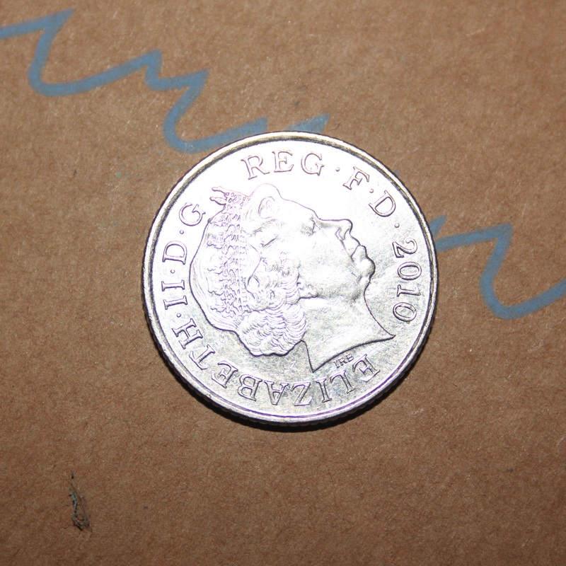
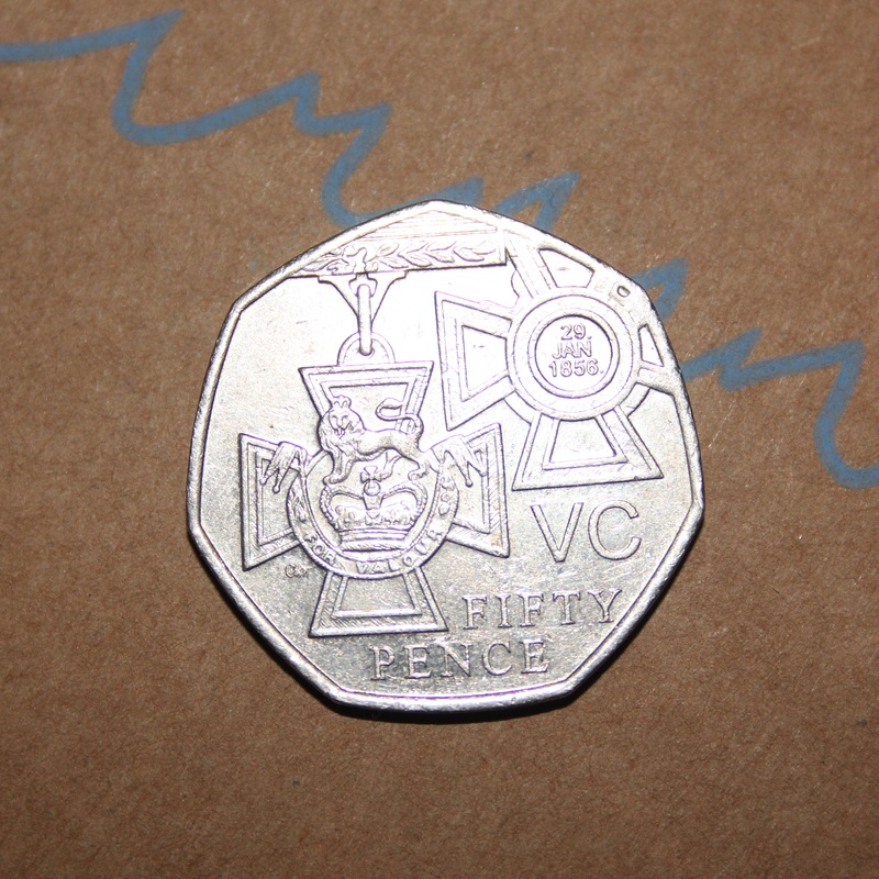
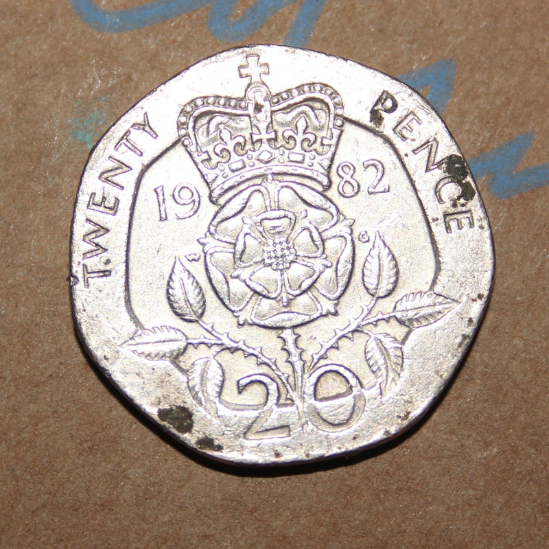
In my opinion this set went well, however it could of been better. This is because all coins have different sizes. so this meant I had to zoom in on certain coins especially the US Cent and the coin that is covered in an unknown substance. These photos were taken on a Tripod as you can possibly see from how I have placed all of the coins, I've tried to keep all of them in the same position. Which is this problem, you can sometimes get the scale of the coins wrong because, in this Typology it appears that a 20 pence coin is bigger than a 50 pence coin.
Refining this Typology
There are a couple of ways I could refine this Typology. One way I could refine this was by focusing on Just one coin, or a certain aspect of coins. For example, I could focus on the Queens face on £1 pound coins because the Queens face of coins have changed a few times. So I could focus on the Queens faces on coins, or I could focus on just e.g. 20p coins. Because I have loads of 20p coins which will have varied degrees of rust.
#2nd Typology: CAFC shirts
I'm a season ticket holder of Charlton Athletic football club and I have had loads of Charlton shirts brought for me since I started watching them in 2004. Also the captions show that range of names and signatures I have on these shirts.
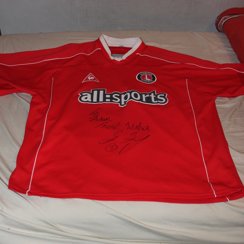
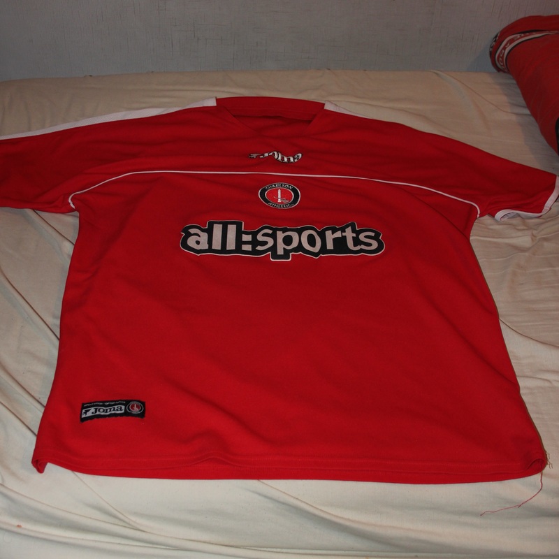
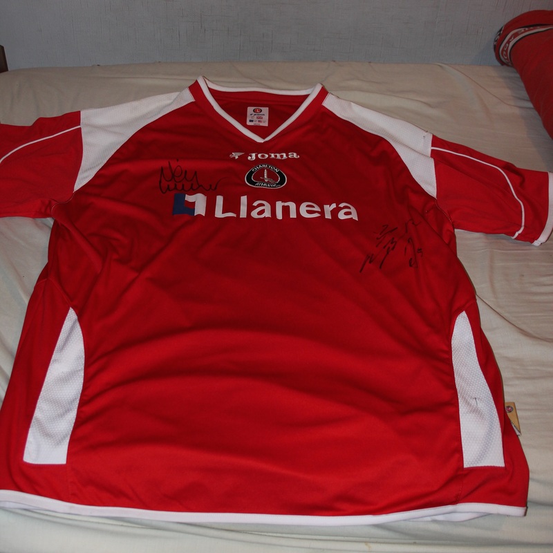
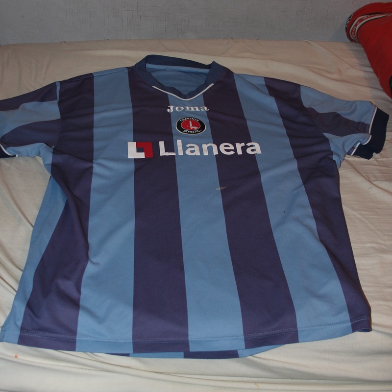
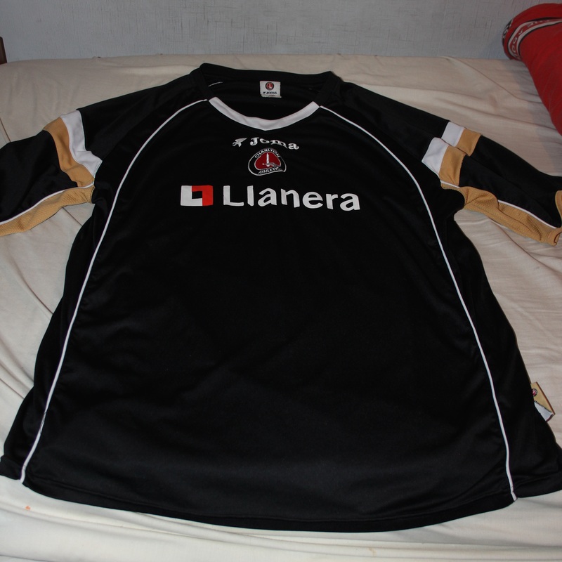
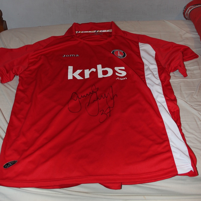
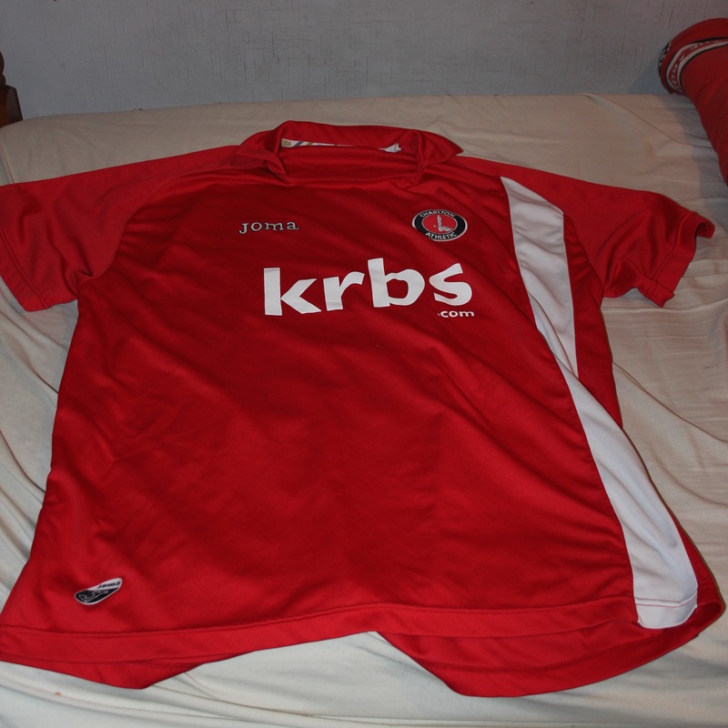
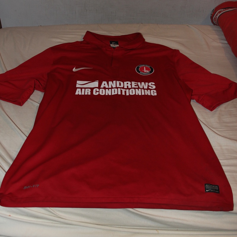
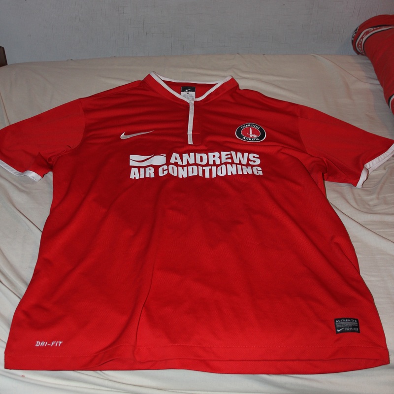
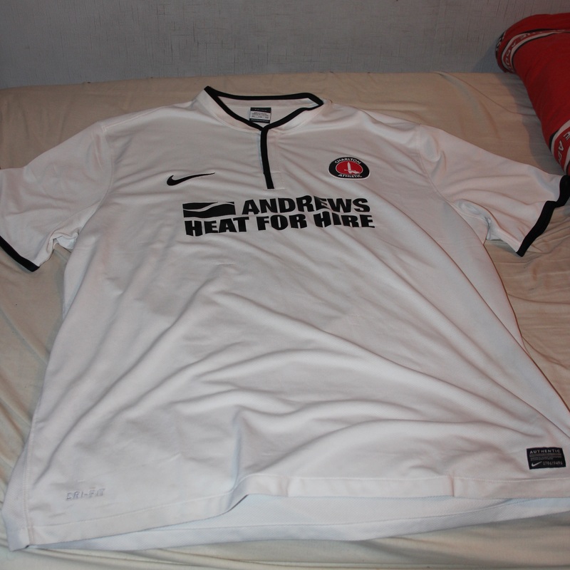
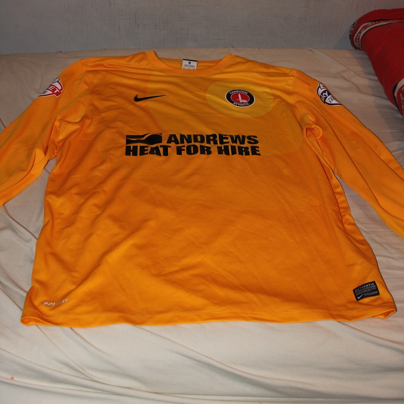
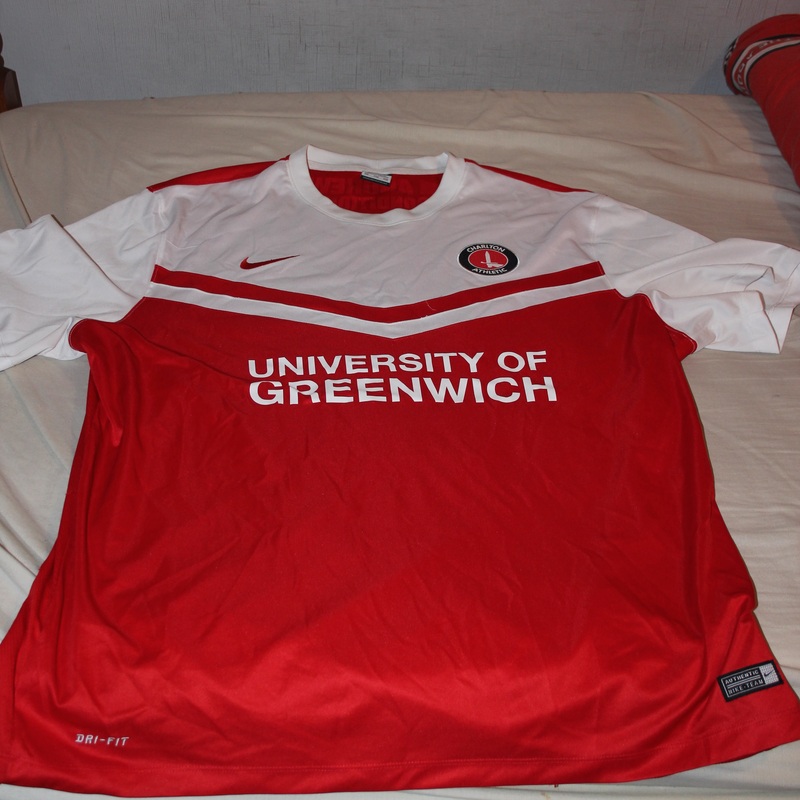
This is one of my favourite Typologies that I have attempted. I also believe this is the most relevant to Contrast. This is because of the Contrast in the the colours included in the shirt. Some-shirts are mostly red with a tiny bit of white, some shirts are something like a quarter white. Also there is sone shirt that is just red.
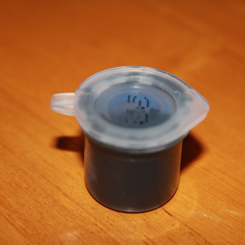
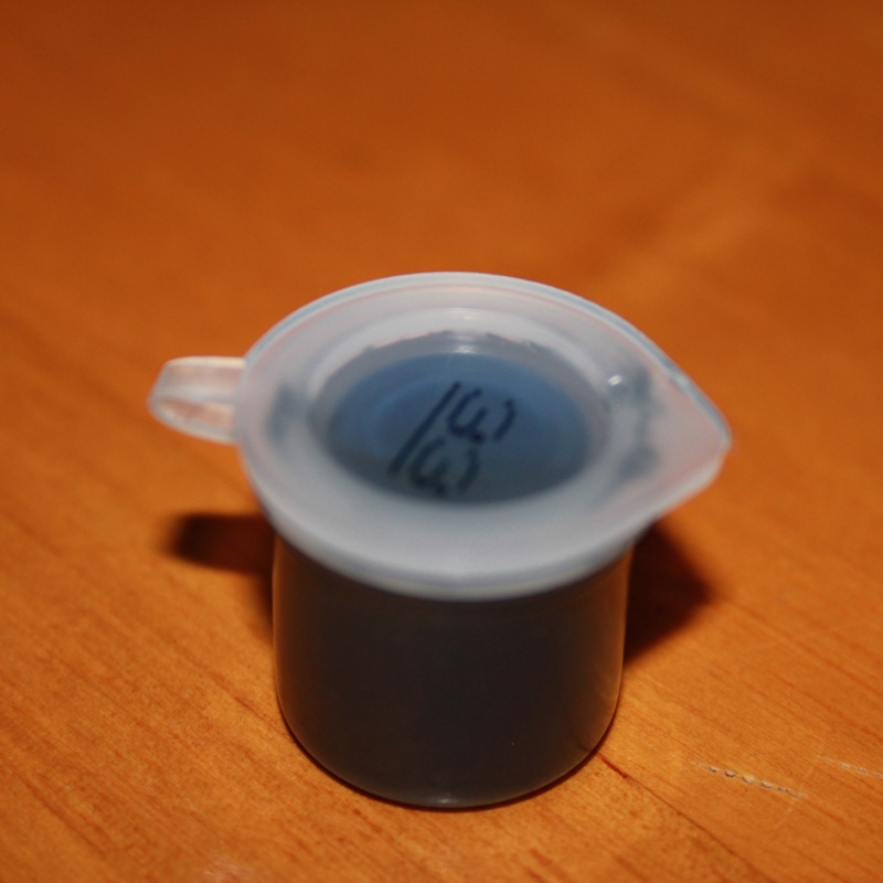
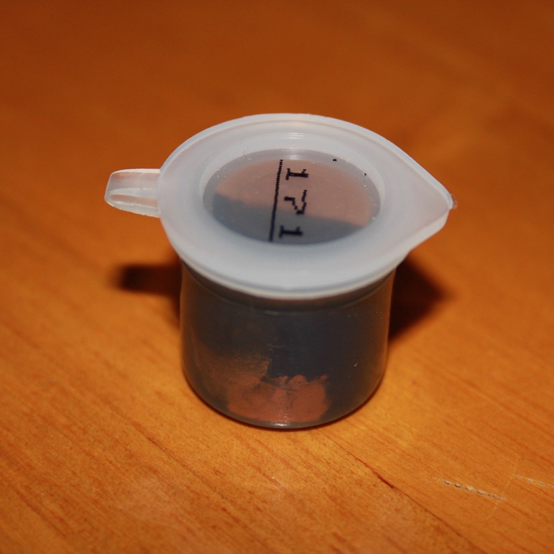
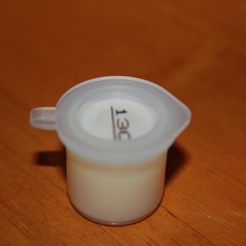
#3rd Typology: Airfix Paint pots
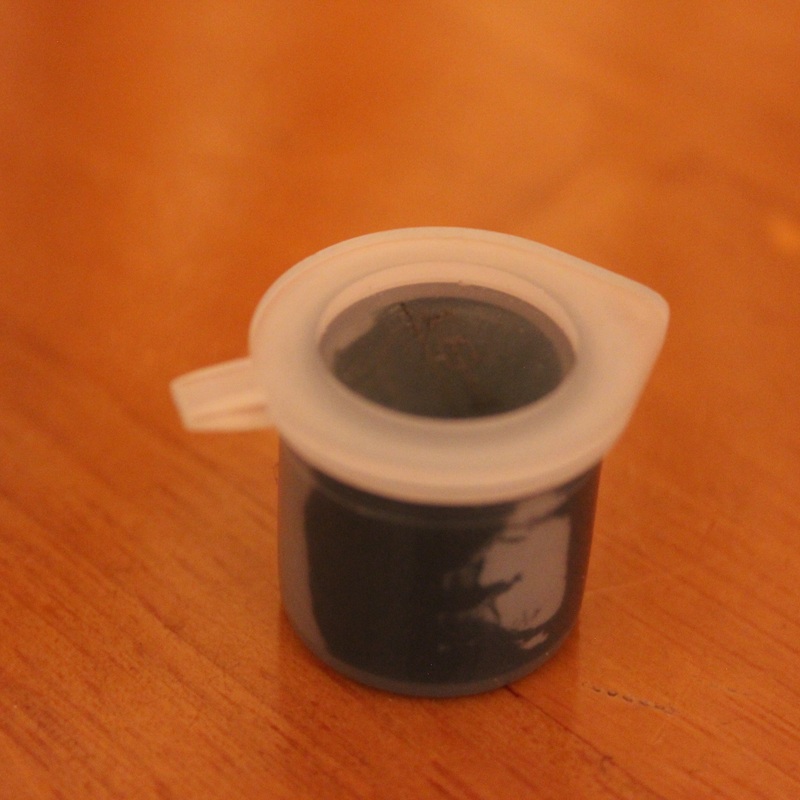
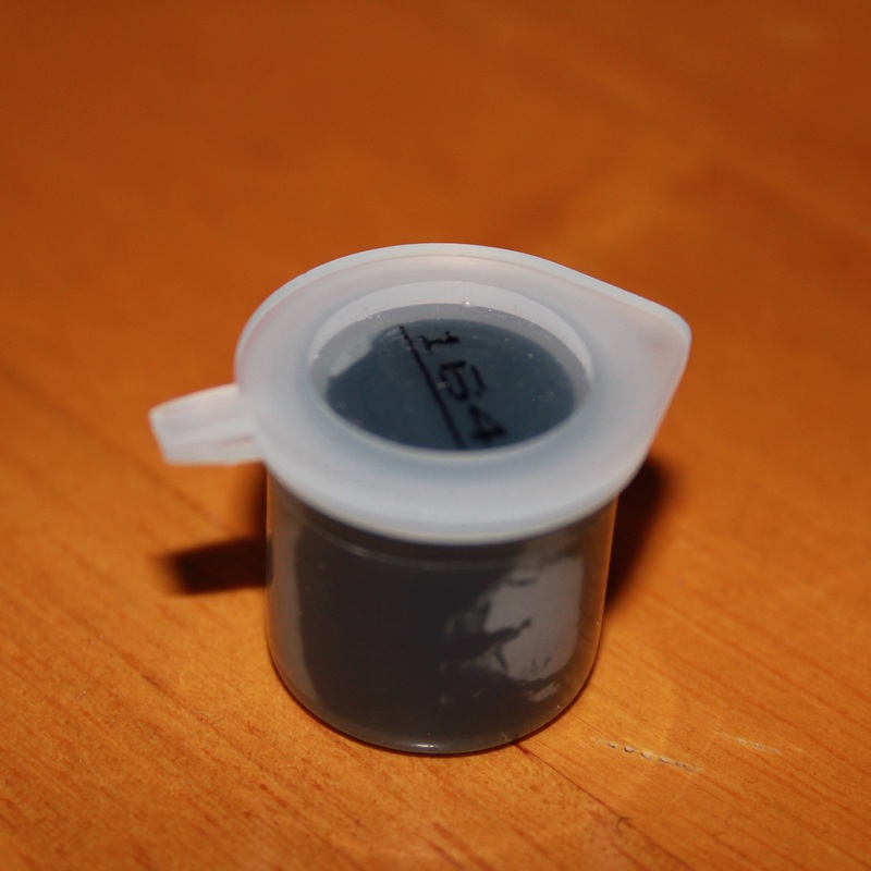
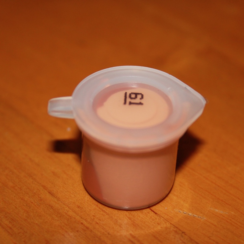
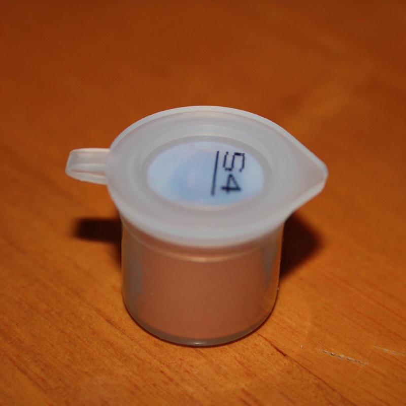
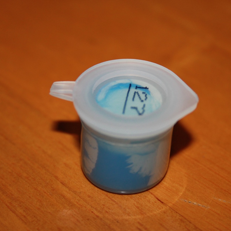
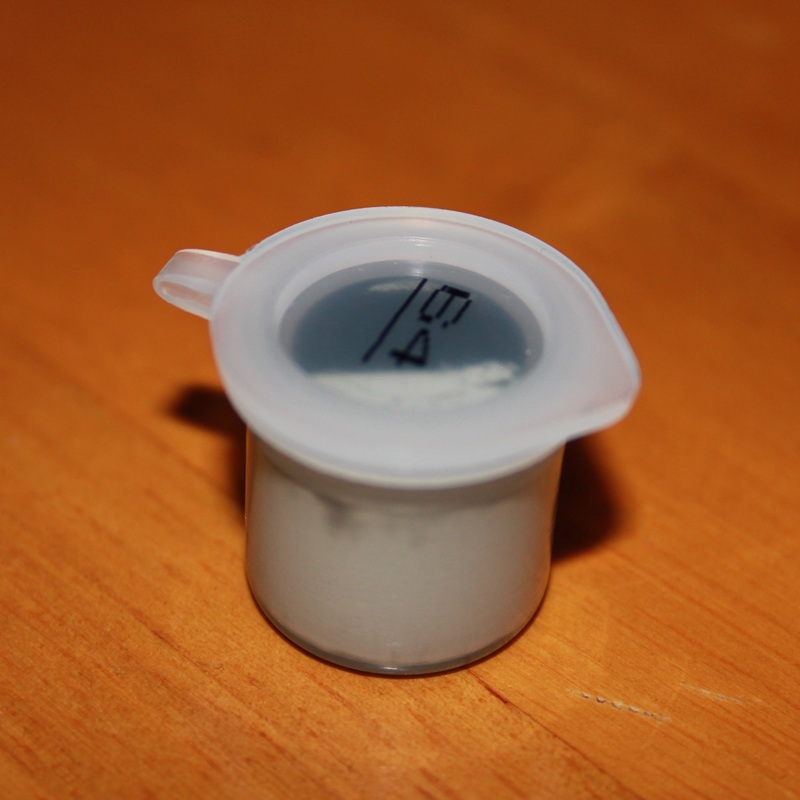
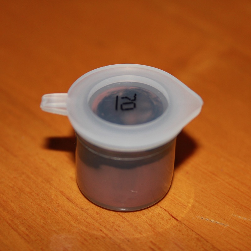
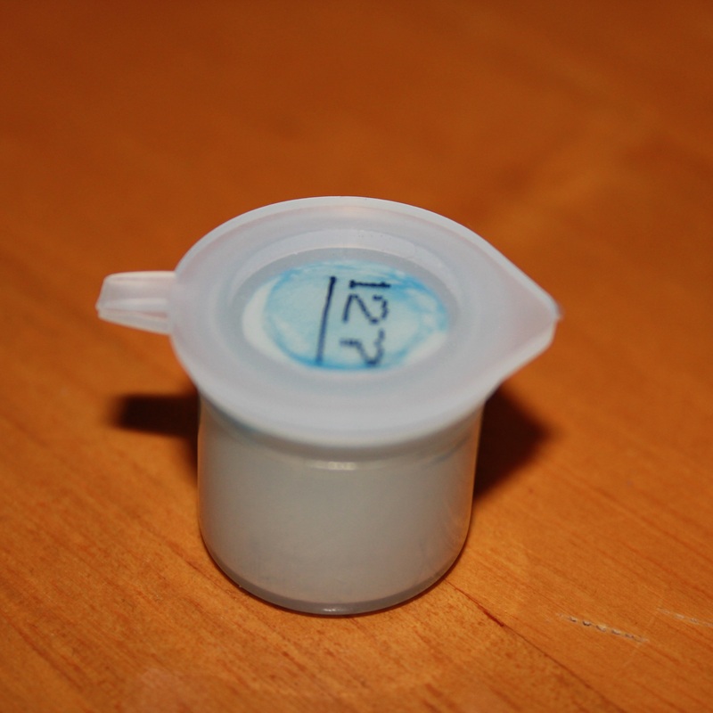
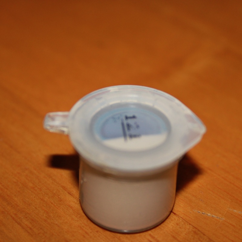
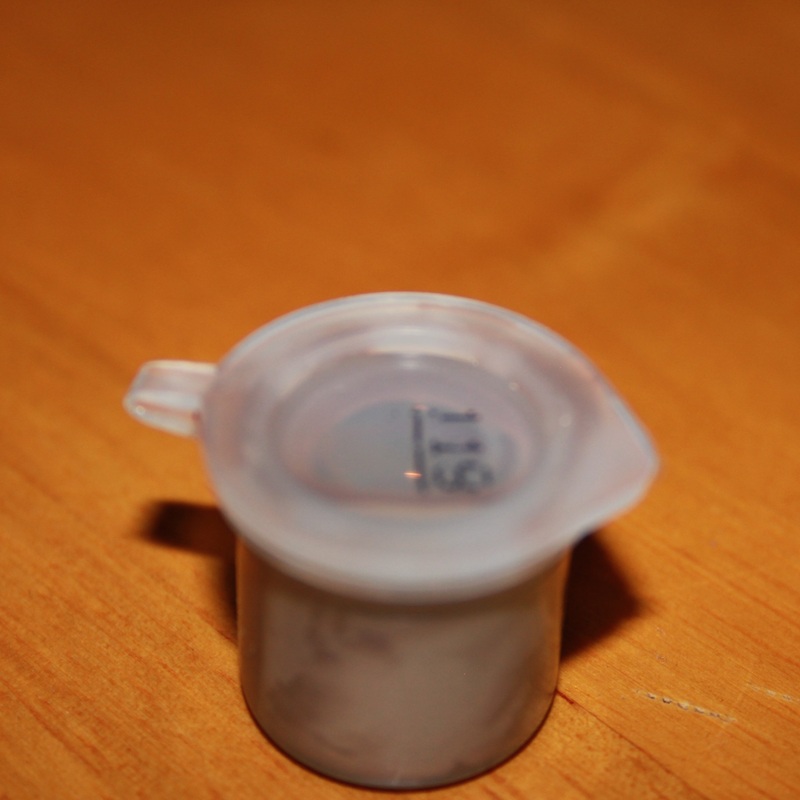
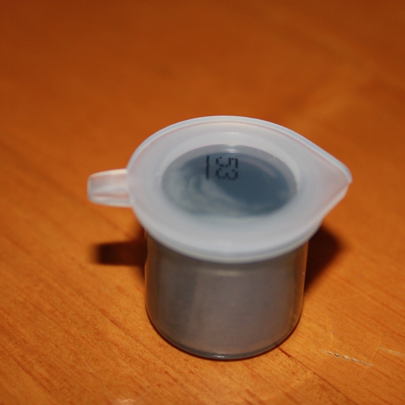
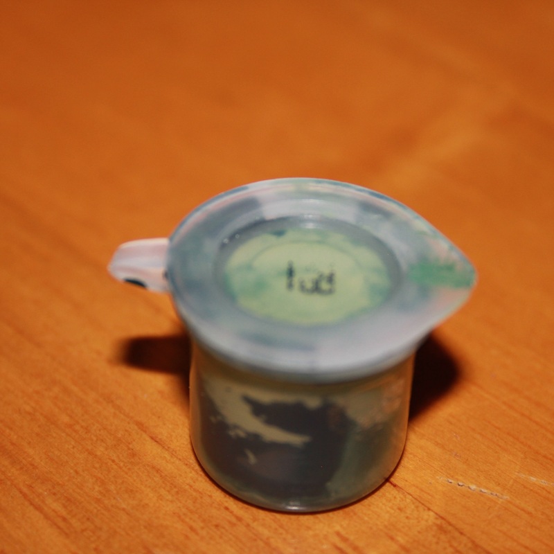
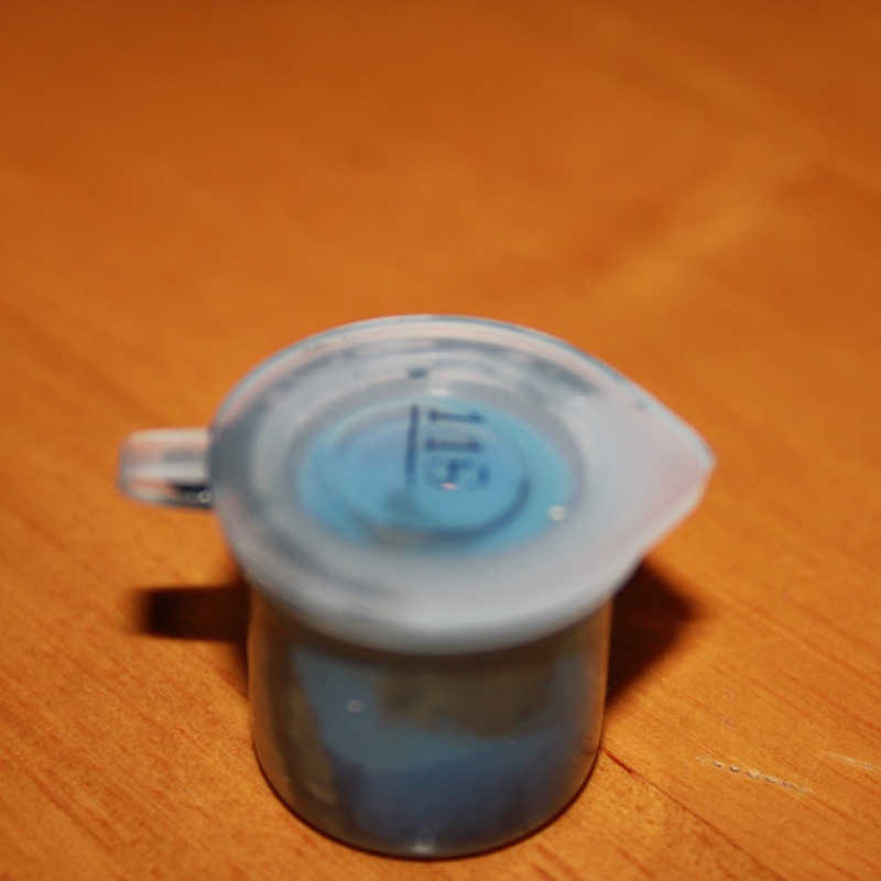
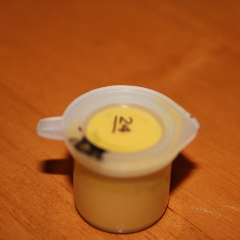
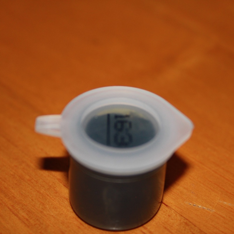
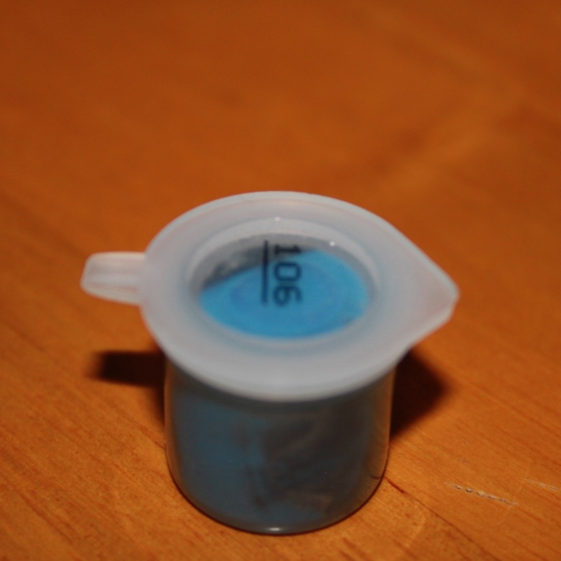
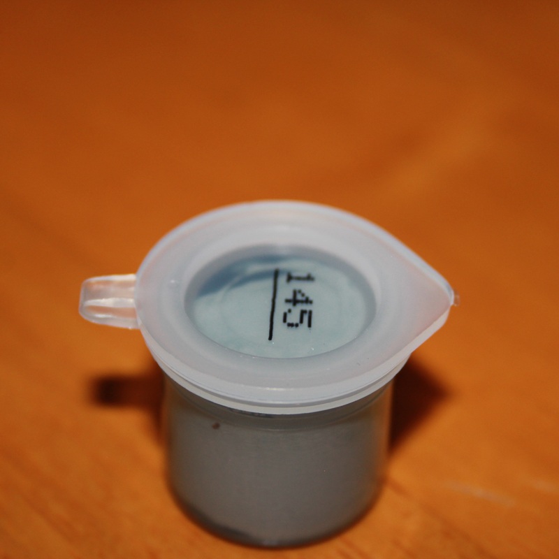
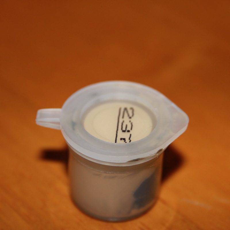
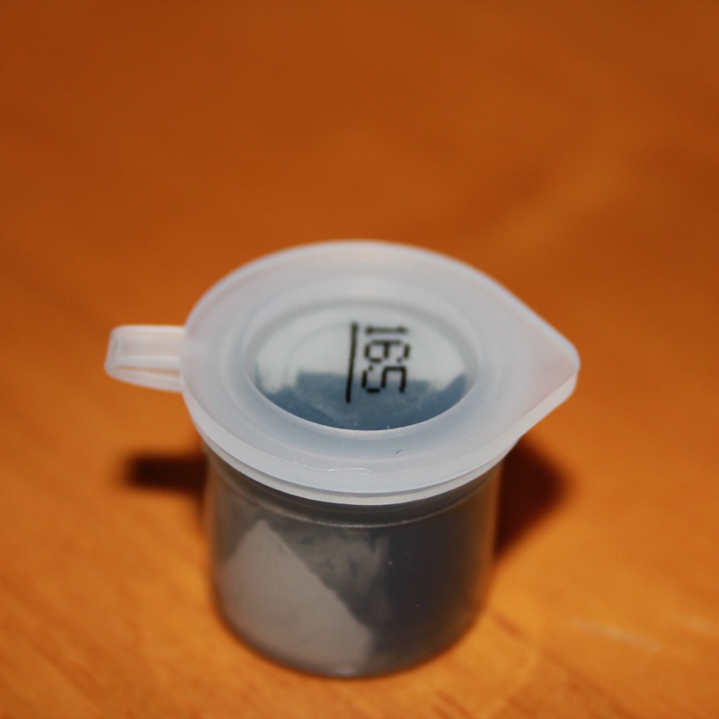
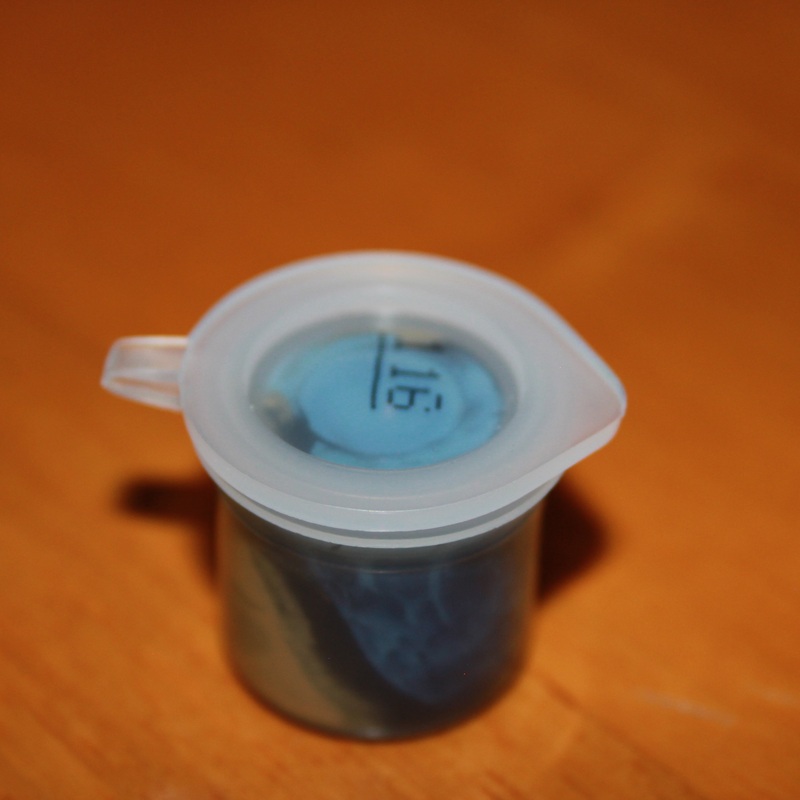
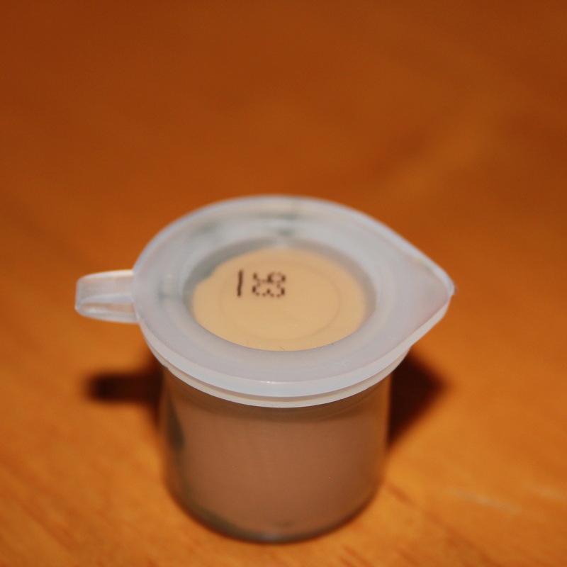
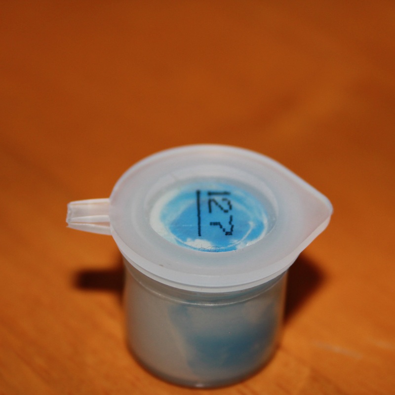
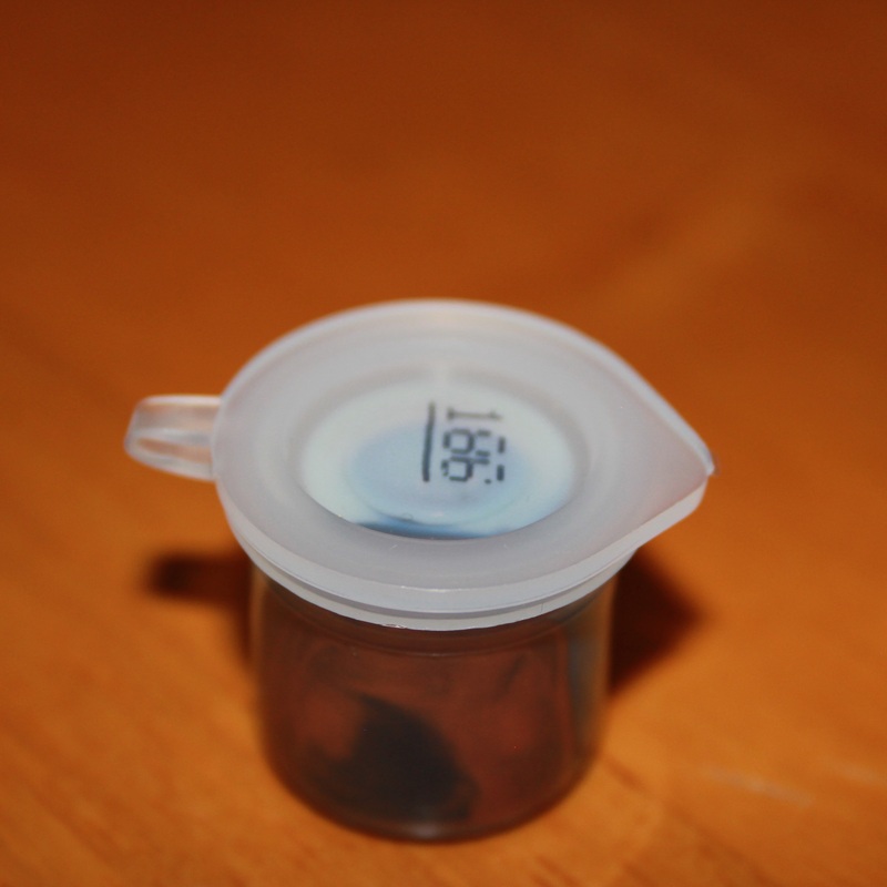
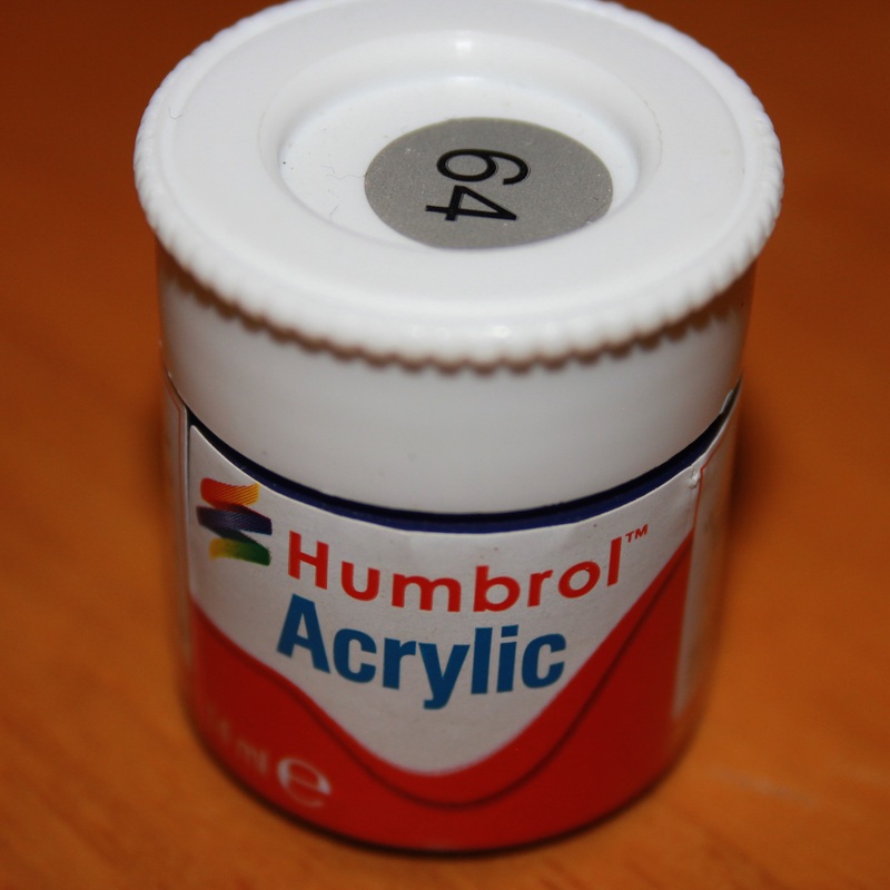
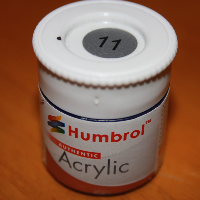
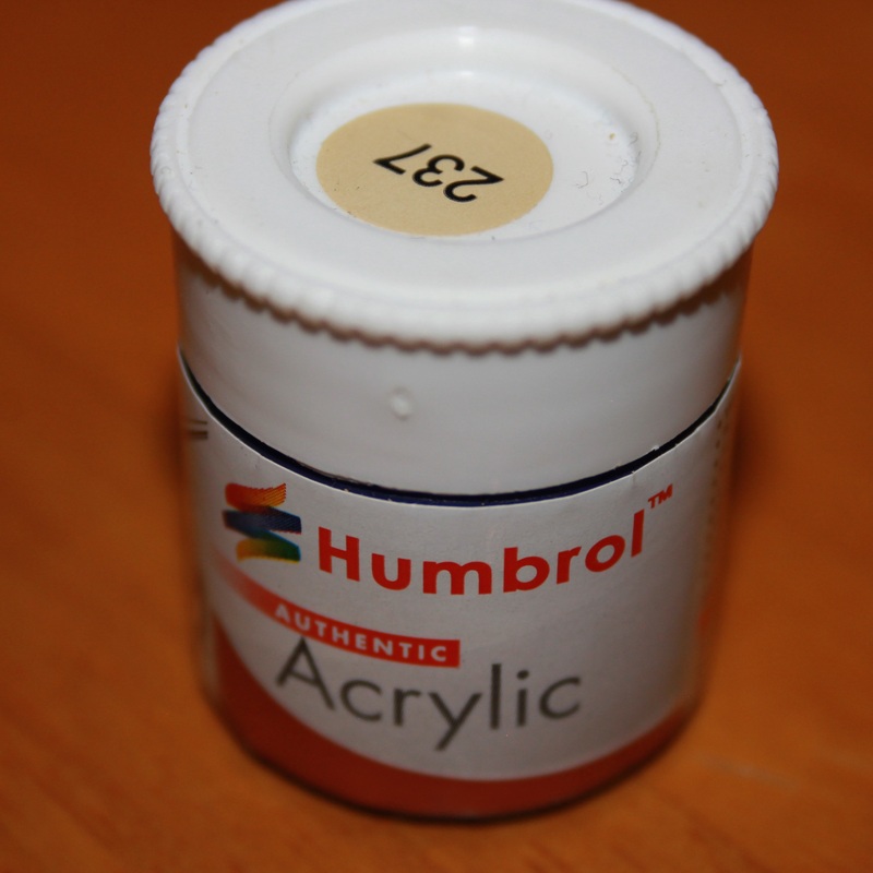
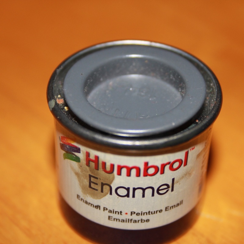
I'm a fan of Airfix models, which means I have 100's of small Airfix paint pots scattered around my room. The paints I have vary from Enamel to Acrylic, from Spray paint to Matt. However this is just a small minority of them. If I photographed every-single one there would there would be an entire page worth. Also there are 1 or 2 repeats of paints here, this shows the vast scale of colours I have in my room. Also I'm showing how old the paints are. This is because lets take for example 127 US Ghost Grey Satin. Despite it supposed to be a Grey colour it appears to be more of a Blue colour. Also 116 US Dark Green Matt, is supposed to be a Green however it appears to be Very Blue. The paint No. and name is in the Captions. However there is one problem with this Typology. It is that some of the photo were out-of-focus or slightly blurry. This is because I had to use a Telephoto lens to be able to get a good amount of detail. I did use a tripod however I had to use Manual Focus because Auto-Focus simply couldn't decide what should be in and what should be Out-of-focus.
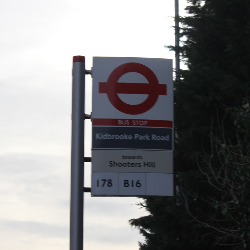
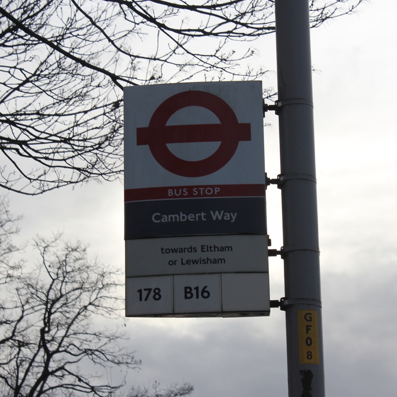
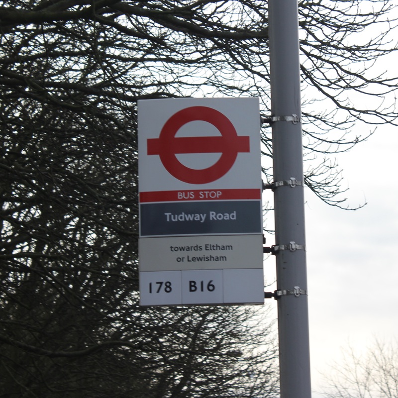
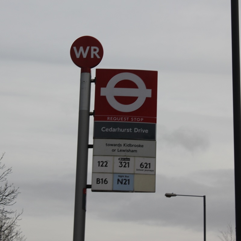
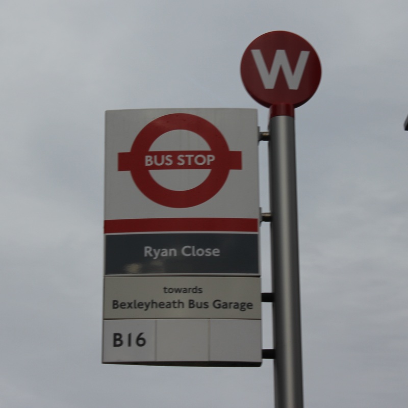
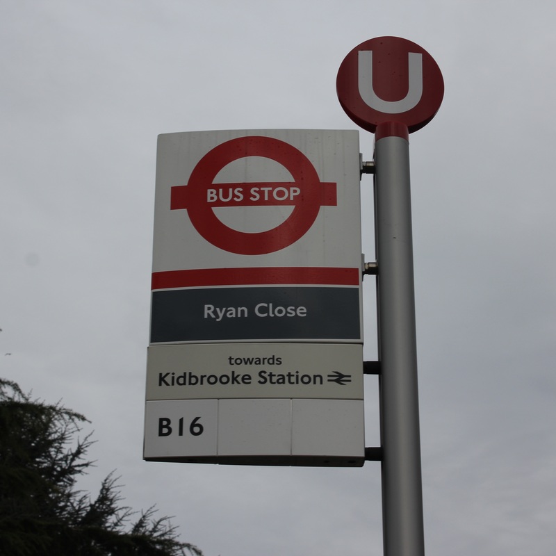
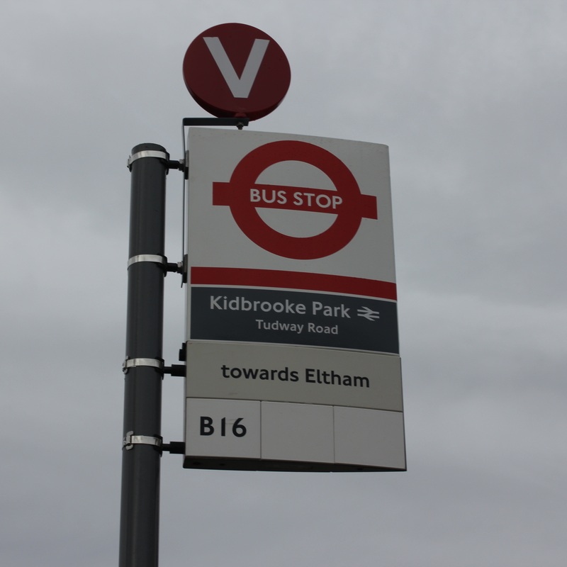
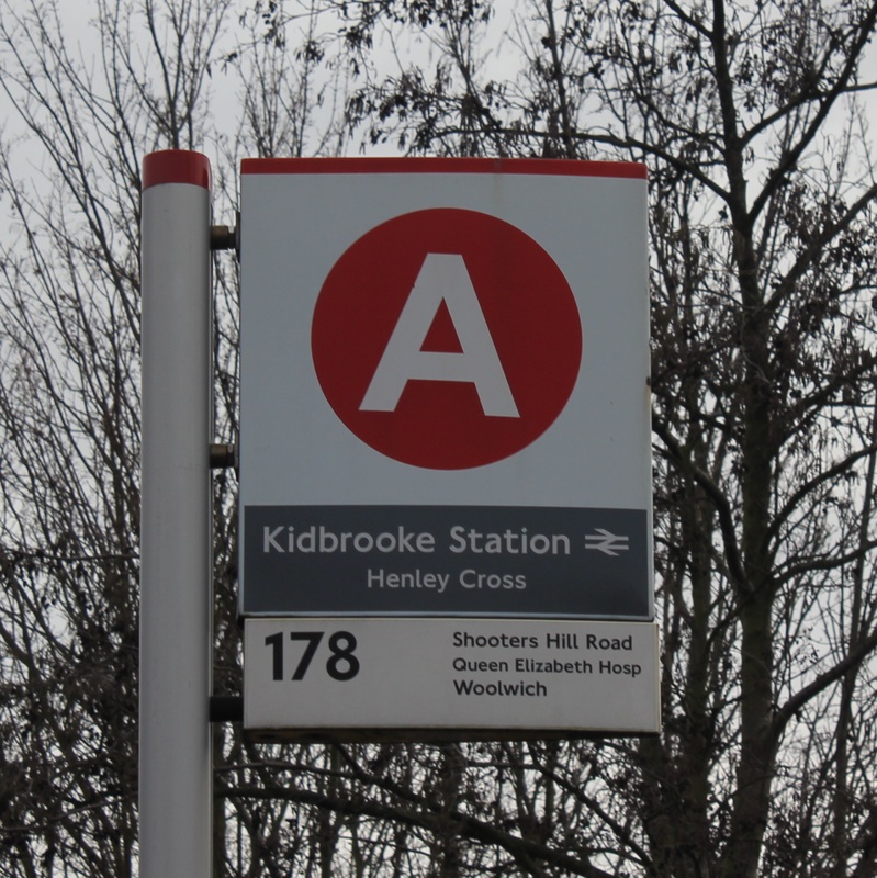
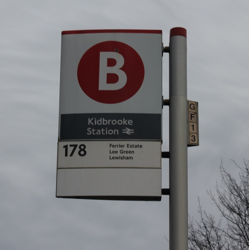
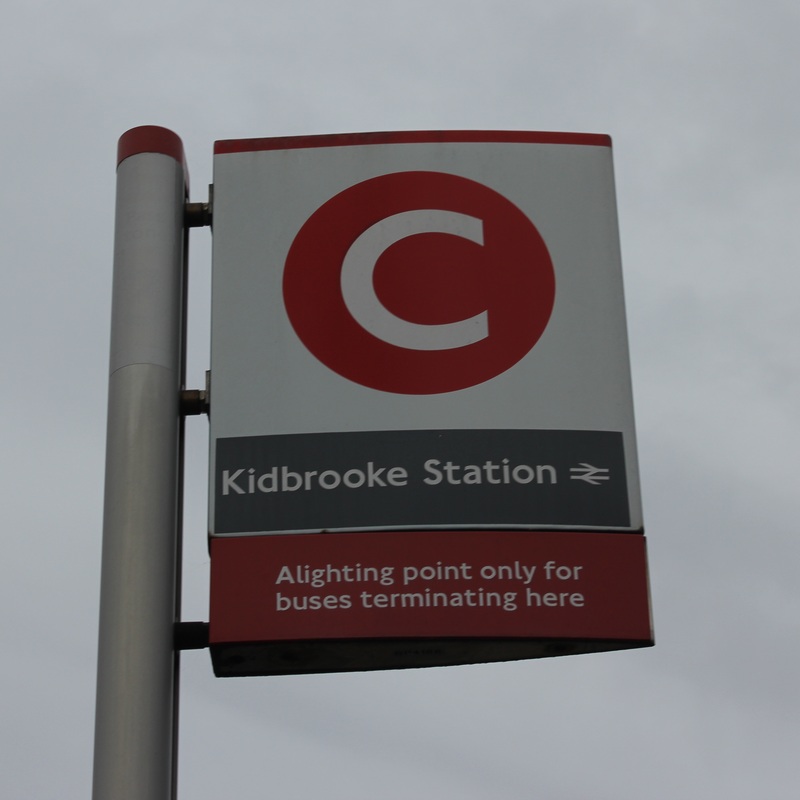
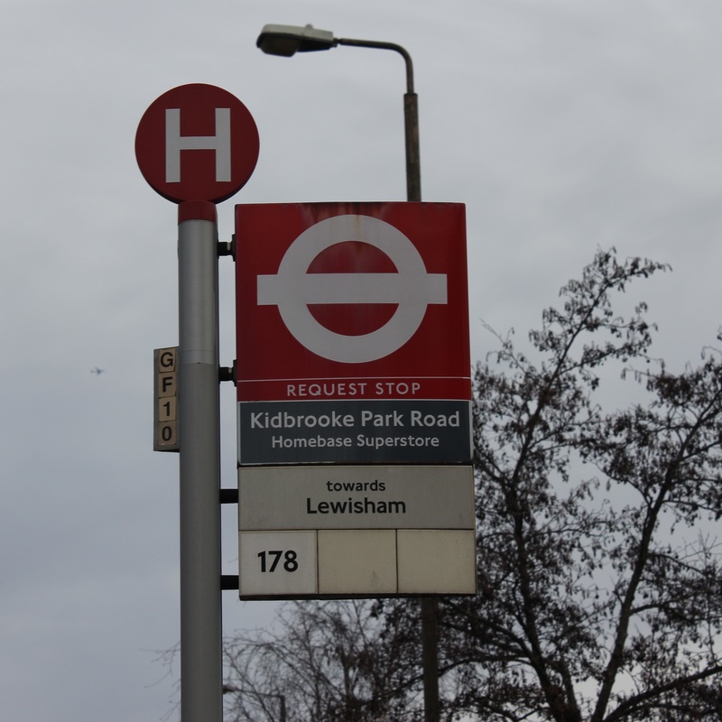
#4th Typology: Kidbrooke Signs
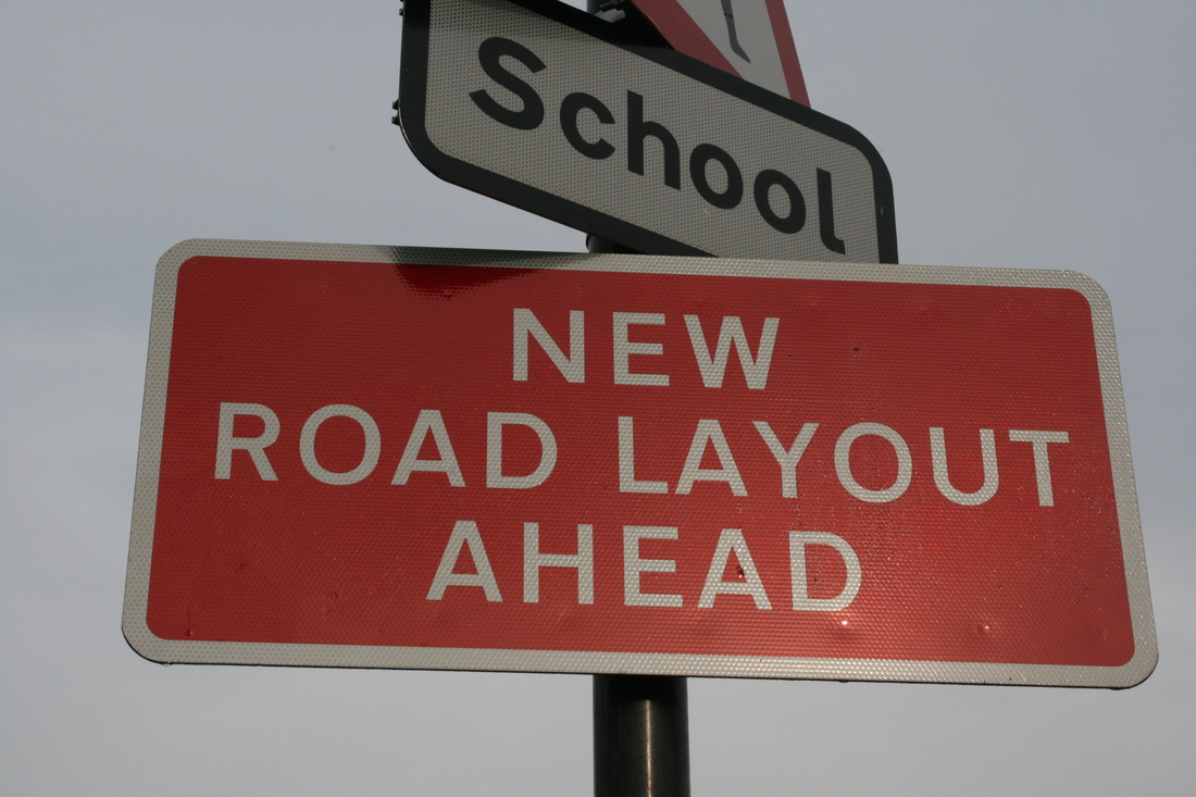
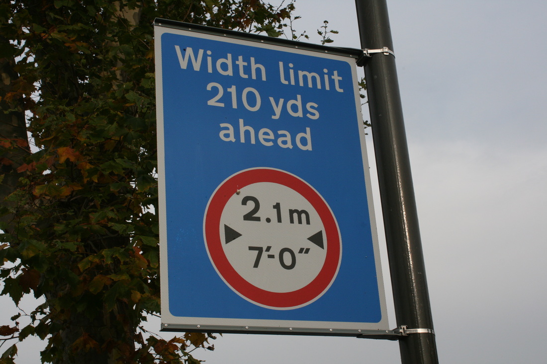
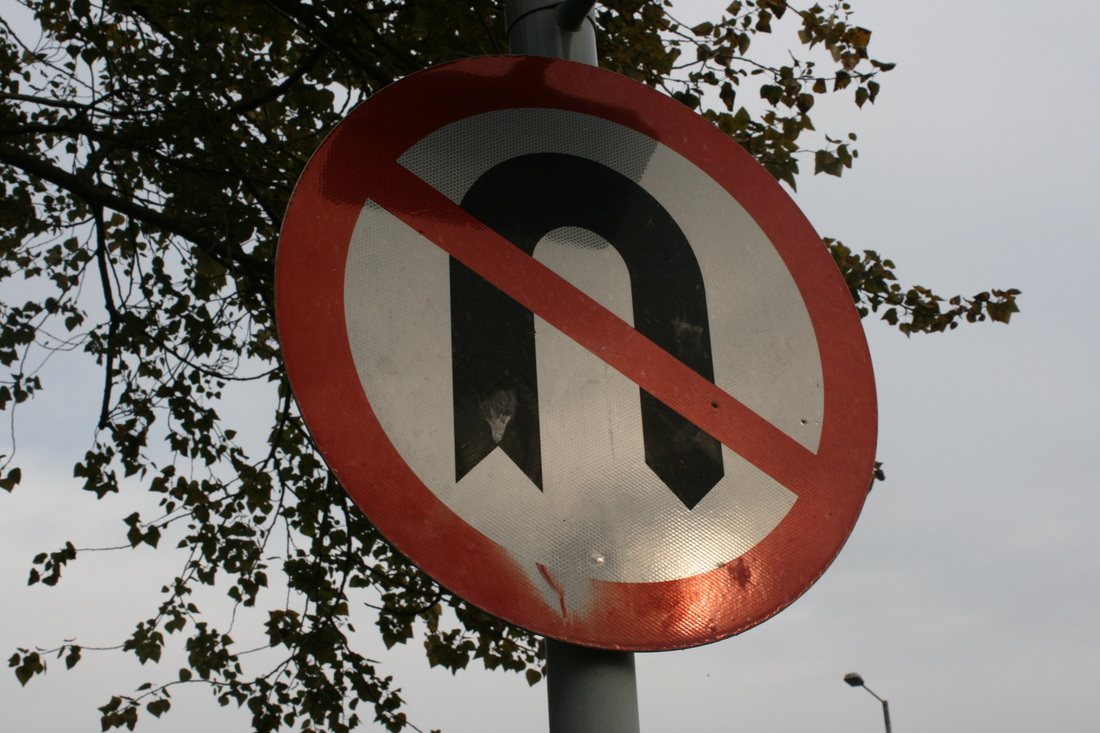
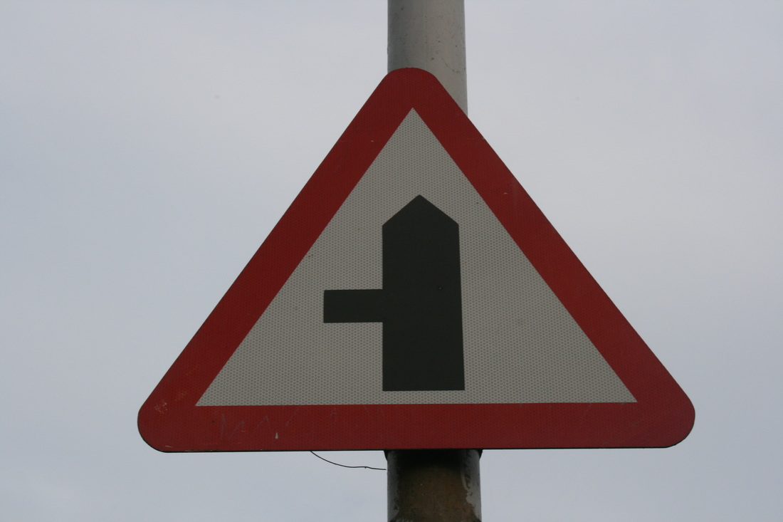
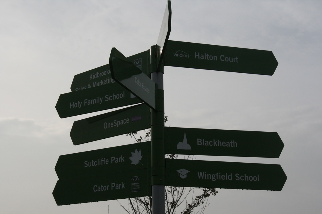
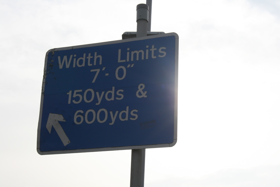
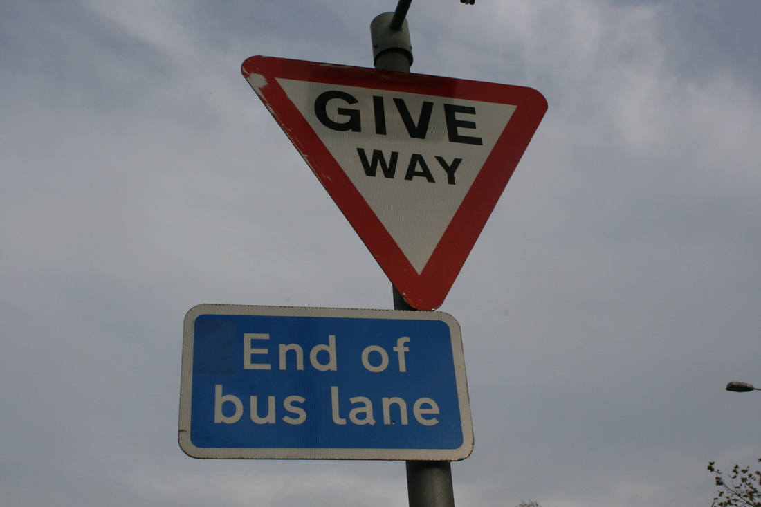
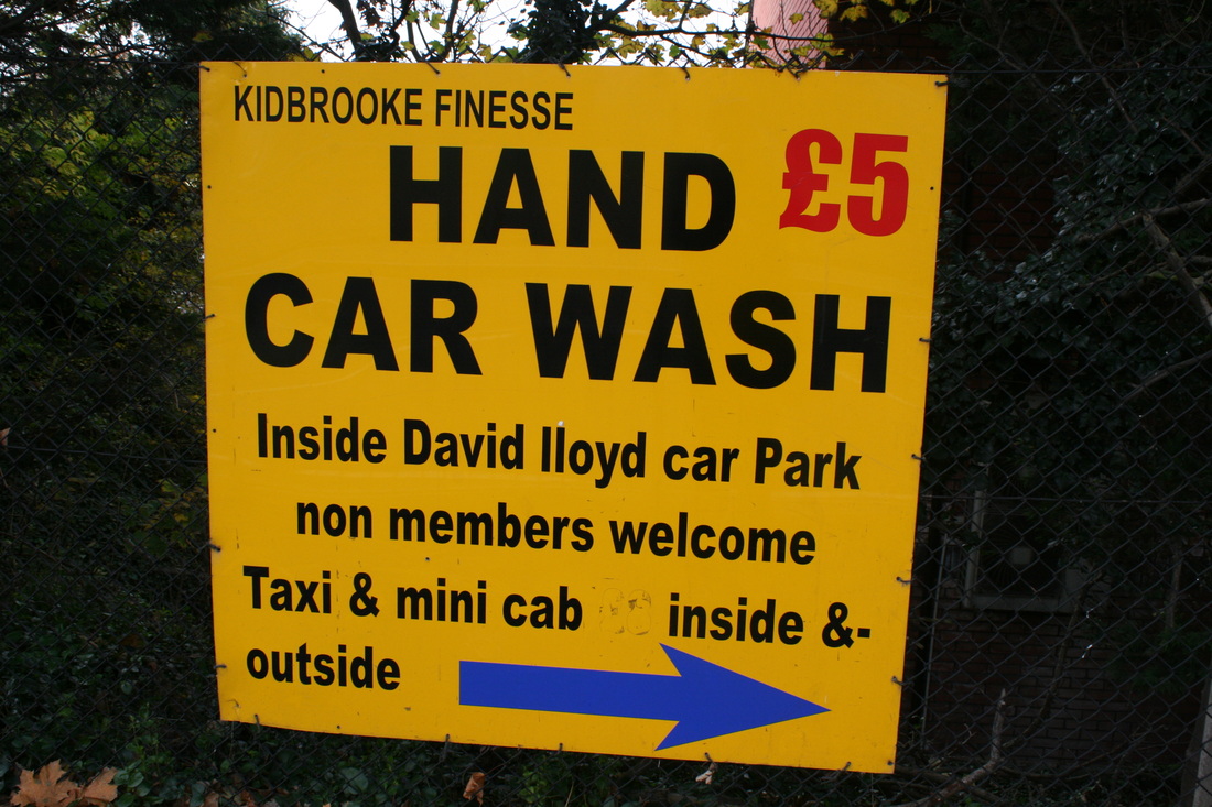
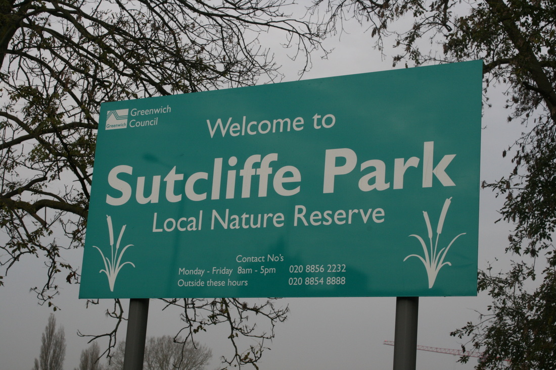
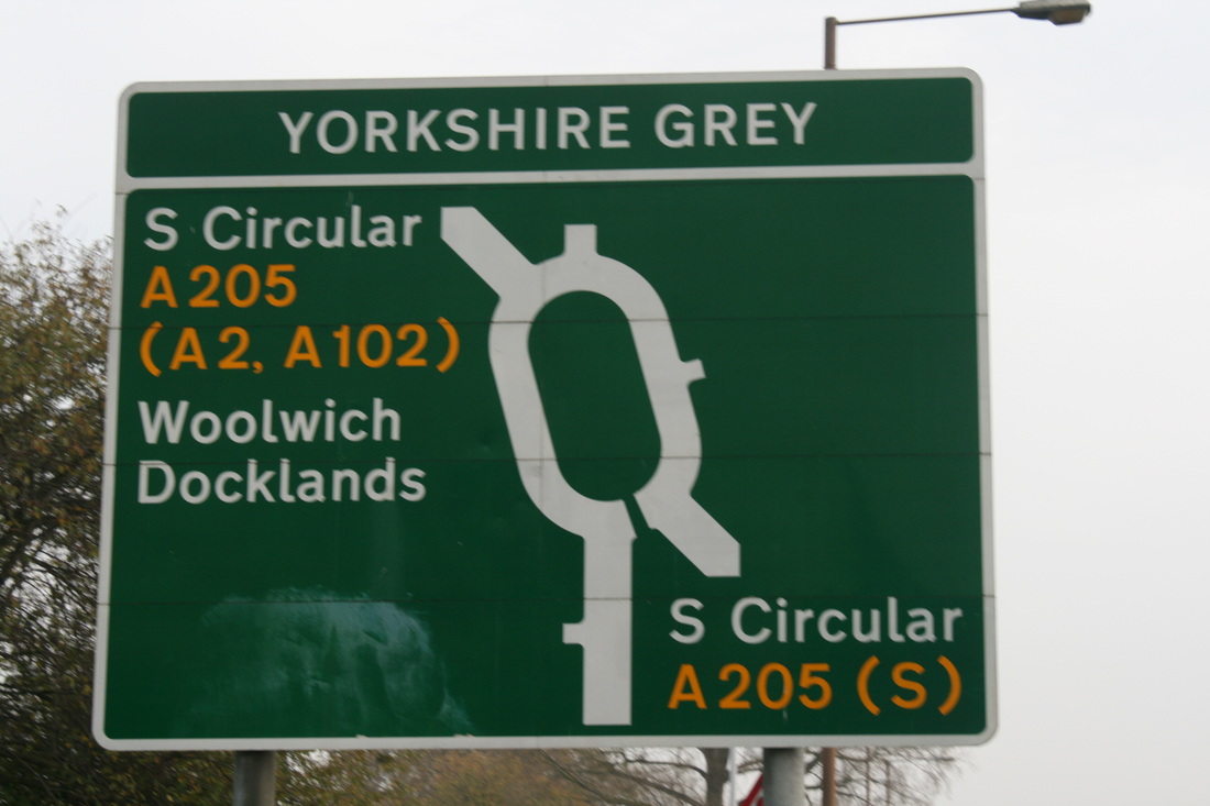
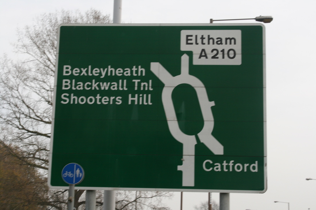
I believe that this Typology is the one that could of been better. The main problem with the one was the Lighting. On some of the signs they are like a Silhouette and not easy to see.
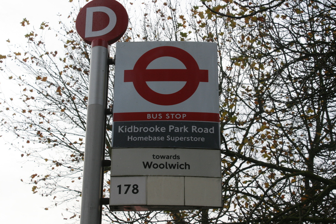
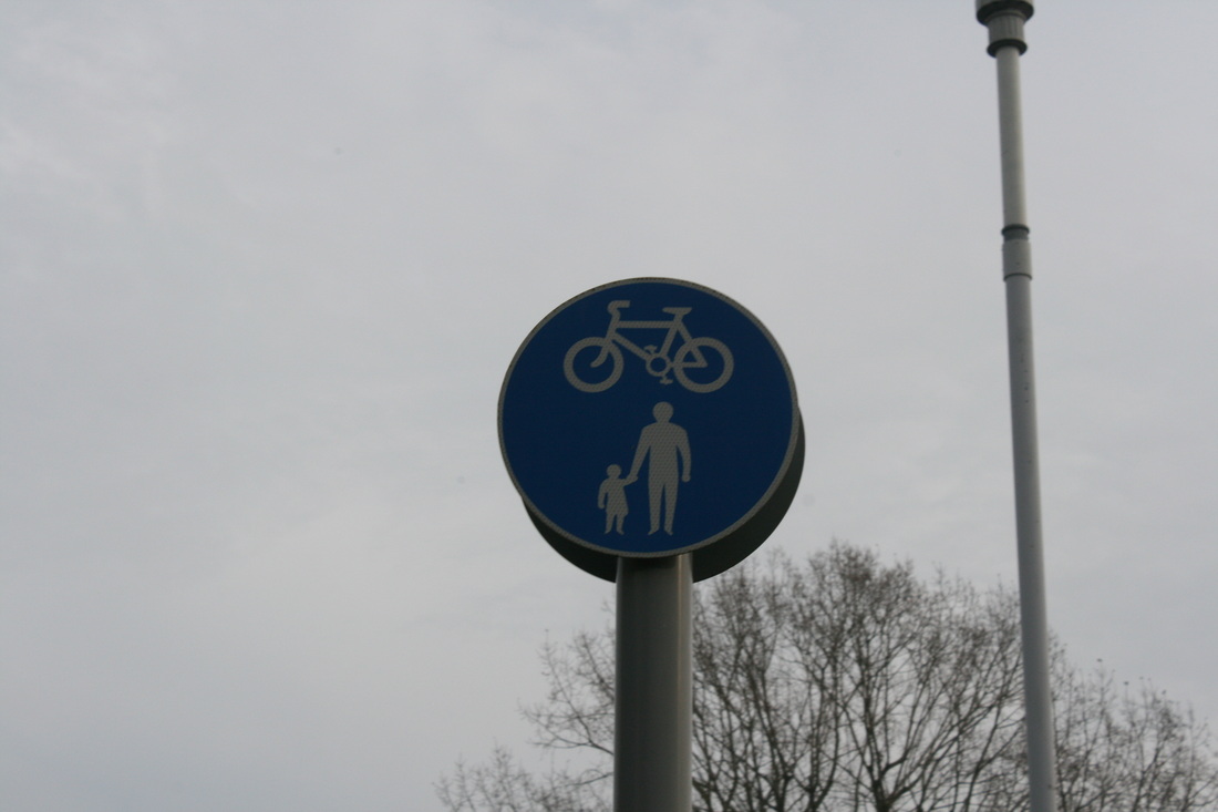
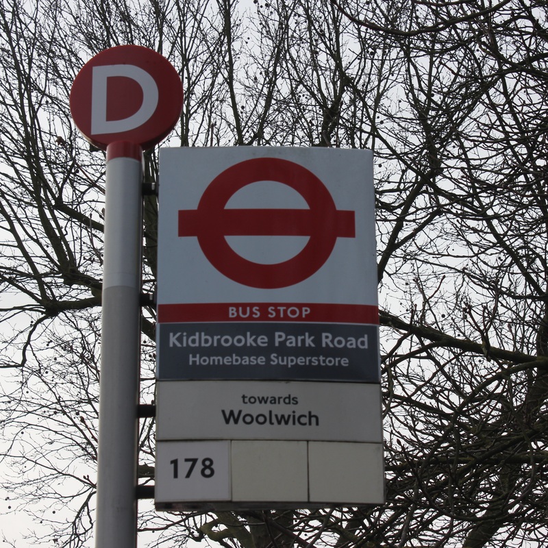
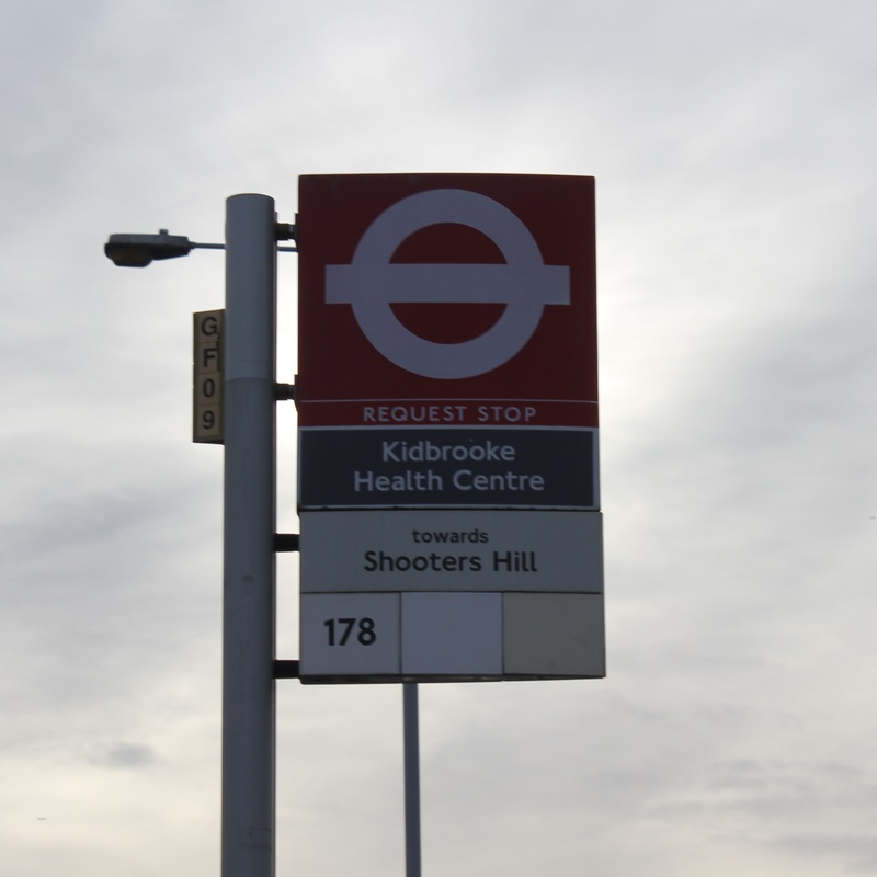
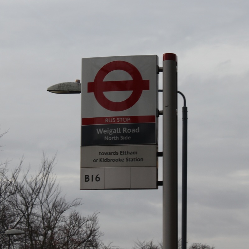
Refined and Developed version
In this version I decided to focus on bus stops. This is because I believe that the name 'Signs' was a bit vague and could mean anything, road signs, billboard signs, roadwork signs etc. So I decided to focus on just one kind of sign.
How does Typology link to Contrast.
One way I believe Typologies link to Contrast is because they refer to a wide range of certain things. For example it shows me a wide range of Signs in Kidbrooke. There is a Contrast is colour, contrast is size, contrast in shape.
