Surrealism Essay
My personal investigation explores the relationship between me and my camera. I’m intrigued into how it changes my perspective of the world and how it changes my vision of the real world. I also like capturing reflective surfaces mainly in the urban landscape. Sometimes it feels like a second image is found within the image. Sometimes it made me question the existence of the reflection because of the multiple layers in one image.
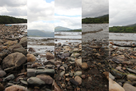
Before my investigation started I was tasked with picking a Surrealist practice during the summer. I chose the idea of creating new photographs out of original photos. I did this by cutting the image into 4 sections. I would have 5 images and I would roll and dice.
Before my investigation started I was tasked with picking a Surrealist practice during the summer. I chose the idea of creating new photographs out of original photos. I did this by cutting the image into 4 sections. I would have 5 images and I would roll and dice.
|
So if I rolled 4, I would use a section from the 4th image, However if I rolled a 6, I would roll again and take that number away for 6 and that would be the image that I would use. This produced some very interesting image especially when I was using the Scottish landscape images where the subject is going up and down, as the image shows you.
|
At the start of my personal investigation, I decided to look at the photographic practices of the Surrealists. They enjoyed playing games of chance where you can’t predict what the outcome will be. The most famous of these exercises is the Exquisite Corpse. This is possibly the most popular game that the Surrealists played. I took part in two exercises inspired by the Exquisite Corpse. The first one was the typical:
The second experiment was a digital photographic version. Using the app Andigraf (an photographic app) I collaborated with a classmate to take a series of photographs according to the laws of chance. We would each take it in turns to make one quarter of an image using the multi-lens camera. We ended up with some very interesting results. For example, one section could be landscape and the next could be portrait.
After the exquisite corpse, I moved on to another Surrealist style game. This game involved cutting out sections of magazines to create collages. For this game I took photos from a cricket magazine so I had a group of pictures of people in different shapes and stances which when stuck together can form an abstract collage. Especially when I had a photo of a person and stuck it the other way round so you are looking at a person built up of words.
After my first few experiments into Surrealism I felt that I needed to find out the definition of Surrealism. So I decided to read the “First Manifesto of Surrealism 1924, which was written by Andre Breton, who is known as the “Father Of Surrealist Movement”. Breton defines Surrealism as “Pure psychic automatism by means of which one intends to express either verbally, or in writing, or in any other manner, the actual functioning of fought”. There was another quote I found that really improve my understanding of Surrealism. “The imaginary is what tends to become real.” Breton clearly believes people that are ‘Surrealists’ can see the world in a different way to ordinary people. A bit like having a photographer’s eye. However rather than seeing a photographic opportunity. Surrealists tend to look at everyday objects and see them as something else. The ‘Automatism’ is considered as the best word to describe the importance of the Surrealist movement.
The next experiment I looked at was Equivalents. To start off, I looked at a photo that was taken by Alfred Stieglitz and a painting that was made by Francis Picabia. At first I really struggled with this experiment because so after looking at the 2, I went out to take some pictures that I thought were to do with Equivalence. The problem was, I wasn’t sure what we had to capture. Luckily I found at a quote by Minor White, “the expressive-creative photographer is concerned, lies in the fact that he can convey and evoke feelings”. This section of the quote is what increased my understanding the most. ‘convey and evoke’ made me understand that we should portray our emotions. So to focus on portraying my emotions, I should keep the photos as basic as possible. No changing of the shutter speed, exposure. So I decided to take the photos on my phone, so I wouldn’t be distracted by the settings.
The next area of my investigation that I looked at was a project that I called ‘Self Size’. I started this experiment by looking at the work of Marcel Duchamp work which he called ‘3 Standard Stoppages’. This work involved Duchamp dropping string onto a canvas. This is where Duchamp first followed his idea of ‘ready-made’. After dropping the string onto a black canvas. The string was a metre long and he dropped them onto the canvas. From Duchamp formed the ‘new metre’ length. I decided to do this but with the length of the body parts. So I measured our arm length, our wrist and other body parts. Then I dropped the string from that specific height onto the canvas. From this practice, the main thing I learned is how much element of chance there is in art because this is what Duchamp did back in 20’s, just stood from a certain height and dropped string. Unfortunately, my string didn’t land in a similar way to Duchamp's ‘new metre’.
Next I looked at the idea of Sequences. I started this experiment by looking at Baldessari’s sequences. Baldessari took photos of him holding hats over his faces, waving at sailing boats, swapping carrots. So I decided to create my own version. I decided to swap chess pieces. The piece that was taken away and added was decided by the number that was rolled on a dice. So if the dice rolled 1 or 2, the first chess piece would be moved, 3 or 4 the middle chess piece will be moved. 5 or 6 and the 3rd chess piece will be moved out of shot. It is the same principle for chess piece that came into the shot.
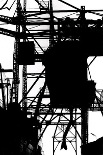
Out of all the aspects of Serious Play. My favourite aspect was the Rorschach test. I started off by making the traditional inkblots on paper. One of the blots fascinated me so I decided to ask people what they saw in it. I got a couple of interesting results. One person said it looked like Iron Man, skull, skeleton, clown. I myself thought it was a skeleton but also looked a bit like a bear. My dad said it was a person who was wearing a chain. After I made these blots. I decided that I needed to try a more photographic version of Rorschachs. So I went into the dark room with a portrait that had been turned into a negative. I would expose the negative onto the photogram. Then afterwards I dropped the developer onto the photograph, rather than put it into the developer. There was only one more aspect of Rorschach's that I wanted to look at. For this idea. I looked at the work of John Sargent Barnard. He tended to take photo of branches and turn them into a Rorschach. So I decided to do the same. I went down to Sutcliffe park and focused on getting photos of branches contrasting with the sky. I wanted to have the branches in silhouette form. The images would appear to be appear more abstract and the more abstract the subject is, the better the illusion there will be in the Rorschach.
For my first response I decided to add an element of chance to digital Rorschach. I decided to mix a photogram Rorschach over the digital one to give it an abstract frame. I also decided to mirror the image yet again to keep the Rorschach effect. At first I printed off the images and I was going to mount them together. However cutting the images out was proving tough. The images weren't lining up. So I decided to have it professionally printed. I sent it off to be printed at Photobox. I decided to have it in 30” by 20”. I went for this size because I wanted to have it in the biggest size possible. The bigger it is printed, the better the illusion will be. Also 30” by 20” was the biggest size available before A1. Anything bigger than 33” by 23” would be too big for one mount board and I would have to use 3 mount boards. Overall I’m happy with my first response.
During the October half-term. I went on holiday to America. When I was in Las Vegas I focused on 3 subjects for Dream City. The desert contrasting with the urban area, neon lights and reflections. The edge of the city one went well I think mainly because I had a fantastic view of Vegas where we were staying, so I could zoom in on the buildings and then capture it with the desert mountain in the background. The neon lights went fairly well as well. The reflections one was ok, I was too far away to capture the reflections on the tinted windows, except for 1 occasion.
- Draw on a sheet paper. The fold that section over
- Pass the paper. Where they will draw the next section
- Create a collaborative drawing by chance
The second experiment was a digital photographic version. Using the app Andigraf (an photographic app) I collaborated with a classmate to take a series of photographs according to the laws of chance. We would each take it in turns to make one quarter of an image using the multi-lens camera. We ended up with some very interesting results. For example, one section could be landscape and the next could be portrait.
After the exquisite corpse, I moved on to another Surrealist style game. This game involved cutting out sections of magazines to create collages. For this game I took photos from a cricket magazine so I had a group of pictures of people in different shapes and stances which when stuck together can form an abstract collage. Especially when I had a photo of a person and stuck it the other way round so you are looking at a person built up of words.
After my first few experiments into Surrealism I felt that I needed to find out the definition of Surrealism. So I decided to read the “First Manifesto of Surrealism 1924, which was written by Andre Breton, who is known as the “Father Of Surrealist Movement”. Breton defines Surrealism as “Pure psychic automatism by means of which one intends to express either verbally, or in writing, or in any other manner, the actual functioning of fought”. There was another quote I found that really improve my understanding of Surrealism. “The imaginary is what tends to become real.” Breton clearly believes people that are ‘Surrealists’ can see the world in a different way to ordinary people. A bit like having a photographer’s eye. However rather than seeing a photographic opportunity. Surrealists tend to look at everyday objects and see them as something else. The ‘Automatism’ is considered as the best word to describe the importance of the Surrealist movement.
The next experiment I looked at was Equivalents. To start off, I looked at a photo that was taken by Alfred Stieglitz and a painting that was made by Francis Picabia. At first I really struggled with this experiment because so after looking at the 2, I went out to take some pictures that I thought were to do with Equivalence. The problem was, I wasn’t sure what we had to capture. Luckily I found at a quote by Minor White, “the expressive-creative photographer is concerned, lies in the fact that he can convey and evoke feelings”. This section of the quote is what increased my understanding the most. ‘convey and evoke’ made me understand that we should portray our emotions. So to focus on portraying my emotions, I should keep the photos as basic as possible. No changing of the shutter speed, exposure. So I decided to take the photos on my phone, so I wouldn’t be distracted by the settings.
The next area of my investigation that I looked at was a project that I called ‘Self Size’. I started this experiment by looking at the work of Marcel Duchamp work which he called ‘3 Standard Stoppages’. This work involved Duchamp dropping string onto a canvas. This is where Duchamp first followed his idea of ‘ready-made’. After dropping the string onto a black canvas. The string was a metre long and he dropped them onto the canvas. From Duchamp formed the ‘new metre’ length. I decided to do this but with the length of the body parts. So I measured our arm length, our wrist and other body parts. Then I dropped the string from that specific height onto the canvas. From this practice, the main thing I learned is how much element of chance there is in art because this is what Duchamp did back in 20’s, just stood from a certain height and dropped string. Unfortunately, my string didn’t land in a similar way to Duchamp's ‘new metre’.
Next I looked at the idea of Sequences. I started this experiment by looking at Baldessari’s sequences. Baldessari took photos of him holding hats over his faces, waving at sailing boats, swapping carrots. So I decided to create my own version. I decided to swap chess pieces. The piece that was taken away and added was decided by the number that was rolled on a dice. So if the dice rolled 1 or 2, the first chess piece would be moved, 3 or 4 the middle chess piece will be moved. 5 or 6 and the 3rd chess piece will be moved out of shot. It is the same principle for chess piece that came into the shot.
Out of all the aspects of Serious Play. My favourite aspect was the Rorschach test. I started off by making the traditional inkblots on paper. One of the blots fascinated me so I decided to ask people what they saw in it. I got a couple of interesting results. One person said it looked like Iron Man, skull, skeleton, clown. I myself thought it was a skeleton but also looked a bit like a bear. My dad said it was a person who was wearing a chain. After I made these blots. I decided that I needed to try a more photographic version of Rorschachs. So I went into the dark room with a portrait that had been turned into a negative. I would expose the negative onto the photogram. Then afterwards I dropped the developer onto the photograph, rather than put it into the developer. There was only one more aspect of Rorschach's that I wanted to look at. For this idea. I looked at the work of John Sargent Barnard. He tended to take photo of branches and turn them into a Rorschach. So I decided to do the same. I went down to Sutcliffe park and focused on getting photos of branches contrasting with the sky. I wanted to have the branches in silhouette form. The images would appear to be appear more abstract and the more abstract the subject is, the better the illusion there will be in the Rorschach.
For my first response I decided to add an element of chance to digital Rorschach. I decided to mix a photogram Rorschach over the digital one to give it an abstract frame. I also decided to mirror the image yet again to keep the Rorschach effect. At first I printed off the images and I was going to mount them together. However cutting the images out was proving tough. The images weren't lining up. So I decided to have it professionally printed. I sent it off to be printed at Photobox. I decided to have it in 30” by 20”. I went for this size because I wanted to have it in the biggest size possible. The bigger it is printed, the better the illusion will be. Also 30” by 20” was the biggest size available before A1. Anything bigger than 33” by 23” would be too big for one mount board and I would have to use 3 mount boards. Overall I’m happy with my first response.
During the October half-term. I went on holiday to America. When I was in Las Vegas I focused on 3 subjects for Dream City. The desert contrasting with the urban area, neon lights and reflections. The edge of the city one went well I think mainly because I had a fantastic view of Vegas where we were staying, so I could zoom in on the buildings and then capture it with the desert mountain in the background. The neon lights went fairly well as well. The reflections one was ok, I was too far away to capture the reflections on the tinted windows, except for 1 occasion.
|
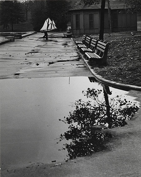
Out of all the photos I got my favourites were the reflection ones. So I thought I needed to pursue this again. I continued my work about reflections by looking at the work of Andre Kertesz. I really like his image of puddles where he left a small clue as to what was in the puddle. For example in the image on the left. In the puddle there is a large amount of a tree and outside the puddle. There is a small section of the tree. The visual clue to what is in the puddle. I also liked how Kertesz tried to make small links in his image. He probably waited for the man with the boat to come into the frame. That way we will see the boat and then the puddle. There is a clear and obvious link between the 2. I decided to keep on the idea of leaving small visual clues when photographing puddles. So I spent the next 2 week photographing this. Mainly when I was coming to school but a couple of photos were taken around in the local area. This idea would lead to my next response for Surrealism. I’m very impressed with my 2nd response to Surrealism, the best thing about it is that it has been printed on glossy paper, so there has that shiny feel which you get on glossy paper.
|
It has worked well with the colours especially with the blue and black areas of the puddles reflection. I really like the composition as well because the subject is right in the middle of the frame, also the subject clearly stands out whereas if I didn’t Photoshop the image, people might not of realised the puddle that easily. Here it is. My only regret with this final piece is that I could of ordered it in 45” by 30” with only little price difference, however I wouldn’t of been able to get it in glossy paper. If the colour wasn’t important in this image I would of order it in that size in Matt, but the colour contrast was very important. In the end this turned out to be a good choice. Obviously with it being glossy, we needed to put it in a photo-frame because the problem with glossy paper is that it is shiny and prone to fingerprints.
Original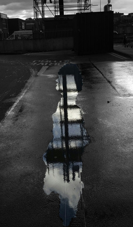
|
Threshold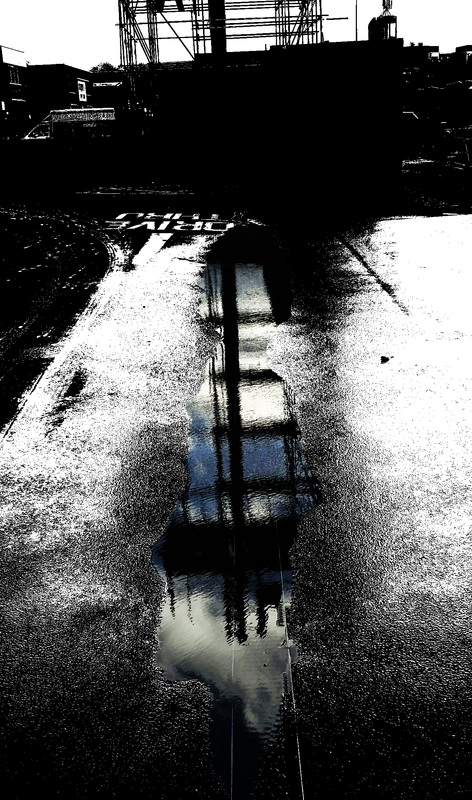
|
However I do have one big regret with this response. Later on when I did the Keld Helmer-Petersen work I was fascinated by the Threshold images. I was thinking to myself what this response would of looked like if I applied a Threshold to the B&W areas.
After doing this, I'm filled with regret that I didn't send this off to be printed instead. I prefer this 2nd one because I feel it is a lot more abstract than the original one and the colours are more rich. |
After I made the Andre Kertesz inspired response. I decided to explore another kind of reflection. This time I went around the school getting photos using mirror. I attempted to hold the mirror in a certain way so half of the image is normal view and half of the image is a reflection. Here is a link to my response. I bet that when you look at it, you think it is photo-shopped, but it isn’t. I think this response is good, especially the mounting, which I have usually struggled with in the past. There are one or 2 problems with the mounting, but they should be able to be improved. I only wish I put the image in B&W, and then I would've decided what looked better. However I didn’t take that opportunity. After making these man-made reflections, I thought I had reached the end of the road and I decided to look into another experiment.
For the final bit of my investigation. I want to explore the existence of reflections mainly within a photographic image. I did by taking photos of objects that are being reflected onto the water. Then I would flip the images ‘upside down’ so that way the reflection will be the right way up. All the distorted effect on the water will also make people question the authenticity of the reflection. After this I decided to turn the already abstract image into a very abstract one. I did this by applying a Threshold to the image. For this section, I was inspired by Keld Helmer-Petersen. I was fascinated by his photos from the ‘Back to Black’ series. However I did expect this to be his stand out work because he is mainly remembered as being one of the pioneers of colour photography.
|
|
For my response I decided to get photos of letters, then I will display them in lines to try to create some kind of abstract illusion, some kind of pattern or a word. I was originally going to make the photos with solid colours like his photo on the left. However I decided to lower the threshold level. I did this because I liked the texture feel to the images and how it made the abstract illusion even more strong. Here is the response. This led to my 5th response.
|
|
After I laid out the images, I decided to zoom in on the words, hopefully to create some abstract images. Then I realised the photos were being taken at around 1/60, which is a slow shutter speed. So I decided to add some intentional motion blur. We sent this off to be printed in AO size. I decided to have a photo taken with someone next to it to indicate the sense of scale. I’m happy with this response mainly because the size of the image. However I'm not a fan of the low contrast, I feel that I should of upped the brightness and contrast of the image to make it more B&W because it appears more grayscale at the moment.
|
Overall, I’m very pleased with my personal investigation into the Surrealist movement. I believe I have conducted a good amount of experiments into a wide range of photographers. I must say my personal investigation has been a lot better than I thought it would. Before the investigation started, I had didn’t what to do, I doubted my chance in this unit. However once I started a few experiments I started to generate ideas.
I think that my best experiment in Surrealism was taking photos minimal colour. In this idea I decided to take photos of reflections that were already abstract because they were distorted by the water. Then I remembered about Keld Helmer-Petersen work. So I applied a Threshold to them to take away the colour of the image. This already made an abstract image even more abstract. It also made me question if they were photographs or not. They sought of looked like lino paintings. In this unit I took 6 sets of photos for this topic. Even though I only used photos from set 5 and 6. I believe the other 4 sets defiantly contributed to that response.
One regret I have from my investigation into Surrealism is that I only had a brief look into Convulsive Beauty. When I looked at Convulsive beauty. This is because I only looked at 2 activities. They were getting photos of colours and then cropping existing photos. I abandoned the Convulsive Beauty work for 2 reasons. Firstly I felt cropping the photos was getting too repetitive and with the colours, I didn’t know what to do next. Then my friend started cutting out the colour and relaying them, however I was exploring a different topic, so I decided not to return. However there was 2 units in Beauty that I was intending to explore but I decided not to. They was the Typology idea and the different perspective. They were both a case of never getting around to them. I only wish I did get around to the different perspective idea because I had a plan to go to a park and put my DSLR onto my monopod, then I would of been able to get shots from a very high angle of view. I could of used a Neewer timer to be able to get shots from that height. These might of resulted in some very interesting shots amongst the trees. I guess another reason why I didn’t get these photos is because of me being self-conscious, I didn’t want to look weird. Which is the opposite of the Surrealists, they didn’t mind standing at weird angles, or using different techniques.
Another idea that could've gone better is Surreal America. I just believe I didn’t conduct enough research for this unit. I had been given rough ideas of what to photograph, but I didn’t have enough time to research about that idea. The only research I conducted was after I took the photos. These were just to see how I could refine this work. In the end I only refined the reflections idea.
