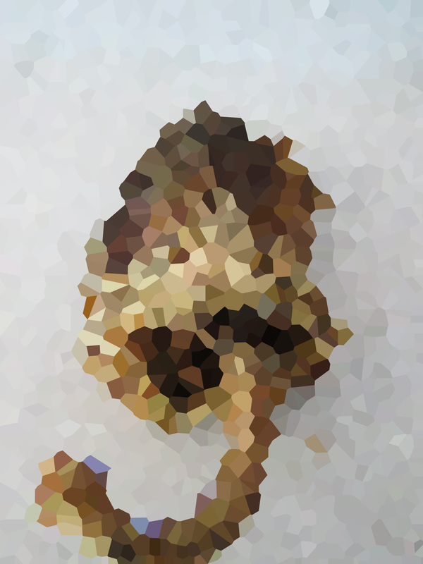
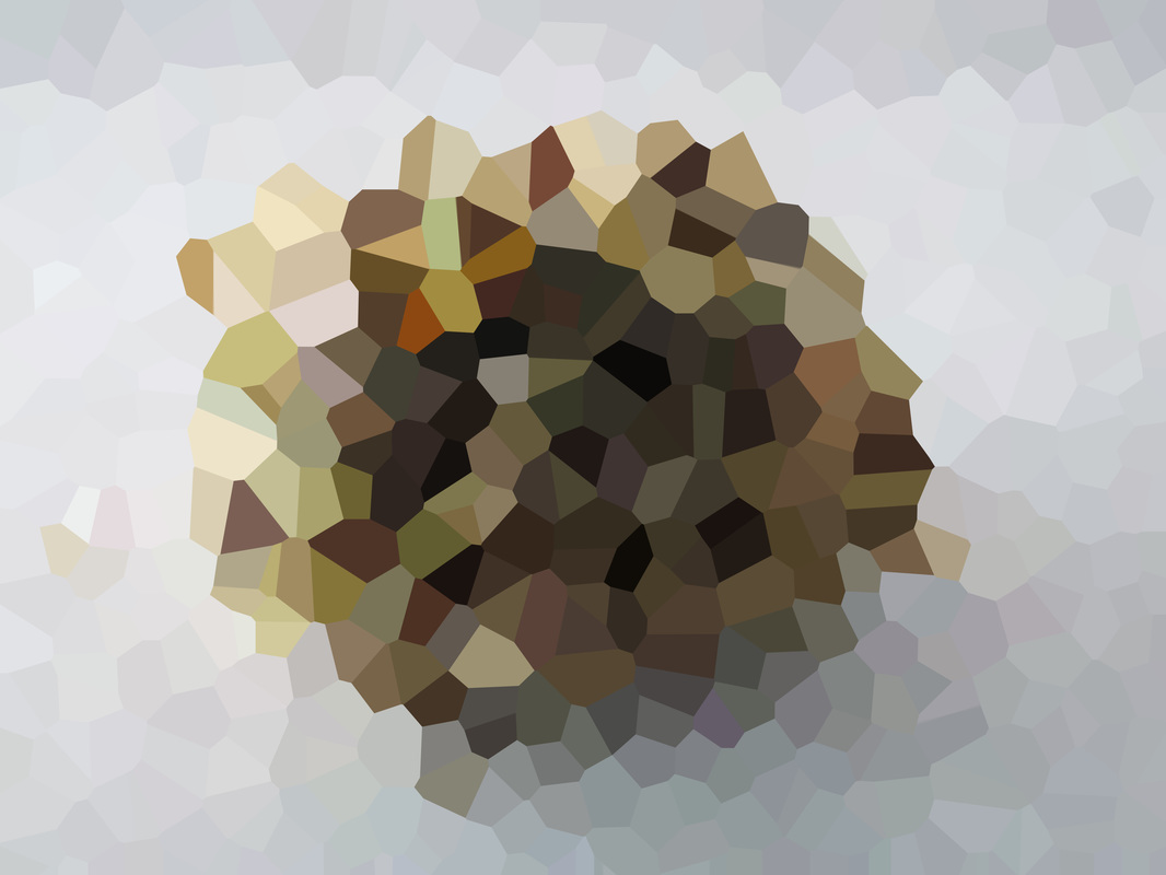
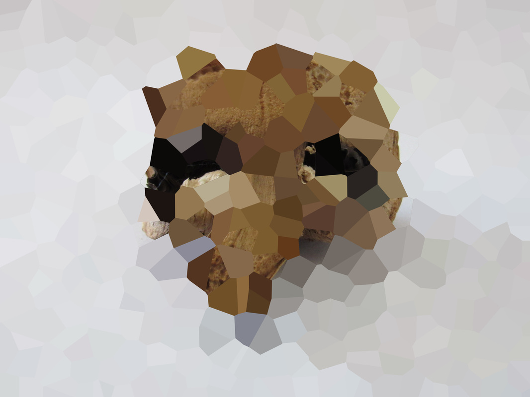
I don't know why, but one day I was thinking about pixilation and how they would bring out the colours of the image. So I picked out some photos from my close ups of Natural Forms Flickr album and I put them into Photoshop. Initially I applied a normal Pixilation filter. As you would expect the photos now composed of loads of squares with different colours. However I felt these were boring and simple. So I went back into Photoshop and used the Crystalize filter under Pixelate. I believe this filter was a lot more relevant because of the different shapes. I feel the colours are expressed much better this way.
|
These pixelated images remind me of the Cubism idea of Art. All the different shapes to make an object that seems normal.
|
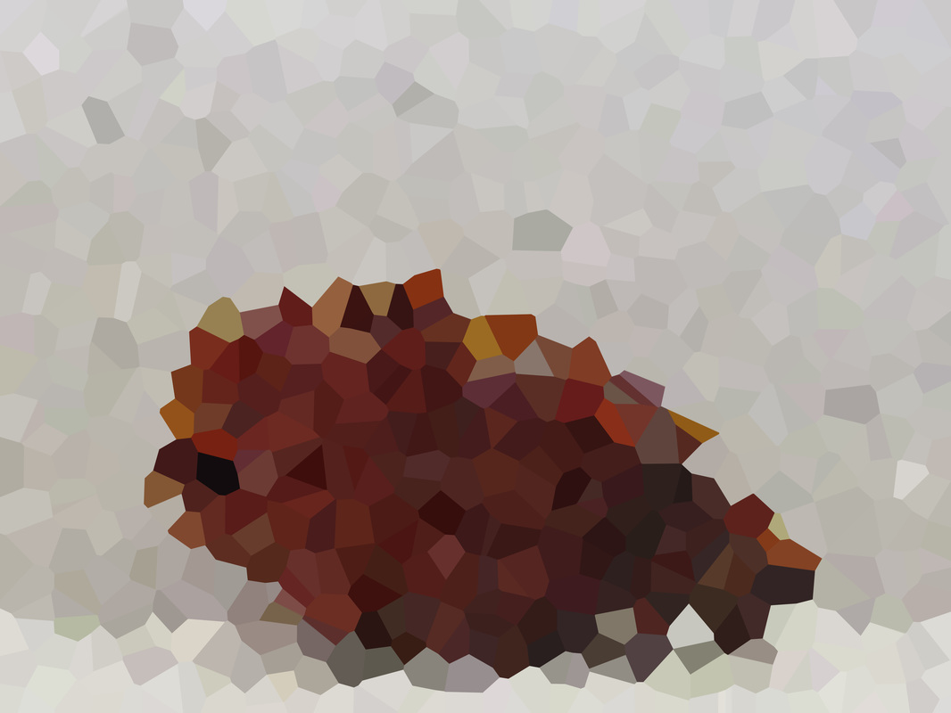
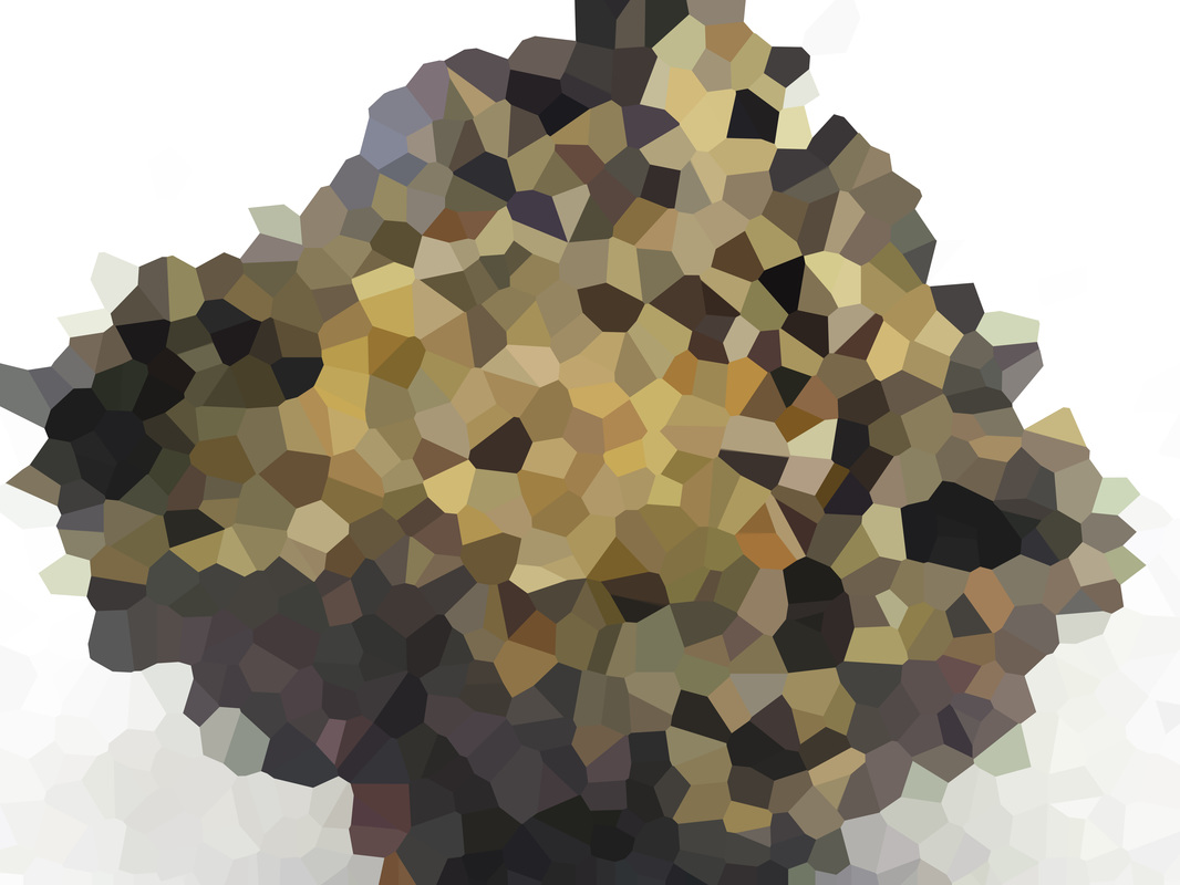
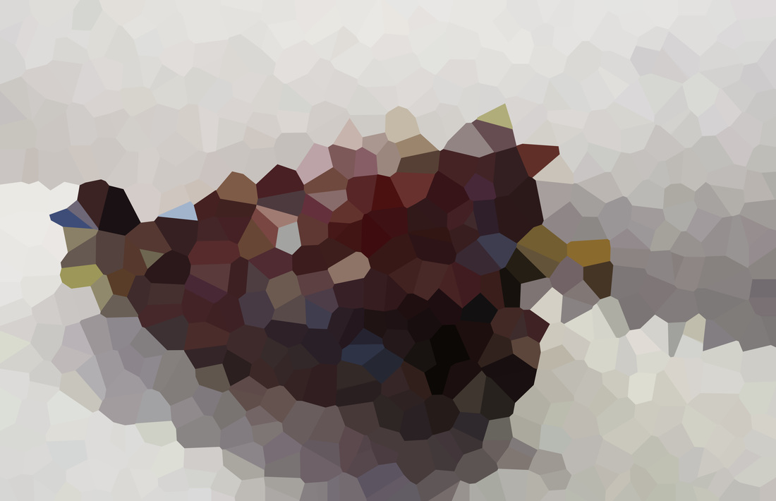

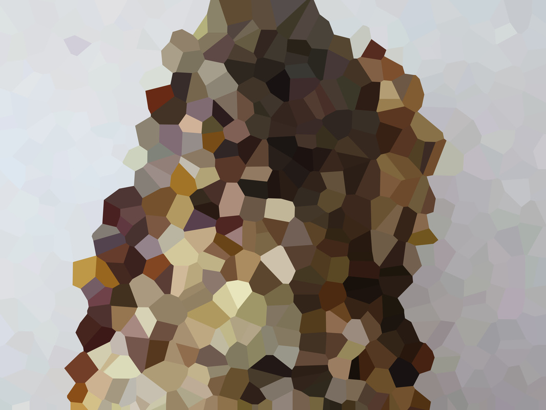
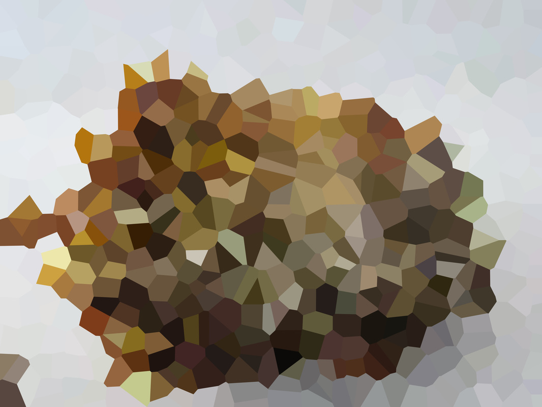
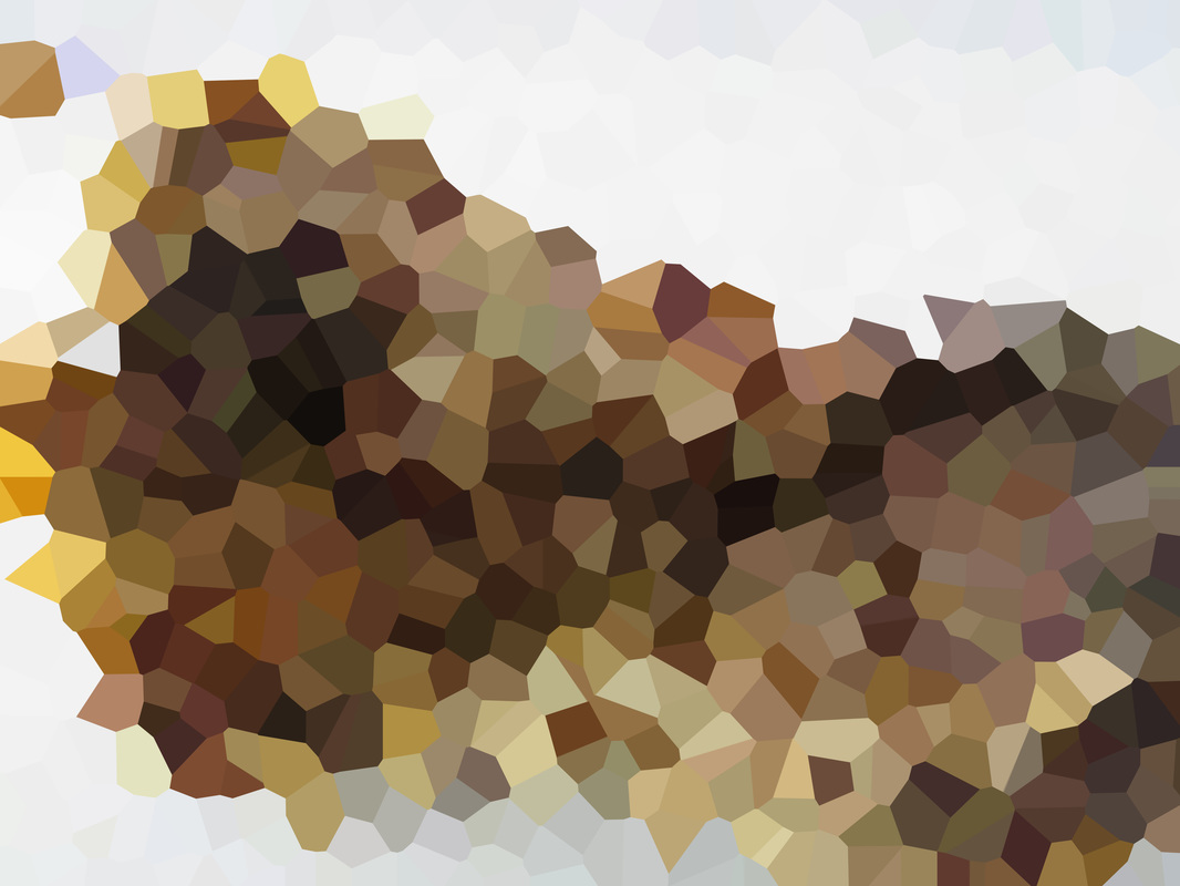
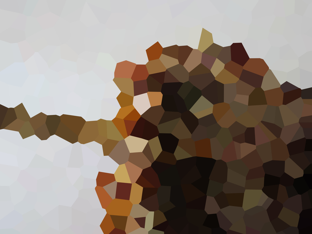
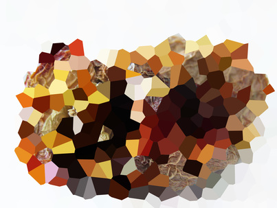
Best Photo

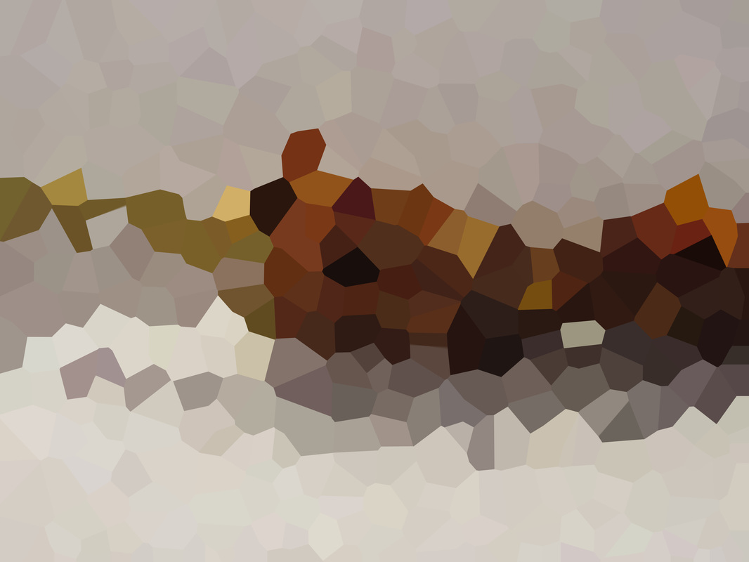
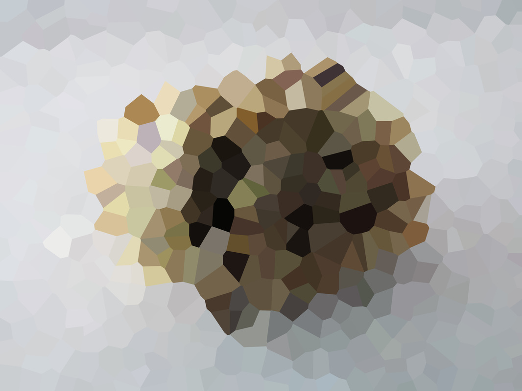
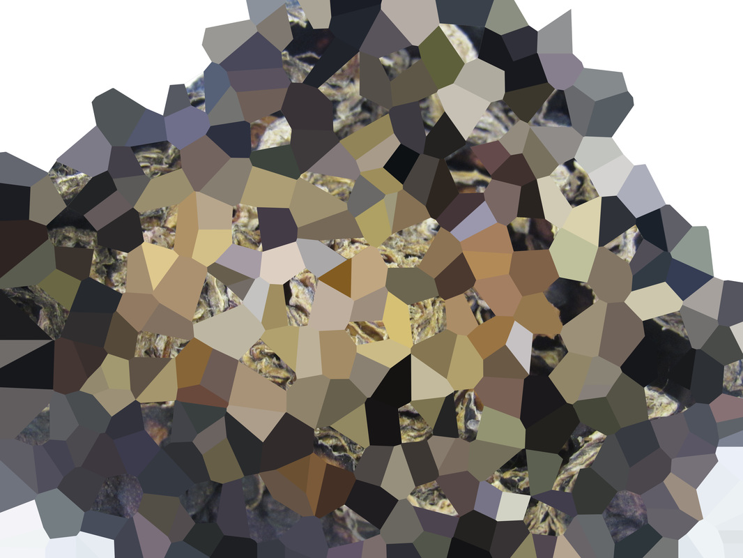
Out with the initial batch of images. This is my favourite image of them. The first thing I like about this level of abstraction to the image. It is very abstract. Looking at this you wouldn't know that this was a piece of food, when I look at this image, I would think this is looking at land. I looks like the countryside from the sky with all the shades of green and brown. It also looks like a map of London's Boroughs. My only concern with this image is that the form goes off of the frame. So the next time I take these images, I will either go one of 2 ways. Either get it in the centre of the frame or completely fill the frame.
|
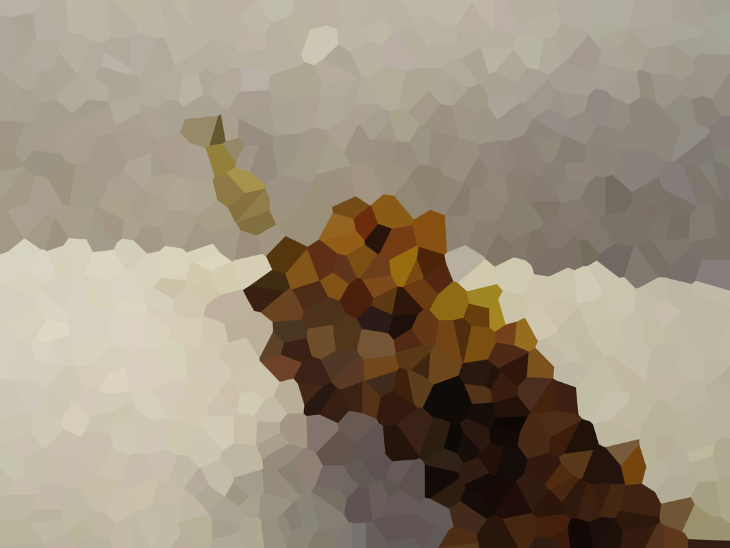
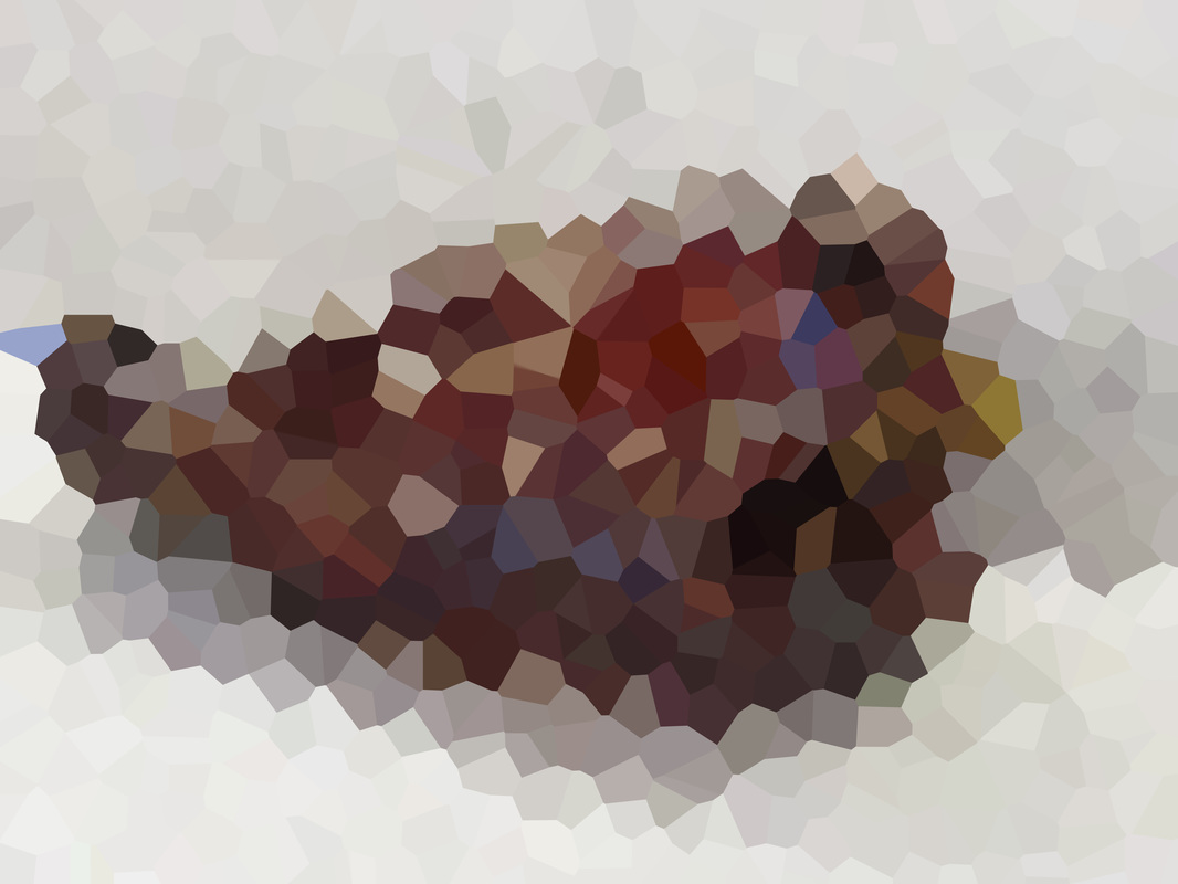
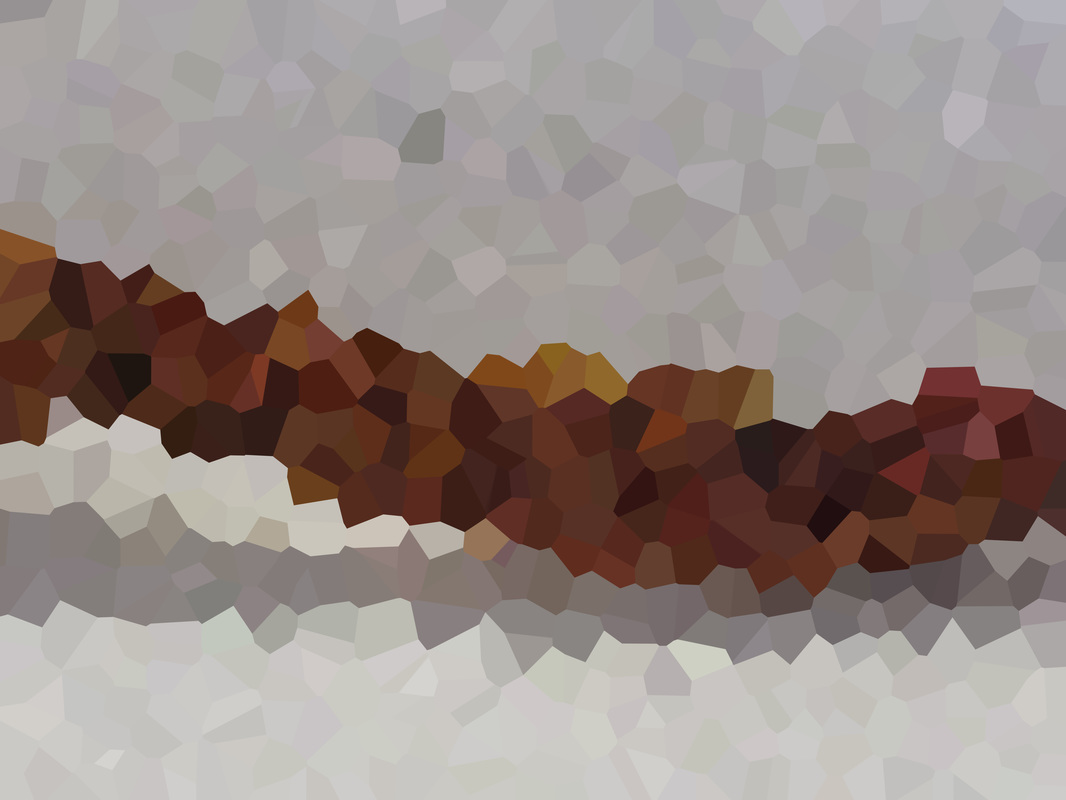
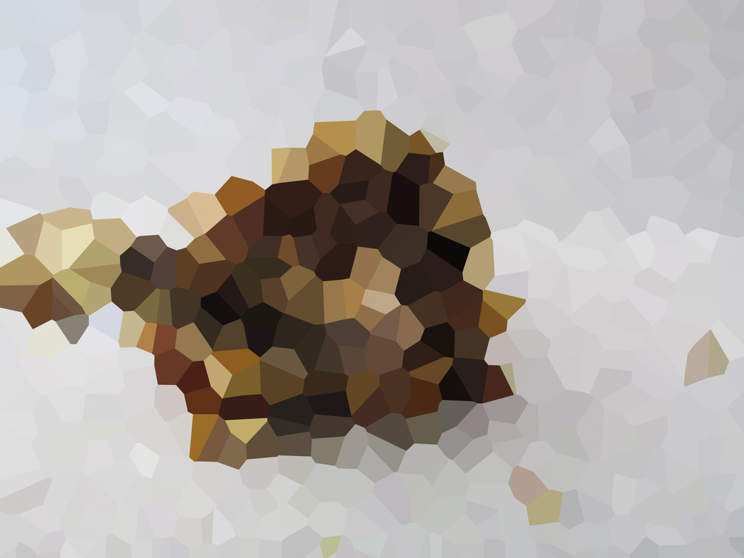
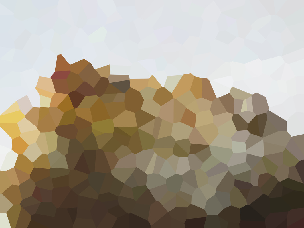
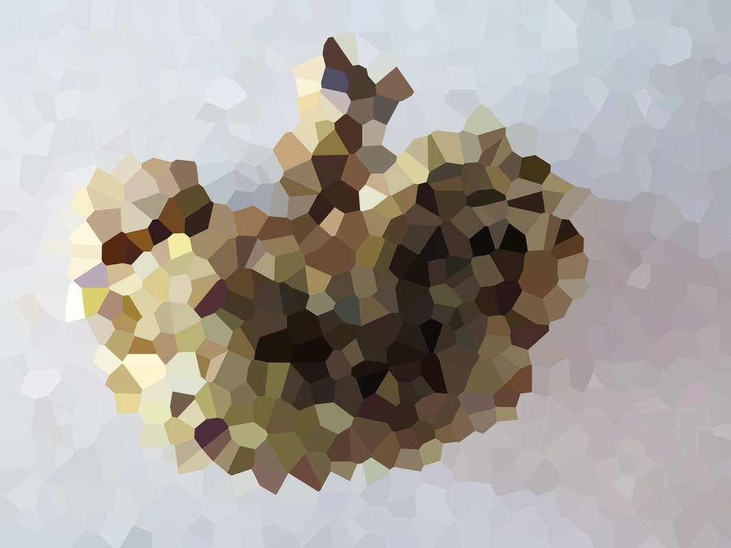
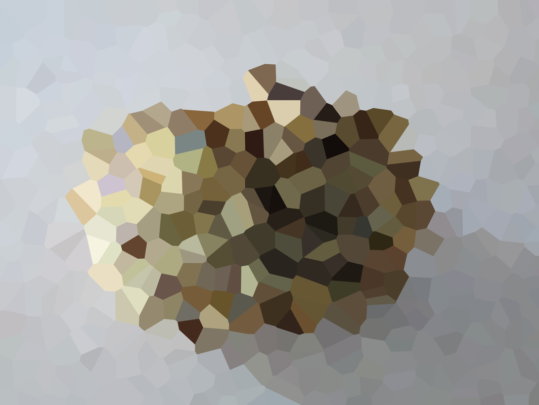
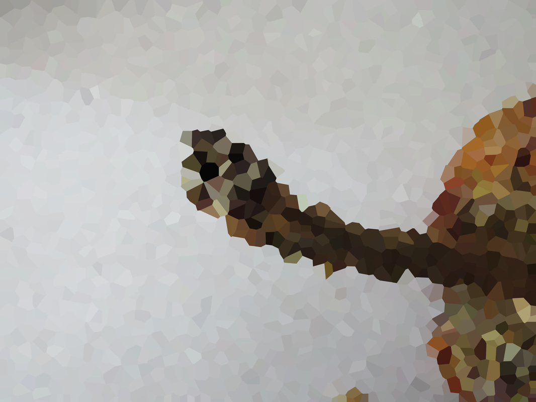
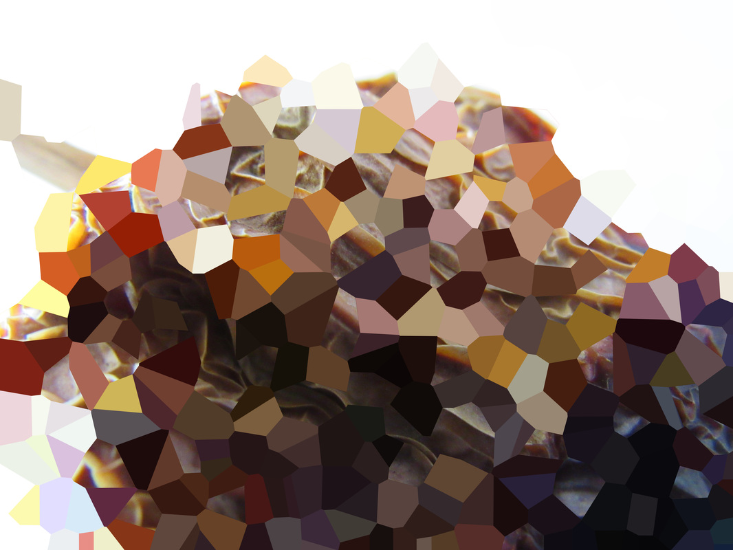
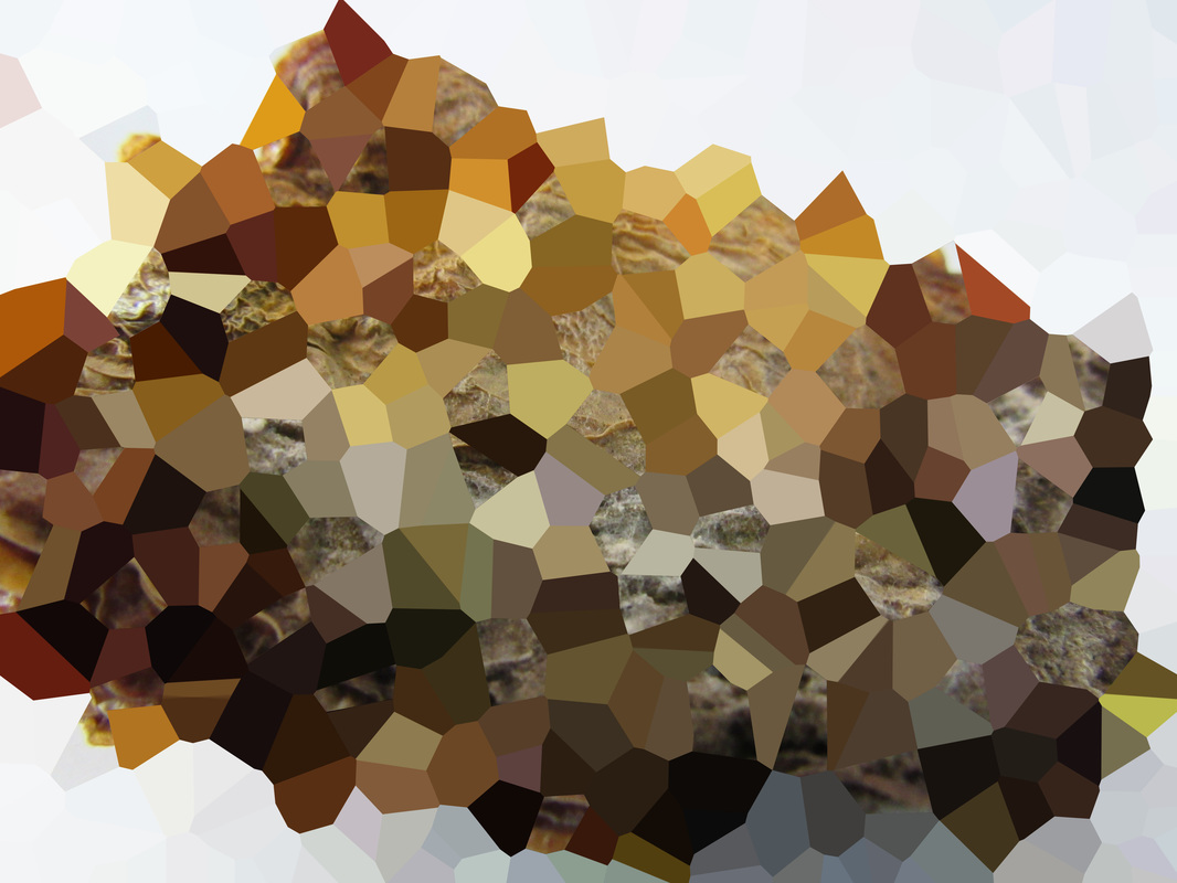
Least Favourite Photo
This is my least favourite photo of the set. I don't think this is a bad image. I just feel this shot isn't that effective. I think this one is the least abstract
However I feel there are some still some good aspects to this image, the pixels that are created by the shadows |
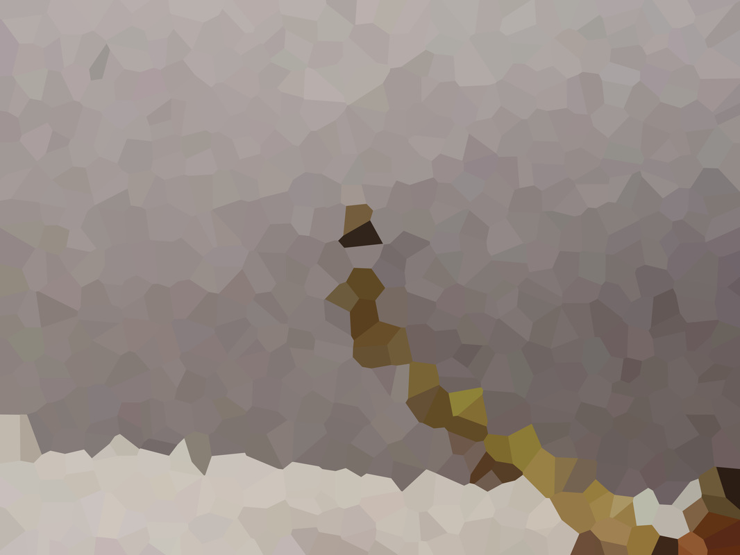
Reshoot
|
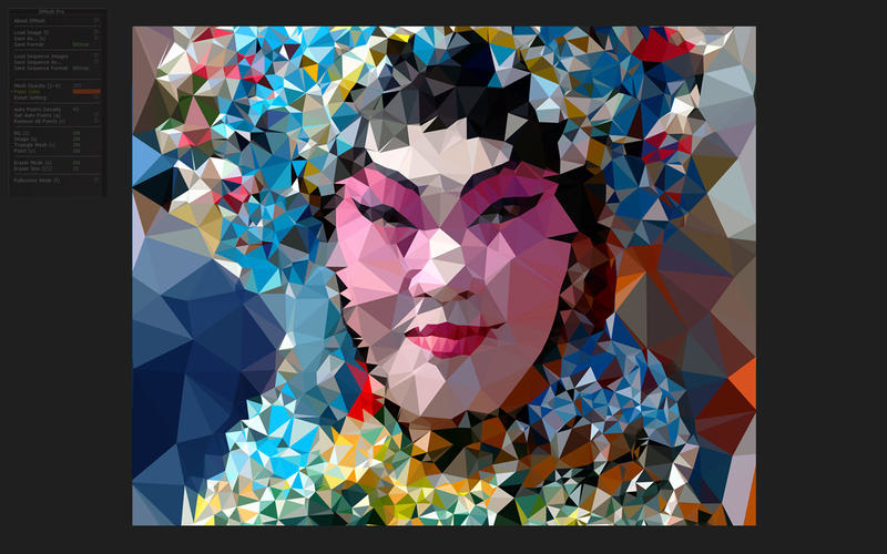
After I made the initial batch, Mr Nicholls recommended the app Dmesh pro which can make a very simple photograph looking like a Cubist painting. It can make the image look very abstract. So I installed the app on my MacBook at home and gave it a try.
|
Layers
|
This is a quick mock up I made in Photoshop of layering the pixelated natural form over the original form. I really like the contrast in texture because looking at the image it sometimes makes me feel like I'm holding different textures depending on what section I'm looking at. When I'm looking at the pixelated image it feels very flat, soft and comfortable. Whereas when I'm looking at the original form, it feels bumpy and uncomfortable. One problem I had with this mock up was the high presence of the colour black. As you can see, there are like 3 sections which are mainly black, annoyingly I couldn't take away any of the shapes because I couldn't individually select one of them. When I did another test run, I changed the Tolerance level of the Magic Wand so that way I could cut out more of the shapes.
|
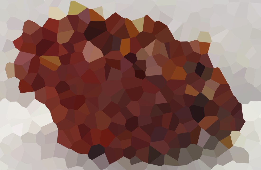
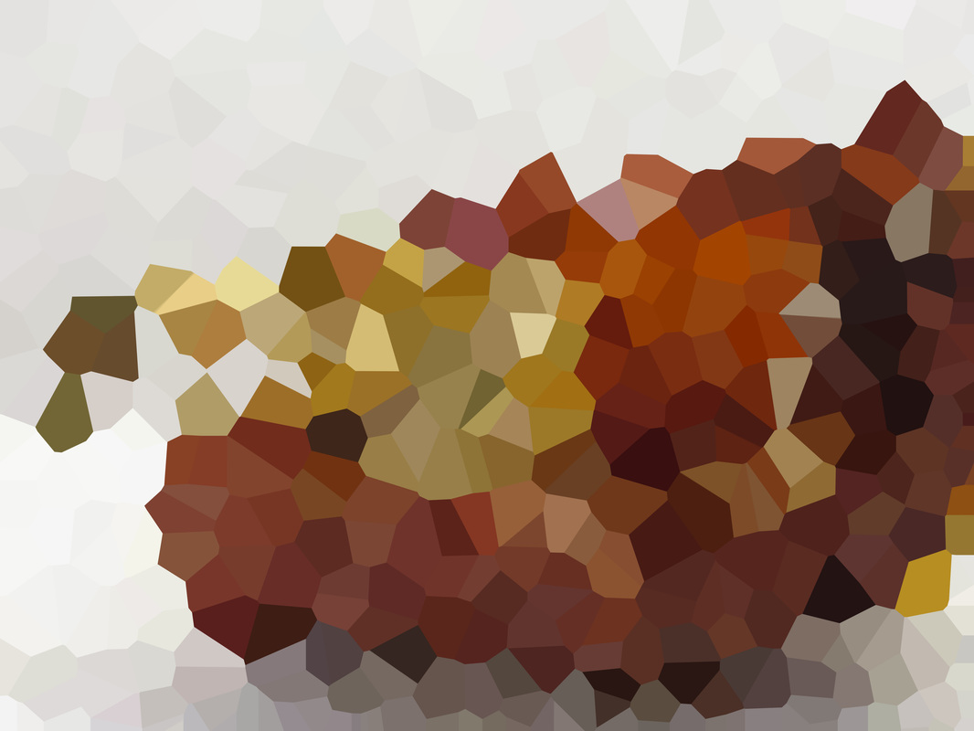
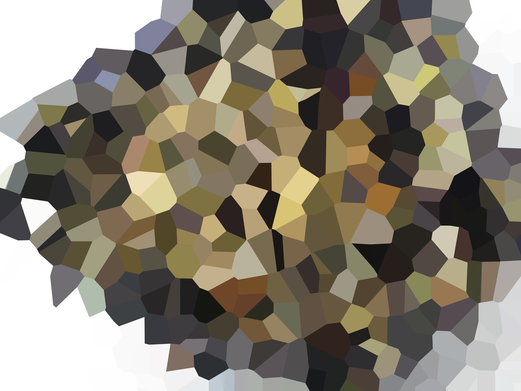
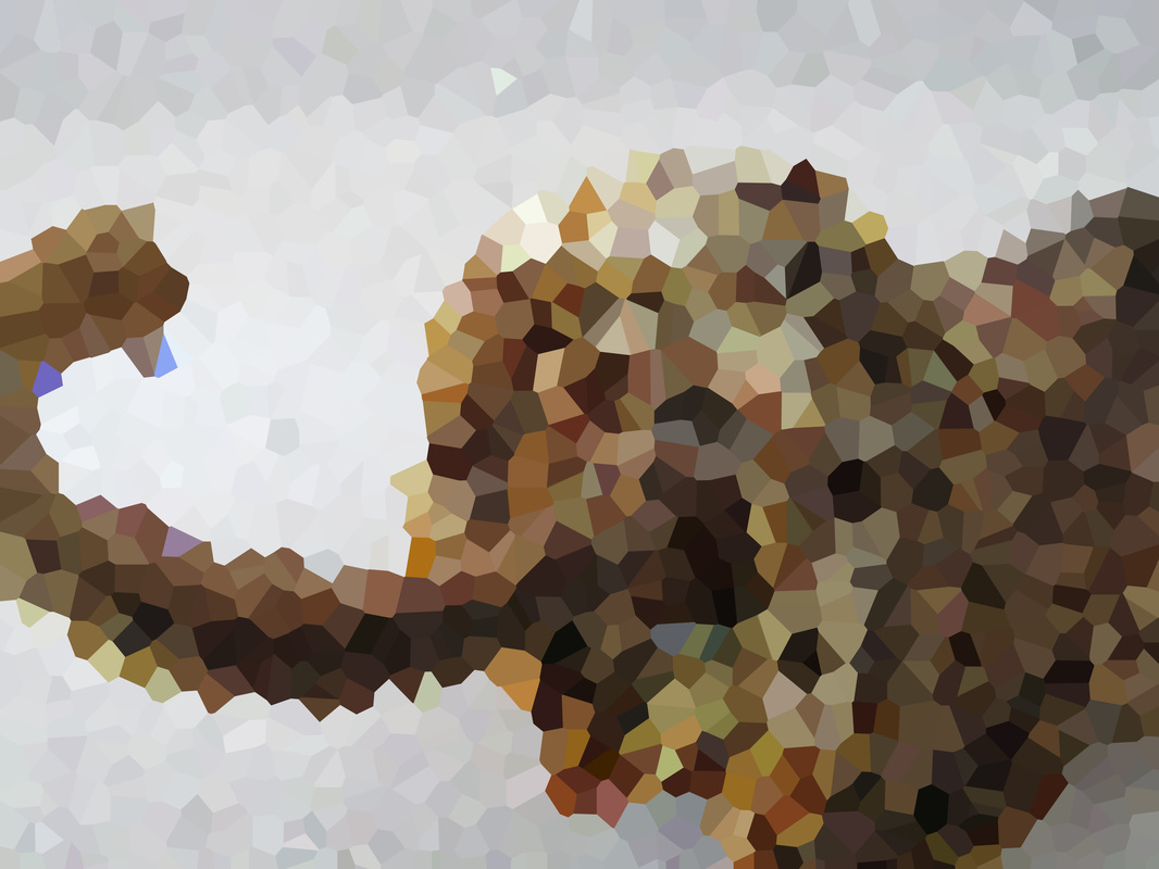
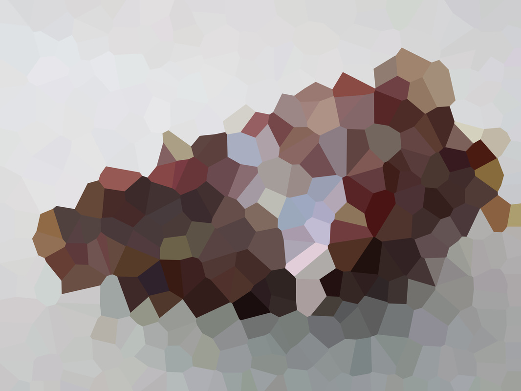
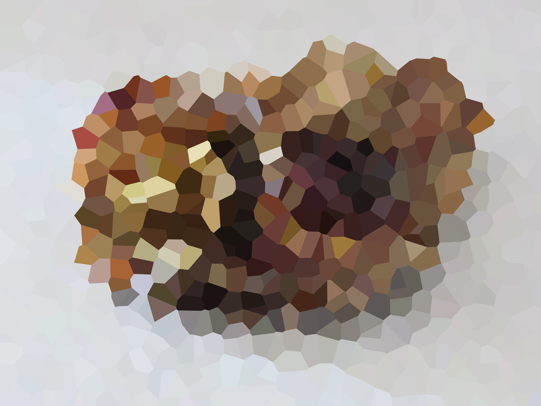
Favourite Photo
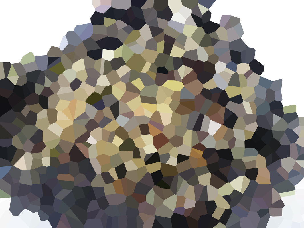
This is my favourite photo from this experiment. The first reason why I like this one the most is the colours. I like the wide range of browns, reds and purples which have been created by the crystals. Because there was such a wide range of colours that meant that I could cut more of the image out with ease. The 2nd reason why I like this image is because of the abstract feel to it. I feel the image looks even more abstract when the pixelated image is combined with the original. This is because you still can't make any connections by looking at the original image because the texture doesn't feel normal.
|
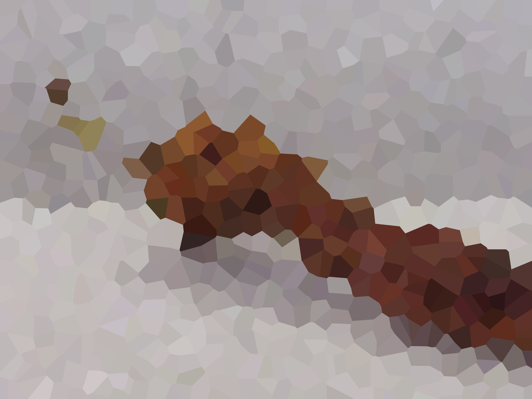
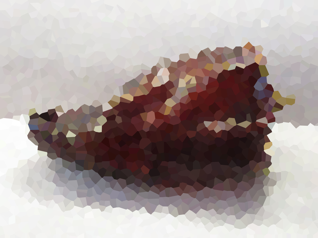
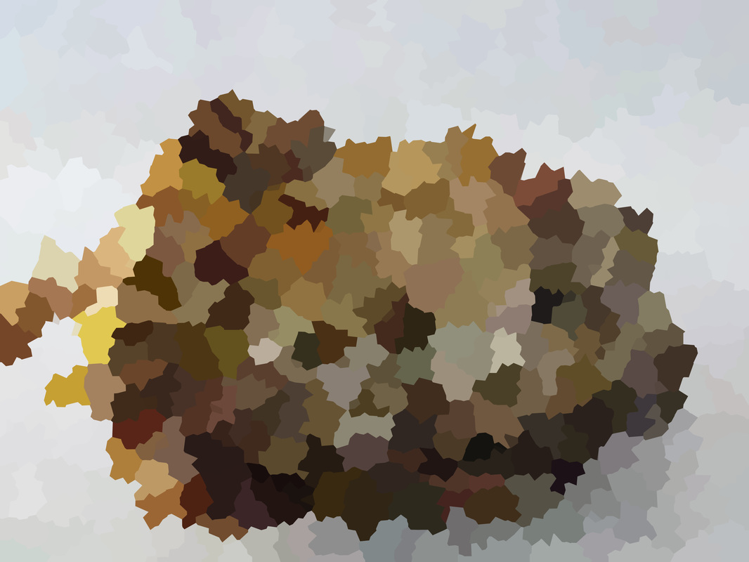
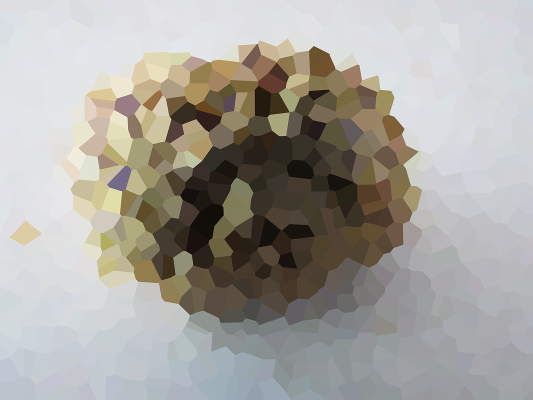
Least Favourite Photo
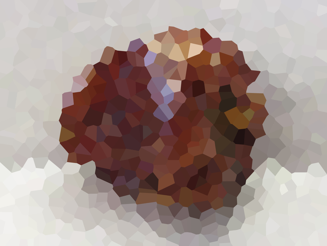
This is my lest favourite image. The 1st reason why is because of the small range of colours. Because the object was small and the colours were similar. So as a result there wasn't much that I could cut out. Which is a shame because the contrast in texture would be very strong because the object is bumpy and rough whereas the crystalized image is more flat and soft.
|
Responses
|
For my 1st response. I decided to print out the best one in a big size. I decided to order it from Photobox in glossy paper. That way the colours will become the subject of the photo because they would stand out.
|
For my 2nd response I decided that I should make a Diptych style image with a similar concept to my Surrealist message response. However instead of words I'm having diptychs of pixelated natural forms. I'm hoping to show a pattern of the colours that are in the forms which are more prominent through the pixelation.
In the end I don't not to mount this response because I felt I would only be making it for the sake of it. Also I feel it didn't really convey a pattern. |
How I made my response
|
|
The video on the left is how I made my response.
|
